Candlestick vs Line vs Bar Charts Compared
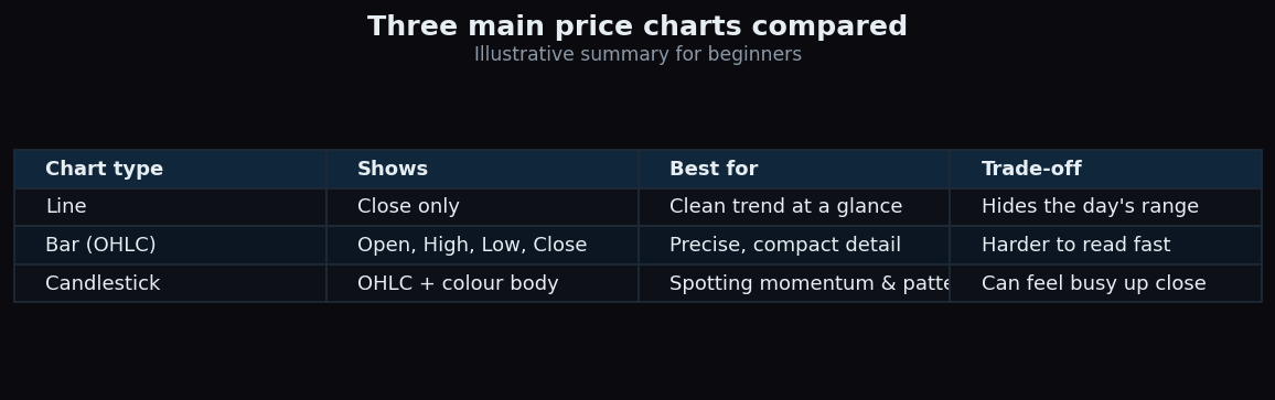
Open any trading screen and the first choice you face is quietly important: how should the price be drawn? The three most common answers are the line chart, the bar chart, and the candlestick chart. They all plot the same underlying prices, but each shows a different amount of detail — and picking the right one for the job makes the market far easier to read. This guide compares all three in plain language. Everything below is illustrative, meant to teach the mechanics rather than describe any real stock.
First, the four prices behind every period
Before comparing charts, you need one idea: for any time period — a day, an hour, a minute — the market records four key prices, together called OHLC:
- Open — the first traded price of the period.
- High — the highest price touched.
- Low — the lowest price touched.
- Close — the last traded price of the period.
The three chart types differ mainly in how many of these four they show you. That single fact explains almost everything about their strengths and weaknesses.
The line chart: simplest of all
A line chart uses just one of the four prices — usually the close — and connects those closing dots with a single line. That is it. By throwing away the open, high, and low, it strips the picture down to its cleanest form.
Think of it like a summary of your day told in one sentence: “I ended up fine.” It skips the ups and downs in between. The line chart is wonderful for seeing the overall trend at a glance and for comparing several things on one screen without visual clutter. Its weakness is the flip side: it hides how wild or calm the period actually was. A day that swung violently and a day that barely moved can look almost identical if they closed at the same price.
The bar chart: all four prices, compactly
A bar chart (often called an OHLC bar) shows all four prices in a small vertical stick. The top of the stick is the high, the bottom is the low. A little tick pointing left marks the open; a little tick pointing right marks the close. In one glance you get the full range and where price started and finished.
Bars are precise and space-efficient — you can pack many onto a screen. The trade-off is readability: those little left-and-right ticks are fiddly, and it takes practice to absorb them quickly. Many beginners find bars accurate but tiring to scan.
The candlestick chart: the same data, easier to feel
A candlestick shows the exact same four prices as a bar, but repackages them into a shape that is far easier to read at speed. Each candle has a thick middle called the real body and thin lines above and below called wicks (or shadows).
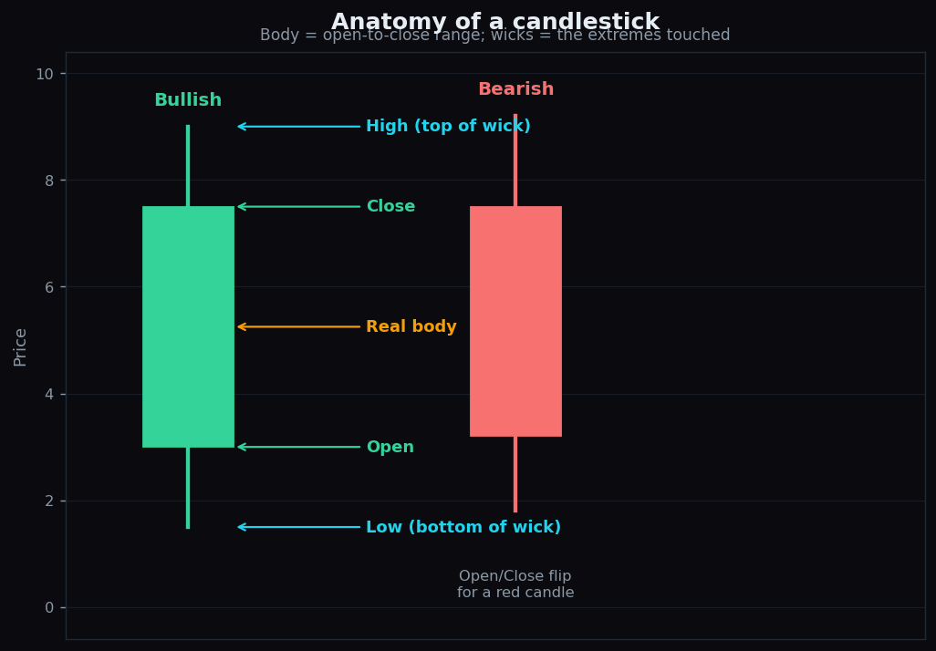
- The real body spans the distance between the open and the close.
- The wicks reach up to the high and down to the low — the extremes the price touched.
- Colour does the heavy lifting: a green (or hollow) body means the close was above the open (buyers won the period); a red (or filled) body means the close was below the open (sellers won).
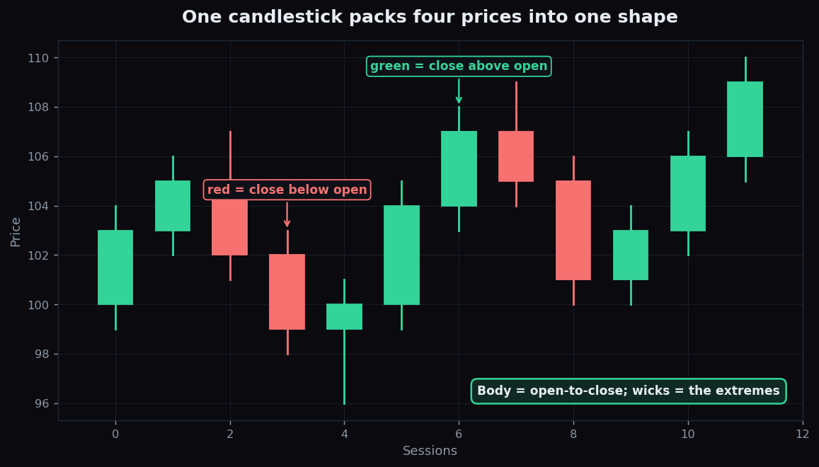
Because colour instantly tells you who won each period, patterns and momentum practically jump off the screen. That is why candlesticks have become the default for most traders. The mild downside: up close, a dense wall of colourful candles can feel busy, and the vivid colours can tempt beginners into reading too much drama into a single candle.
A worked example with round numbers
Imagine one trading day where a stock opens at 100, climbs to a high of 108, dips to a low of 99, and closes at 104. Here is how each chart would tell that story:
- Line chart: plots a single dot at 104 and connects it to yesterday's close. You see the finish, nothing else.
- Bar chart: a stick from 99 to 108, a left tick at 100 (open), a right tick at 104 (close). All four numbers, compactly.
- Candlestick: a green body from 100 to 104 (close above open), a lower wick down to 99, and an upper wick up to 108. One glance tells you it closed higher and the range was 99–108.
Same day, same four prices — three different amounts of detail.
The honest catch
No chart type is “best” in the abstract; they answer different questions.
- More detail is not always better. When you just want the big-picture trend or to compare many instruments, a line chart's simplicity is a feature, not a limitation.
- Candlesticks can over-dramatise. A single striking candle is easy to over-interpret. Colour grabs attention, but one period rarely tells the whole story.
- The timeframe changes everything. A candle on a 1-minute chart and a candle on a weekly chart look the same but mean very different things. Always check what period each candle or bar represents.
- They describe, they do not predict. A chart type shows what happened; none of them forecasts what happens next.
The practical takeaway is simple: match the chart to the question. Zooming out to judge a trend? A line is clean. Studying momentum and the tug-of-war between buyers and sellers? Candlesticks make it visible. Want precision without colour? Bars deliver.
Reading a chart clearly is step one of market literacy — and it should never cost you anything to learn. TrueTrend pairs plain-English explainers with a transparent public scoreboard so beginners can build genuine understanding before risking a rupee. Start free at TrueTrend.
Key takeaways
- Every period has four prices — open, high, low, close (OHLC) — and the three chart types differ in how many they show.
- A line chart shows only the close: cleanest for trends, but hides the range.
- A bar chart shows all four prices compactly, but the little ticks take practice to read.
- A candlestick shows the same four prices with a body and wicks, and uses colour so momentum is easy to spot — at the cost of looking busy up close.
- Match the chart to your question; check the timeframe; remember charts describe the past, they do not predict.
- All prices and examples here are illustrative, not advice.
See these concepts on live market data — free
Create a free TrueTrend account to watch daily support/resistance levels, market regime, and option-positioning charts on NIFTY, BankNifty and 12 more instruments. Every level we publish is scored on a public scoreboard — misses included. No card required.
Free forever tier · daily levels with published hit-rates across every instrument. Descriptive market structure, not investment advice.
Not ready for an account? Get the daily levels by email.
One short email each market day — the indices' call wall, put wall, gamma flip and max pain, and how the last session's levels scored. Free, no account, unsubscribe anytime.
Descriptive market structure, not investment advice. We never share your email.