The TrueTrend Blog
Clear, data-backed writing on Indian and global markets — option structure, market regime, open interest and the ideas behind the platform. No tips, just understanding.
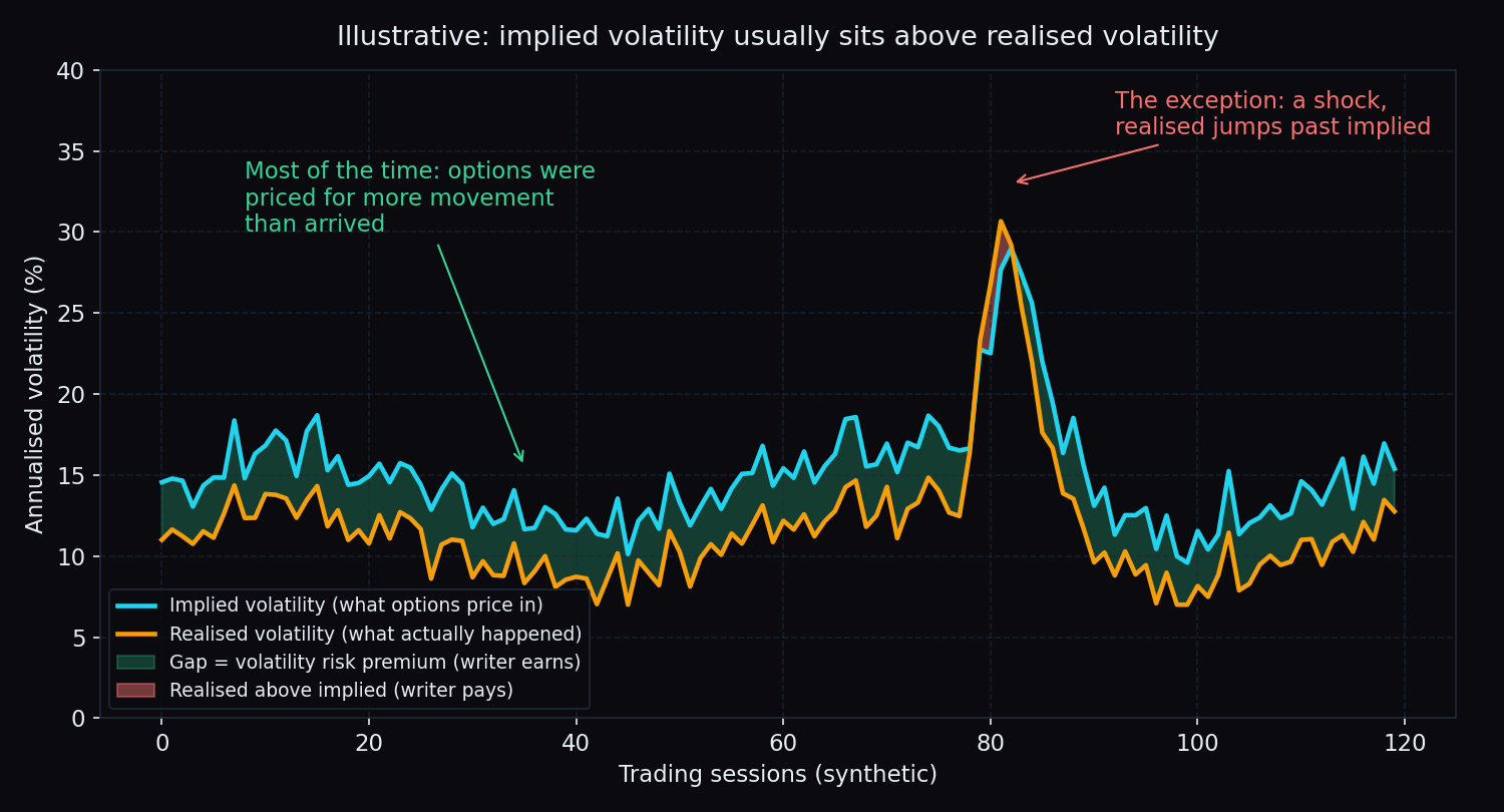
Volatility Risk Premium: Why Option Writing Pays on Average, and When It Doesn't
Options usually price in more movement than arrives. That gap is the volatility risk premium: why it exists, who collects it, and when it flips.
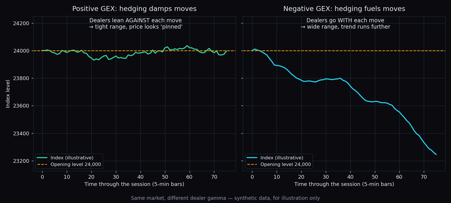
Gamma Exposure (GEX): Why Dealer Hedging Pins Some Days and Fuels Others
Some sessions stay glued to one strike; others run all day. Gamma exposure (GEX) explains why: dealer hedging either brakes the index or accelerates it.
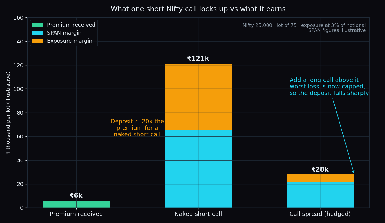
SPAN and Exposure Margin: What Option Writers Deposit and Why
Why writing one Nifty option can lock up twenty times the premium it earns: SPAN margin, exposure margin, and how a hedge shrinks the deposit, in round numbers.
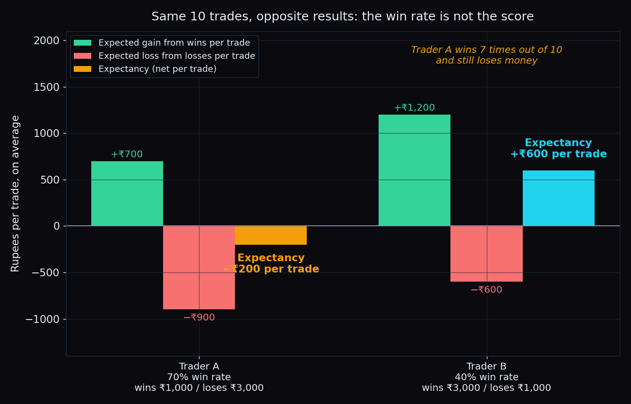
Trading Expectancy: The Win Rate vs Risk-Reward Math
A 70% win rate can lose money and a 40% win rate can make it. Expectancy is the one number that combines both. Here is how to work it out in round numbers.
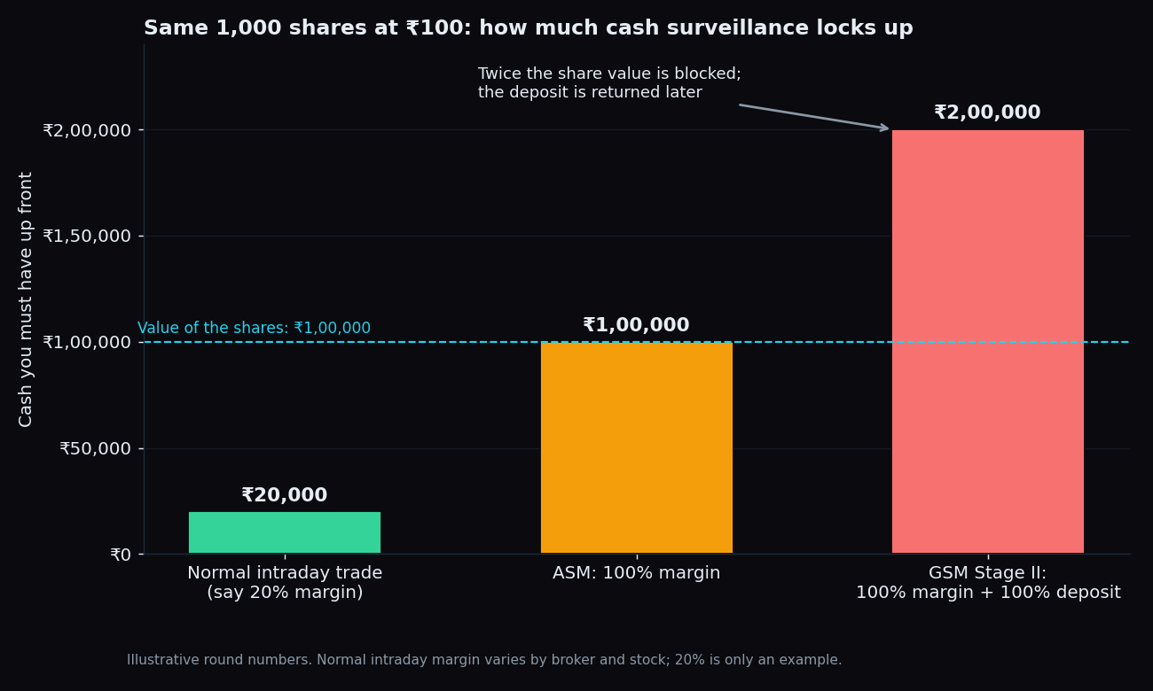
ASM and GSM Explained: NSE's Surveillance Frameworks
ASM and GSM are the two frameworks NSE and BSE use to slow down stocks with odd price moves or weak fundamentals. Here is what each stage does to your trade.
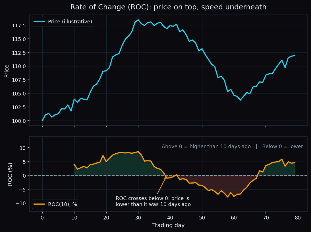
Rate of Change (ROC): The Simplest Momentum Indicator
ROC is one subtraction and one division: how far price moved, in percent, over a fixed lookback. How to read it, how to pick the window, and where it misleads.
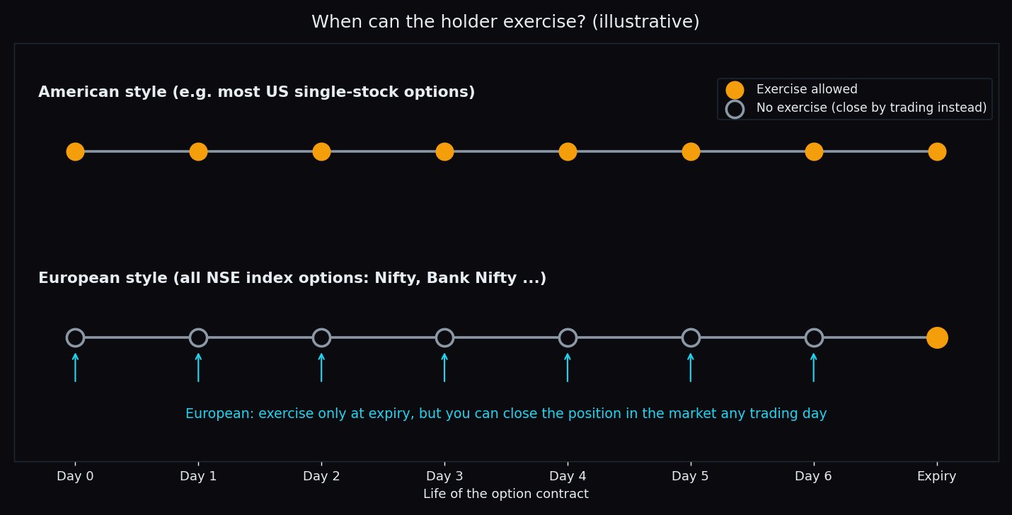
American vs European Options: Why Indian Index Options Can't Be Exercised Early
Nifty and Bank Nifty options are European-style: exercise happens only at expiry. What that means, why it rarely costs holders, and where the catch is.
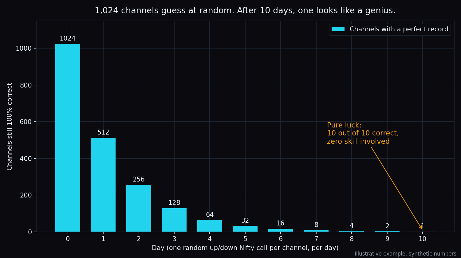
Survivorship Bias: Why Trading-Guru Track Records Mislead You
Let 1,024 channels guess Nifty at random and one will likely be perfect for 10 days. How survivorship bias builds fake gurus, and how to read a record.
Grey Market Premium (GMP): What It Means and Why It Misleads
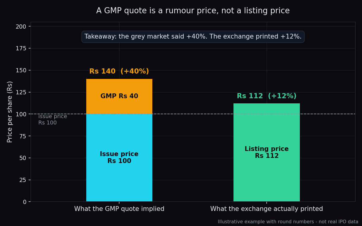
GMP Rs 40 on a Rs 100 IPO reads like a promise of a 40% listing pop. It is a quote from an unofficial market with no records, no regulator and no scorecard.
Backtesting Basics: Why Most Backtests Lie to Traders
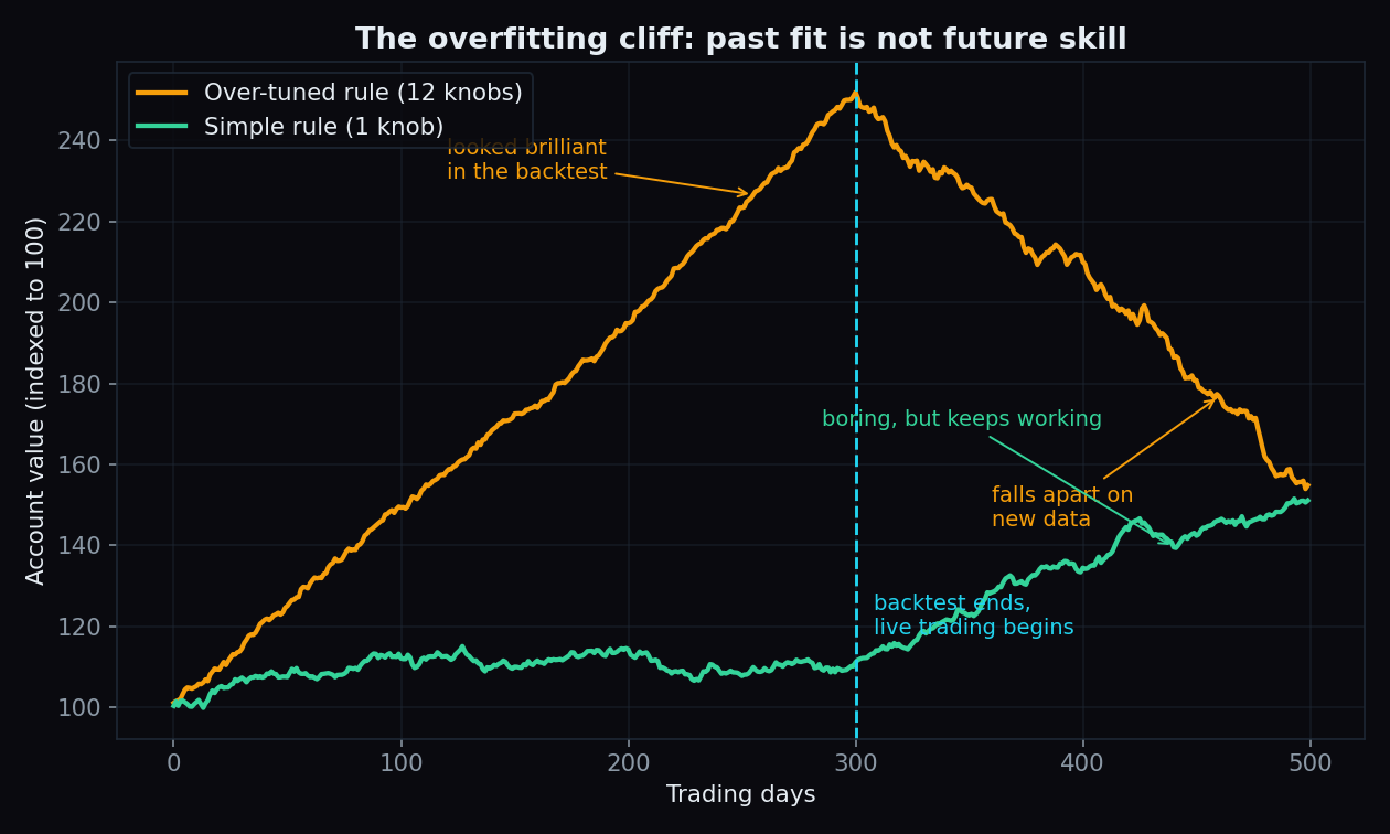
A rule that aced the past can still fail tomorrow. Why backtests flatter, how overfitting fools traders, and the simple checks that separate luck from edge.
Gold vs Equities: How the Safe-Haven Link Really Works
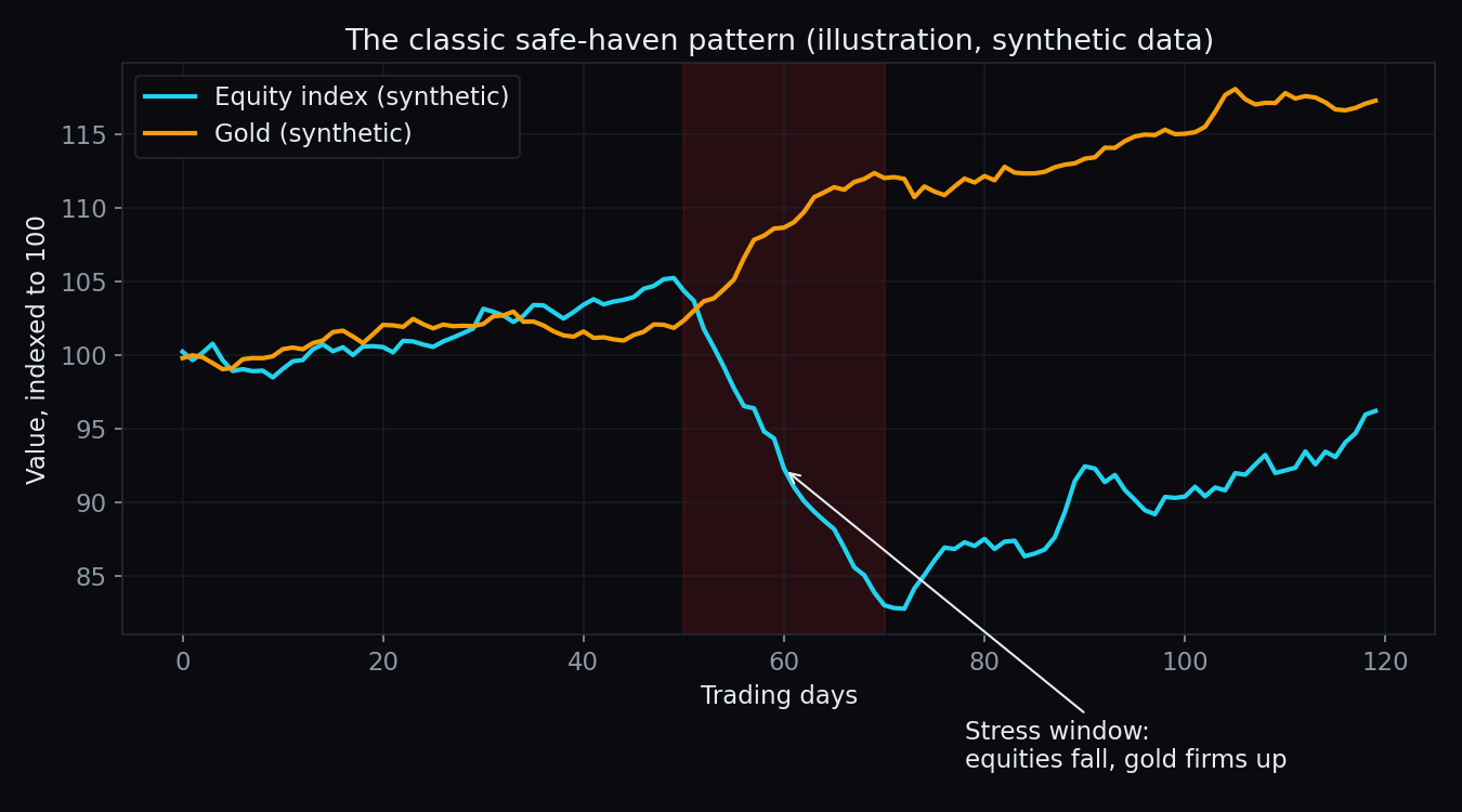
Gold usually rises when Indian equities fall, but not always. What a safe haven really is, when gold cushions a crash, and when it drops with everything else.
Futures Rollover Data: How to Read Monthly Rollover Percentages
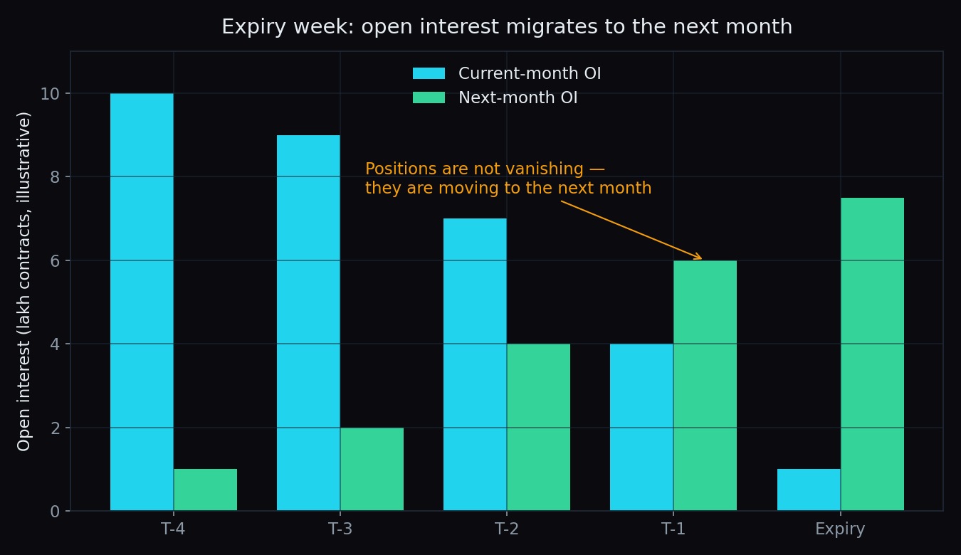
Rollover % tells you how much open interest moved to the next month at expiry. Here is the formula, a simple worked example, and how to read it right.
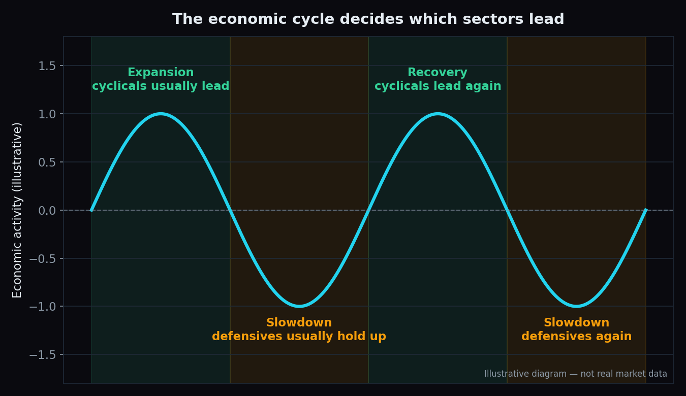
Cyclical vs Defensive Sectors: How the Economy Picks Leaders
Car makers boom and bust with the economy; toothpaste demand barely moves. How cyclical and defensive sectors work, and why market leadership rotates.
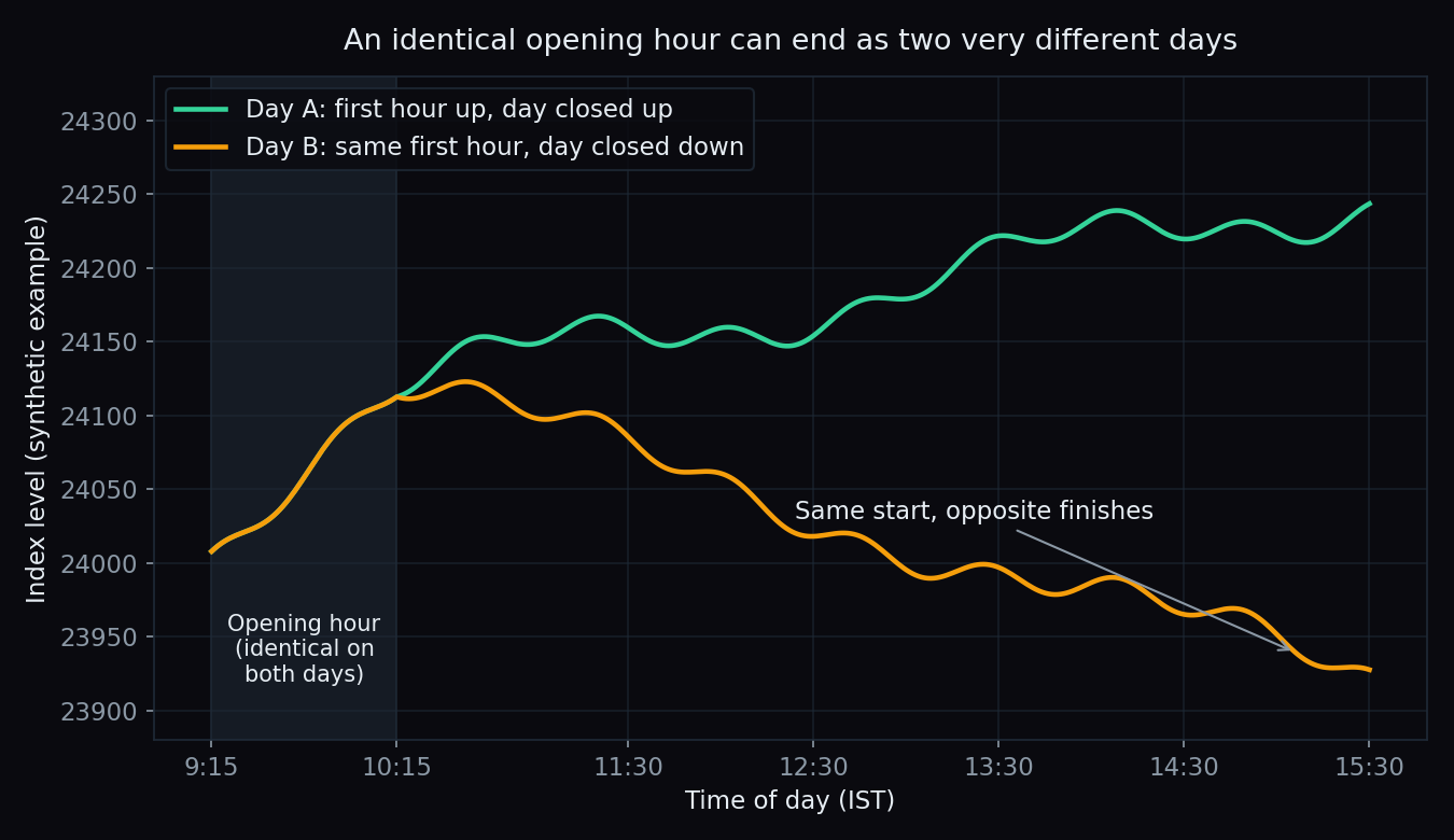
Does the Opening Hour Decide the Day? What Our Data Shows
Traders say the first hour sets the whole day. We put that folklore beside 90 scored Nifty and Bank Nifty sessions to see what it can and cannot foretell.
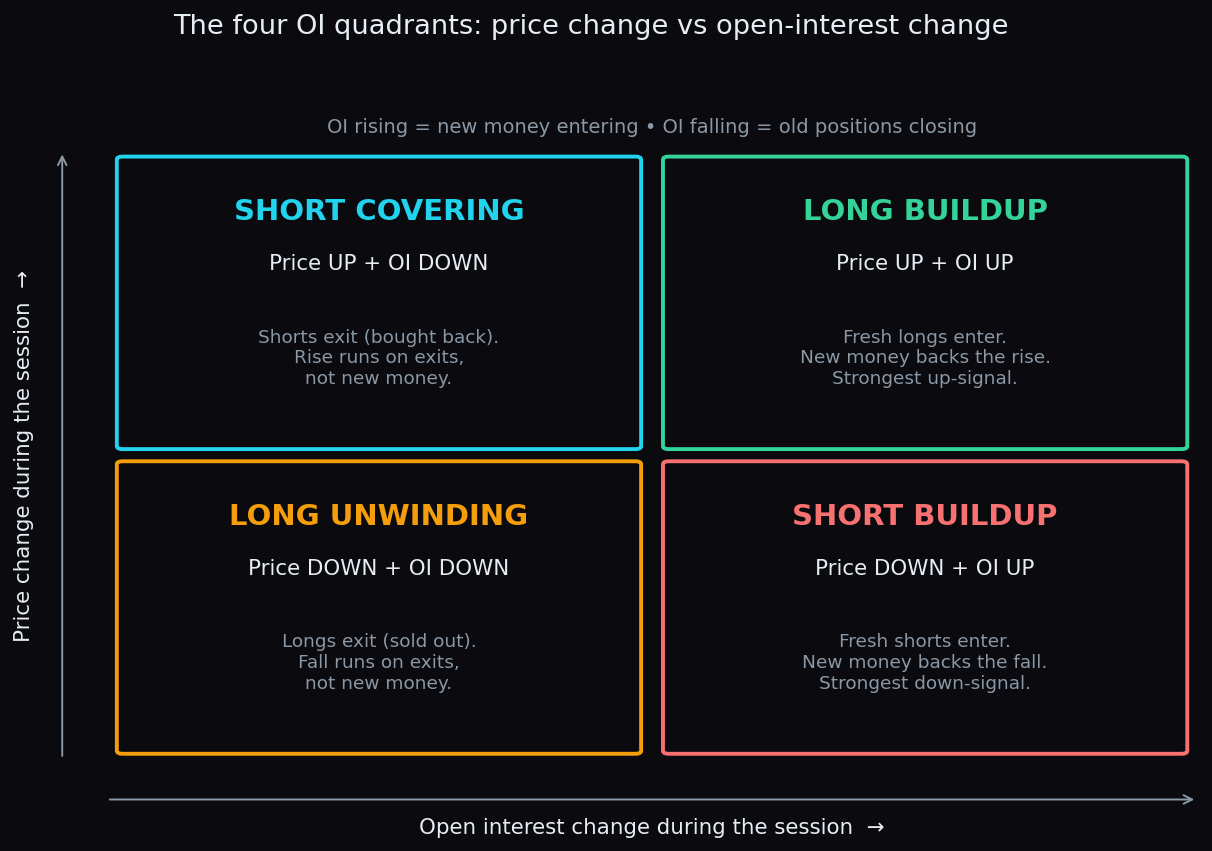
The Four OI Quadrants: Long Buildup to Short Covering
Price up with OI up is long buildup; price up with OI down is short covering. Learn all four OI quadrants and how a strike migrates between them intraday.
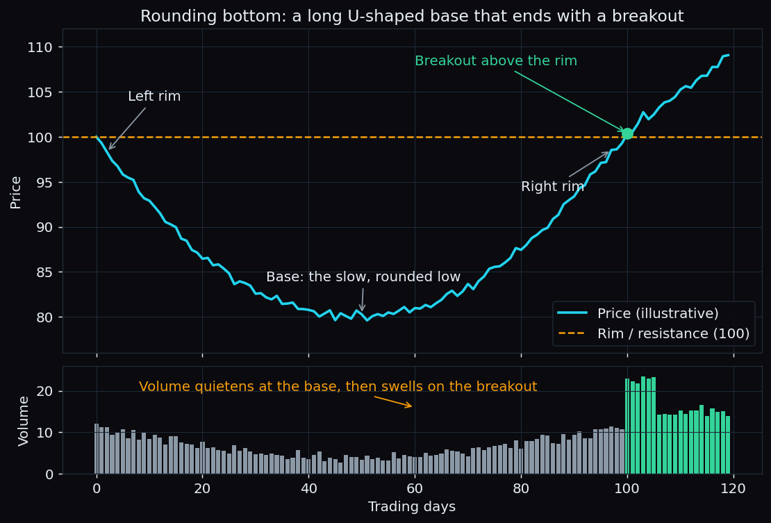
Rounding Bottom Pattern Explained: The Slow U-Turn on a Chart
A saucer-shaped base that forms over months, not days. What a rounding bottom is, how volume mirrors it, the measured-move maths, and where the pattern breaks.
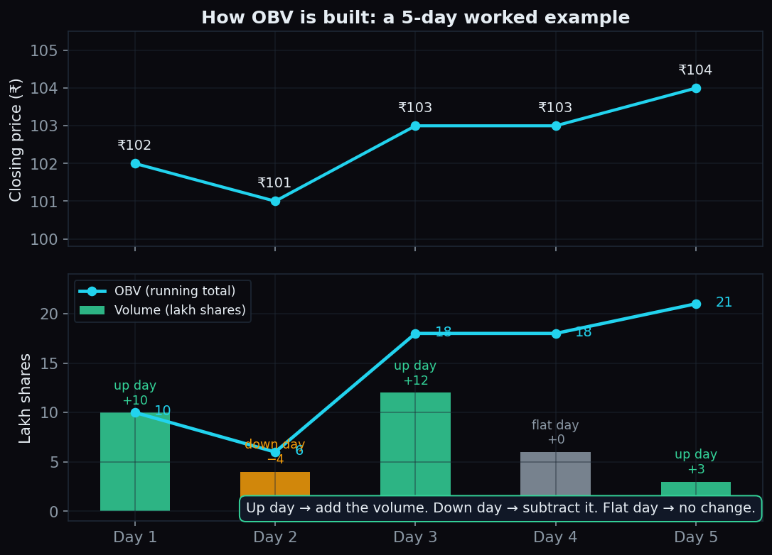
On-Balance Volume (OBV) Explained: When Volume Leads Price
OBV keeps a running total of volume — added on up days, subtracted on down days. A beginner's guide to confirmation, divergence, and the honest limits.
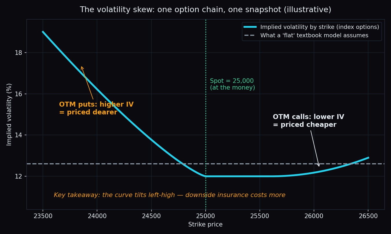
Volatility Smile and Skew: Why OTM Puts Cost More
Two Nifty options, each 500 points from the index, yet the put costs more every day. What the volatility smile and skew are, and why puts carry a fear premium.
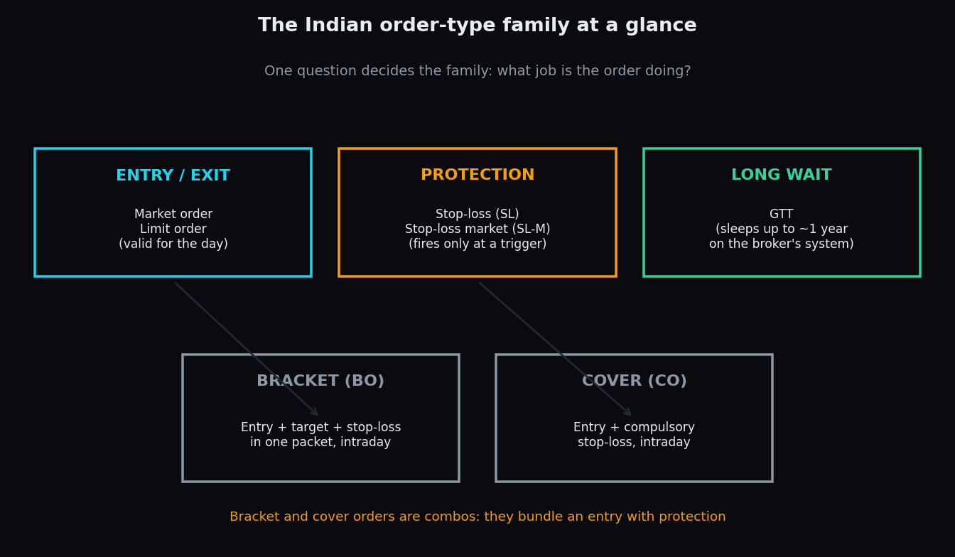
Order Types in India: Stop-Loss, SL-M, Bracket, Cover & GTT
Stop-loss, SL-M, bracket, cover and GTT orders each solve one problem: acting for you when you are not watching. A plain-English guide with examples.
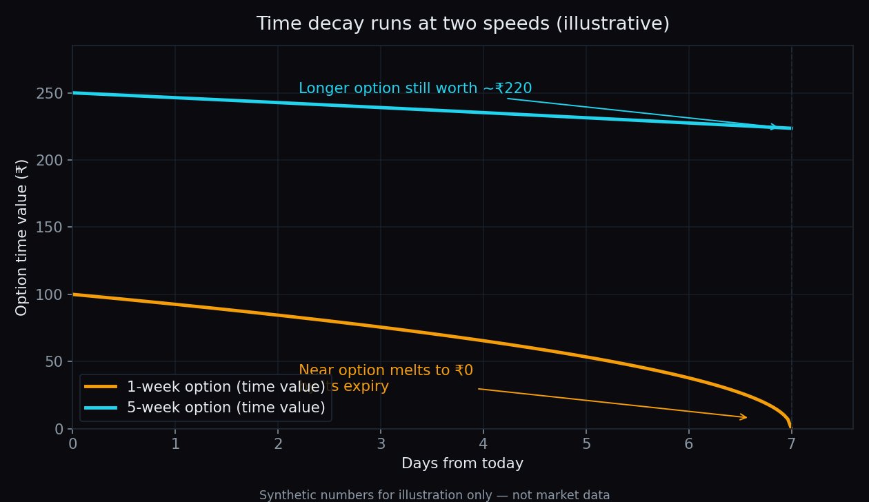
The Calendar Spread Explained: A Simple Illustrative Example
Same strike, two expiries: how a calendar spread collects the gap between fast and slow time decay, with one simple ₹150 worked example and the honest catch.
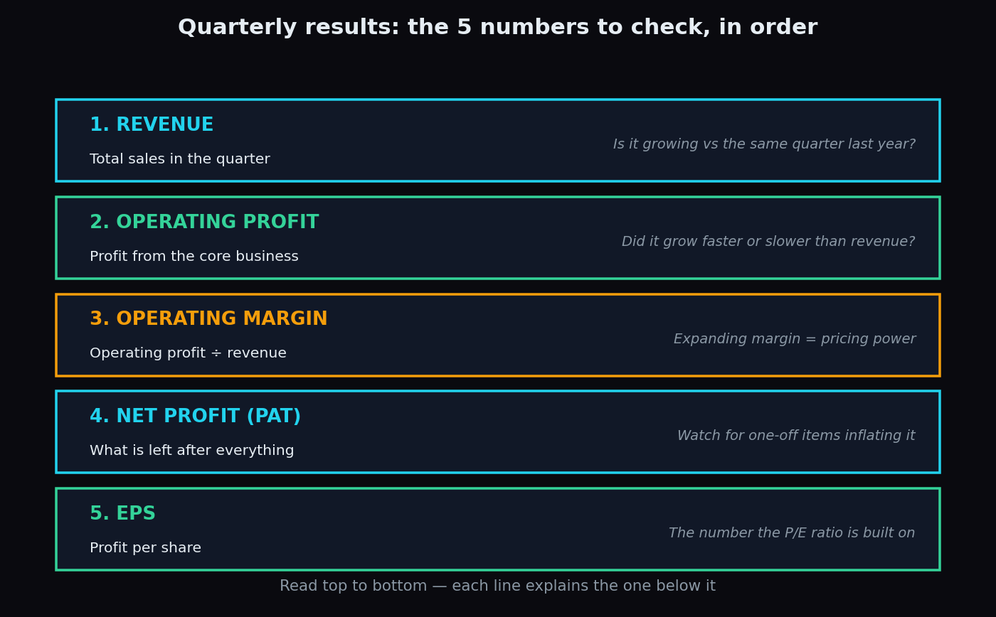
How to Read a Quarterly Results Announcement: A Beginner's Checklist
Every quarter, listed companies publish a report card. Here are the five numbers to check, the traps (one-offs, QoQ noise) and a simple worked example.
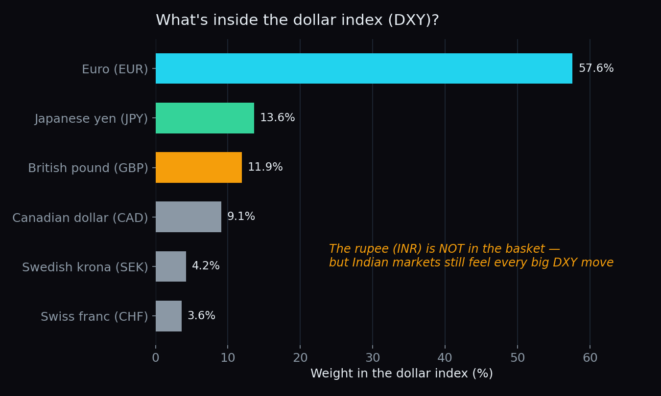
The Dollar Index (DXY): Why a Strong Dollar Hurts India
What the dollar index (DXY) measures, and the three routes — FII flows, a weaker rupee, costlier imports — through which a strong dollar squeezes Indian stocks.
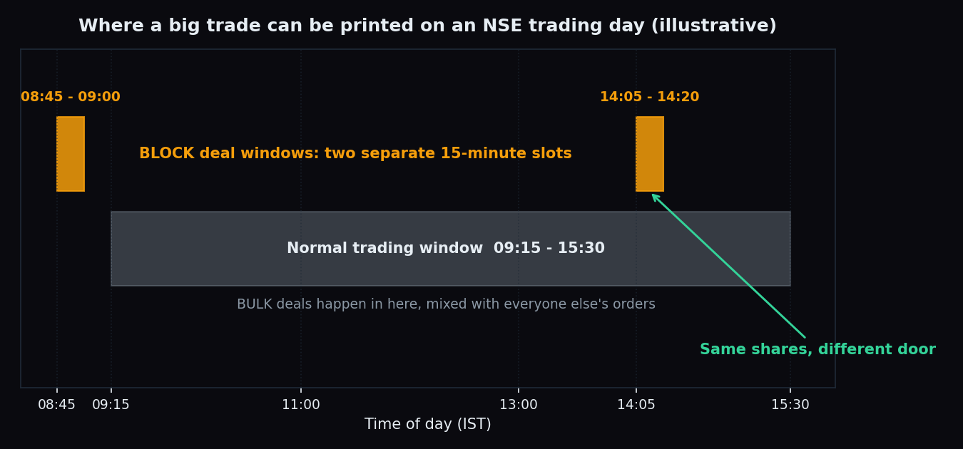
Block Deals and Bulk Deals: Big Money Footprints on NSE
A fund moves 40 lakh shares in one print and the exchange names it after the close. What block and bulk deal disclosures show, and what they never tell you.
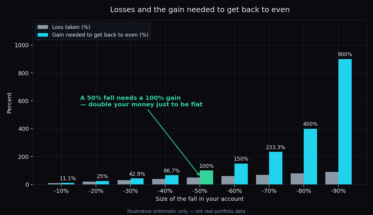
Drawdown Math: Why a 50% Loss Needs a 100% Gain Back
Lose 50% and you need 100% just to get back to even. The arithmetic of drawdowns, with round numbers, three simple charts, and what our scored data adds.
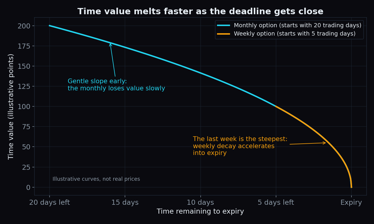
Weekly vs Monthly Options: Expiry, Theta and Liquidity
Weekly and monthly options are the same contract with different deadlines. How that one difference changes decay, pricing and liquidity, with our scored data.
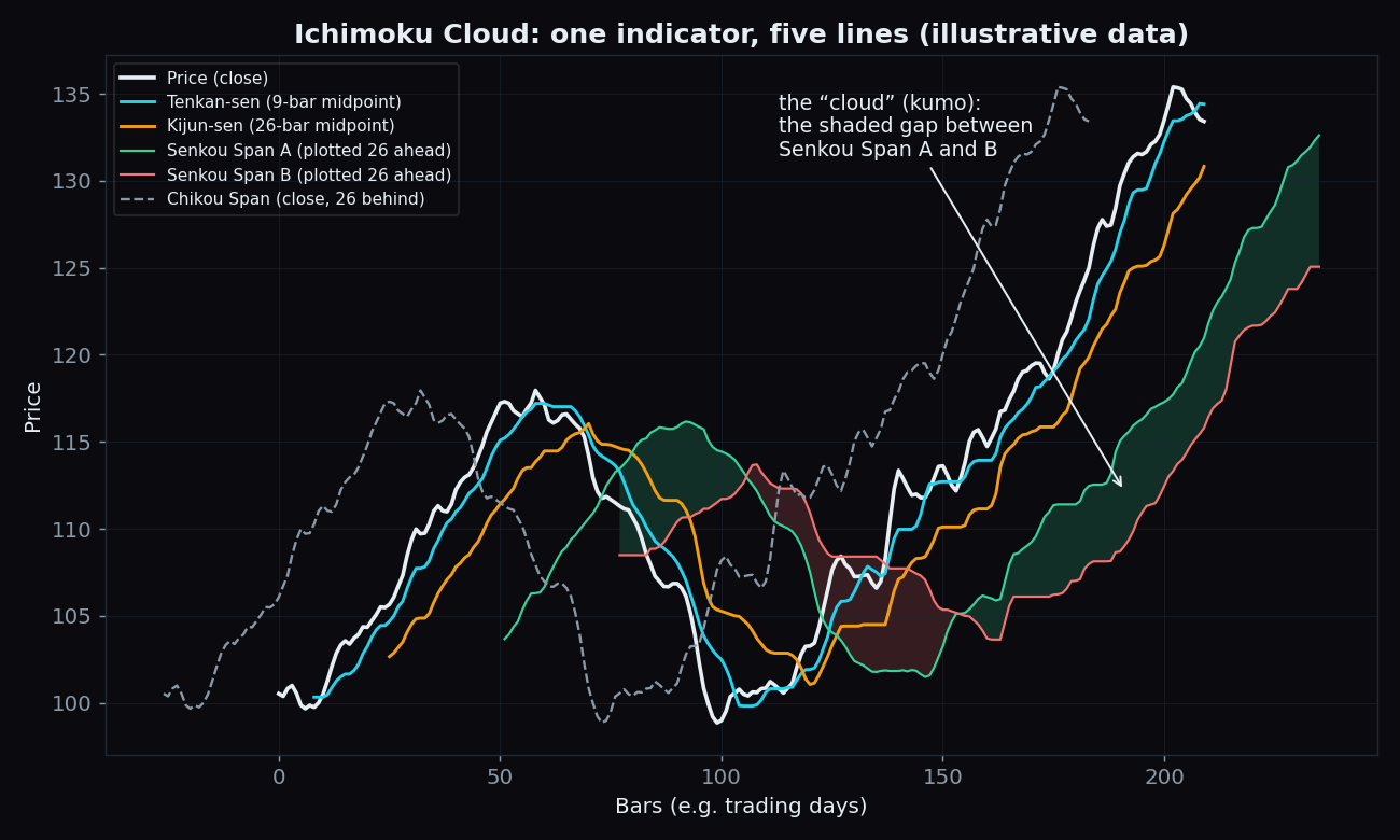
Ichimoku Cloud Explained: The 5 Lines and What They Mean
One Japanese indicator draws five lines and a shaded cloud. What each line measures, why two are time-shifted, a worked example, and the honest catch.
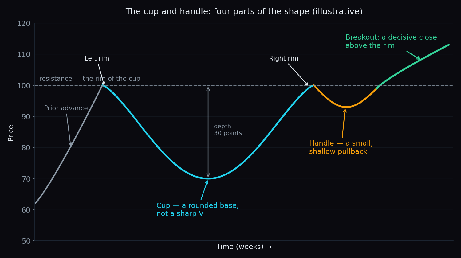
Cup and Handle Pattern Explained for Beginners
The cup and handle is a rounded base, a small dip, then a breakout. Learn the four parts, the volume tell, a worked example, and why so many of them fail.
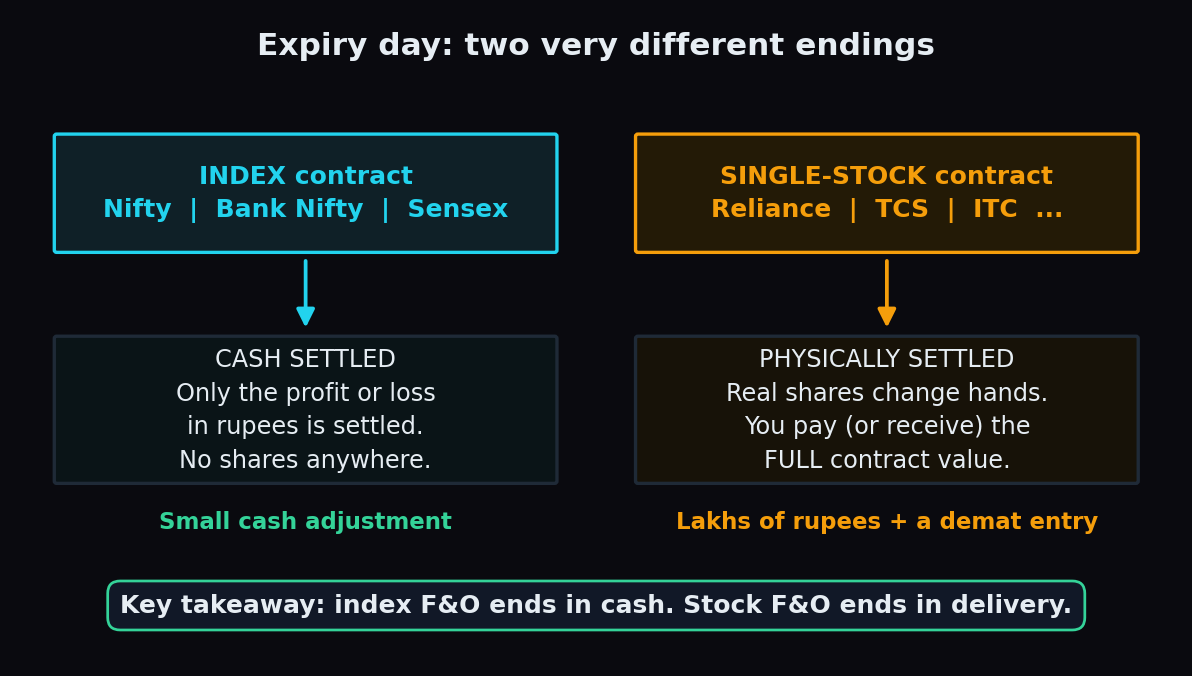
Physical Settlement of Stock F&O: What Happens at Expiry
Index F&O ends in cash. Single-stock F&O ends in shares. Who owes what at expiry, a worked example, the expiry-week margin squeeze, and the real cost.
Overtrading: How to Catch the Silent Account Killer
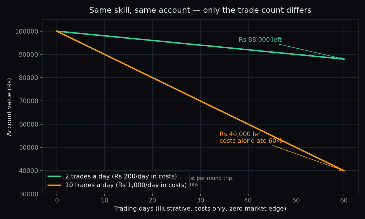
Overtrading quietly drains accounts through costs and revenge trades. The simple maths of trade frequency, plus early warning signs to catch it in time.
Rights Issues and Buybacks: Corporate Actions Explained
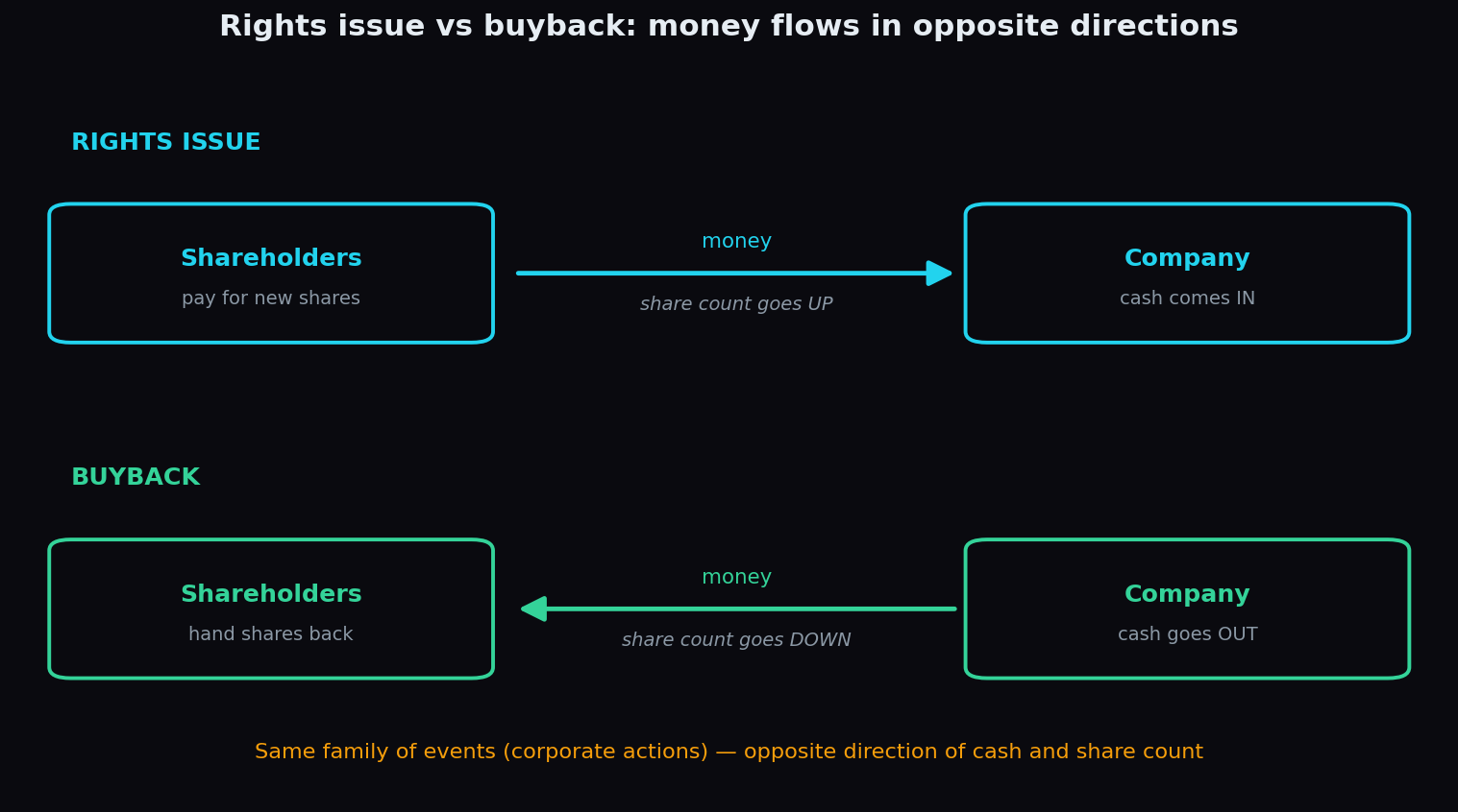
One corporate action asks shareholders for money, the other hands it back. How rights issues and buybacks work, with simple maths and the honest catches.
Money Flow Index (MFI) Explained: The Volume-Weighted RSI
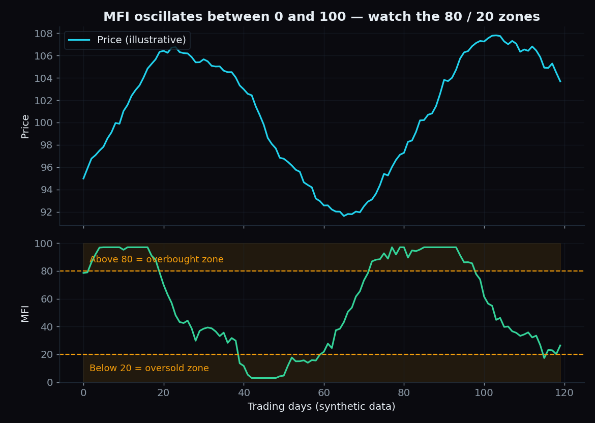
MFI is RSI with volume built in. Learn the 0-100 scale, 80/20 zones, divergence and a worked example, plus the honest limits every beginner should know.
IV Rank vs IV Percentile: Is Volatility Cheap or Expensive?
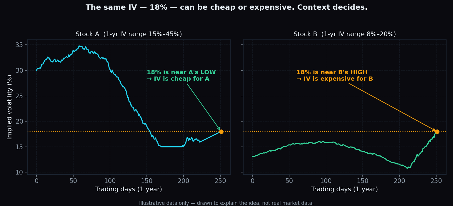
An IV number alone means nothing. IV rank and IV percentile put today's implied volatility in one-year context — explained with simple worked examples.
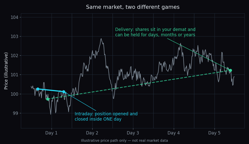
Intraday vs Delivery Trading: Costs, Margins and Mindset
Per trade, delivery costs about 3x more than intraday — yet intraday traders usually pay far more in a year. A worked ₹1 lakh example explains why.
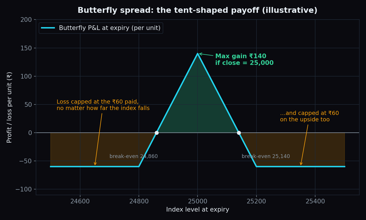
The Butterfly Spread Explained: A Simple Illustrative Example
Three strikes, one tent: how a butterfly spread risks a small ₹60 for a payoff that peaks at the middle strike, with a worked example and the honest catch.
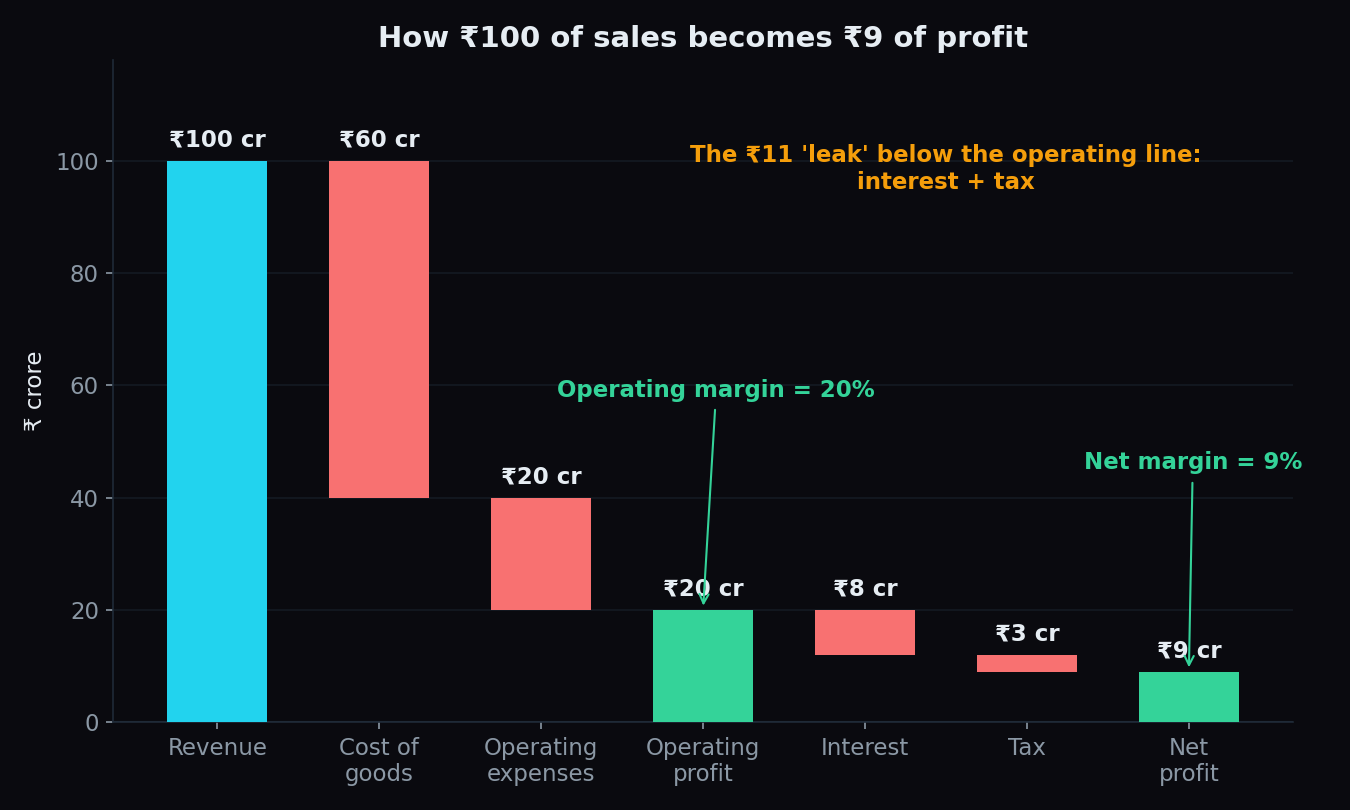
Operating Margin vs Net Margin: Where a Company's Profit Leaks
A company can run a great business and still keep very little of each sale. Here is how operating margin and net margin reveal where the profit leaks.
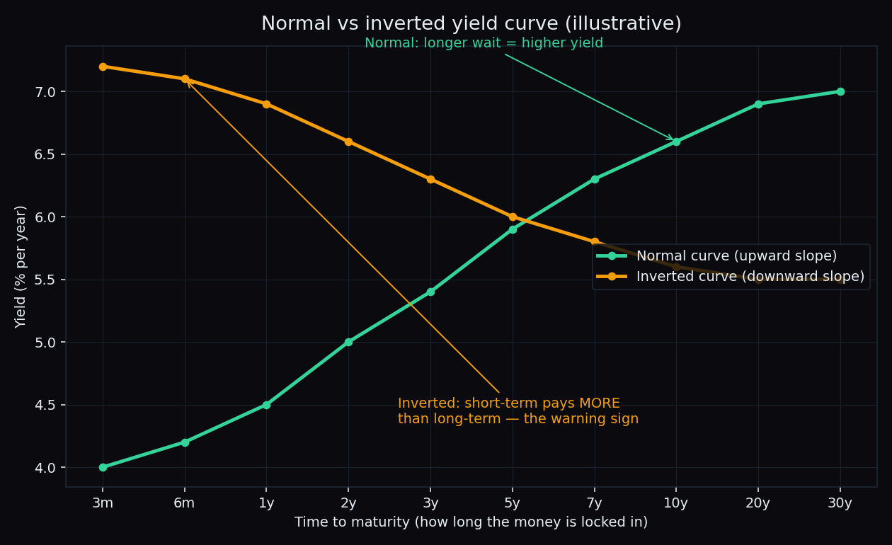
Yield Curve Inversion: What It Signals and Why Equity Markets Watch It
When short-term bonds pay more than long-term ones, the yield curve has inverted. What it signals, its track record, and why stock markets watch it.
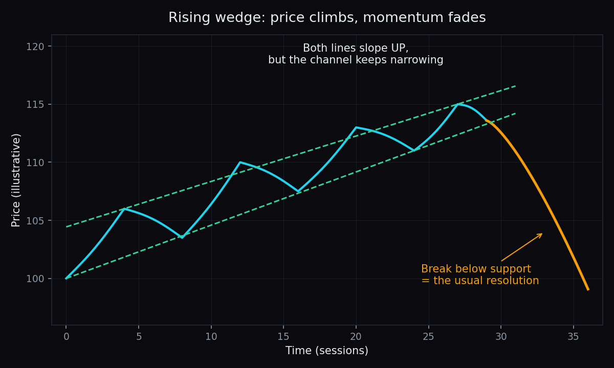
Rising and Falling Wedge Patterns Explained
Wedges are narrowing chart patterns where momentum quietly fades. Learn how rising and falling wedges form, which way they usually break, and why.
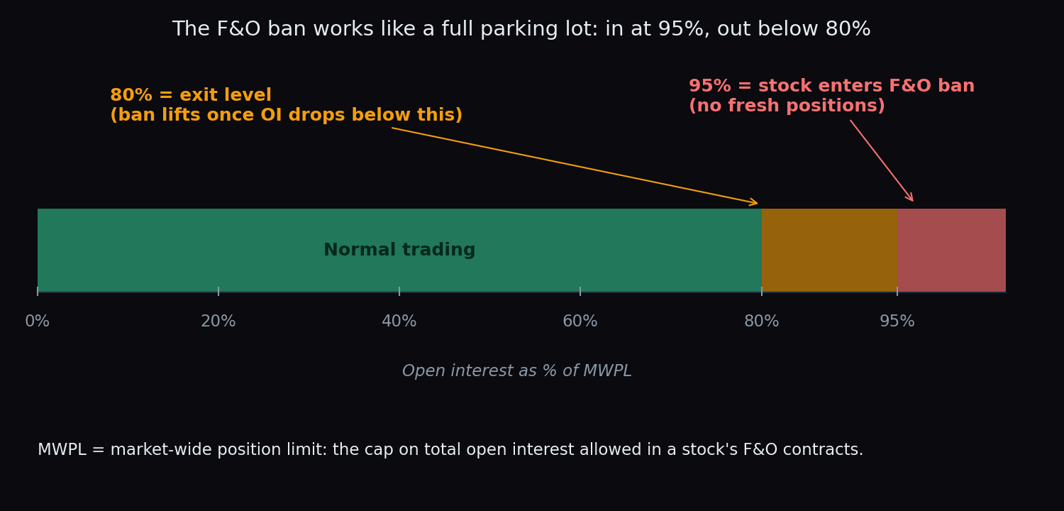
F&O Ban Period and MWPL Explained: Why Some Stocks Get Locked Out
When open interest in a stock crosses 95% of its MWPL, the stock enters the F&O ban: no fresh positions until OI cools below 80%. Here's how it works.
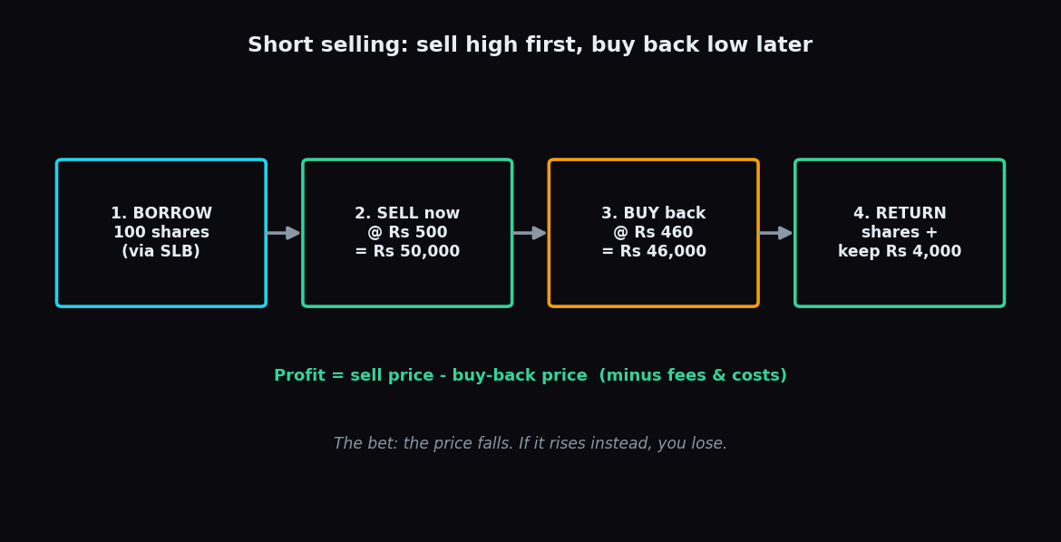
What Is Short Selling? How It Works in India (SLB)
Short selling means selling shares you don't own, betting the price falls so you can buy them back cheaper. Here's how it works in India, and how SLB fits in.
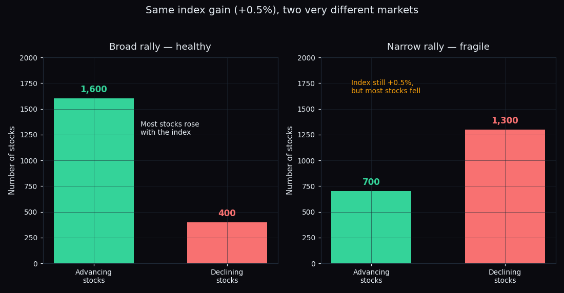
Market Breadth: What Advance-Decline Data Says About a Rally
An index can rise while most of its stocks fall. Market breadth — advancers, decliners and the advance-decline line — shows if a rally is broad or narrow.
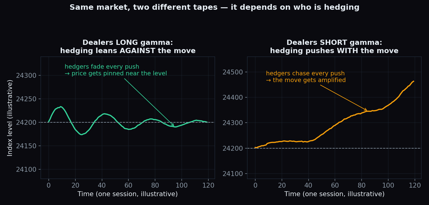
How Option Sellers' Hedging Moves the Market: Dealer Positioning 101
Option sellers don't just wait for expiry. They hedge all day, and that hedging itself moves the index. Dealer positioning and gamma, explained simply.
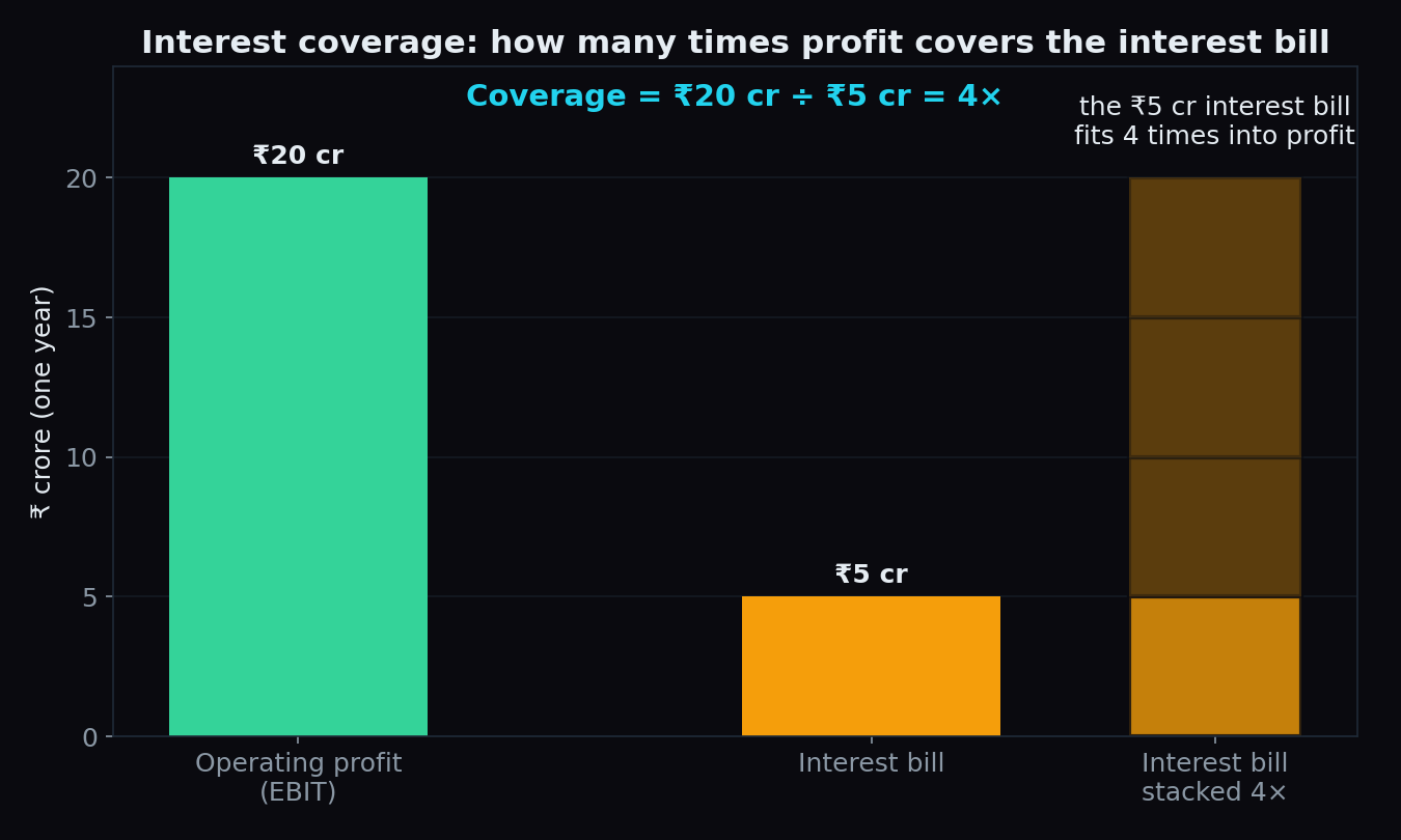
Interest Coverage Ratio: Can a Company Pay Its Interest?
A company can grow sales every year and still struggle to pay its loan interest. The interest coverage ratio shows how big that safety cushion really is.
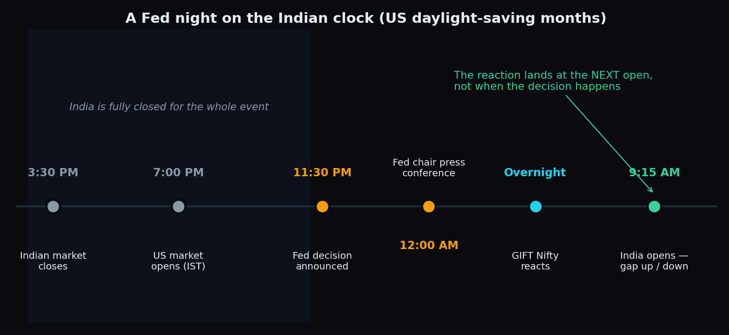
US Fed Meetings and Indian Markets: Why the 11:30 PM Decision Matters
Eight nights a year the US Fed sets interest rates at 11:30 PM India time, after our market closes. Here is how that decision reaches Nifty by 9:15 AM.
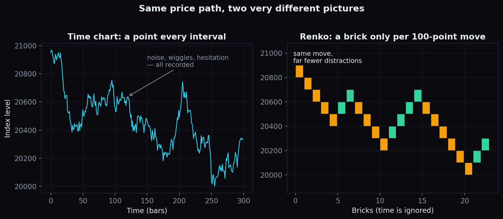
Renko Charts Explained: Filtering Time Out of Price
Renko charts print a brick only when price moves a fixed amount and ignore time completely. How bricks form, why traders use them, and what the filter costs.
STT on Expiry: What Really Happens to Your ITM Options
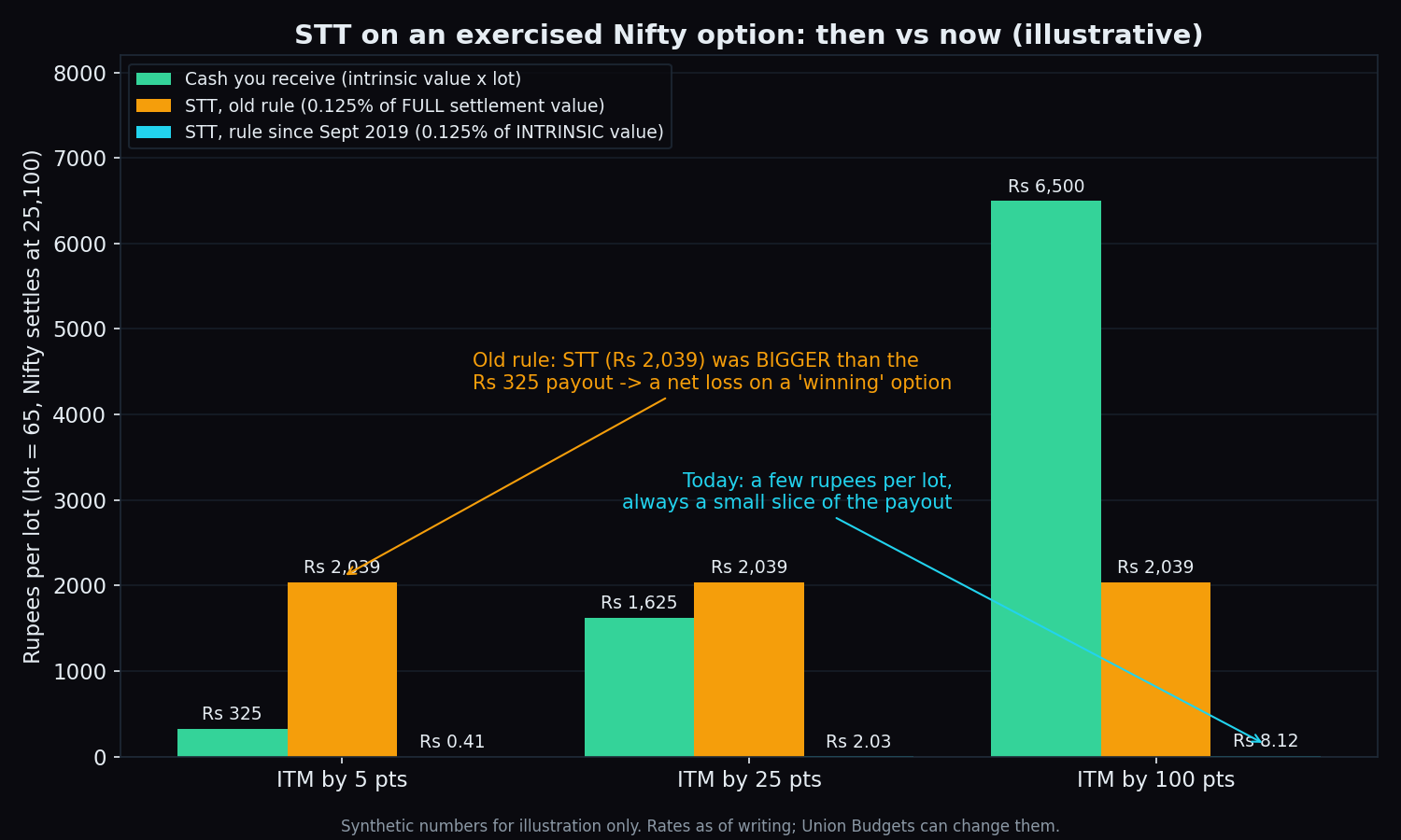
An ITM option left to expire is exercised automatically and charged STT on its intrinsic value. What it costs now, the old trap and the settlement-price catch.
The Disposition Effect: Why We Sell Winners Early and Hold Losers Too Long
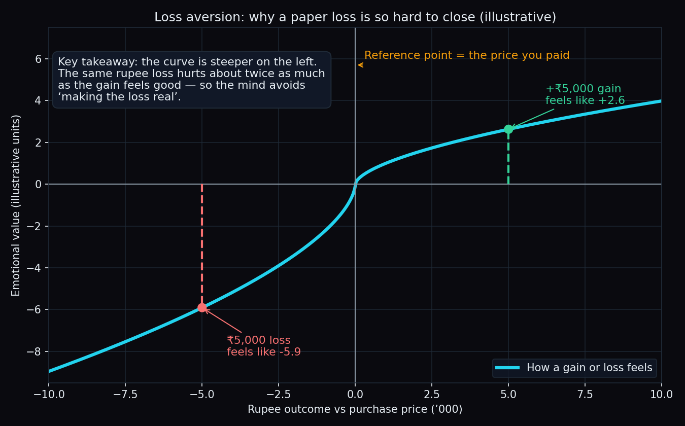
Most people close a small gain fast and sit on a large loss for months. The psychology behind the disposition effect, the evidence and a worked example.
Index Rebalancing: What Happens When a Stock Enters or Exits the Nifty
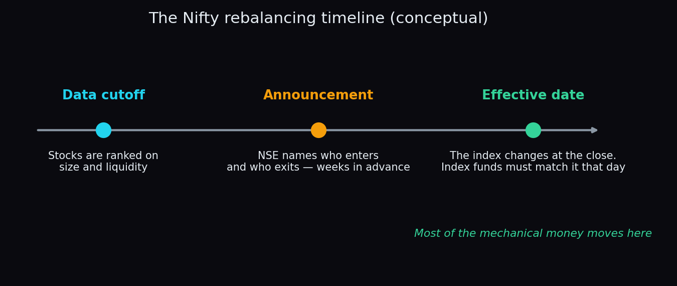
Twice a year the Nifty 50 swaps members. How entries and exits are decided, why index funds must trade the change in one day, and what it does to prices.
Williams %R Explained: A Fast Overbought-Oversold Gauge
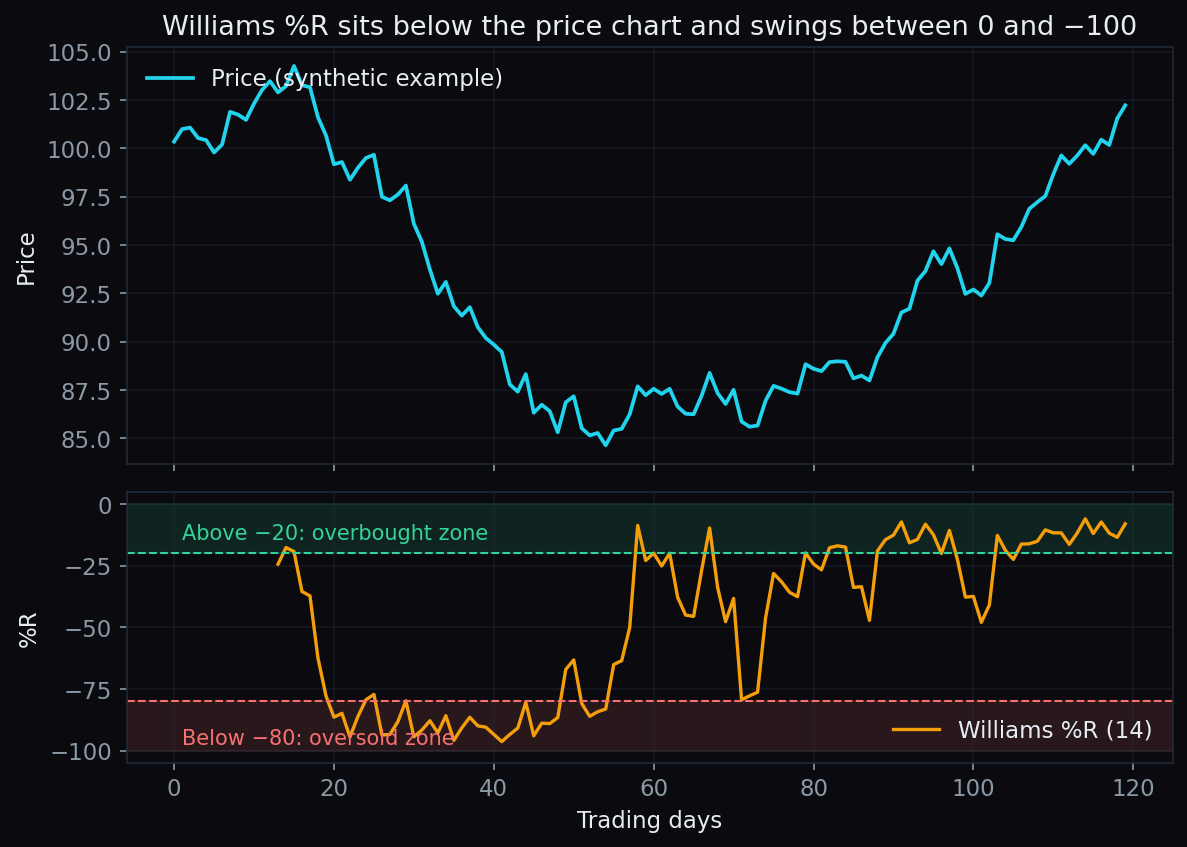
A beginner's guide to Williams %R: what the 0 to −100 scale means, how the 14-day formula works, and why an overbought reading is not a stop sign.
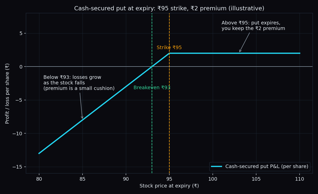
Cash-Secured Put Explained: A Simple Worked Example
A cash-secured put is a promise to purchase a stock at a fixed price, made with the full cash kept ready. A simple ₹95-strike example shows how it works.
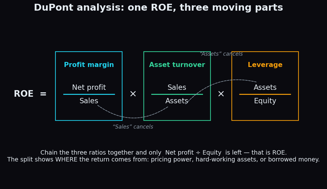
DuPont Analysis: Breaking ROE into Margin, Turnover and Leverage
Two companies can report the same ROE with completely different engines underneath. DuPont analysis splits ROE into margin, turnover and leverage to show which.