The TrueTrend Blog
Clear, data-backed writing on Indian and global markets — option structure, market regime, open interest and the ideas behind the platform. No tips, just understanding.
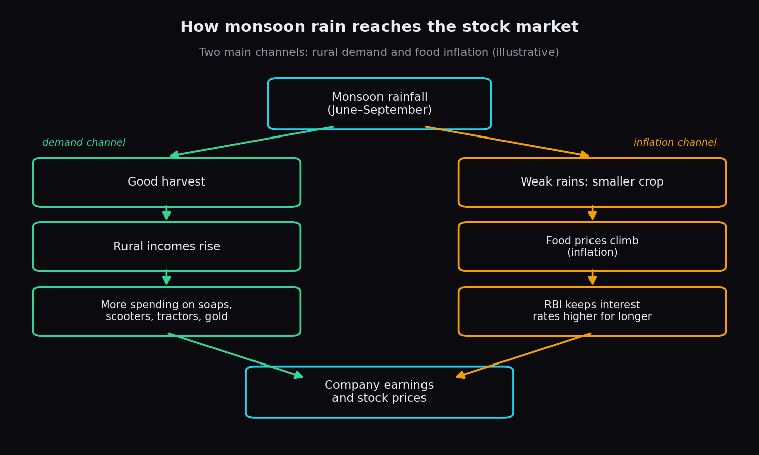
Monsoon and the Markets: How Rainfall Moves Indian Stocks
How monsoon rain shapes rural demand, food inflation and RBI policy, and why the link between rainfall and Indian stocks is looser than headlines say.
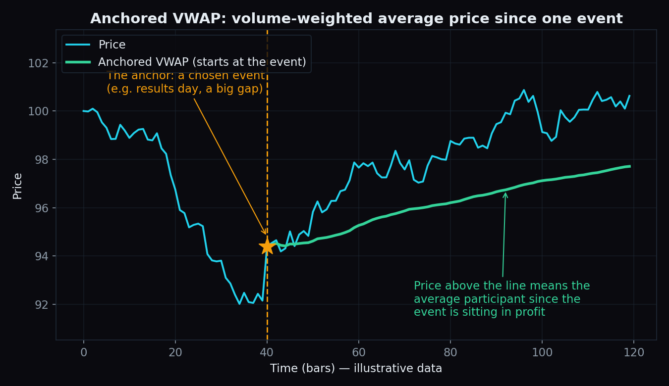
Anchored VWAP Explained: Fair Value Measured From an Event
Anchored VWAP tracks the average price the market has paid since one event: a results day, a breakout, a budget. Simple numbers, charts, the honest catch.
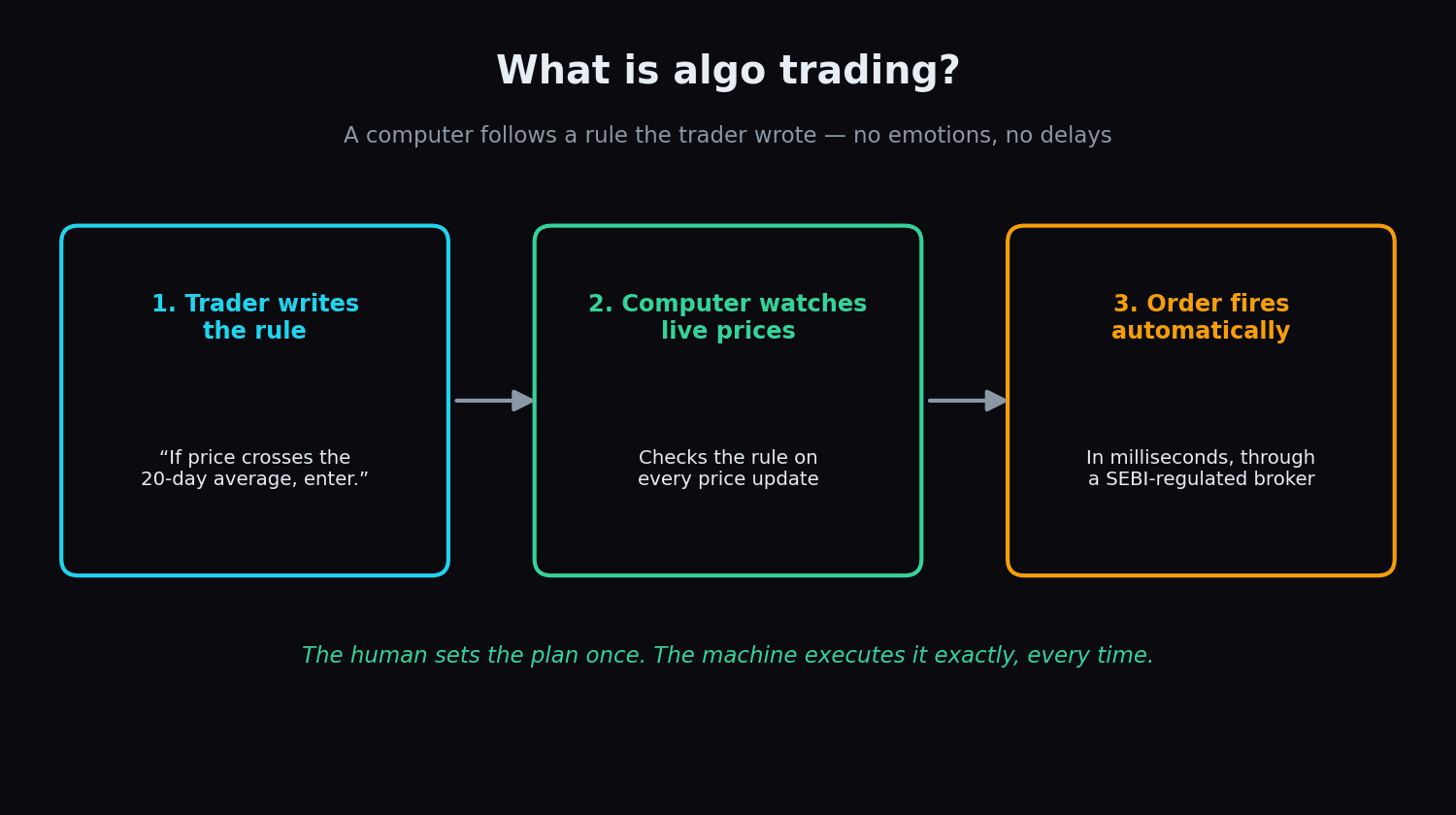
What Is Algo Trading? How It Works and How SEBI Regulates It in India
Algo trading means a computer places orders by rules written in advance. Here is how it works, who uses it in India, and the guardrails SEBI has built.
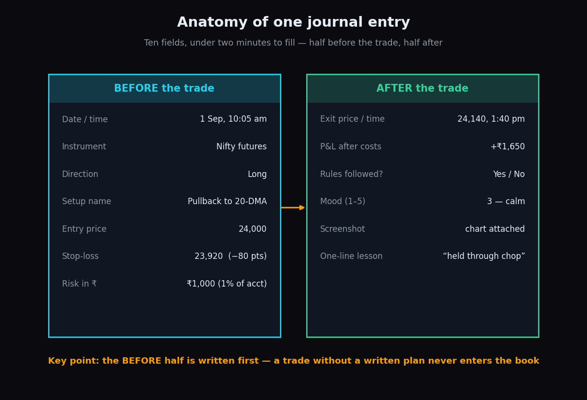
Trading Journal: What to Record and Why It Actually Works
Most traders remember their trades wrongly. What a simple trading journal records, the numbers it reveals, and why writing trades down changes them.
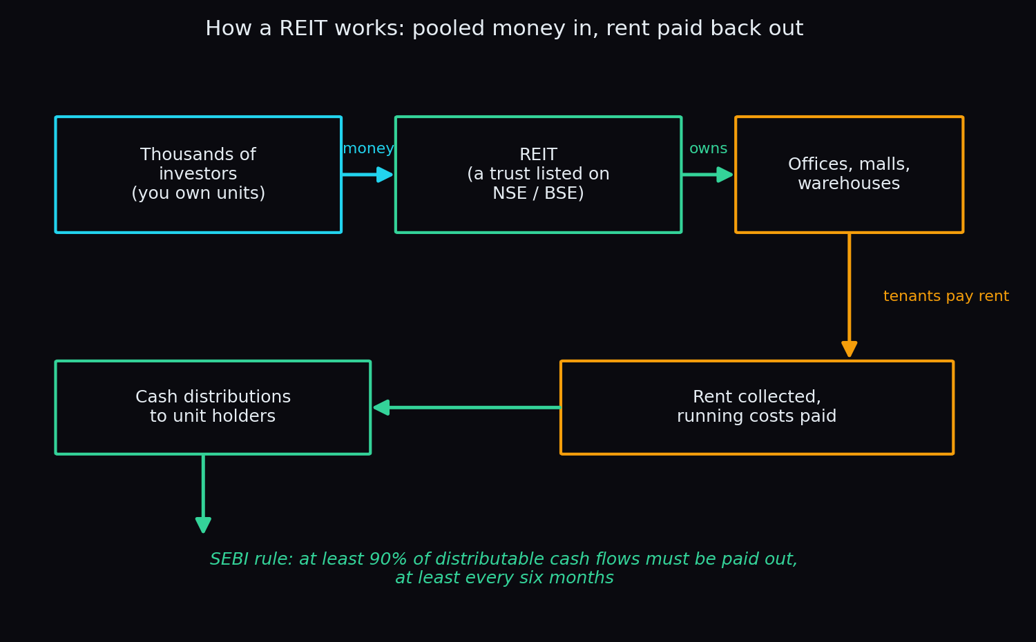
REITs and InvITs Explained: Owning Real Estate and Infrastructure Through the Market
REITs and InvITs let you own a slice of offices, malls, roads and power lines through the exchange. How they work, how you earn, and the honest risks.
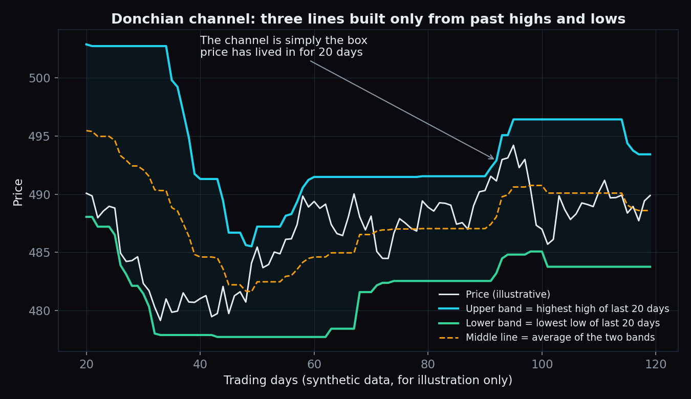
Donchian Channels Explained: Trading the N-Day High and Low
Three lines built from nothing but past highs and lows. How Donchian channels map a trend, what a breakout really means, and the whipsaw catch to know.
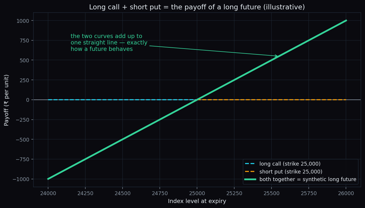
Synthetic Futures: How Options Can Mimic a Future
How a long call plus a short put at the same strike recreates a futures payoff — a plain-English walkthrough with round-number Nifty examples.
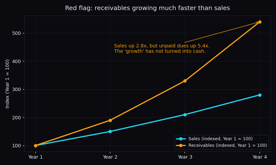
Inventory and Receivables Red Flags: When Growing Sales Hide Trouble
Rising sales can look great while cash never arrives. How receivables, inventory days and operating cash flow reveal weak revenue quality early.
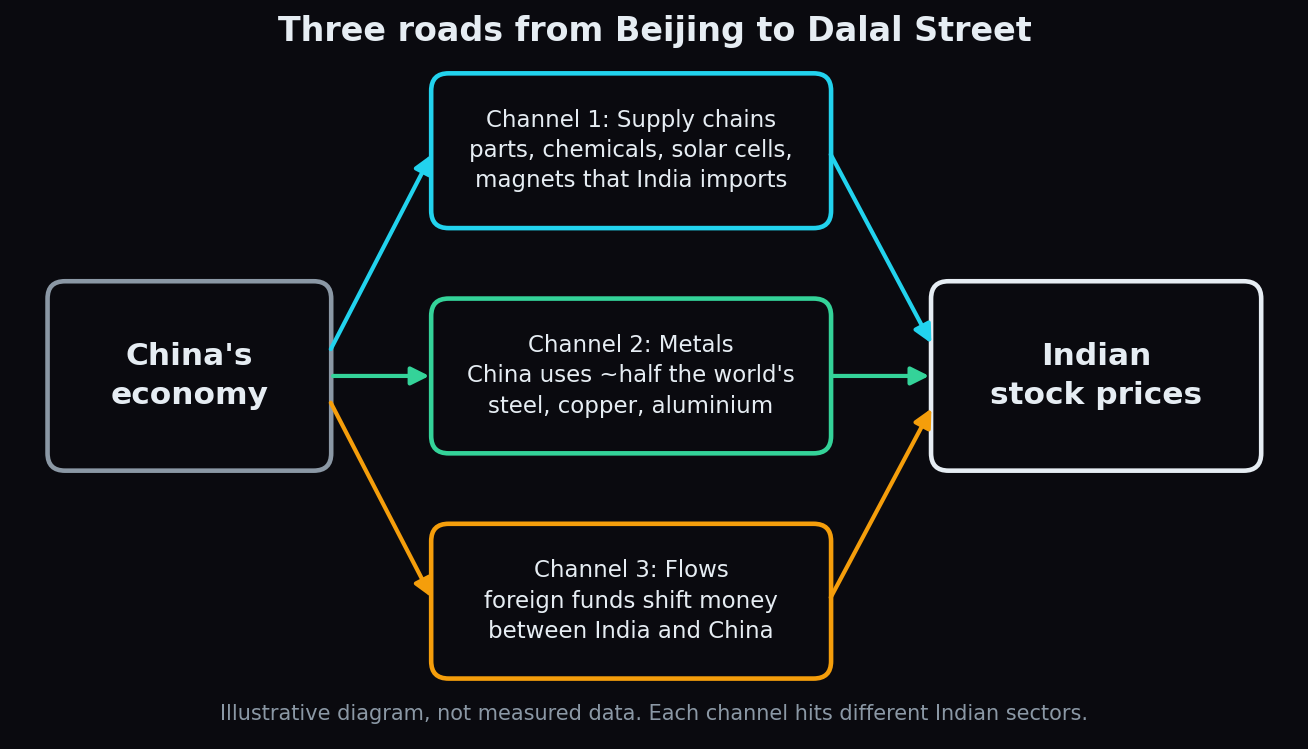
How China's Economy Moves Indian Markets: Supply Chains, Metals and Flows
Three channels link China's economy to Indian stocks: the parts India imports, the metal prices China sets, and the foreign money both countries compete for.
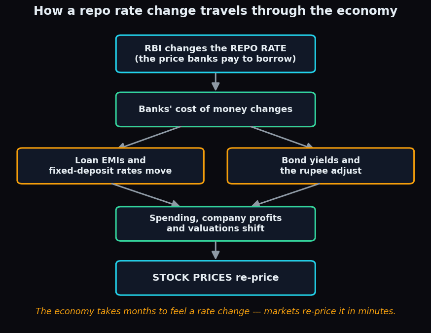
RBI Repo Rate: How Rate Decisions Move Indian Markets
The repo rate is the wholesale price of money in India. What the RBI's Monetary Policy Committee decides, and how it ripples into EMIs, bonds and stocks.
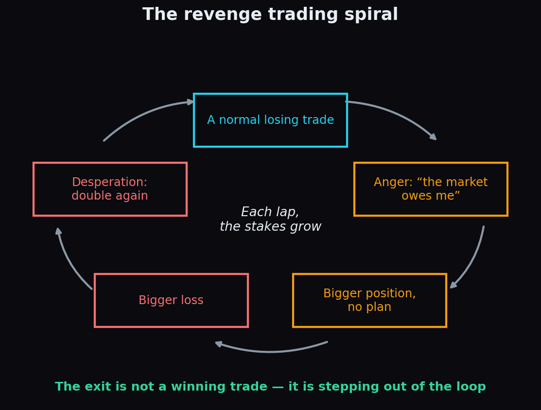
Revenge Trading: The Psychology of Trying to Win It Back
One angry trade after a loss can undo a month of discipline. The psychology of revenge trading, the brutal recovery maths, and the rules that break the loop.
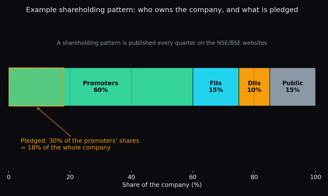
Promoter Holding and Share Pledging: Red Flags to Check
Promoters run the company and own a big slice of it. When their stake keeps falling, or gets pledged for loans, it can warn of trouble. What to check.
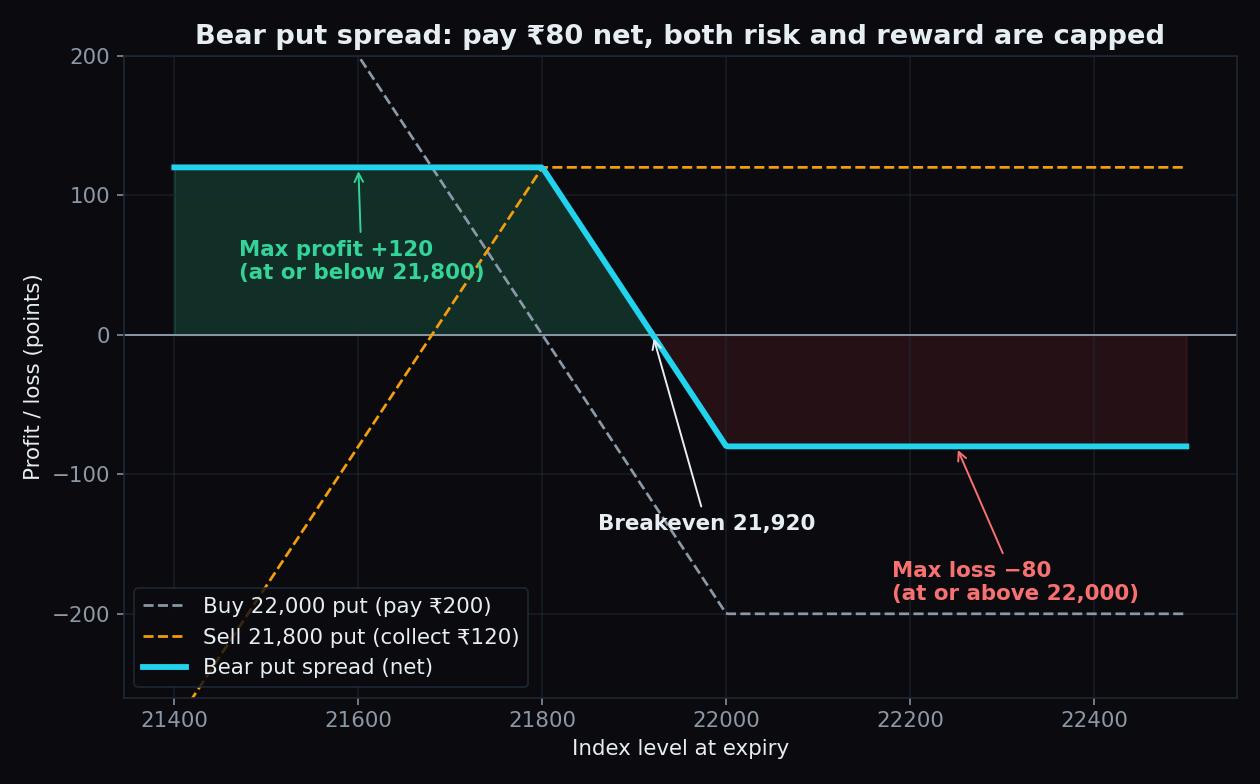
Bear Put Spread vs Bear Call Spread: A Worked Example
Two option spreads for a falling market. The bear put spread pays upfront; the bear call spread collects premium. Same view, mirrored trade-offs.
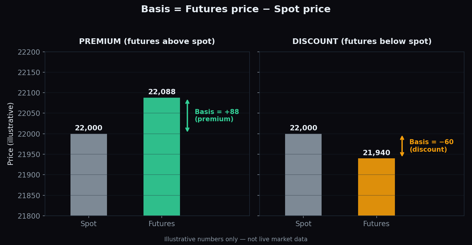
Futures Basis, Premium and Discount: Cost of Carry Explained
Nifty futures usually trade a little above the index. That gap is the basis. What premium and discount mean, and the simple cost-of-carry maths behind them.
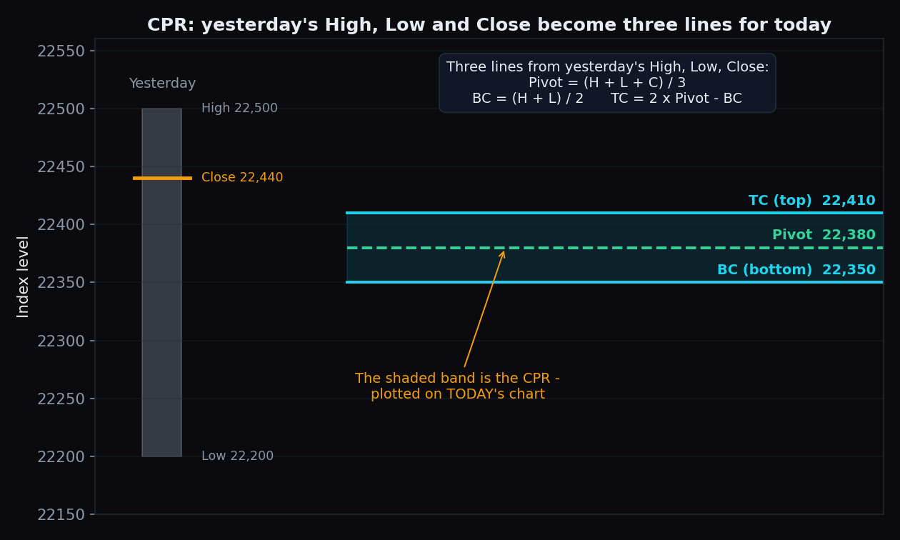
CPR (Central Pivot Range) Explained for Intraday Traders
Yesterday's high, low and close become three lines on today's chart. What TC, pivot and BC mean, how traders read a narrow vs wide band, and the catch.
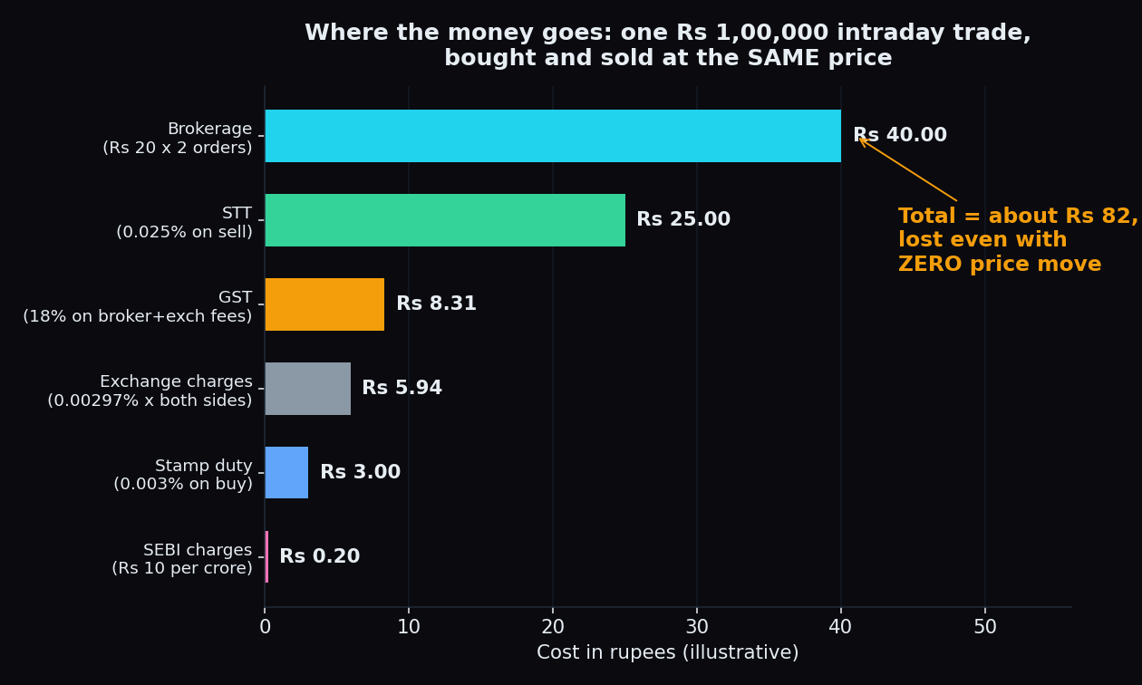
The Real Cost of One Trade: Brokerage, STT, GST & Slippage
Brokerage, STT, exchange charges, GST, stamp duty and slippage add up on every trade. We total them on one simple example — it is more than most expect.
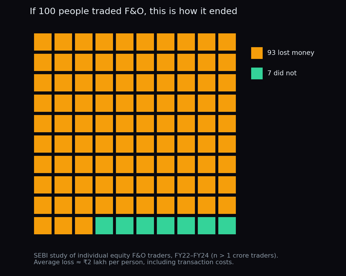
The SEBI Study: Why 9 Out of 10 F&O Traders Lose Money
SEBI tracked over 1 crore individual F&O traders: 93% lost money between FY22 and FY24, about ₹2 lakh each. Here is what the data actually teaches.
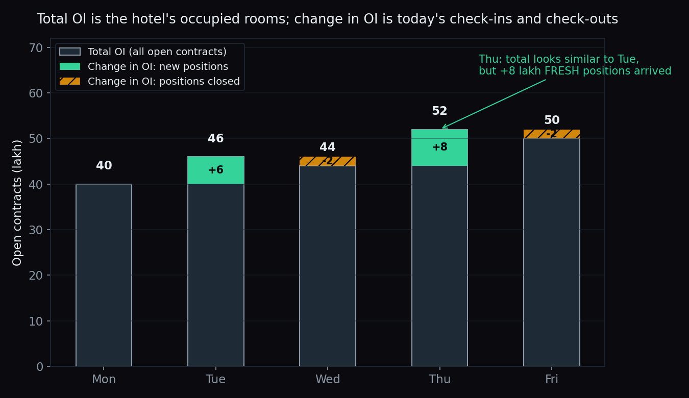
Change in OI vs Total OI: How to Spot Fresh Positions
Total OI shows where positions sit; change in OI shows where money moved today. A beginner's guide to spotting fresh positions in the option chain.
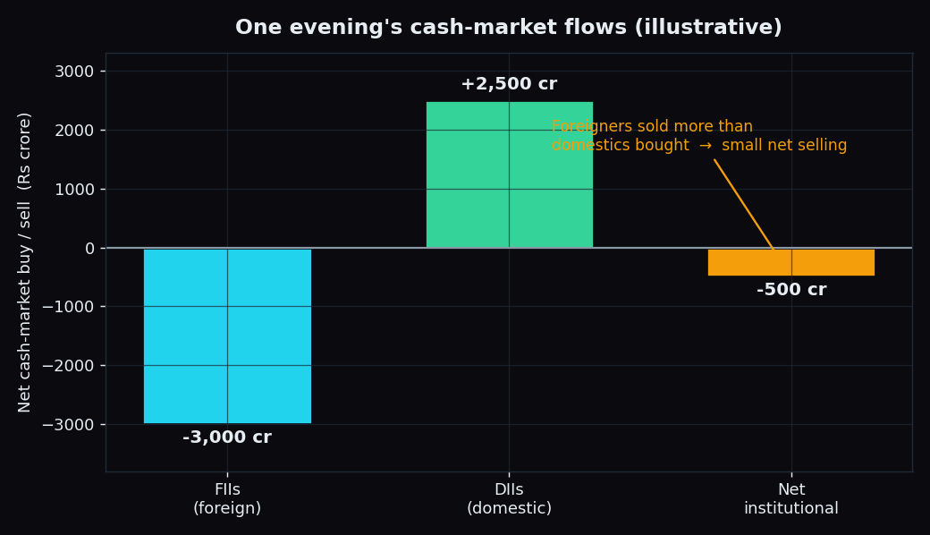
FII vs DII: Who Really Moves Indian Markets?
Every evening the exchanges publish what foreign (FII) and domestic (DII) institutions bought and sold. Here's what those daily flows mean — and their limits.
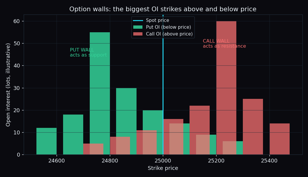
Support and Resistance vs Option Walls: The Numbers
Support lines are drawn by eye; option walls are real money parked at a strike. We scored how often each one actually held in Nifty and Bank Nifty.
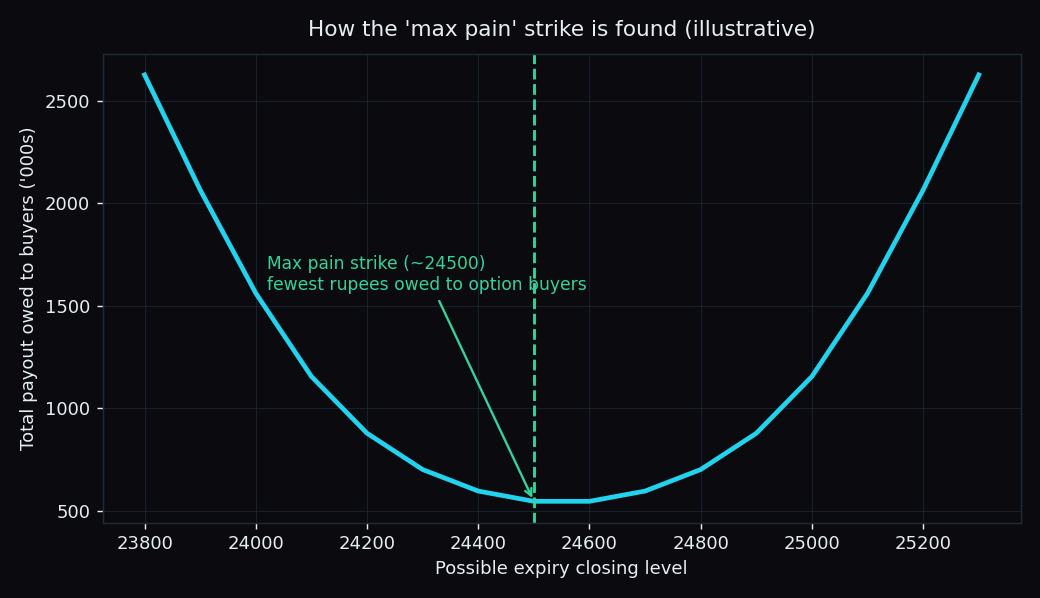
Does Price Really Gravitate to Max Pain? The Scored Data
Max pain theory says price drifts to the strike that hurts option buyers most. We scored 56 Nifty and 55 Bank Nifty sessions to test whether it holds.
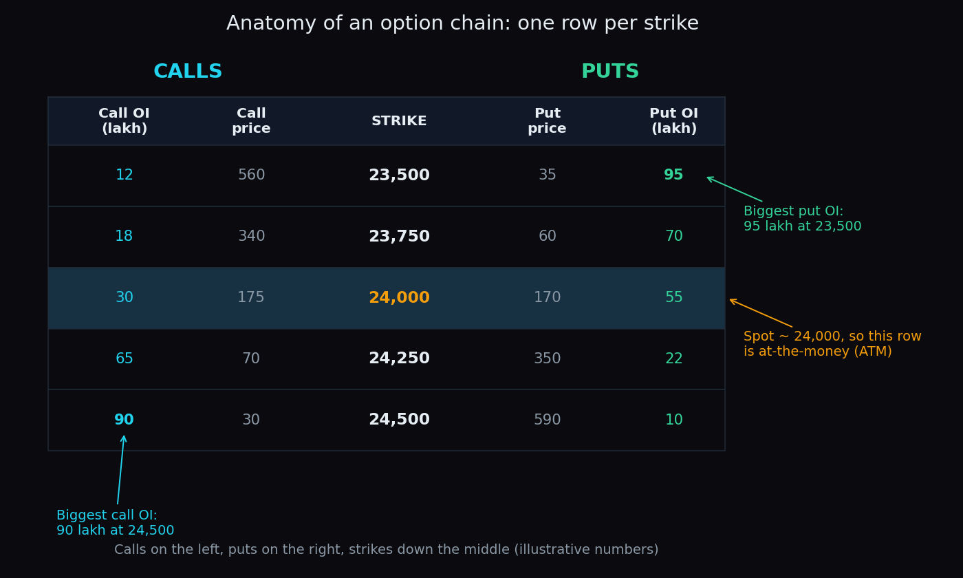
Reading the Option Chain: A Beginner's 5-Minute Guide
The option chain looks like a wall of numbers, but you only need five of them. A simple 5-minute routine for reading the Nifty chain like a map.
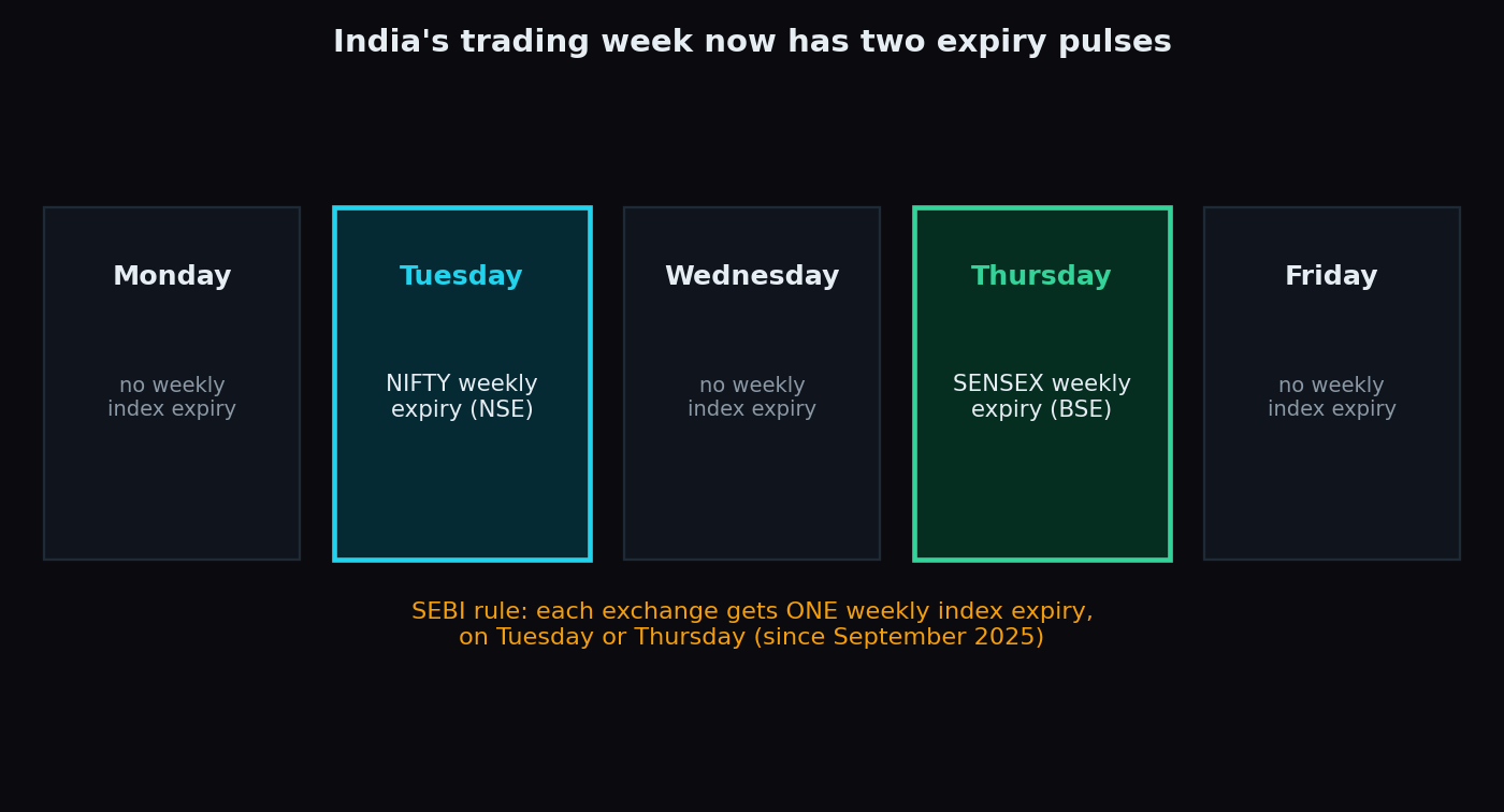
Expiry Day in India: Nifty Tuesday vs Sensex Thursday
India's trading week now has two expiry pulses: Nifty on Tuesday (NSE) and Sensex on Thursday (BSE). What changes on expiry day, with our scored numbers.
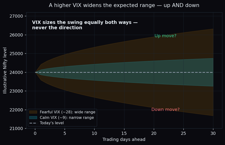
India VIX: What It Actually Tells You (and What It Doesn't)
The India VIX sizes the market's expected swing — but it can't tell you direction, timing, or which stock moves. A plain guide to what the fear index can't say.
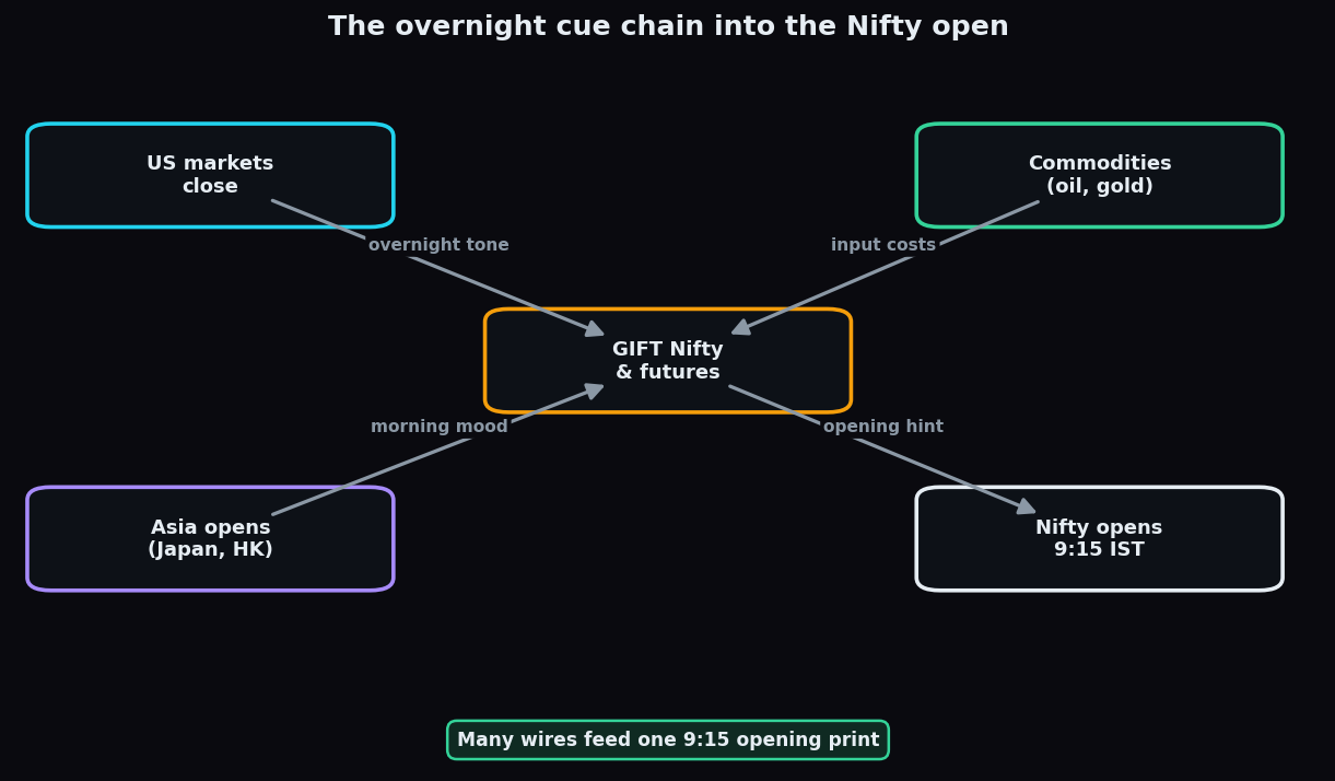
How Global Cues Move the Nifty Each Morning
The overnight cue chain end to end: how the US close, Asian markets, commodities and GIFT Nifty combine to shape where the Nifty opens each morning.
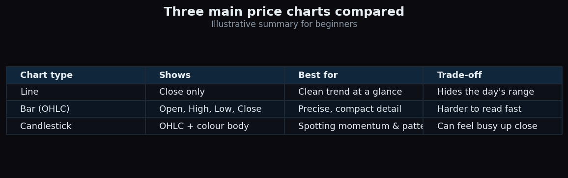
Candlestick vs Line vs Bar Charts Compared
Line, bar, and candlestick charts all plot price but show different detail. Learn what each reveals and when to use it, with clear illustrative examples.
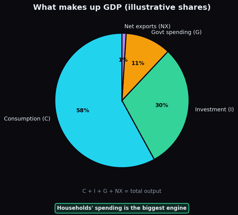
GDP Explained and Why Markets Watch It
What GDP measures, its four components (C + I + G + NX), and why the stock market often moves ahead of the growth data instead of with it.
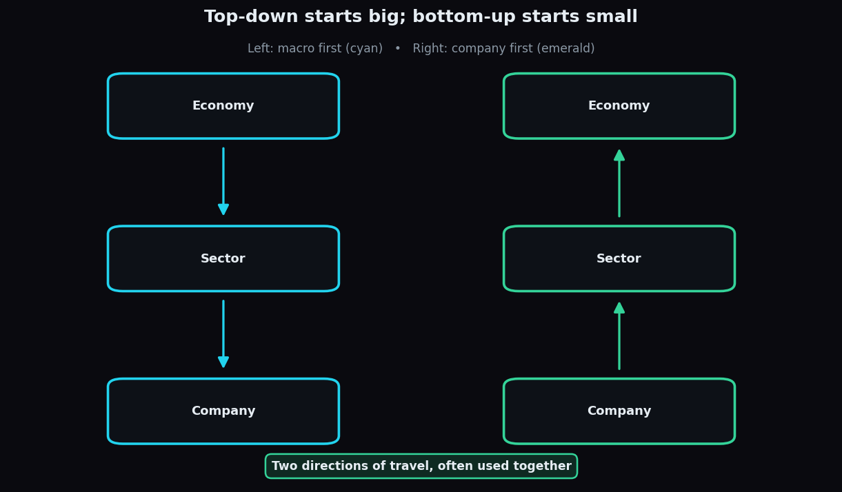
Top-Down vs Bottom-Up Analysis Explained
Macro-first vs company-first investing research: how top-down and bottom-up analysis differ, where each shines, their blind spots, and how to blend them.
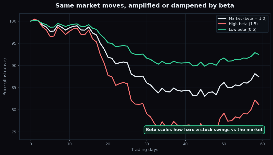
What Is Beta? A Stock's Swing vs the Market
Beta measures how much a stock swings versus the market. Learn what beta of 1, below 1, and above 1 mean, with clear illustrative examples for beginners.
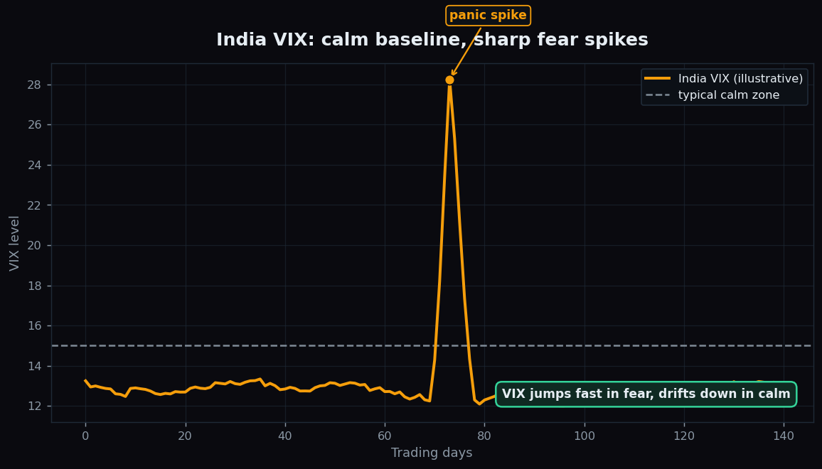
India VIX Explained: The Market Fear Index
What the India VIX measures, why the fear index spikes during panic, and how to turn a VIX level into an expected market range with simple examples.
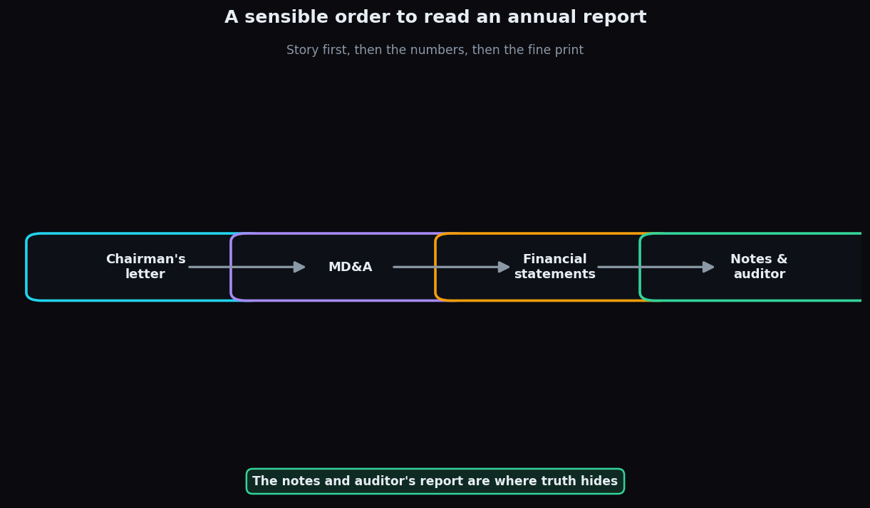
How to Read an Annual Report: A Beginner Guide
A beginner's guide to annual reports: which sections matter, the order to read them, how the income statement works, and the red flags to watch.
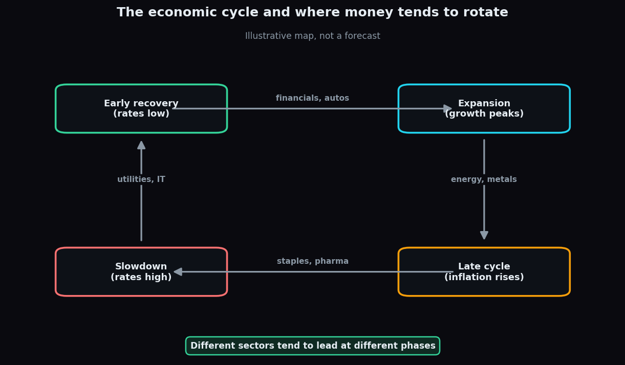
Sector Rotation Explained for Beginners
Sector rotation is how market leadership passes between industries as the economy cycles. A beginner-friendly guide with clear illustrative examples.
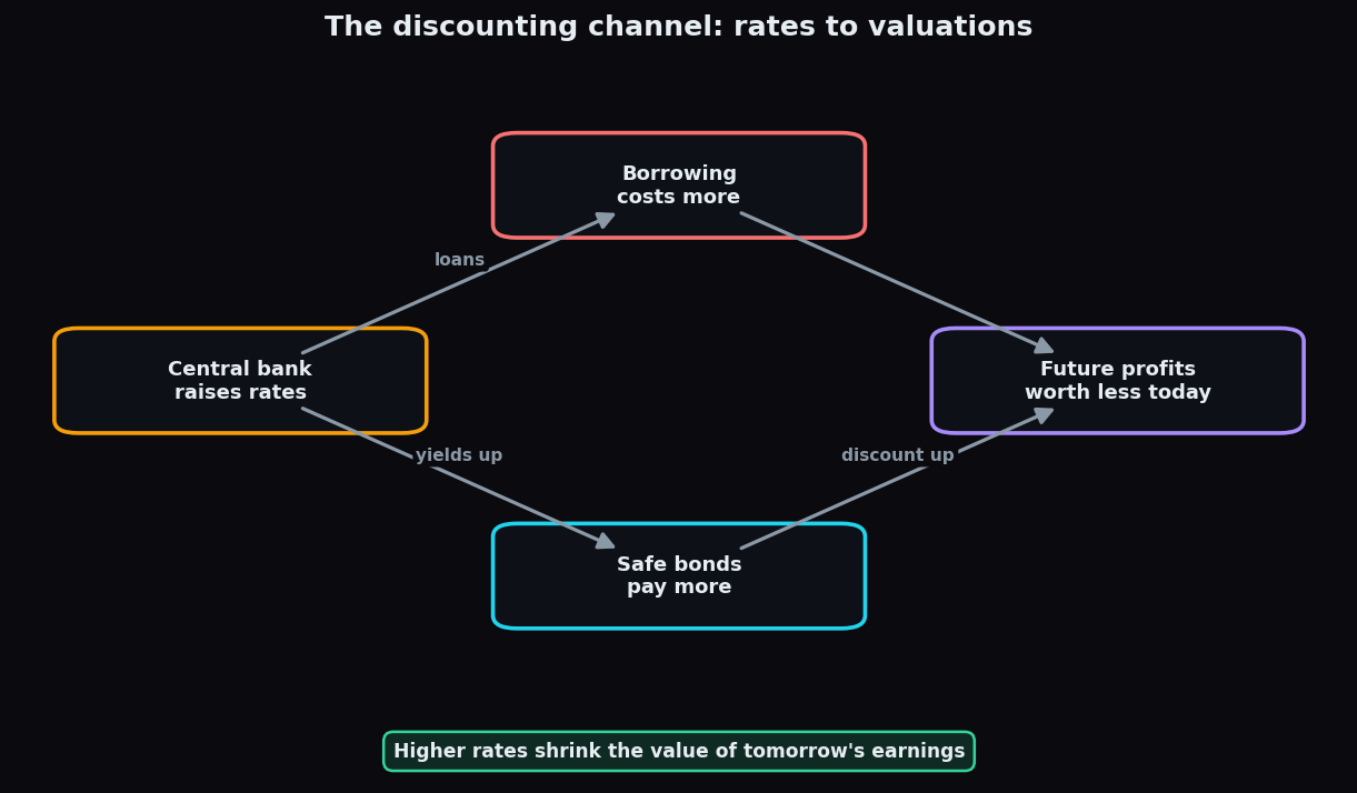
How Interest Rates Affect Stock Markets
How central-bank rates reshape stock valuations through the discounting channel, why rising rates compress P/E multiples, and which sectors feel it most.
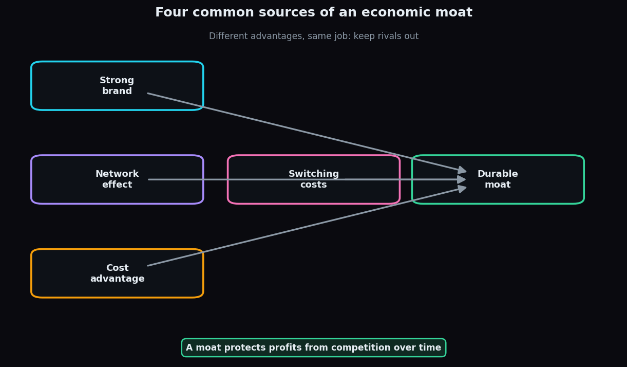
Economic Moats Explained: Durable Advantages
What an economic moat is, the four main types (brand, network, cost, switching), why durable advantages protect profits, and where moats erode.
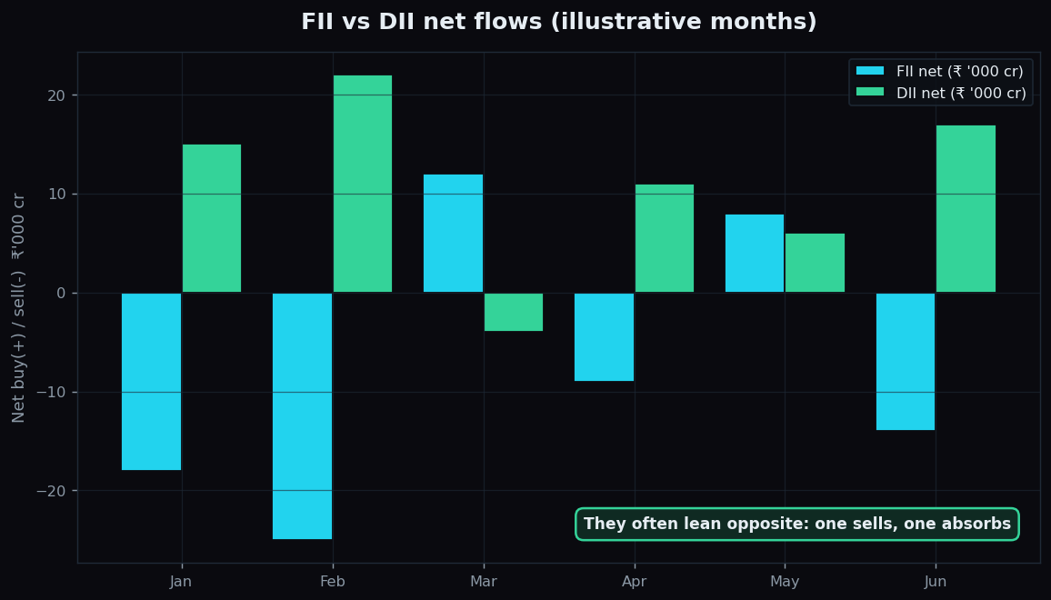
FII and DII Flows Explained for Beginners
Who foreign (FII) and domestic (DII) institutions are, why their large net flows move Indian markets, and how to read their daily tug-of-war.
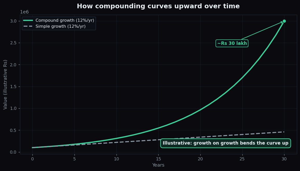
The Power of Compounding Explained Simply
Compounding means earning returns on your returns. See why time matters more than a high rate, with clear illustrative examples for beginners.
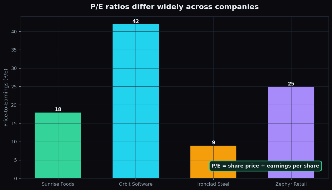
The P/E Ratio Explained Simply for Beginners
The price-to-earnings ratio in plain language: what P/E measures, how to read high vs low, why sector context matters, and where it misleads.
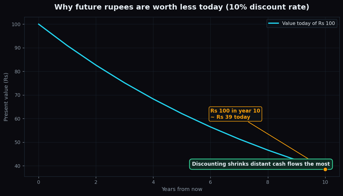
DCF Valuation Explained for Beginners, Step by Step
A DCF values a company by discounting its future cash flows to today. Learn the time-value-of-money idea, the four steps, and why assumptions make it fragile.
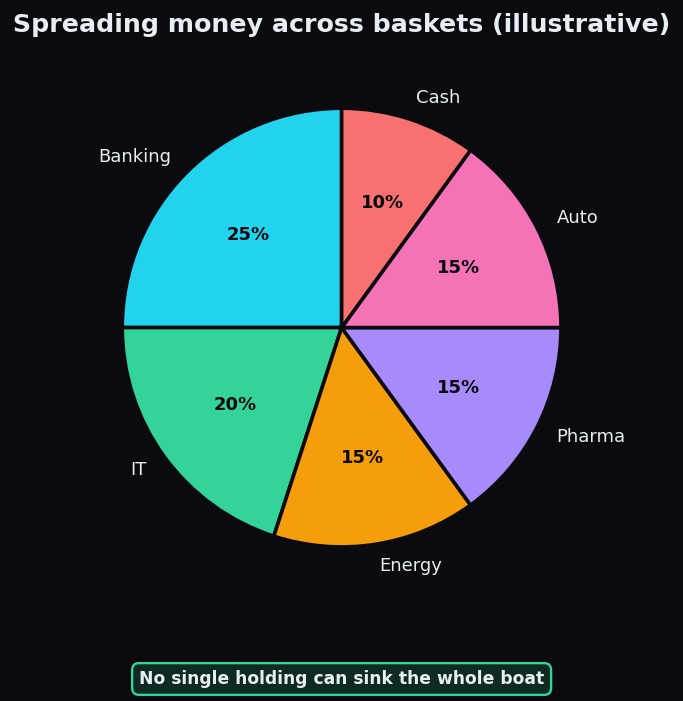
Diversification: Don't Put All Eggs in One Basket
What diversification is, why spreading risk works, how correlation decides its power, and the real limits of not putting all your eggs in one basket.
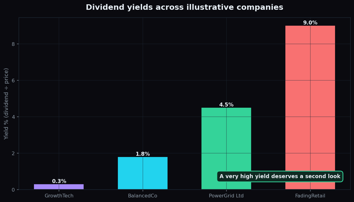
Dividend Yield Explained: Income and the Yield Trap
What dividend yield measures, how it is calculated from dividend per share and price, why a very high yield can be a warning, and the yield-trap caveat.
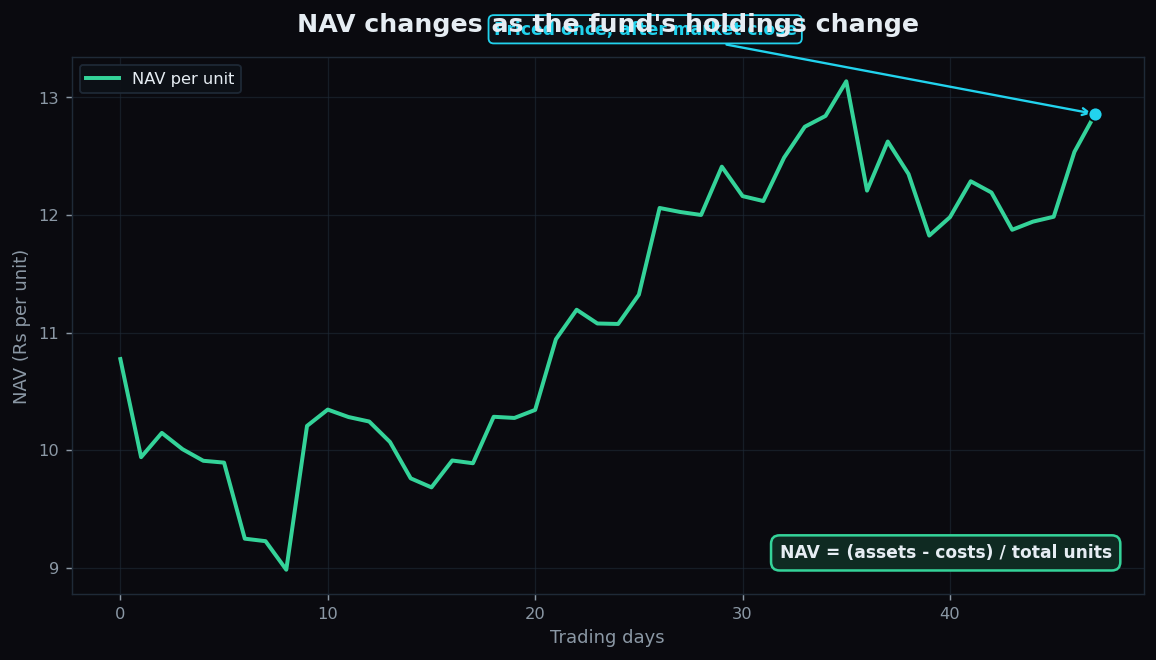
Mutual Funds and NAV Explained for Beginners
A mutual fund pools money into one managed basket. Learn what NAV means, how it is calculated, why it changes, and why a low NAV is not cheap.
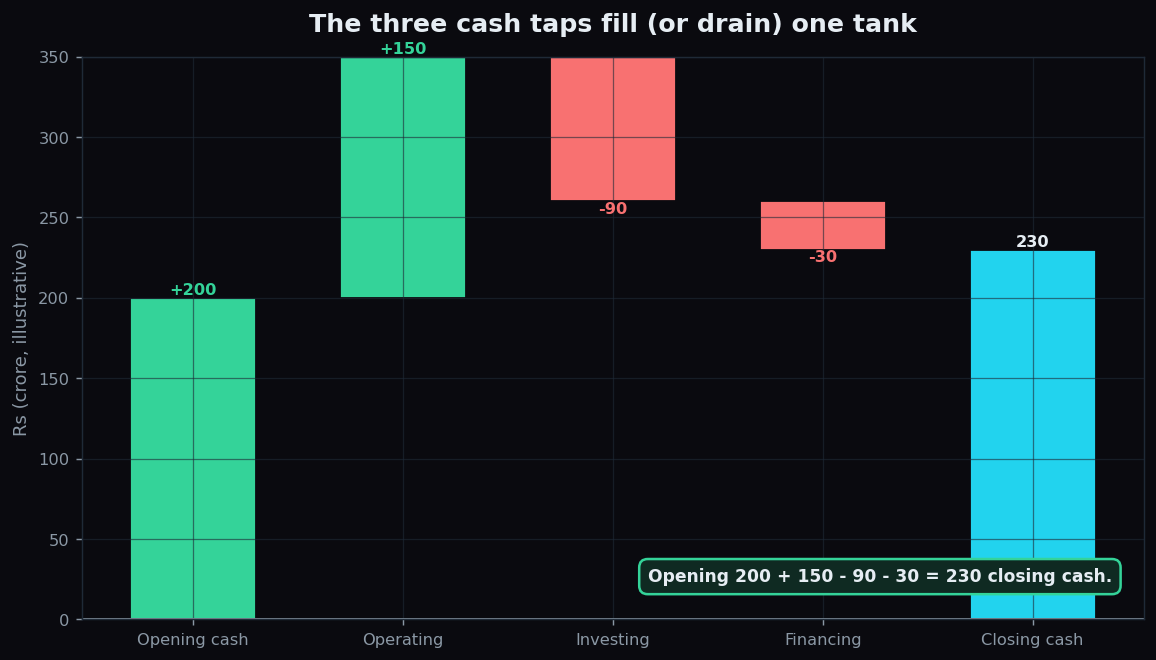
The Cash Flow Statement Explained for Beginners
Cash is a fact; profit is an opinion. Learn operating, investing and financing cash flows and why a profitable company can still run out of cash.
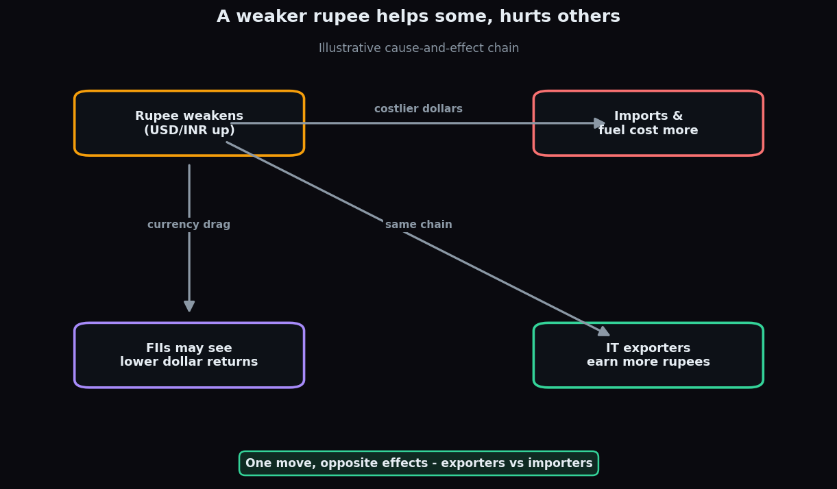
USD/INR and the Stock Market: How the Rupee Moves Shares
What a weaker or stronger rupee means for the market: exporters vs importers, the FII flow connection, and why hedging softens the textbook story.
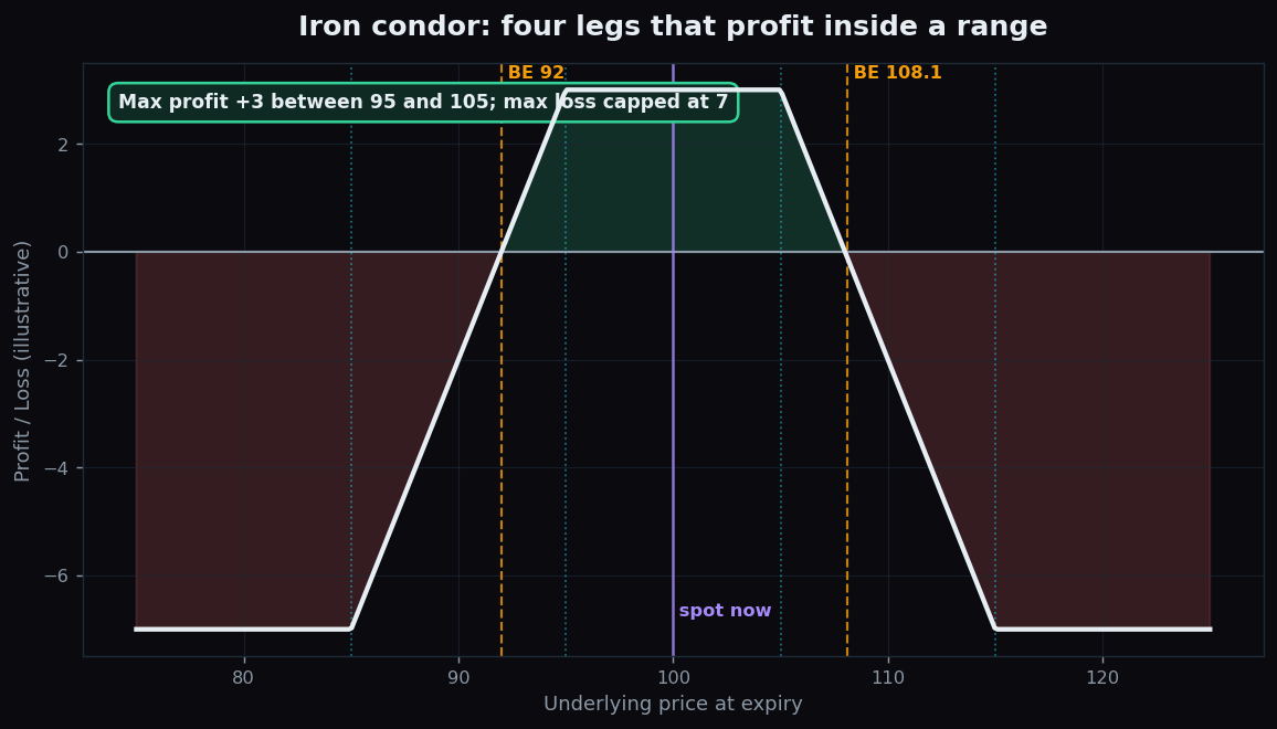
The Iron Condor Explained (Illustrative Example)
An illustrative, beginner-friendly guide to the iron condor: four legs that profit inside a range, with defined risk, capped reward, and the honest catch on a big move.
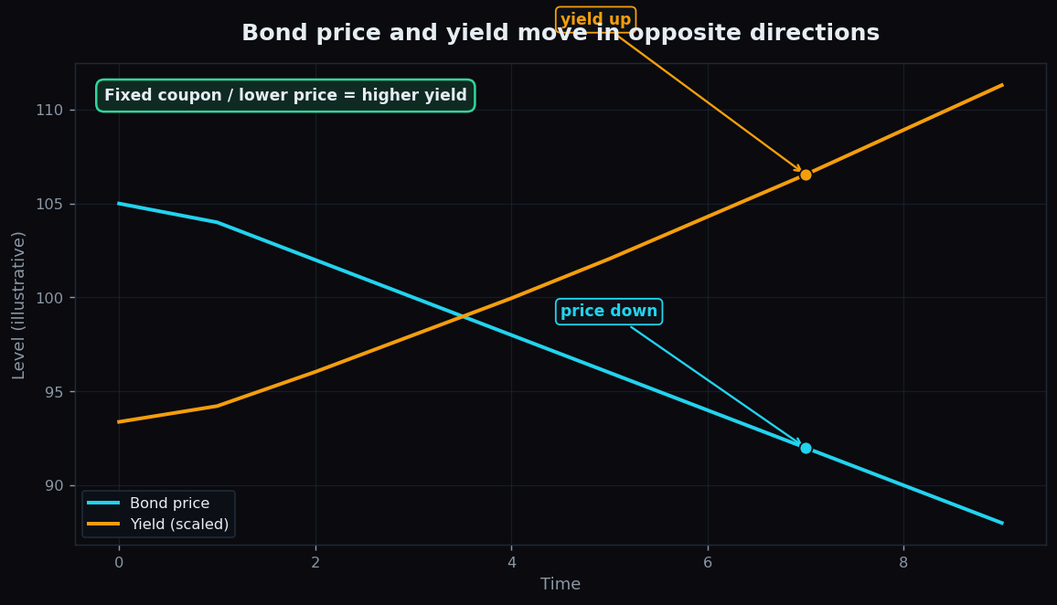
Bond Yields Explained Simply for Beginners
Why bond price and yield move in opposite directions, what the coupon is, and why the 10-year government yield is the number the whole market watches.
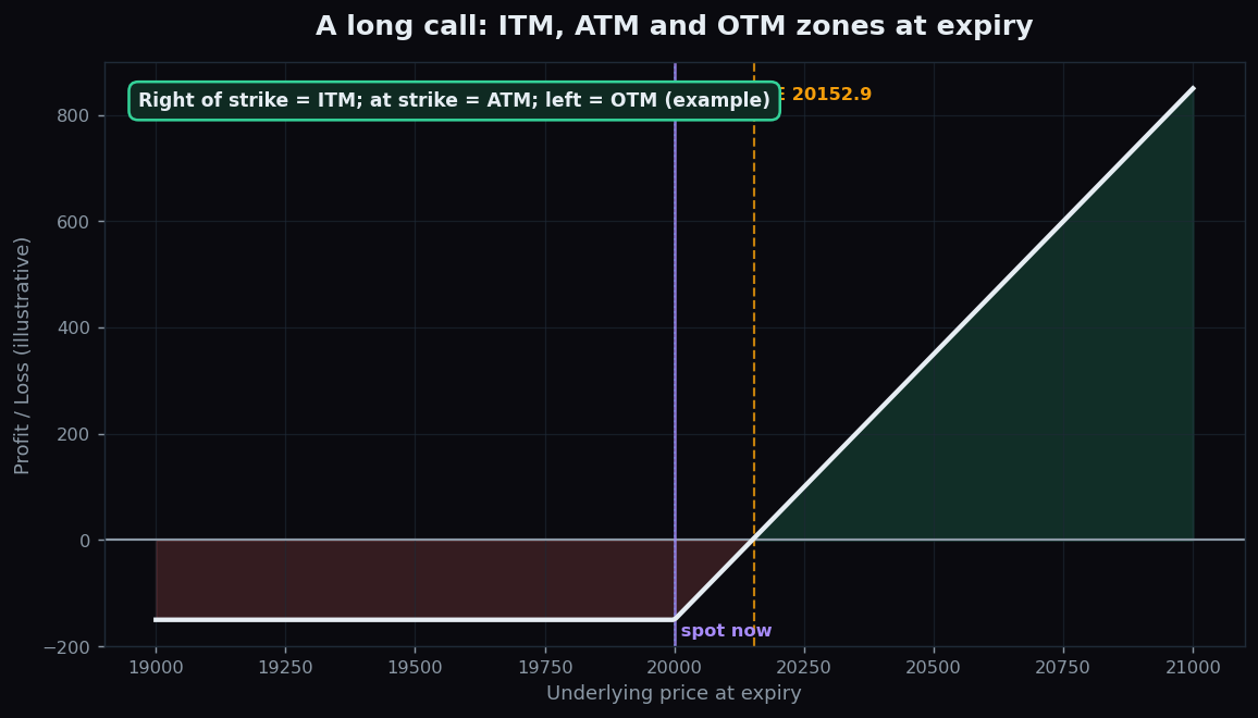
Option Moneyness: ITM, ATM and OTM Explained Simply
Moneyness is where spot sits versus the strike. Learn ITM, ATM and OTM, intrinsic versus time value, and how premium and risk differ, with an example.
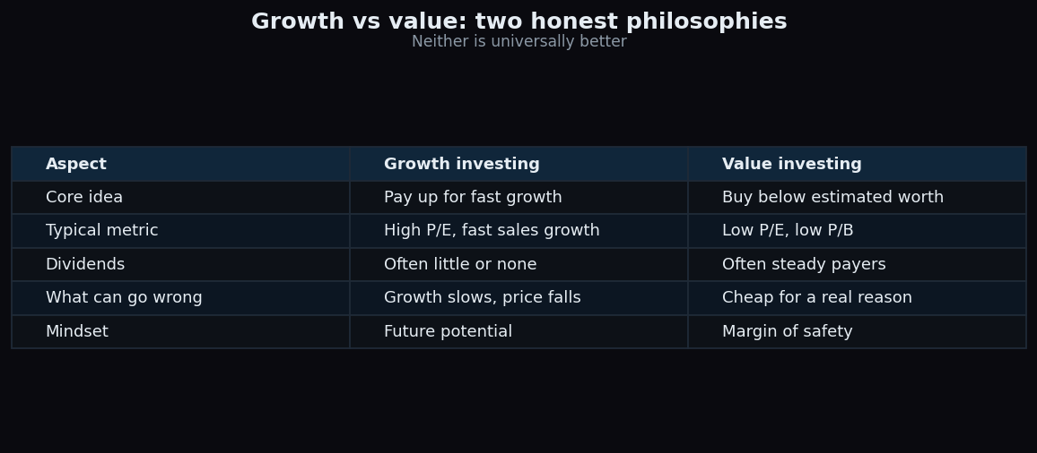
Growth vs Value Investing: Two Honest Philosophies
Growth investing pays up for fast expansion; value investing buys cheap. A balanced, beginner-friendly guide to both styles, their trade-offs, and why neither wins always.
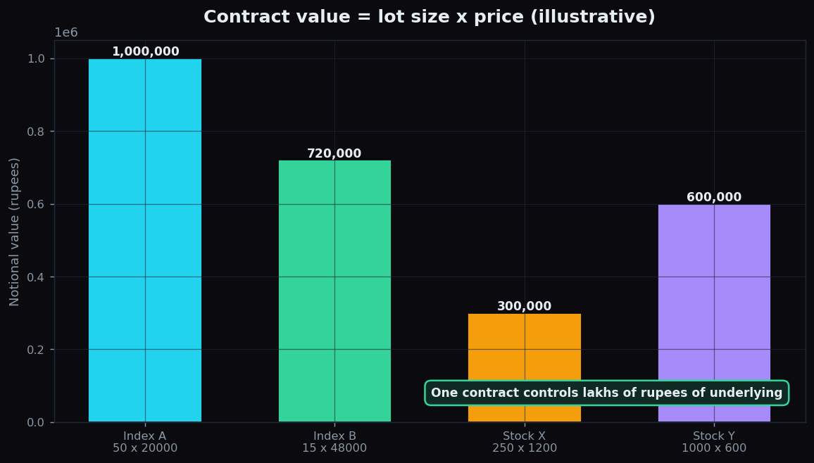
Lot Size and Contract Value in F&O Explained
A lot is the fixed quantity per F&O contract; contract value is lot size times price. Learn why one contract controls lakhs, with a worked example.
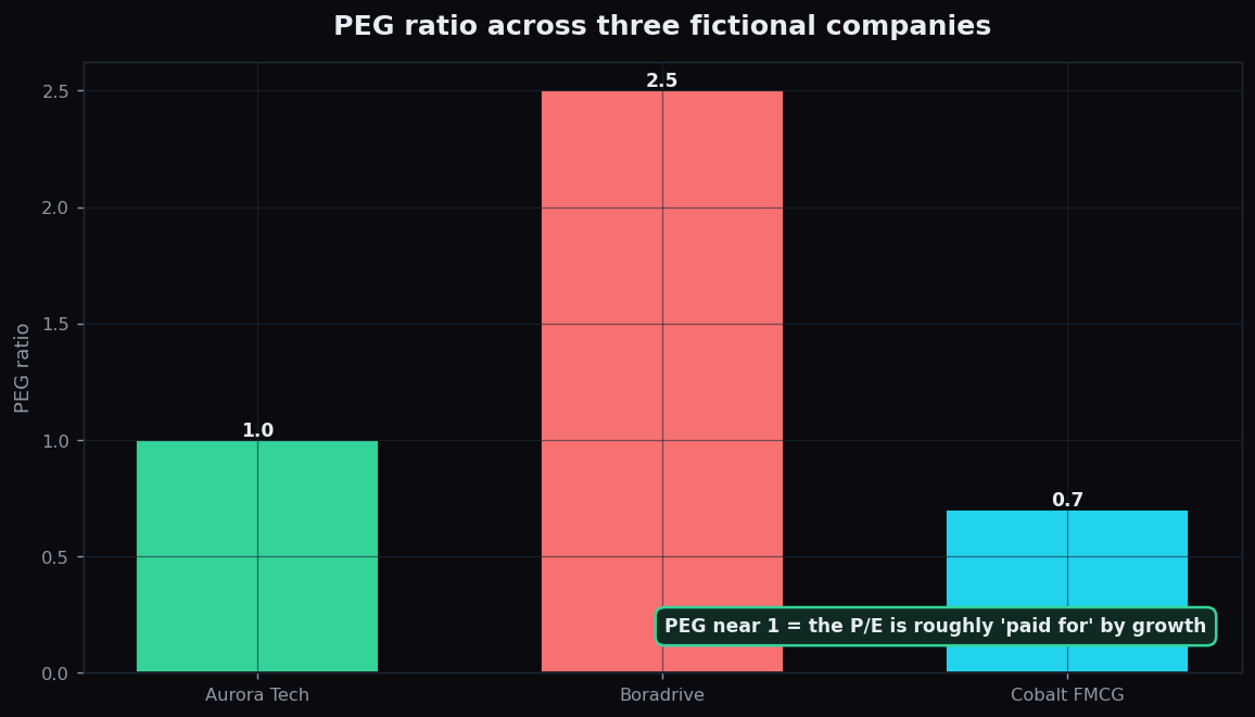
The PEG Ratio Explained: P/E Adjusted for Growth
The PEG ratio takes the P/E and divides it by earnings growth, fixing P/E's blind spot. Learn to read it — near 1 is balanced — with a worked example.
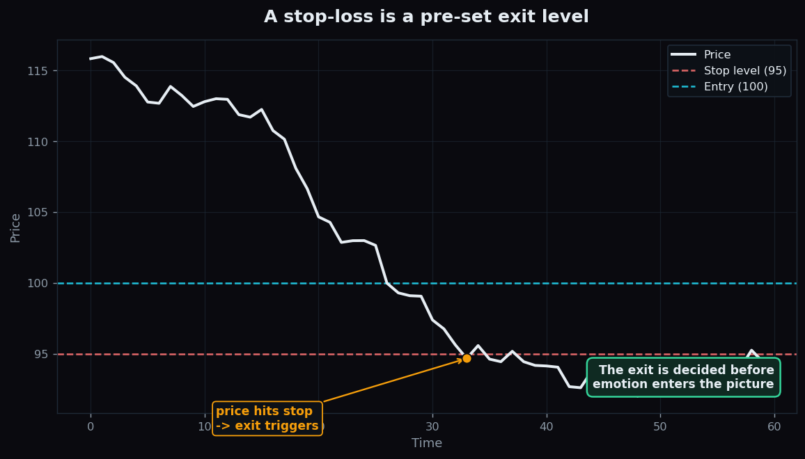
What Is a Stop-Loss? Risk Control Explained
A stop-loss is a pre-set exit level that caps a loss. Learn what it is, the main types, and a simple worked example of how it limits damage (illustrative).