Heikin-Ashi Candles Explained for Beginners
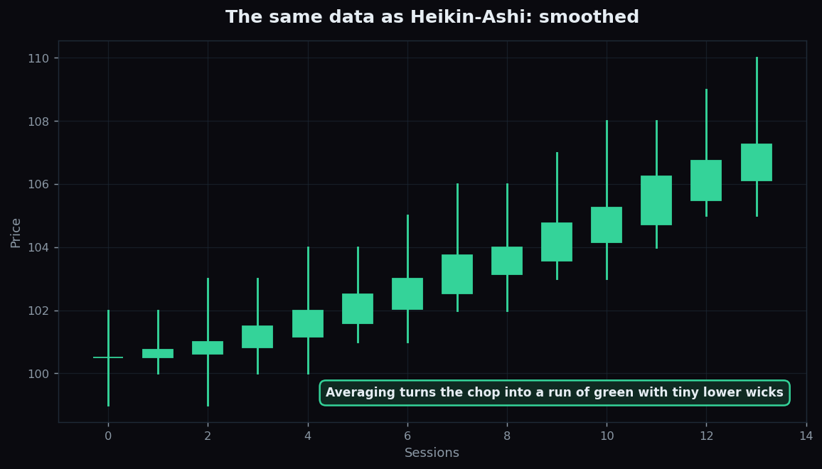
Normal candlestick charts are honest but noisy. In a healthy uptrend you still get red candles scattered through the green ones, plenty of overlapping wicks, and enough back-and-forth that it can be hard to tell a real trend from random chop. Heikin-Ashi candles are a clever re-drawing of that same data designed to quiet the noise and make the underlying trend easier to see. The name is Japanese for "average bar" — and averaging is exactly the trick.
What Heikin-Ashi candles are
A Heikin-Ashi candle looks like an ordinary candlestick — it has a body and wicks — but its four values are not the raw open, high, low and close of the period. Instead, each candle is built partly from averages, including a blend of the previous candle. That small change has a big visual effect: it smooths the series so a trend shows up as a clean run of same-coloured candles.
Here is the recipe, in plain terms (you never have to compute it by hand — platforms do it for you):
- HA Close = the average of this period's open, high, low and close.
- HA Open = the average of the previous Heikin-Ashi candle's open and close.
- HA High = the highest of this period's high, the HA open, and the HA close.
- HA Low = the lowest of this period's low, the HA open, and the HA close.
The key line is the HA Open: because it always reaches back to the prior candle, every Heikin-Ashi candle is partly tied to the one before it. That linkage is what produces the smoothing.
How they differ from normal candles
The easiest way to grasp Heikin-Ashi is to see the same data drawn both ways. First, the raw candlesticks:
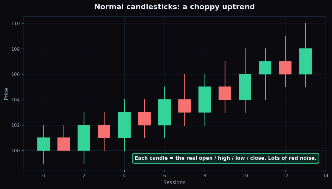
That is a real uptrend, but it is messy — red candles interrupt the green, and the bodies jump around. Now the identical price data, redrawn as Heikin-Ashi:
Same information, completely different feel. The chop melts into a tidy staircase of green candles. Two visual cues are worth knowing:
- A strong trend shows a run of same-coloured candles. In a strong uptrend, the candles are green with little or no lower wick — the lack of a lower wick is the tell of one-directional pressure.
- A weakening trend or a turn shows up as smaller bodies and wicks growing on both sides, often followed by a colour flip. Because the noise is gone, that change of character is easier to spot.
An everyday analogy: a normal candle chart is like listening to a song on a crackly radio — the melody is there, but static keeps interrupting. Heikin-Ashi is the noise-cancelling version: clearer melody, but you have filtered out some of the raw sound.
Why traders use them
The appeal is psychological as much as technical. Trends are genuinely hard to sit through because every small pullback on a normal chart looks like it might be the top. By averaging away much of that flicker, Heikin-Ashi makes it easier to see a trend as a single sustained move rather than a string of scary wobbles. Traders often use it as a visual filter — a calmer backdrop for judging whether a move is still intact — while keeping a normal chart alongside for the real prices.
A worked example with round numbers
Suppose a normal candle for one session is: open 104, high 108, low 103, close 106. The Heikin-Ashi close is the average of all four: (104 + 108 + 103 + 106) ÷ 4 = 105.25. Suppose the previous Heikin-Ashi candle had an open of 103 and a close of 104; then this candle's HA open is (103 + 104) ÷ 2 = 103.5. Because the HA close (105.25) sits above the HA open (103.5), the candle is green — and because the HA low never dips much below the open, it shows little lower wick. One green, low-wick candle, telling a clean upward story. These numbers are illustrative, chosen to make the maths easy to follow.
The honest catch — the lag tradeoff
Smoothing is never free. The single most important thing to understand about Heikin-Ashi is that the prices on the candles are not the real prices, and that smoothing introduces lag:
- The values are synthetic. A Heikin-Ashi open or close is an average, not a price anything actually traded at. You cannot read an exact entry or exit off it — always use a normal chart for the true levels.
- It lags. Because each candle leans on the previous one, Heikin-Ashi reacts a step late. It tells you a trend is established after it is already underway, and it confirms a turn after the real price has begun reversing.
- Calm can be misleading. The clean look can lull you into thinking a move is safer or smoother than the raw price actually is. The static you removed was sometimes telling you something.
In short, Heikin-Ashi trades a little timeliness for a lot of clarity. That can be a worthwhile swap when your goal is to read the trend, and a poor one when you need the exact price right now. For the foundations of how raw candles are built in the first place, the smoothing idea also connects to moving averages, which trade timeliness for clarity in much the same way.
Smoothed visuals are most useful when paired with an honest record of how trends actually resolved. TrueTrend keeps a transparent, education-first scoreboard so you can study trend behaviour over many sessions rather than trusting one tidy chart — explore it and decide for yourself.
Key takeaways
- Heikin-Ashi redraws normal candles using averages, blending each candle with the one before it to smooth the series.
- A strong trend appears as a run of same-coloured candles with little wick on the trend side; weakening shows smaller bodies and two-sided wicks.
- The benefit is clarity — it makes a trend easier to see and sit through.
- The cost is a lag tradeoff, and the candle values are synthetic, not real traded prices.
- Use it as a visual filter alongside a normal chart — this article is education, not advice.
See these concepts on live market data — free
Create a free TrueTrend account to watch daily support/resistance levels, market regime, and option-positioning charts on NIFTY, BankNifty and 12 more instruments. Every level we publish is scored on a public scoreboard — misses included. No card required.
Free forever tier · daily levels with published hit-rates across every instrument. Descriptive market structure, not investment advice.
Not ready for an account? Get the daily levels by email.
One short email each market day — the indices' call wall, put wall, gamma flip and max pain, and how the last session's levels scored. Free, no account, unsubscribe anytime.
Descriptive market structure, not investment advice. We never share your email.