Volume Profile Explained: Volume by Price
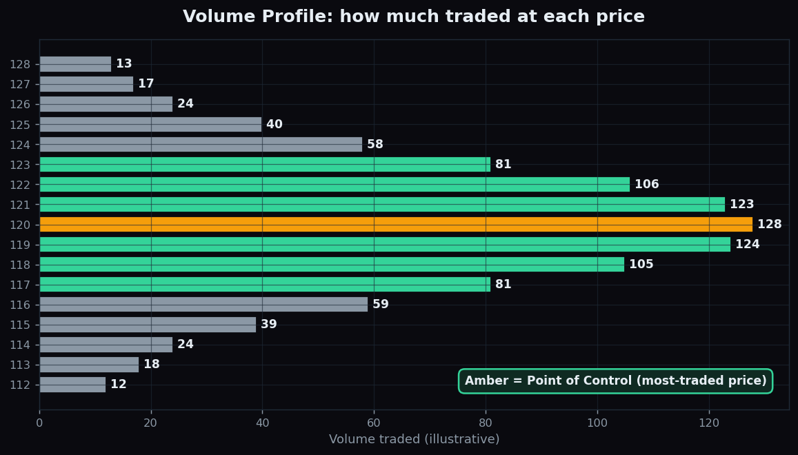
Most charts answer the question “what did price do over time?” A Volume Profile answers a different and surprisingly powerful question: “at which prices did the most trading actually happen?” Instead of stacking volume along the bottom of the chart by time, it turns the idea sideways and shows volume by price level — revealing where buyers and sellers did the heavy lifting.
What a Volume Profile is
A normal volume chart shows a bar under each candle: how many shares or contracts traded during that time period. A Volume Profile reorganises the very same trades by price. It splits the price range into horizontal slices and asks, for each slice, “how much total volume changed hands at this price?” The result is a horizontal histogram running up the side of the chart — long bars at prices where lots of trading occurred, short bars where little did.
That shape is the heart of it. Where the bars bulge out, traders agreed to do business again and again — these are prices the market considers fair. Where the bars are thin, price passed through quickly and few were willing to trade — the market considered these prices unfair and rejected them.
Three terms you need
- Point of Control (POC): the single price with the most traded volume — the longest bar. It marks the level of greatest agreement, the market’s centre of gravity.
- Value Area (VA): the band of prices where roughly 70% of all the volume took place — the “fair” zone where most business was done.
- Value Area High and Low (VAH / VAL): the top and bottom edges of that 70% band. They act as the boundaries of the fair zone.
The 70% figure is a long-standing convention (it echoes the idea that most of a normal distribution sits within one standard deviation), not a hard rule.
An everyday analogy
Think of a busy food market over a whole day. Most shoppers cluster around the stalls in the middle, where the popular, fairly priced goods are — that crowded centre is the Point of Control. The few stalls at the far ends, with odd or overpriced items, barely see a customer — those are the thin, low-volume tails. If you wanted to know where the “real” market was, you would not look at the empty corners; you would look at the crowd. A Volume Profile simply maps that crowd onto a price axis.
How it maps onto the chart
Once you know the POC and the value area, you can overlay them on the normal time chart as horizontal levels. Price tends to behave differently around them: it often gravitates back toward the POC (a kind of magnet effect, because that is where agreement lives), and the value-area edges frequently act as zones where moves pause, stall, or accelerate if broken.
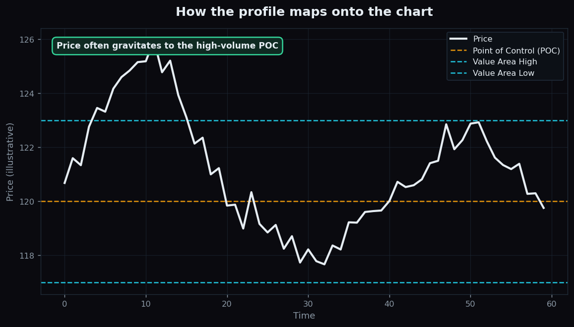
So the profile is not just a static histogram — it gives you a small set of structurally meaningful price levels that you can watch on the live chart.
A worked example with round numbers
Suppose a stock spent a week trading between 112 and 128. You build a Volume Profile and read off:
- The POC is 120 — more volume traded at 120 than at any other price. The market kept returning there to do business.
- The Value Area runs from 117 to 123 — about 70% of the week’s volume happened inside this band. This is the “fair” zone.
- Prices like 113 and 127 show thin bars — the stock visited them briefly but few wanted to trade there, so they were rejected as “unfair.”
Now suppose price drifts up to 126, into a thin area above value. A profile reader simply notes the context: price is in a low-volume zone, away from the 120 centre of gravity, near the upper edge of where the market recently considered fair. That is a description of structure — not a signal to do anything. These numbers are illustrative, chosen to make the idea concrete, and are not a recommendation.
Why it matters
Volume Profile is valuable because it shows where conviction lives, which a plain price chart hides. A breakout through a high-volume shelf means more than a breakout through a thin one, because more positions are concentrated there. The POC and value-area edges give objective reference levels that are built from actual traded volume rather than drawn by hand. It pairs naturally with trend tools — for direction — and with order-flow ideas like open interest, which similarly ask “where is participation concentrated?” rather than just “where is price?”
The honest catch
A Volume Profile is entirely backward-looking: it is a faithful map of where trading has happened, with zero promise about the future. A POC at 120 does not mean price must return to 120; it only tells you where past agreement was. The profile also depends heavily on the range you choose — a profile of one day, one week, and one year can have completely different POCs, so two analysts can draw different conclusions from the same chart simply by picking different windows. High-volume levels can also fail to hold: when sentiment shifts, price can slice straight through a thick shelf. And in fast, news-driven moves the “value” from last week may simply no longer apply. Treat it as context, never a guarantee.
Want to see where real participation concentrates across recent market sessions, explained in plain language? TrueTrend turns raw market structure into clear, honest analytics you can study yourself. Explore the public TrueTrend scoreboard or start free.
Key takeaways
- A Volume Profile shows volume by price level, not by time — revealing where trading actually concentrated.
- The Point of Control (POC) is the most-traded price; the Value Area is the ~70% band of fair prices, bounded by VAH and VAL.
- Thick bars mark prices the market found fair; thin bars mark prices it rejected.
- Price often gravitates toward the POC, and value-area edges act as structural levels to watch.
- It is backward-looking and window-dependent — change the date range and the POC changes — so use it as context, not prophecy.
- This is educational content with illustrative numbers only — not trading advice.
See these concepts on live market data — free
Create a free TrueTrend account to watch daily support/resistance levels, market regime, and option-positioning charts on NIFTY, BankNifty and 12 more instruments. Every level we publish is scored on a public scoreboard — misses included. No card required.
Free forever tier · daily levels with published hit-rates across every instrument. Descriptive market structure, not investment advice.
Not ready for an account? Get the daily levels by email.
One short email each market day — the indices' call wall, put wall, gamma flip and max pain, and how the last session's levels scored. Free, no account, unsubscribe anytime.
Descriptive market structure, not investment advice. We never share your email.