Parabolic SAR Explained: The Trailing Dots
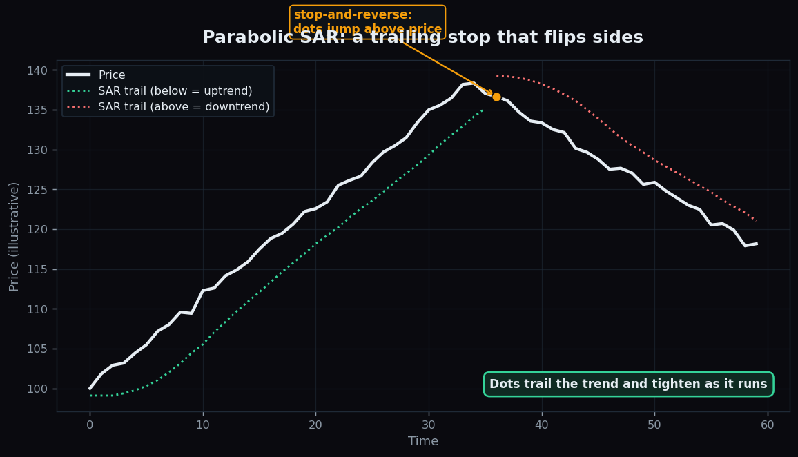
On many charts you will spot a string of little dots that trail along beneath a rising price, then suddenly jump to sit above a falling price. Those dots are the Parabolic SAR, one of the oldest and most distinctive trend tools in technical analysis. Its whole job is to follow a trend with a moving stop level and to flag, in a single visual flip, when that trend may have ended.
What Parabolic SAR is
SAR stands for Stop And Reverse. The name is the idea in three words: the indicator plots a stop level that trails the price, and when price crosses it, the dot stops tracking one direction and reverses to the other side. It was created by J. Welles Wilder Jr. — the same author who designed the ADX — and it is a pure trend-following tool, meaning it follows an existing move rather than predicting a new one.
- When the dots are below price, the indicator reads the trend as up, and each dot acts as a rising support/stop level.
- When the dots are above price, the trend is read as down, and each dot is a falling resistance/stop level.
The clever part: acceleration
What makes SAR special is that the dots do not trail at a fixed distance — they speed up the longer a trend runs. This is controlled by an acceleration factor (often starting at 0.02 and stepping up to a maximum of 0.20). Each time price makes a fresh extreme in the direction of the trend, the factor nudges higher, so the dots creep closer and closer to price. The visual result is a parabola — a curve that starts gently and tightens — which is where the indicator gets its name.
The practical effect: early in a move the stop sits loosely, giving the trend room to breathe; deep into a mature move the stop hugs price tightly, ready to flip at the first real stumble.
An everyday analogy
Picture a parent walking behind a child learning to ride a bicycle. At first the parent stays a few steps back, giving the child space. As the child speeds up and grows confident, the parent jogs closer, hand hovering nearer the seat, ready to catch a fall instantly. The moment the bike tips over, the parent darts around to the other side to steady it. Parabolic SAR is that hovering hand: it trails the trend, tightens as the move accelerates, and snaps to the opposite side the instant the trend topples.
A worked example with round numbers
Imagine a stock in a clean uptrend, with the SAR dots trailing below:
- Price is 500 and today’s SAR dot sits at 480 — a comfortable 20 points below.
- Price climbs to 520, then 540. With each new high the acceleration factor ticks up, so the dot ratchets to 508, then 532. Notice the gap is shrinking — 20 points, then 12, then 8 — even as price makes higher highs: the stop is tightening as the move matures.
- Price then slips and trades down to 503, below the 505 dot. SAR stops and reverses: the next dot appears above price, and the indicator now reads the trend as down.
These are illustrative numbers to show the mechanics — not a recommendation to act at any level. The takeaway is the rhythm: trail, tighten, flip.
Why it matters
Parabolic SAR is popular for two reasons. First, it is unambiguous: dots are either above or below, with no grey zone to interpret. Second, it doubles as a built-in trailing stop framework — many traders use the dot level as a moving line that follows the trend and tightens automatically, so they do not have to recalculate a stop by hand. Combined with a direction or smoothing tool like moving averages, it gives a simple, visual read on where a trend’s “give-up” level currently sits.
The honest catch
Here is the weakness, and it is a big one: Parabolic SAR is built for trends, so it falls apart in a range. When price moves sideways with no clear direction, the dots flip from one side to the other again and again, generating a stream of false signals. This constant flipping is called whipsaw, and in a choppy market SAR can be almost pure noise.
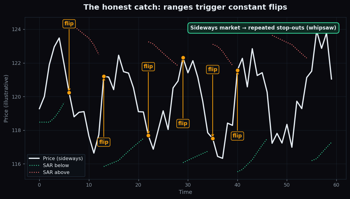
The picture above shows the trap clearly: in a flat market nearly every flip is a false alarm. Two further cautions are worth noting. SAR is always in the market — it is either long or short by design, with no “stay out” state — which is unrealistic when nothing is really happening. And because it reacts to recent extremes, a single sharp spike can trigger an early flip even inside a healthy trend. Like every indicator here, it is derived from past prices only and describes what has happened, not what will. This is exactly why most users add a trend-strength filter (such as ADX) to switch SAR off during flat phases.
How people actually use it
In practice, SAR is treated as a trailing reference and a context cue, not a standalone system. Typical uses include reading the trend side at a glance, using the dot as a moving stop level that tightens as a move runs, and — importantly — ignoring the dots entirely when a separate gauge says the market is ranging. The acceleration settings can be tuned: a higher step makes the dots tighten faster (more flips), a lower step keeps them looser (fewer flips, more room).
Want to study how trailing trend tools behave across real, recent market sessions instead of clean diagrams? TrueTrend turns raw market structure into clear, honest, plain-language analytics. Browse the public TrueTrend scoreboard or create a free account to explore.
Key takeaways
- Parabolic SAR means Stop And Reverse: dots trail below price in an uptrend and flip above in a downtrend.
- Its acceleration factor makes the dots tighten the longer a trend runs, tracing a parabola.
- The dot level doubles as a self-adjusting trailing stop, which is much of its appeal.
- Its great weakness is whipsaw in sideways markets, where the dots flip constantly and most signals are false.
- SAR is always in the market and reacts to recent extremes, so many readers pair it with a trend-strength filter.
- This is educational content using illustrative numbers only — not trading advice.
See these concepts on live market data — free
Create a free TrueTrend account to watch daily support/resistance levels, market regime, and option-positioning charts on NIFTY, BankNifty and 12 more instruments. Every level we publish is scored on a public scoreboard — misses included. No card required.
Free forever tier · daily levels with published hit-rates across every instrument. Descriptive market structure, not investment advice.
Not ready for an account? Get the daily levels by email.
One short email each market day — the indices' call wall, put wall, gamma flip and max pain, and how the last session's levels scored. Free, no account, unsubscribe anytime.
Descriptive market structure, not investment advice. We never share your email.