Golden Cross and Death Cross Explained for Beginners
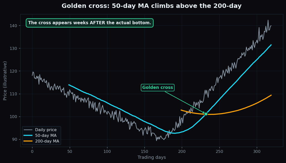
You have probably seen a headline scream that a stock just flashed a “golden cross,” or that an index is staring at a dreaded “death cross.” The names sound dramatic, but the idea underneath is calm and mechanical. Both are simply moments when two moving averages — one fast, one slow — trade places. This post explains exactly what crosses, why anyone cares, and the heavy catch that the names rarely mention.
What a golden cross and death cross actually are
First, a quick definition. A moving average (MA) is the average closing price over a fixed number of recent days, recalculated every day so it “moves” forward. A 50-day MA averages the last 50 closes; a 200-day MA averages the last 200. The 50-day reacts quickly to fresh prices; the 200-day is slow and steady because each new day is just one vote out of two hundred. If moving averages are new to you, our explainer on how moving averages smooth out price is a gentle place to start.
Now the two events:
- A golden cross happens when the 50-day MA rises from below the 200-day MA and crosses above it.
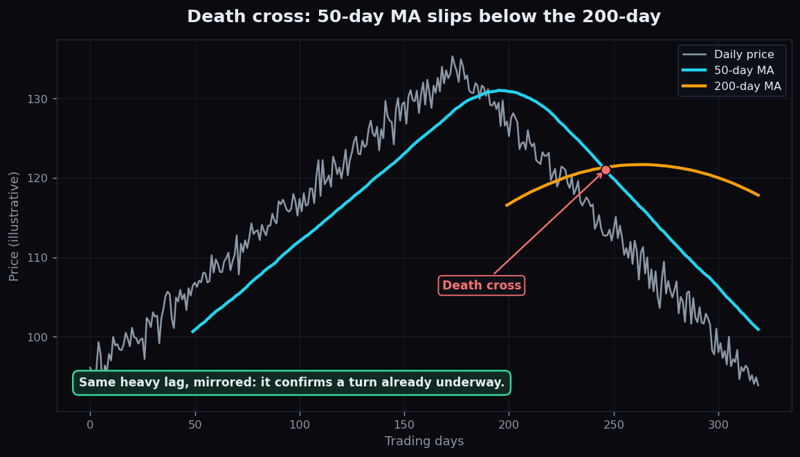
- A death cross happens when the 50-day MA falls from above the 200-day MA and crosses below it.
That is the whole definition. No magic, no secret formula — just one line stepping over another.
Why people watch them
The appeal is that the cross tries to summarise a change in regime — the market’s broad mood — in a single, unarguable signal. When the fast average climbs above the slow one, it means recent prices have, on average, pulled clearly ahead of the longer-run average. That is the fingerprint of a market that has shifted from falling to rising. The death cross is the mirror image: recent prices have sagged below the long-run trend, the fingerprint of a shift from rising to falling.
Think of it like a thermometer for a slow-changing season. A single warm afternoon does not mean winter is over. But when the rolling 50-day temperature finally rises above the rolling 200-day temperature, the season really has turned. The cross is deliberately sluggish so that one hot or cold day cannot fool it.
Because the 50/200 pairing uses such long windows, these crosses describe big-picture structure, not day-to-day wiggles. That is why they show up on weekly market reviews and long-term charts far more than on a five-minute trading screen.
A worked example with round numbers
Imagine a stock that fell for months and is now recovering. Keep the numbers simple:
- The 200-day MA has flattened out near 100, because it still carries six months of old, higher and lower prices that roughly cancel out.
- The 50-day MA sat down at 94 while the stock was weak.
Now the stock rallies and spends several weeks closing around 104. Each new high close pushes up the fast 50-day average quickly, because 50 is a small denominator. Over those weeks the 50-day climbs: 96, then 98, then 100, then 101. The slow 200-day barely budges from 100. The day the 50-day prints 100.5 while the 200-day is still 100.2, the lines cross — a golden cross is “official.”
Notice what already happened: the stock had to climb from its low and hold around 104 for weeks before the averages crossed. The cross confirmed a recovery that was already well underway. A death cross works the same way in reverse, confirming a decline that has already happened.
How chart-watchers use them
In practice, people treat these crosses as context, not commands. A golden cross is read as “the longer-term backdrop has turned constructive,” and a death cross as “the backdrop has turned heavy.” Many analysts then look inside that backdrop for the actual structure: whether price is making higher highs, whether volume supports the move, whether the broader index agrees.
Some common, descriptive uses:
- As a filter. Treating a market above a fresh golden cross differently from one stuck below a death cross — not as a green or red light, but as a tilt of the playing field.
- As a regime label. Splitting history into “above-cross” and “below-cross” periods to study how a strategy behaved in each.
- With confirmation. Waiting for the slow 200-day line itself to start sloping in the same direction, since a cross while the 200-day is still flat is weaker than one where both lines point the same way.
The honest catch: heavy lag
Here is the part the dramatic names hide. Because both averages look backward, the cross always arrives late — often weeks after the actual low or high. In our first chart, the price bottom forms long before the lines finally cross. By the time a golden cross is confirmed, a chunk of the recovery is already in the past.
This lag creates two well-known headaches:
- Whipsaws in sideways markets. When a market drifts flat, the two averages hug each other and can cross back and forth repeatedly, firing golden and death crosses that mean nothing. The signal only shines when there is a genuine, sustained trend to confirm.
- Old news. A death cross can appear right as a falling market is finishing its drop, and a golden cross can appear right as a rally is tiring. The cross describes where price has been, never where it is going.
None of this makes the tool useless. It makes it a slow confirmer of regime, best read alongside other clues and never as a stand-alone forecast. Treating a lagging summary as a crystal ball is the classic beginner mistake.
Want to see how directional ideas actually hold up over time instead of trusting a dramatic label? TrueTrend publishes a transparent, day-by-day market scoreboard so you can judge signals by their track record, not their nickname. Explore it and create a free account to follow along.
Key takeaways
- A golden cross is the 50-day MA crossing above the 200-day MA; a death cross is the 50-day crossing below it.
- They try to flag a change in the market’s broad regime — from falling to rising, or rising to falling — in one mechanical signal.
- Both are built from backward-looking averages, so they lag heavily and confirm a turn that has often already happened.
- In flat, sideways markets they whipsaw and produce meaningless crosses; they only earn their keep in clear trends.
- Read them as slow context, alongside trend, volume and the broader index — never as a forecast on their own.
See these concepts on live market data — free
Create a free TrueTrend account to watch daily support/resistance levels, market regime, and option-positioning charts on NIFTY, BankNifty and 12 more instruments. Every level we publish is scored on a public scoreboard — misses included. No card required.
Free forever tier · daily levels with published hit-rates across every instrument. Descriptive market structure, not investment advice.
Not ready for an account? Get the daily levels by email.
One short email each market day — the indices' call wall, put wall, gamma flip and max pain, and how the last session's levels scored. Free, no account, unsubscribe anytime.
Descriptive market structure, not investment advice. We never share your email.