Triangle Chart Patterns: Ascending, Descending, Symmetrical
When a market stops swinging wildly and starts to coil into a tighter and tighter range, chartists often see a triangle taking shape. Triangles are among the most recognisable patterns in technical analysis because they capture a simple, visual story: a battle between buyers and sellers that is slowly being squeezed toward a resolution. Learning the three main types — ascending, descending, and symmetrical — gives you a clean vocabulary for reading consolidation.
What a triangle pattern is
A triangle forms when price swings get progressively smaller, so that you can draw two converging trendlines around the highs and the lows. A trendline is just a straight line connecting a series of peaks (resistance) or troughs (support). As the lines close in on each other, the trading range narrows — the market is “coiling.” Triangles are usually classed as continuation patterns, meaning price more often resumes its prior direction after the pause, though that is a tendency, not a promise.
The key event everyone watches for is the breakout: the moment price finally pushes decisively out of the narrowing range, through one of the trendlines.
The three types
1. Ascending triangle
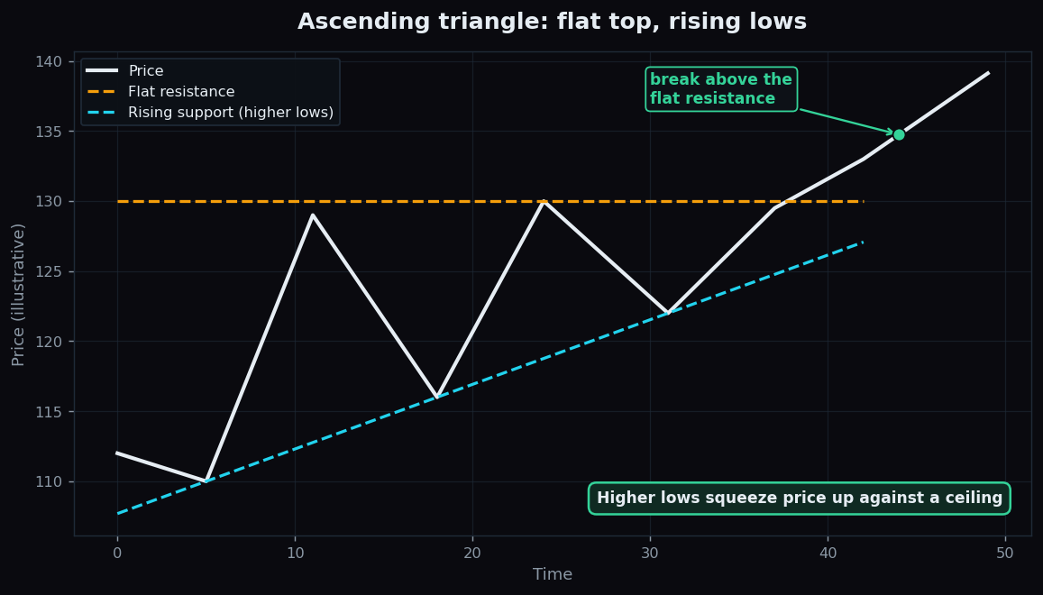
An ascending triangle has a flat top and a rising bottom. Price keeps stalling at the same ceiling (a horizontal resistance level), but each dip bottoms out higher than the last (rising support). The picture is of buyers growing more eager — willing to step in at ever-higher prices — while a fixed wall of sellers caps the top. It is generally read as the more bullish-leaning shape, often appearing during an uptrend.
2. Descending triangle
A descending triangle is the mirror image: a flat bottom and a falling top. Price keeps finding the same floor (horizontal support), but each rally peaks lower than the last (falling resistance). Here sellers are growing more aggressive — willing to sell at ever-lower prices — while a fixed band of buyers holds the floor. It is generally read as the more bearish-leaning shape, often appearing during a downtrend.
3. Symmetrical triangle
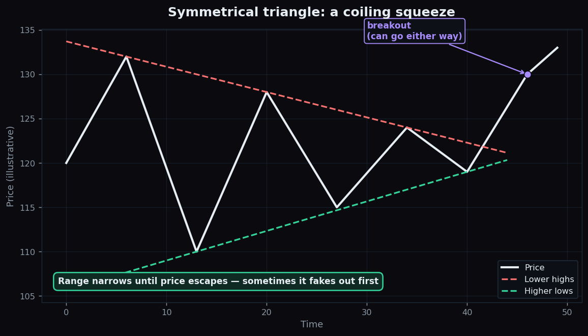
A symmetrical triangle has lower highs and higher lows at the same time — both trendlines tilt toward each other at a similar angle. Neither side is clearly winning; the range simply compresses from both directions, like a coiled spring. Because there is no built-in bias, a symmetrical triangle is considered neutral — it can break either way, and chartists usually wait for the breakout to reveal the direction.
An everyday analogy
Think of shaking a fizzy drink and slowly loosening the cap. The pressure builds as the range tightens, and everyone knows something is about to give — you just are not certain which way the spray will go until it does. An ascending triangle is like tilting the bottle so the pressure leans upward; a descending one leans downward; a symmetrical one is held perfectly level, so the direction of the release is genuinely uncertain until the cap pops.
A worked example with round numbers
Imagine a stock forming an ascending triangle:
- It keeps stalling at a flat ceiling of 130 — touching it at, say, three separate peaks.
- Its dips make higher lows: 110, then 116, then 122. The rising support line climbs toward the 130 ceiling.
- The range between support and resistance shrinks from 20 points (130 − 110) down to about 8 points (130 − 122). The spring is coiling.
- Eventually price closes at 133, clearly above the 130 ceiling. That decisive close through resistance is the breakout.
One common way chartists estimate a move’s rough scale is the pattern’s height: the triangle’s tallest point was about 20 points (130 − 110), so a textbook “measured move” would project roughly 20 points beyond the breakout. These are illustrative numbers to show the mechanics — a description of how the pattern is read, not a price target or a recommendation to act.
Why it matters
Triangles are useful because they translate a messy, sideways patch into a structured picture with clear levels: a ceiling, a floor, and a shrinking distance between them. That structure tells you where the “decision point” sits and which line price must cross to resolve the standoff. They pair naturally with other tools — volume often dries up inside a triangle and picks up on the breakout, and trend tools like moving averages can help judge the broader backdrop the pattern is forming within.
The honest catch
Triangles are far less reliable than tidy textbooks suggest, and the biggest trap has a name: the false breakout (or “fakeout”). Price pokes through a trendline, lures in traders expecting the move — then snaps right back into the range and often runs the other way. Because so many people watch the same obvious lines, those levels are exactly where sharp reversals get engineered. A few more cautions:
- The lines are subjective. Two analysts can draw the same triangle slightly differently, so where the “breakout” happens is not always crisp.
- Continuation is a tendency, not a rule. Plenty of triangles break against the prior trend.
- The “measured move” is a rough guide only — price frequently falls short of or overshoots it.
- Patterns are clearest in hindsight. A shape that looks like a perfect triangle today may dissolve into noise tomorrow.
This is why disciplined chart readers wait for confirmation (such as a decisive close beyond the line, ideally with a pickup in volume) rather than anticipating the breakout — and why they accept that a meaningful share of breakouts simply fail.
Want to study how consolidation and breakouts behave across real, recent market sessions instead of perfect diagrams? TrueTrend turns raw market structure into clear, honest, plain-language analytics. Browse the public TrueTrend scoreboard or create a free account to explore.
Key takeaways
- Triangles form when price swings shrink between two converging trendlines — a coiling consolidation.
- Ascending = flat top + rising lows (bullish-leaning); descending = flat bottom + falling highs (bearish-leaning); symmetrical = lower highs + higher lows (neutral).
- They are usually continuation patterns, and the key event is a decisive breakout through a trendline.
- The pattern’s height gives a rough measured-move guide — emphasis on rough.
- The big risk is the false breakout; the lines are subjective, and patterns look clearest only in hindsight.
- This is educational content using illustrative numbers only — not trading advice.
See these concepts on live market data — free
Create a free TrueTrend account to watch daily support/resistance levels, market regime, and option-positioning charts on NIFTY, BankNifty and 12 more instruments. Every level we publish is scored on a public scoreboard — misses included. No card required.
Free forever tier · daily levels with published hit-rates across every instrument. Descriptive market structure, not investment advice.
Not ready for an account? Get the daily levels by email.
One short email each market day — the indices' call wall, put wall, gamma flip and max pain, and how the last session's levels scored. Free, no account, unsubscribe anytime.
Descriptive market structure, not investment advice. We never share your email.