Keltner Channels Explained (vs Bollinger Bands)
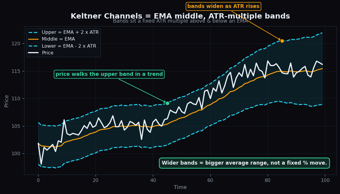
Most charting toolkits ship with at least one “channel” — a pair of lines drawn above and below price to show whether it is running hot or cold. Keltner Channels are one of the cleanest examples, and they are often confused with the more famous Bollinger Bands. They look similar at a glance, but they are built from different ingredients, and that difference changes how they behave. This post explains Keltner Channels from scratch and lines them up directly against Bollinger Bands.
What a Keltner Channel is
A Keltner Channel is three lines:
- A middle line: an EMA (exponential moving average) of price. An EMA is an average that weights recent prices more heavily, so it hugs price a little more tightly than a plain average.
- An upper band: the EMA plus a multiple of the ATR.
- A lower band: the EMA minus the same multiple of the ATR.
The new term is ATR (Average True Range). ATR measures how much an instrument typically moves in one period — its average range, including any gaps from one period to the next. A calm stock has a small ATR; a wild one has a large ATR. A typical setting is a 20-period EMA with bands set 2 ATRs away, though the multiple is adjustable.
So the recipe is simple: draw an EMA, then place two rails a couple of “average daily moves” above and below it. The channel automatically gets wider when the market gets jumpy and narrower when it calms down, because ATR itself rises and falls.
Why that matters
A fixed-width channel — say, always 5 points above and below an average — would be useless, because 5 points is huge for a sleepy stock and nothing for a volatile one. By tying the band width to ATR, Keltner Channels speak each instrument’s own language. The bands describe what counts as a “normal” move for this market right now.
Think of the channel as a lane on a road that widens and narrows with the traffic. On a quiet road the lane is tight; on a chaotic one it opens up to give cars more room. Price drifting along inside the lane is ordinary. Price pressing hard against one rail is the noteworthy event.
Two everyday readings fall out of this:
- Trend behaviour. In a strong trend, price tends to walk along the upper band (in an uptrend) or the lower band (in a downtrend), riding the rail rather than snapping back. That persistent contact is the fingerprint of momentum.
- Calm versus storm. When the bands pinch in tight, the market is quiet; when they balloon out, it is volatile. The width itself is information.
A worked example with round numbers
Suppose a stock’s 20-day EMA sits at 100, and its ATR — its typical daily move — is 2. With a 2x ATR setting:
- Upper band = 100 + (2 x 2) = 104
- Lower band = 100 − (2 x 2) = 96
So the “normal” lane runs from 96 to 104. A close at 103 is unremarkable. Now imagine an earnings shock doubles the typical daily move: ATR jumps from 2 to 4. With the EMA still near 100, the lane instantly widens to 92–108. A move to 103 that mattered last week is now firmly mid-lane. Nothing about the formula changed — the channel simply re-scaled itself to the new, larger sense of “normal.” That self-adjustment is the whole point.
Keltner Channels versus Bollinger Bands
Bollinger Bands share the channel idea but use different maths. Their middle line is a plain SMA (simple moving average), and their band width is set by standard deviation — a statistical measure of how spread out the recent closing prices have been — rather than by ATR.
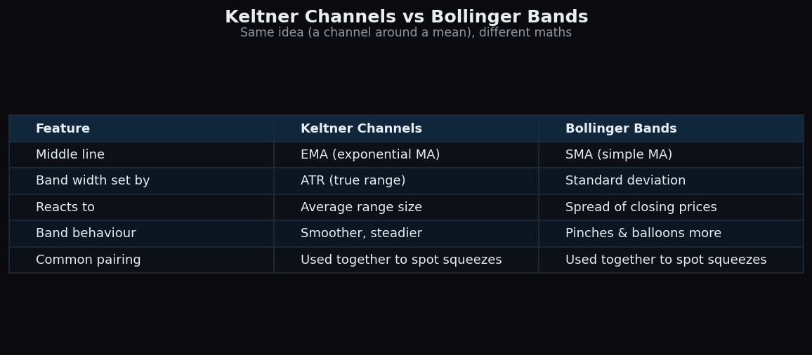
That single swap — ATR versus standard deviation — produces the practical differences:
- What drives the width. Keltner reacts to range (including gaps); Bollinger reacts to the dispersion of closes. Range-based width tends to feel steadier.
- How the bands move. Bollinger Bands “pinch and balloon” more dramatically, because standard deviation spikes hard when prices scatter. Keltner Channels generally expand and contract more smoothly.
- The middle line. Keltner’s EMA reacts a touch faster to fresh prices than Bollinger’s SMA.
Interestingly, the two are often used together. When the smoother Keltner Channel is wider than the jumpier Bollinger Bands — that is, the Bollinger Bands have pinched inside the Keltner — chart-watchers call it a squeeze: a stretch of unusually low volatility that often precedes a bigger move. Neither tool predicts the direction of that move; the squeeze only describes the quiet that came before it.
The honest catch
Channels are descriptive tools, and they mislead anyone who reads them as buy/sell switches:
- Touching a band is not a signal. Price riding the upper rail can mean a strong, healthy trend — not that price is “too high” and must fall. In a real trend, fading every band touch is exactly the wrong instinct.
- Settings change everything. A 1x ATR channel and a 3x ATR channel tell different stories from the same data. There is no universally correct setting; it is a choice, not a fact.
- It is backward-looking. EMA and ATR are both built from past prices. The channel maps where volatility has been, never where price is headed.
- Calm can stay calm. A squeeze flags low volatility, but markets can sit quietly for a long time before anything happens — or expand and then immediately go quiet again.
Used as a context tool — is this move normal-sized or unusual, is volatility rising or falling, is price riding a rail — Keltner Channels are a clean, intuitive lens. Used as a crystal ball, they disappoint like every other indicator.
Volatility context is far easier to act on when it is laid out plainly. TrueTrend translates market structure and range into beginner-friendly language so the “is this move big or small?” question answers itself — create a free account to explore.
Key takeaways
- A Keltner Channel is an EMA middle line with bands set a multiple of ATR above and below it.
- Because width is tied to ATR, the channel widens in volatility and narrows in calm, describing what is “normal” for that market.
- Versus Bollinger Bands: Keltner uses an EMA + ATR; Bollinger uses an SMA + standard deviation, which makes Bollinger pinch and balloon more.
- The two combined reveal a squeeze — a low-volatility lull — though neither predicts the direction that follows.
- Touching a band is context, not a signal; in trends, price often walks the rail. The tool looks backward and depends entirely on its settings.
See these concepts on live market data — free
Create a free TrueTrend account to watch daily support/resistance levels, market regime, and option-positioning charts on NIFTY, BankNifty and 12 more instruments. Every level we publish is scored on a public scoreboard — misses included. No card required.
Free forever tier · daily levels with published hit-rates across every instrument. Descriptive market structure, not investment advice.
Not ready for an account? Get the daily levels by email.
One short email each market day — the indices' call wall, put wall, gamma flip and max pain, and how the last session's levels scored. Free, no account, unsubscribe anytime.
Descriptive market structure, not investment advice. We never share your email.