MACD Explained: The Convergence-Divergence Indicator
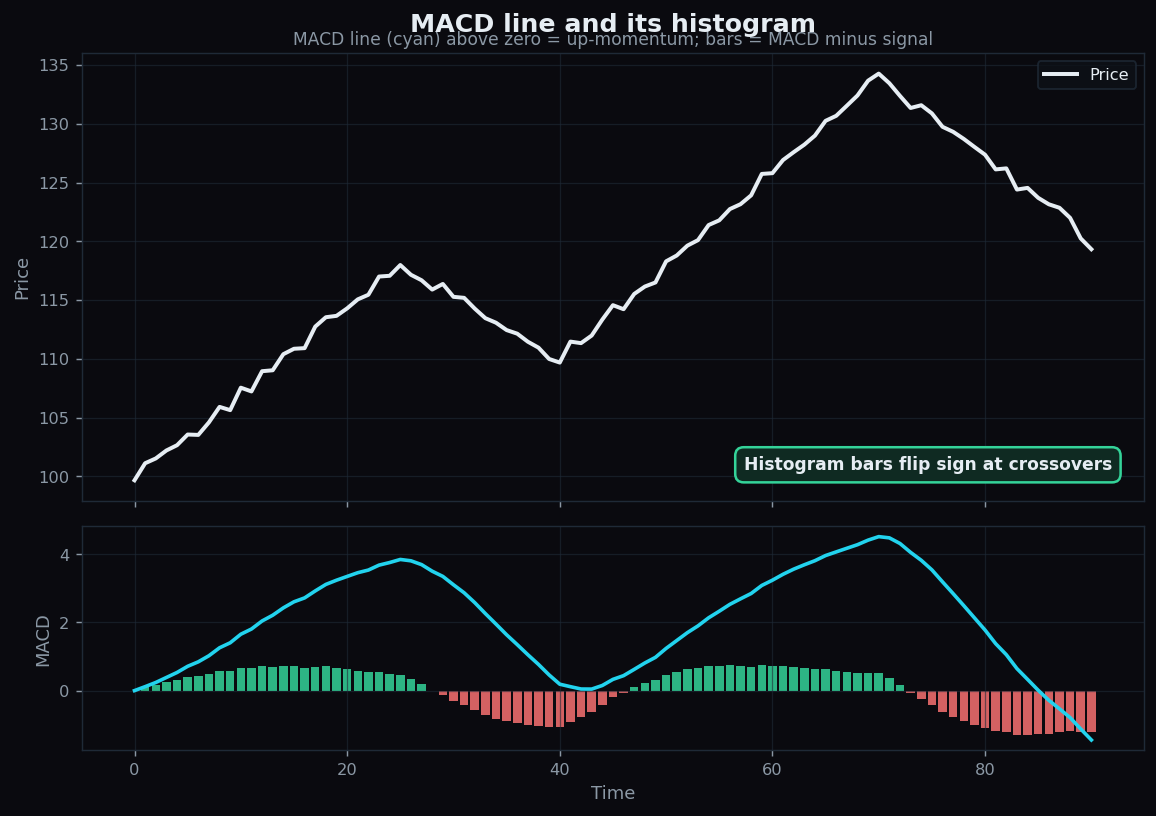
If RSI is a speedometer, MACD is more like a tool that compares two speedometers against each other. Its full name — Moving Average Convergence Divergence — sounds intimidating, but the idea underneath is friendly: it watches a fast average and a slow average of price and measures the gap between them. That gap, and how it changes, is what the whole indicator is about. This post unpacks the MACD line, the signal line, the histogram, the crossovers everyone talks about, and the lag that comes free with all of it.
This is educational material describing what MACD is and its limits — not a suggestion to act on any reading.
The building blocks: two moving averages
A moving average is just the average price over a recent window, recalculated each period so it glides along with the chart. MACD uses two exponential moving averages (which weight recent prices more heavily): a fast one (commonly 12 periods) and a slow one (commonly 26). If you want the foundation first, our explainer on moving averages covers it.
The core insight: when price is accelerating upward, the fast average pulls away above the slow one. When price is rolling over, the fast average sinks back toward and then below the slow one. MACD turns that relationship into numbers.
The three parts of MACD
- MACD line. The fast average minus the slow average (12-EMA − 26-EMA). When it is above zero, the fast average is above the slow one — up-momentum. Below zero, the reverse.
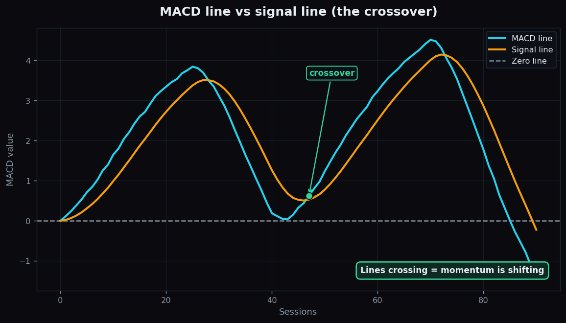
- Signal line. A moving average of the MACD line itself (commonly 9 periods). It is a smoothed, slower version that the MACD line crosses back and forth.
- Histogram. Bars showing the MACD line minus the signal line — literally the gap between the two. When the histogram flips from negative to positive, the MACD line has just crossed above its signal line.
The analogy: imagine two runners, one quick to react (the MACD line) and one steady (the signal line). The histogram measures the distance between them. When the quick runner pulls ahead, the bars grow positive; when they fall behind, the bars go negative. The moment they swap places is a crossover.
Crossovers and the zero line
Two events get the most attention:
- Signal-line crossover. The MACD line crossing above its signal line (histogram turning positive) is read as up-momentum building; crossing below (histogram turning negative) as momentum fading. These are the events the histogram makes easy to spot.
- Zero-line cross. The MACD line crossing zero means the fast and slow averages themselves have crossed — a slower, more structural shift than a signal-line cross.
A worked example with round numbers
Suppose price has been rising. The 12-period average sits at 134 and the 26-period average at 130. The MACD line is 134 − 130 = +4 — positive, reflecting the up-momentum. The signal line (a 9-period average of recent MACD values) is lagging at, say, +5. Because the MACD line (+4) is below the signal line (+5), the histogram reads 4 − 5 = −1: a small negative bar, hinting momentum has just started to cool even though the MACD line is still positive.
If the next moves push the MACD line up to +6 while the signal line drifts to +5.5, the histogram flips to +0.5 — a fresh positive bar marking a signal-line crossover. The numbers are illustrative, but they show how the three parts move together: the line, its smoothed echo, and the gap between them.
How MACD is used
Thoughtful chart-readers treat MACD as a momentum description, with a few habits:
- Read the histogram for tempo. Growing bars mean momentum is expanding; shrinking bars mean it is contracting, often before a crossover actually happens.
- Watch for divergence. Like RSI, MACD can diverge from price — price making a higher high while the MACD line makes a lower high hints the move is losing energy.
- Mind the zero line. Crossovers above zero sit inside an up-context; the same crossover below zero sits in a down-context. Location colours the meaning.
- It is relative, not absolute. A MACD value of +4 is meaningful for one instrument and tiny for another — the indicator is about change, not a universal scale.
The honest catch: lag and whipsaw
MACD is built entirely from moving averages, and averages are backward-looking by nature. That has consequences:
- It lags — doubly. The MACD line lags price (it is made of averages), and the signal line lags the MACD line (it is an average of an average). Crossovers therefore arrive after a move is already underway.
- Whipsaw in sideways markets. When price chops without trend, the MACD and signal lines tangle around zero, firing crossover after crossover that lead nowhere. This is MACD's single biggest weakness.
- Divergence is unreliable. Fading momentum can re-ignite; a clean divergence is a hint, not a forecast.
- No fixed scale. Because the values are relative, there is no “overbought” ceiling to lean on the way RSI offers — you only have crossings and direction.
So MACD is best understood as a momentum-and-trend storyteller: excellent at describing whether the fast pulse of price is pulling ahead of or falling behind the slower one, and honestly poor at calling exact turns — especially when there is no trend to work with.
Every momentum tool looks brilliant on the charts where it worked and quietly forgets the rest. TrueTrend keeps the full record visible — our public scoreboard shows how signals actually performed, lag and whipsaw included. Start free to explore MACD and other indicators honestly.
Key takeaways
- MACD measures the gap between a fast and a slow moving average of price (commonly 12 and 26).
- It has three parts: the MACD line (fast minus slow), the signal line (a 9-period average of the MACD line), and the histogram (the gap between them).
- Crossovers — MACD versus signal, and the MACD line versus zero — describe momentum building or fading; the histogram makes them easy to see.
- MACD lags doubly (an average of an average) and whipsaws badly in sideways markets.
- Read it as a momentum-and-trend description in context, never as a standalone trigger.
See these concepts on live market data — free
Create a free TrueTrend account to watch daily support/resistance levels, market regime, and option-positioning charts on NIFTY, BankNifty and 12 more instruments. Every level we publish is scored on a public scoreboard — misses included. No card required.
Free forever tier · daily levels with published hit-rates across every instrument. Descriptive market structure, not investment advice.
Not ready for an account? Get the daily levels by email.
One short email each market day — the indices' call wall, put wall, gamma flip and max pain, and how the last session's levels scored. Free, no account, unsubscribe anytime.
Descriptive market structure, not investment advice. We never share your email.