How to Read an Option Chain: A Simple Beginner's Guide
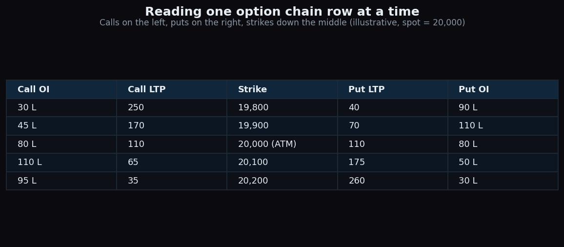
An option chain looks intimidating at first — a wall of tiny numbers in narrow columns. But it is really just a price list for one underlying, sorted by strike. Once you know what each column means, you can read it like a train timetable. This guide walks through every column, one row at a time, using a simple synthetic example.
What an option chain actually is
An option is a contract tied to an underlying, such as the NIFTY index or a single stock. A call gives its holder the right to buy the underlying at a fixed price. A put gives the right to sell the underlying at a fixed price. That fixed price is the strike. An option chain is simply every available strike for one expiry, with the call data on one side and the put data on the other.
Picture a menu printed down the middle of a page. The dish names — here, the strike prices — run down the centre. On the left, the menu lists call prices and how many call contracts are open. On the right, it lists the same details for puts. Each horizontal row is one strike, and reading straight across that row tells you the full story for that price level.
The columns, one at a time
Most chains show the same core columns mirrored on each side. Here are the ones a beginner needs first:
- Strike — the fixed price written into the contract. Strikes are listed at regular gaps (for example every 100 points on NIFTY).
- LTP, also called the premium — the last traded price of that option: what one unit changed hands for most recently. This is the per-unit cost to hold the contract.
- OI, or open interest — the number of contracts at that strike that are still open and have not been closed out. It is a running headcount of live positions, not a count of today's trades.
- Volume — how many contracts traded during the current session. A strike can have heavy volume but little change in OI, because volume counts every trade while OI counts only what stays open.
Many chains also show IV (implied volatility, the market's estimate of how much the underlying might move) and change in OI (how OI shifted today). You can ignore those while you are learning the layout.
The ATM row is your anchor
The row to find first is the at-the-money, or ATM, strike: the one closest to the current price of the underlying, known as the spot. In the table above the spot is 20,000, so the 20,000 row is ATM. Strikes above it where the call has no built-in value yet are called out-of-the-money calls; strikes below it are out-of-the-money puts. Anchoring on the ATM row keeps you oriented, because everything above and below it lines up symmetrically.
A worked example
Read the ATM row across. The 20,000 call shows an LTP of 110. With a lot size of 50 units, one lot of that call would cost 110 × 50 = 5,500 in premium. Its call OI of 80 lakh means 80,00,000 units of open call positions sit at that strike. The 20,000 put on the right also shows an LTP of 110 and a put OI of 80 lakh — roughly balanced at the money.
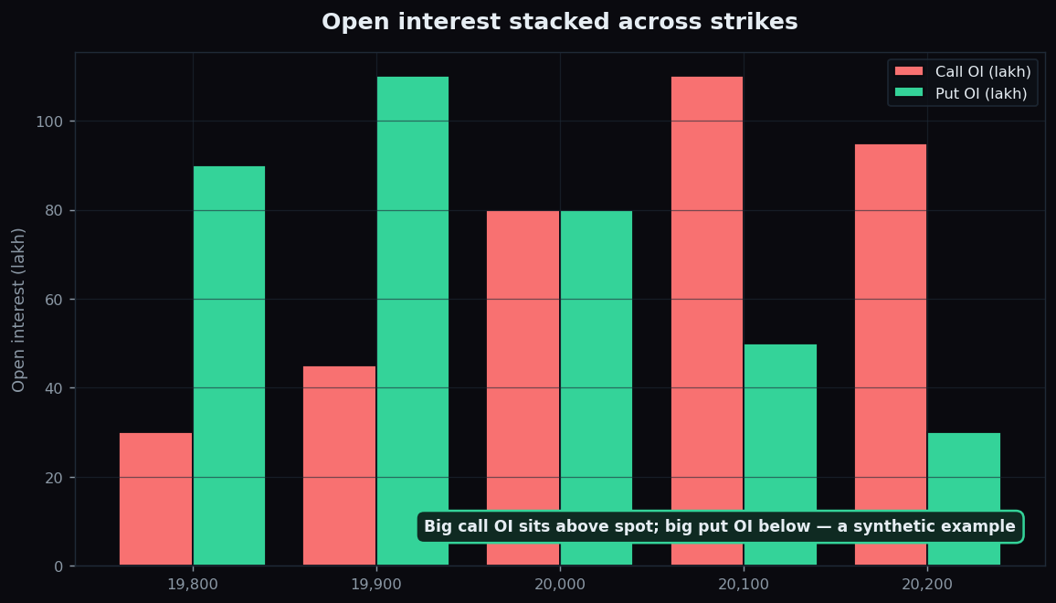
Now slide up to the 20,200 row. The call LTP has fallen to 35, because that strike is further out-of-the-money and cheaper, yet its call OI is a heavy 95 lakh. The matching 20,200 put costs 260 and carries only 30 lakh of put OI. Reading those two rows tells you, at a glance, where the crowd has parked its open call and put positions — all from synthetic numbers chosen to make the pattern obvious.
Why people study the chain
The chain is popular because it shows structure, not just price. By scanning where OI clusters, market watchers describe which strikes carry the most open call and put positions. Big call OI often sits above the spot and big put OI below it, as in the chart above. People discuss these clusters as potential zones of interest. If you want to go deeper on what those open positions do and do not tell you, our explainer on open interest and why it matters unpacks it carefully.
The honest catch
An option chain is a snapshot, and a noisy one. OI updates with a lag and reflects positions already taken, not what will happen next. Premiums swing with volatility and time, so a cheap-looking option can be cheap for good reason. Large OI at a strike is often read as support or resistance, but that reading frequently fails — positions get rolled, hedged, or closed without warning. The chain describes the current state of open contracts. It does not predict where price will go, and nobody should treat any single number on it as a signal to act.
Want to practise reading structure without the clutter? TrueTrend lays out option-chain context in plain language so beginners can follow along. Create a free account to explore it.
Key takeaways
- An option chain is a price list of every strike for one expiry: calls on one side, puts on the other, strikes down the middle.
- LTP is the premium (per-unit price); OI is the number of contracts still open; volume is today's trading activity.
- Find the ATM row — the strike nearest spot — first, then read symmetrically above and below it.
- Read across a single row to get the full picture for that strike, as in the worked example.
- The chain is a lagging snapshot that describes open positions; it is not a forecast.
See these concepts on live market data — free
Create a free TrueTrend account to watch daily support/resistance levels, market regime, and option-positioning charts on NIFTY, BankNifty and 12 more instruments. Every level we publish is scored on a public scoreboard — misses included. No card required.
Free forever tier · daily levels with published hit-rates across every instrument. Descriptive market structure, not investment advice.
Not ready for an account? Get the daily levels by email.
One short email each market day — the indices' call wall, put wall, gamma flip and max pain, and how the last session's levels scored. Free, no account, unsubscribe anytime.
Descriptive market structure, not investment advice. We never share your email.