Fibonacci Retracement Explained Simply
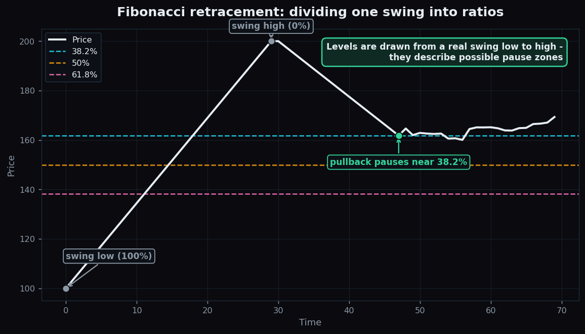
Open almost any trading chart and you will eventually see a ladder of horizontal lines labelled with odd percentages: 38.2%, 50%, 61.8%. These are Fibonacci retracement levels — one of the most widely drawn (and most argued-about) tools in technical analysis. This guide explains where the numbers come from, how the levels are drawn, what they are meant to describe, and the honest caveat that makes them work at all.
Everything below uses simple, round, made-up numbers to teach the mechanics. It is an explanation of market structure, not advice about what to do.
What a retracement is
Markets rarely move in a straight line. After a strong push in one direction, price usually pulls back part of the way before (sometimes) continuing. That partial pullback is a retracement — price “retraces” some of the ground it just covered. If a stock rallies from ₹100 to ₹200 and then drifts back to ₹160, it has given back ₹40 of a ₹100 move — a 40% retracement.
Fibonacci retracement is simply a way of marking the pullback levels that traders watch most often. It takes one clear price swing — from a swing low (the bottom of the move) to a swing high (the top) — and divides it with a set of ratios.
Where the numbers come from
The ratios trace back to the Fibonacci sequence, a string of numbers where each is the sum of the two before it: 1, 1, 2, 3, 5, 8, 13, 21, 34, 55… This pattern shows up surprisingly often in nature — the spiral of a sunflower, the branching of trees. Divide one number by the next and you approach 0.618; skip one and you approach 0.382. Those become the famous 61.8% and 38.2% levels. The 50% level is not actually a Fibonacci ratio at all — it is just the obvious halfway point, kept because traders find it useful.
So the standard retracement levels are: 23.6%, 38.2%, 50%, 61.8%, and sometimes 78.6%. Each marks a fraction of the original swing that price might pull back to.
How to draw them — a worked example
Take a clean move and anchor the tool to its two ends. Suppose a stock climbs from a swing low of ₹100 to a swing high of ₹200. The full move is ₹100. Now the retracement levels (measured down from the high) are easy arithmetic:
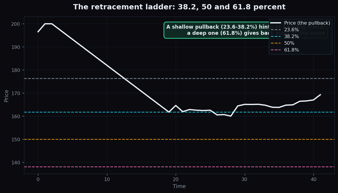
- 23.6%: 200 − (0.236 × 100) = ₹176.40
- 38.2%: 200 − (0.382 × 100) = ₹161.80
- 50%: 200 − (0.50 × 100) = ₹150.00
- 61.8%: 200 − (0.618 × 100) = ₹138.20
Those four prices become horizontal lines on the chart — a ladder of possible pause zones where the pullback might slow or steady before the market decides its next direction. A shallow retracement that holds near 23.6–38.2% suggests the original move was strong (buyers barely let go). A deep retracement to 61.8% means price gave back most of its gains — the move was weaker, or the mood is shifting.
Why traders watch these levels
The honest reason Fibonacci levels matter is not mystical mathematics — it is crowd behaviour. Because so many traders draw the same swing with the same ratios, a huge number of eyes are looking at the same price — say ₹161.80 in our example. When a crowd watches one level, their collective reactions can cluster orders around it, which sometimes makes the level “work” for no reason other than that everyone expected it to. This is the classic self-fulfilling prophecy: the level matters partly because people believe it matters.
That makes Fibonacci retracement best understood as a map of attention — a way to see where many other participants are likely to be watching, not a law of physics that price must obey.
The honest catch: the self-fulfilling caveat
Once you accept that the levels work mostly through shared attention, the limits become clear:
- They are subjective. Two analysts can pick different swing highs and lows on the same chart and get completely different levels. There is no single “correct” drawing — which means “Fibonacci said so” can be made to fit almost any outcome after the fact.
- Hindsight bias. It is easy to glance back and see price “respecting” a level, while quietly ignoring the many times it sliced straight through. The misses rarely make the screenshots.
- No directional promise. A retracement level marks a possible pause, not a turn. Price can pause and then keep falling, or never pause at all.
- The 50% isn’t even Fibonacci. Its inclusion is a reminder that the toolkit is built on convention and habit as much as on the sequence itself.
None of this makes the tool useless — it makes it honest. Fibonacci retracement is valuable as a structured way to mark where a crowd is likely watching, especially when those levels line up with other evidence such as a prior high, a round number, or a moving average. When several independent things point at the same price, the level is more interesting. On its own, it is one opinion among many.
Curious whether widely-watched levels actually hold up when you track them honestly over many sessions, rather than cherry-picking the charts that worked? TrueTrend keeps its market readings out in the open and scores them transparently over time — explore the TrueTrend scoreboard or create a free account to follow along.
Key takeaways
- A retracement is a partial pullback after a strong move; Fibonacci retracement marks the pullback levels traders watch most.
- The key ratios — 38.2% and 61.8% — come from the Fibonacci sequence; 50% is added by convention, not from the sequence.
- You draw them by anchoring the tool from a swing low to a swing high (or high to low), then reading the horizontal levels as possible pause zones.
- The levels work largely as a self-fulfilling prophecy — they matter because so many people watch the same prices.
- They are subjective (different swings give different levels), prone to hindsight bias, and promise no direction — strongest when they line up with other independent evidence.
See these concepts on live market data — free
Create a free TrueTrend account to watch daily support/resistance levels, market regime, and option-positioning charts on NIFTY, BankNifty and 12 more instruments. Every level we publish is scored on a public scoreboard — misses included. No card required.
Free forever tier · daily levels with published hit-rates across every instrument. Descriptive market structure, not investment advice.
Not ready for an account? Get the daily levels by email.
One short email each market day — the indices' call wall, put wall, gamma flip and max pain, and how the last session's levels scored. Free, no account, unsubscribe anytime.
Descriptive market structure, not investment advice. We never share your email.