Multi-Timeframe Analysis Explained for Beginners
Two people can look at the very same stock at the very same moment and completely disagree — one sees a strong uptrend, the other sees a sharp sell-off. Often they are both right. They are simply looking through different timeframes. Multi-timeframe analysis is the habit of reading one market across several zoom levels so the small picture and the big picture stop contradicting each other.
What multi-timeframe analysis is
A timeframe is the amount of time each bar or candle on your chart represents. On a daily chart, one candle is one trading day. On a weekly chart, one candle is a whole week. On a 5-minute chart, one candle is five minutes. The price data is identical; only the lens changes.
Multi-timeframe analysis simply means studying the same instrument on more than one of these lenses at once — typically a higher (slower) timeframe for direction and a lower (faster) timeframe for detail. The goal is alignment: understanding how a tiny move on the 5-minute chart fits inside the larger story on the daily or weekly chart.
Think of it like map zoom levels on your phone. Zoom all the way in and you can see individual lanes, but you have no idea which city you are in. Zoom all the way out and you can see the whole country, but you cannot find your street. You need both, and you usually start zoomed out to get your bearings before zooming in.
Why it matters
A single timeframe hides information by design. The daily chart cannot show you the calm, multi-month uptrend that a weekly chart reveals. The weekly chart cannot show you the sharp two-day dip that a daily chart reveals. If you only ever watch one lens, you are blind to everything happening on the others — and that blindness is where a lot of confusion comes from.
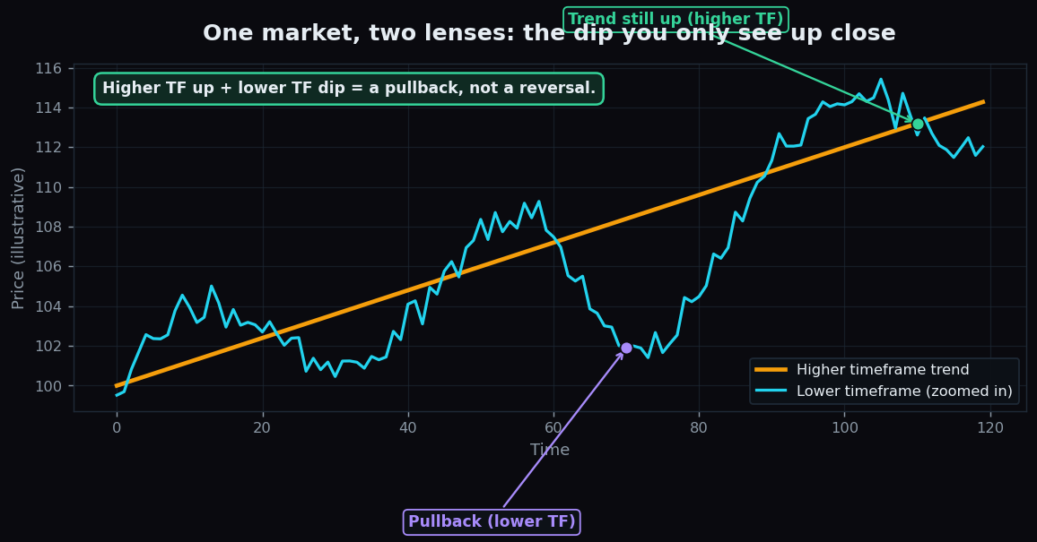
The classic example is the pullback that looks like a crash. On a 5-minute chart, a normal one-day dip inside a healthy uptrend can look terrifying: red candle after red candle, price falling fast. But zoom out to the weekly chart and that “crash” is a barely visible notch in a staircase that is still climbing. Same market, same moment, two completely different emotional reactions — and the calmer one came from the bigger lens.
How it is used: the top-down approach
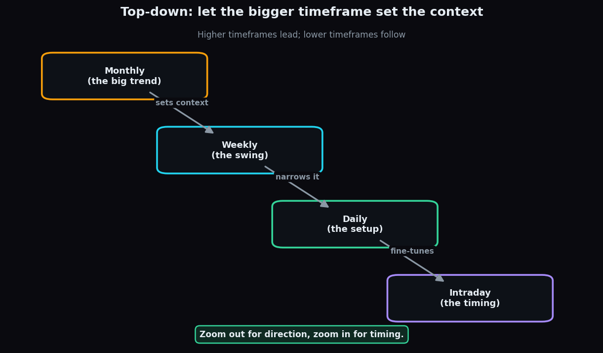
The most common method is top-down: start with the highest timeframe you care about and work your way down. Each level answers a different question.
- Highest timeframe — the big trend. Monthly or weekly. Question: which way is the larger tide flowing? Up, down, or sideways? This sets the context for everything below.
- Middle timeframe — the swing. Daily. Question: within that big trend, is price currently pushing forward, pulling back, or resting? This narrows the context to a workable structure.
- Lowest timeframe — the timing. Hourly or a few minutes. Question: where exactly is price right now relative to the levels you spotted higher up? This fine-tunes the detail.
The crucial discipline is direction of travel. You let the higher timeframe lead and the lower timeframe follow. The big lens decides the storyline; the small lens decides the precise wording. You never let a 5-minute wiggle overrule a six-month trend — that is letting the tail wag the dog.
When all three lenses point the same way, analysts call it alignment, and it is considered the cleanest kind of picture. When they disagree — weekly up but daily down, say — that is a signal to be cautious and patient, because the timeframes are telling competing stories.
A worked example with round numbers
Suppose a stock is trading at 500. You read it top-down:
- Weekly chart: price has climbed steadily from 400 to 500 over several months, making higher highs. The big trend is clearly up. Context: constructive.
- Daily chart: over the last week the stock slipped from 510 back to 500 — a small pullback. Inside a rising weekly trend, this looks like a pause, not a breakdown.
- Hourly chart: price has stopped falling near 500 and is forming small, steady candles. The fast dip has cooled off.
Now the same numbers through a single, lower lens: if you only watched the hourly chart, that drop from 510 to 500 might have felt like the start of something ugly. The weekly context reframes it as an ordinary 2% breather inside a 25% climb. The conclusion is not a recommendation to do anything — it is simply a clearer, less panicked reading of where price sits.
The honest catch
Multi-timeframe analysis is powerful, but it has real traps:
- Analysis paralysis. Stack too many timeframes — monthly, weekly, daily, 4-hour, hourly, 15-minute, 5-minute — and they will always disagree about something. Most people find that two or three well-chosen lenses are far more useful than seven. A common spacing is roughly 4x to 6x apart (for example weekly, daily, hourly).
- Conflicting signals are normal. The lenses will contradict each other regularly, because they measure different time spans. Disagreement is information, not a malfunction. Forcing them to agree by cherry-picking is just bias in disguise.
- It still only describes the past. Every timeframe is built from prices that have already printed. Reading three lenses gives you better context, never a guarantee about the next move.
- Lower timeframes are noisier. The faster the chart, the more random, meaningless jiggle it contains. Treating every 5-minute twitch as meaningful is a fast track to confusion.
Used sensibly, though, the technique does one thing beautifully: it stops you from mistaking a small move for a big one, and a big move for a small one.
Reading one market across several lenses takes practice. TrueTrend lays out market structure and context in plain language so you can build that top-down habit faster — create a free account to follow along.
Key takeaways
- A timeframe is how much time each candle represents; the same market looks different through each lens.
- Multi-timeframe analysis reads one instrument across several lenses so the small and big pictures stop contradicting each other.
- Work top-down: the higher timeframe sets direction (context), the lower timeframe handles detail (timing).
- Alignment — all lenses pointing the same way — is the cleanest read; disagreement is a cue for patience, not panic.
- Beware analysis paralysis: two or three timeframes usually beat seven, and none of them predict the future.
See these concepts on live market data — free
Create a free TrueTrend account to watch daily support/resistance levels, market regime, and option-positioning charts on NIFTY, BankNifty and 12 more instruments. Every level we publish is scored on a public scoreboard — misses included. No card required.
Free forever tier · daily levels with published hit-rates across every instrument. Descriptive market structure, not investment advice.
Not ready for an account? Get the daily levels by email.
One short email each market day — the indices' call wall, put wall, gamma flip and max pain, and how the last session's levels scored. Free, no account, unsubscribe anytime.
Descriptive market structure, not investment advice. We never share your email.