The TrueTrend Blog
Clear, data-backed writing on Indian and global markets — option structure, market regime, open interest and the ideas behind the platform. No tips, just understanding.
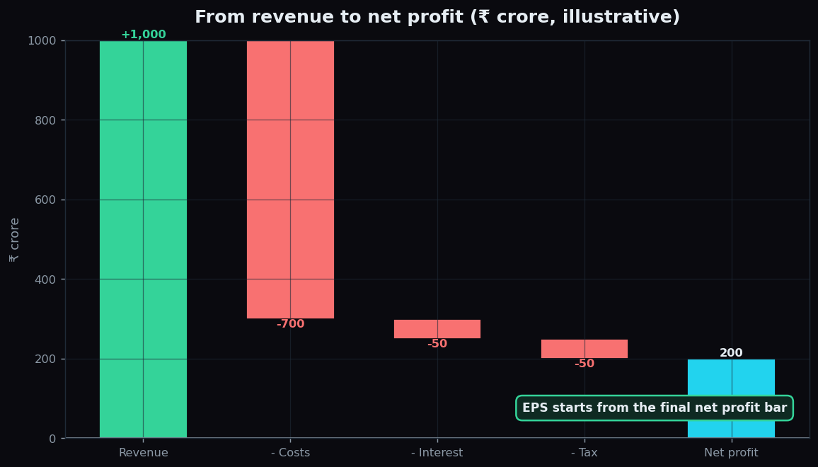
EPS (Earnings Per Share) Explained for Beginners
What EPS is, how net profit becomes profit per share, the difference between basic and diluted EPS, and why the trend matters more than any single figure.
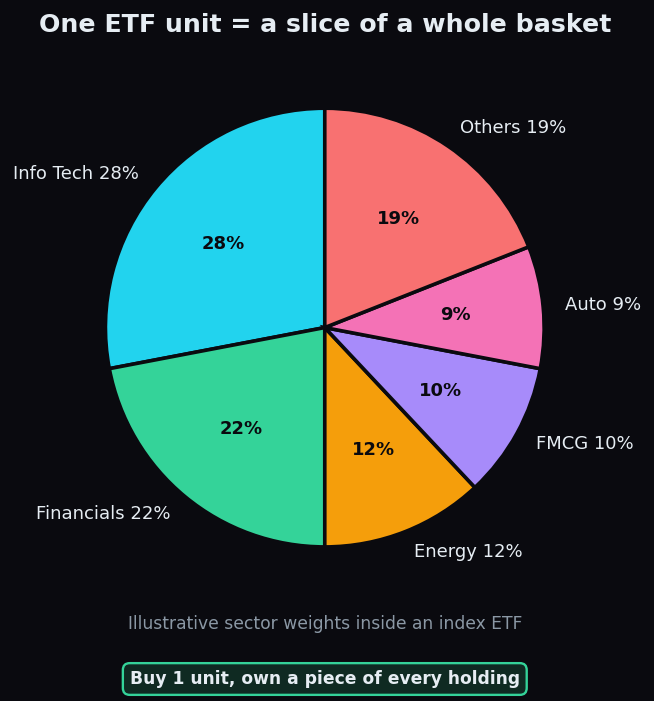
What Is an ETF? Exchange Traded Funds Explained
An ETF is a basket of investments that trades like a single stock. See how it tracks an index, gives instant diversification, and its honest trade-offs.
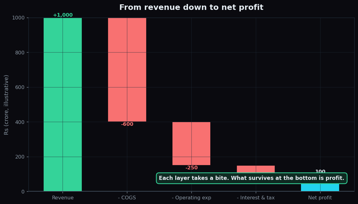
The Income Statement Explained: Revenue to Net Profit
The income statement walks from revenue down to net profit. Learn the cost layers, gross/operating/net profit, and margins with a simple example.
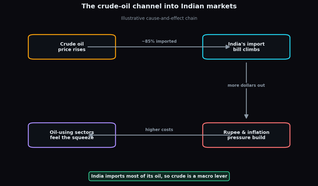
Crude Oil and Indian Markets Explained for Beginners
Why crude oil is a macro lever for India: the import bill, the inflation-and-rupee channel, and which sectors win or lose when oil prices move.
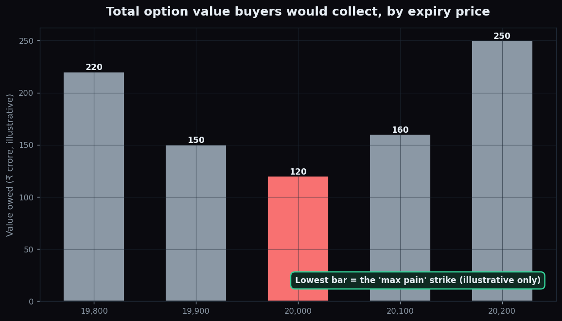
Max Pain Theory Explained: The Strike Where Value Expires
Max pain is the expiry price where the most option value expires worthless. Learn how it's calculated, with a worked example and the caveats that matter.
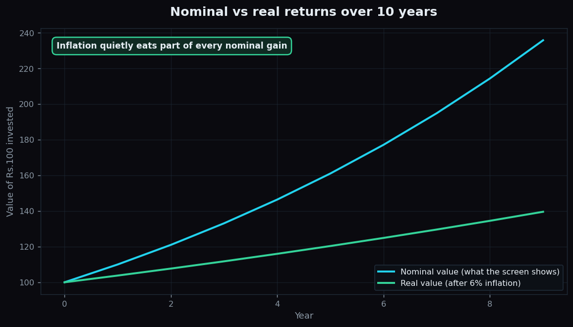
Inflation and the Stock Market Explained
What inflation and CPI really mean, the difference between nominal and real returns, and the two channels through which rising prices reach equity markets.
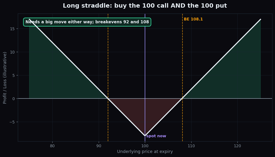
Straddle and Strangle Explained (Illustrative Example)
An illustrative, beginner-friendly guide to long straddles and strangles: buying a call and a put to bet on movement, with breakevens on both sides and the honest catch.
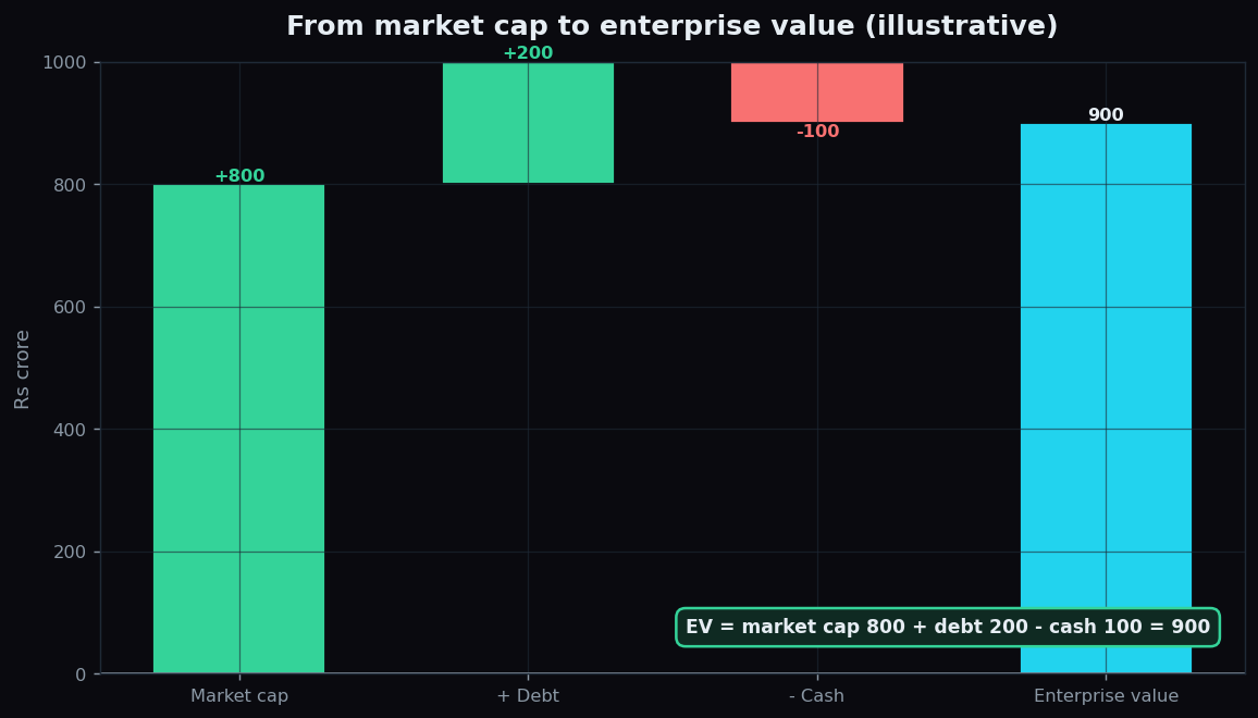
Market Cap vs Enterprise Value: The Real Price Tag
Market cap prices the equity; enterprise value prices the whole business. A beginner-friendly guide to EV = market cap + debt - cash, with a worked example.
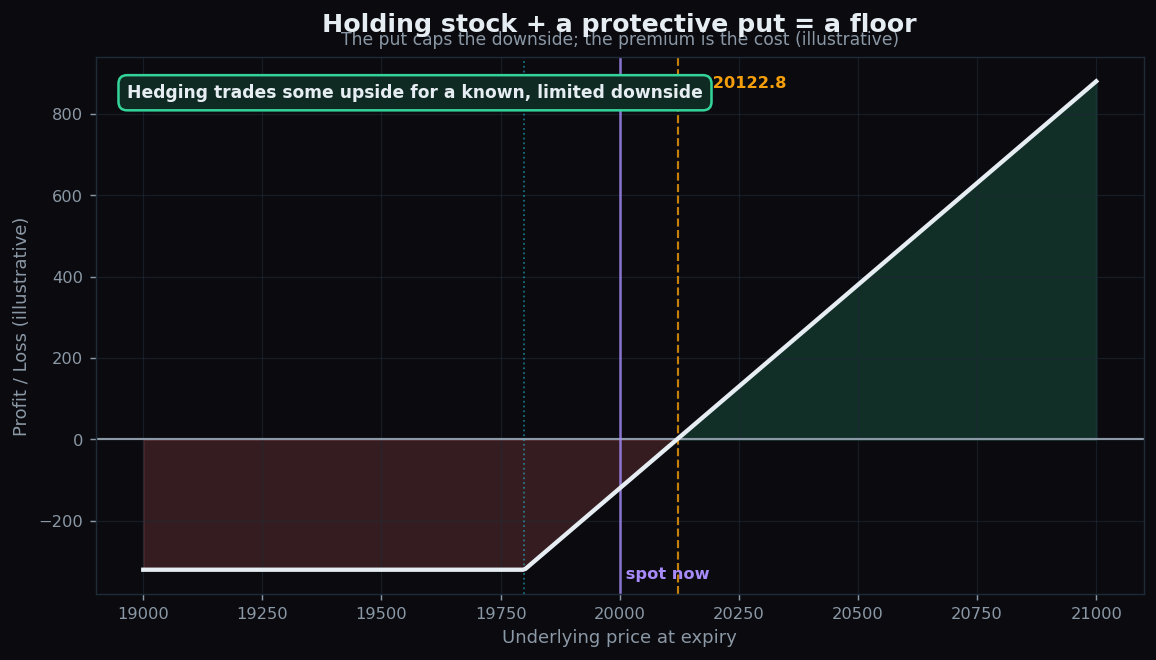
What Is Hedging? Protecting a Portfolio
Hedging is insurance for a portfolio: pay a known premium to cap an unknown loss. Learn the protective put, the cost, and the real trade-off.
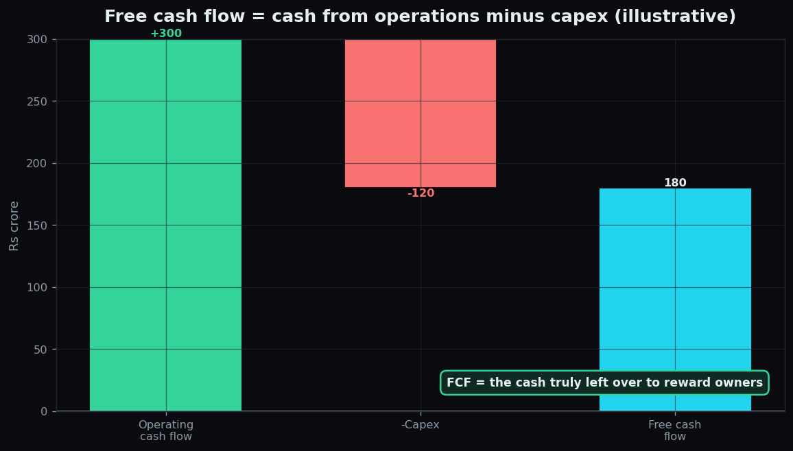
Free Cash Flow Explained: Why Cash Beats Profit
Free cash flow is operating cash flow minus capex — the real money a business keeps. Learn why it can matter more than reported profit, with a worked example.
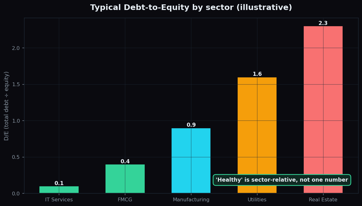
The Debt-to-Equity Ratio Explained for Beginners
What the Debt-to-Equity ratio measures, why leverage cuts both ways, what counts as healthy versus risky, and why the safe level is always sector-relative.
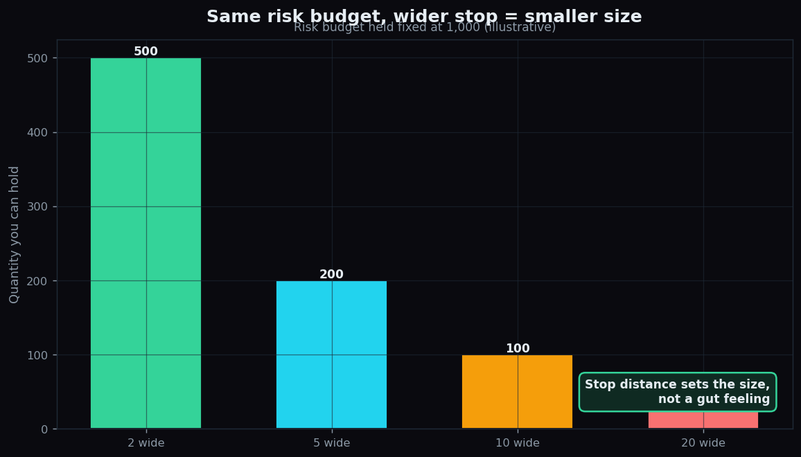
Position Sizing Explained: How Much to Risk
How to size a position by the risk taken, why the 1% rule aids survival, and a clean worked example linking exit distance to quantity (illustrative).
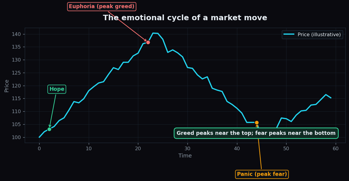
Trading Psychology: Fear and Greed Explained Simply
Fear and greed drive most trading mistakes. See the emotional cycle, why it repeats, and why a calm, rule-based plan beats reacting to every move.
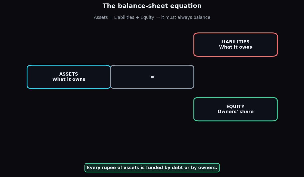
How to Read a Balance Sheet: A Beginner's Guide
A balance sheet shows what a company owns, owes and what's left for owners. Learn the accounting equation and how to spot financial health fast.
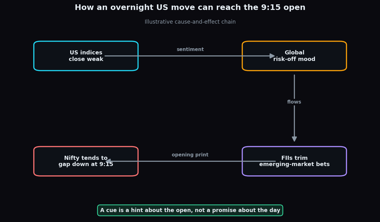
How US Markets Affect Indian Stocks: A Beginner's Guide
Why a night on Wall Street can nudge the Nifty at 9:15 - the overnight cue chain, the loose correlation, and which Indian sectors react most.
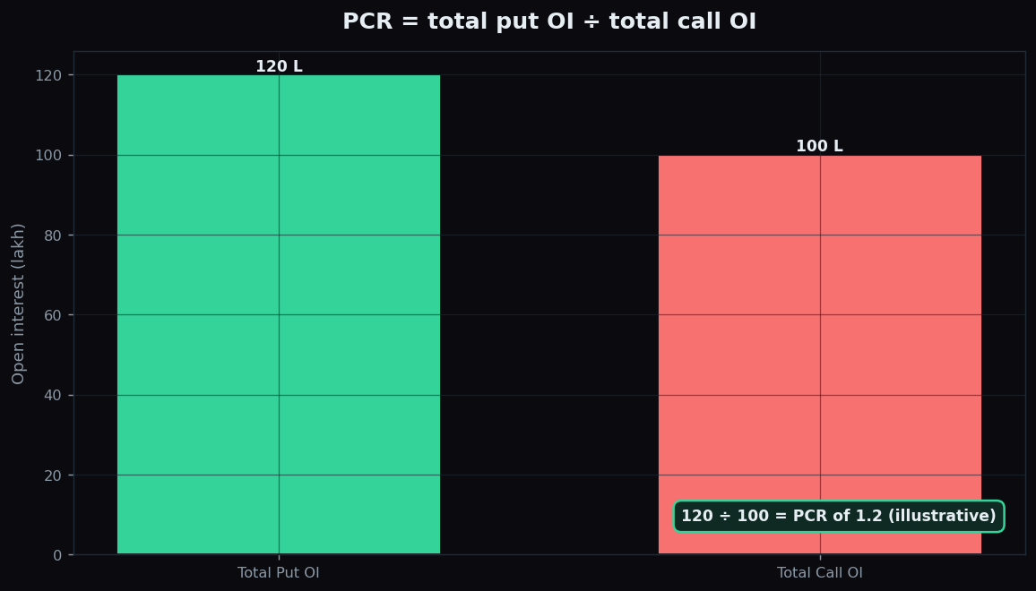
Put-Call Ratio (PCR) Explained: Sentiment and Its Limits
PCR = total put OI divided by call OI. Learn the calculation, the contrarian sentiment reading, and the caveats that make it unreliable as a signal.
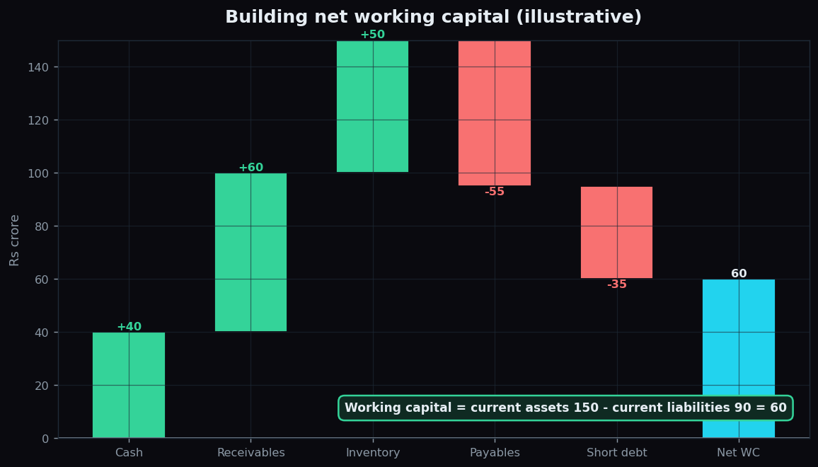
Working Capital Explained: The Cash a Business Runs On
Working capital is the short-term cushion that keeps a business running between paying suppliers and getting paid. A plain-English guide with a worked example.
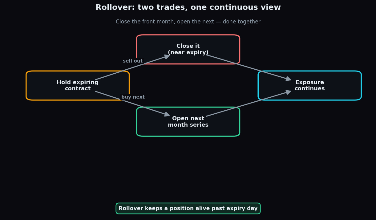
Futures Rollover Explained: Carrying a Position
Rollover closes an expiring futures contract and opens the next series. Learn the rollover percentage, roll cost, and what the data really tells you.
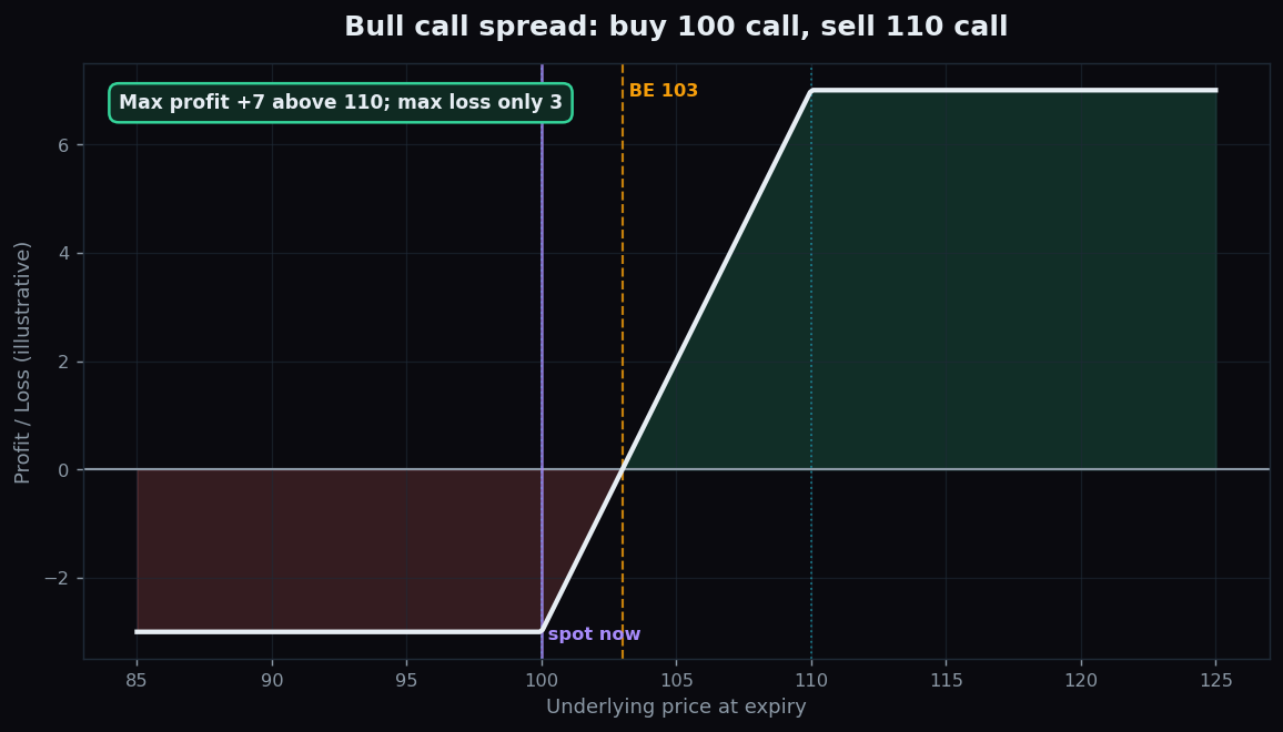
The Bull Call Spread Explained (Illustrative Example)
An illustrative, beginner-friendly guide to the bull call spread: buy a lower call, sell a higher call, for defined risk and defined reward — with the honest catch.
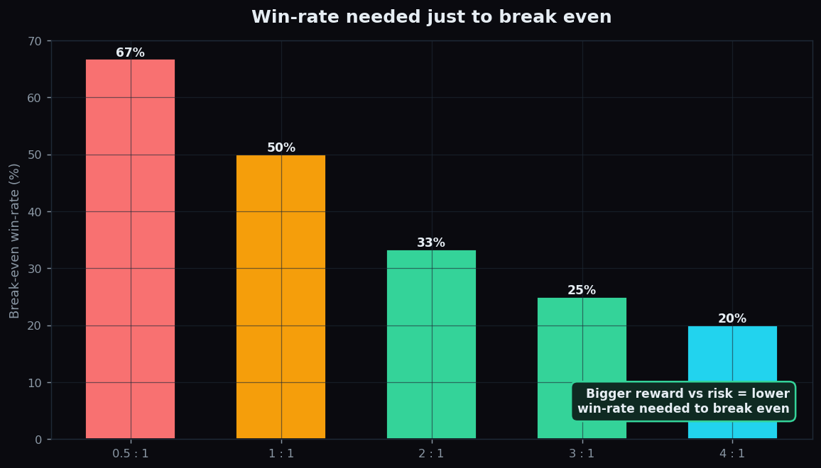
The Risk-Reward Ratio Explained for Beginners
What the risk-reward ratio means, why it decides whether a strategy survives, and the break-even win-rate behind every trade idea (illustrative).
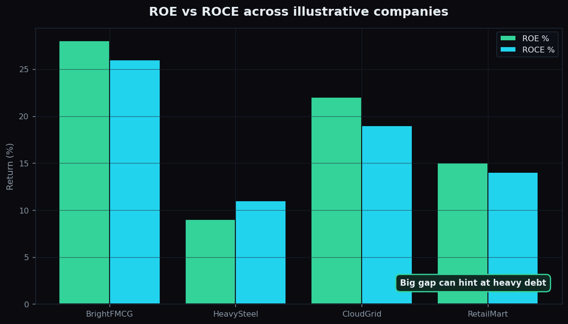
ROE and ROCE Explained: Reading Business Quality
Return on Equity versus Return on Capital Employed: what each measures, how they differ, and what a gap between them signals about a company's quality.
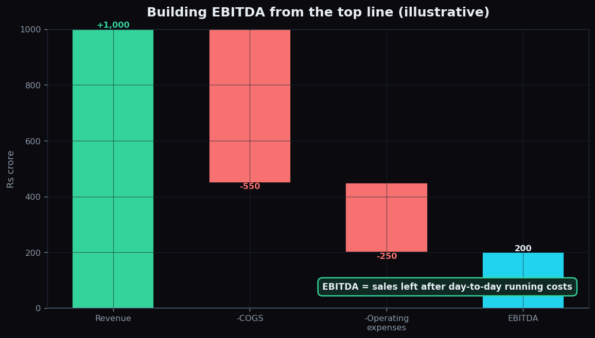
EBITDA Explained Simply: Uses, Limits and Abuses
EBITDA in plain English: what earnings before interest, tax, depreciation and amortisation really measures, and the real costs it quietly leaves out.
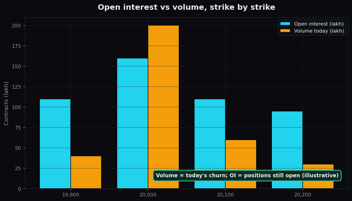
Open Interest vs Volume: What's the Real Difference?
Volume counts contracts traded today; open interest counts contracts still open. See how each changes on a trade, with a simple worked example.
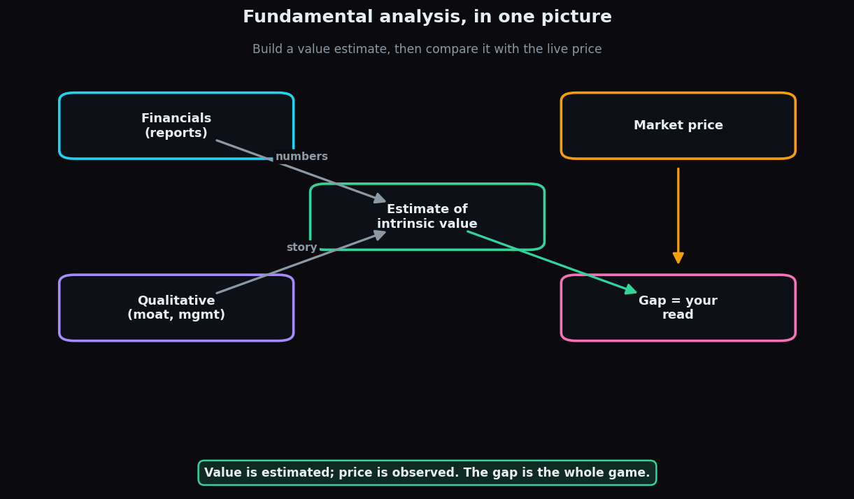
What Is Fundamental Analysis? A Complete Beginner's Guide
Fundamental analysis estimates what a business is truly worth. Learn intrinsic value, quantitative vs qualitative, and top-down vs bottom-up.
Margin and Leverage Explained for Beginners
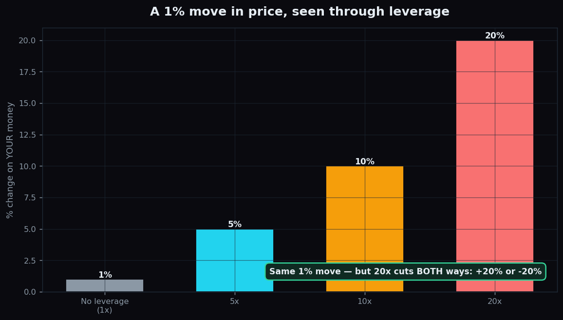
Leverage magnifies gains AND losses. Learn how margin, leverage ratios, and margin calls really work, with a simple worked example.
The Protective Put Explained (Illustrative Example)
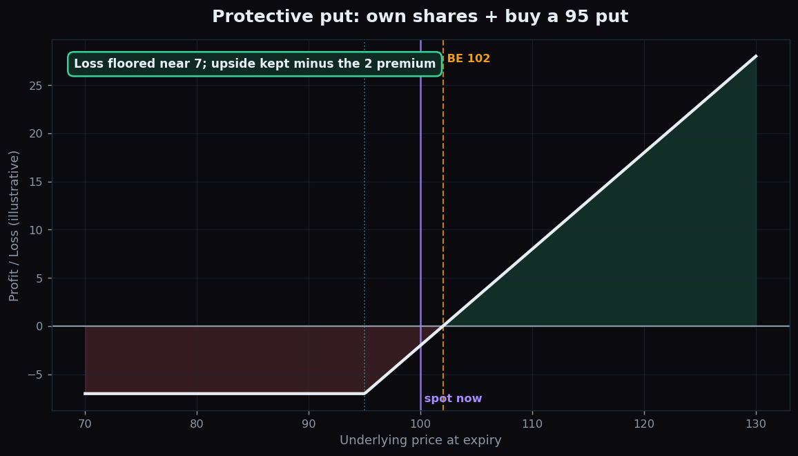
An illustrative, beginner-friendly guide to the protective put: own shares, buy a put as insurance, floor your loss, keep your upside — with the honest cost.
The Price-to-Book (P/B) Ratio Explained for Beginners
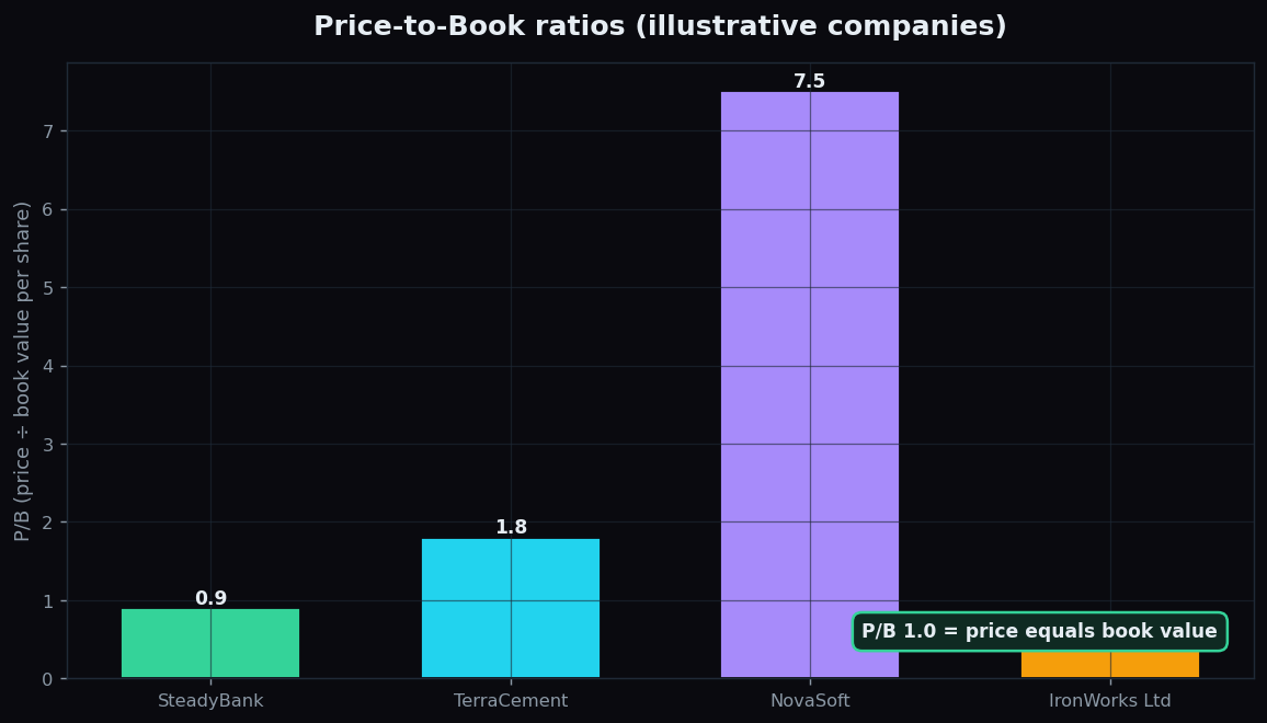
What the P/B ratio is, how price compares to book value per share, where it fits in fundamental analysis, and the limits every beginner should know.
How to Read an Option Chain: A Simple Beginner's Guide
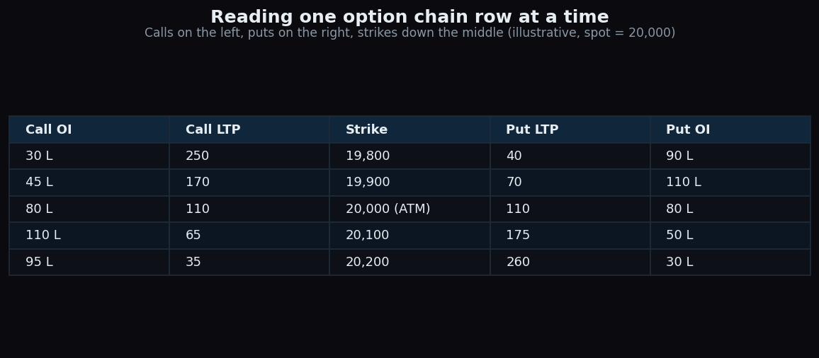
An option chain is just a price list of strikes for one expiry. Learn the call, put, strike, LTP and OI columns and how to read a single row.
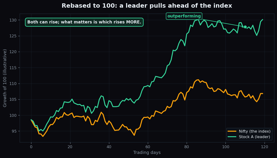
Relative Strength: A Stock vs the Index Explained
Relative strength measures a stock against the index, not against zero. How the RS line reveals leaders and laggards, and why it is not the RSI.
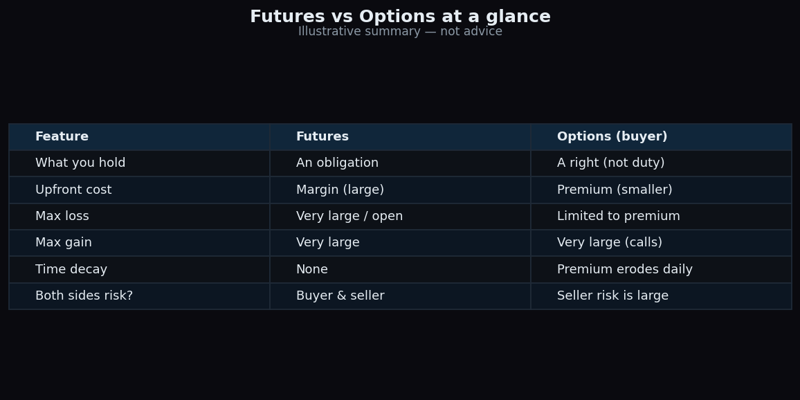
Futures vs Options: The Key Differences Explained
Futures are an obligation with symmetric risk; options are a right with capped buyer loss. A plain-English, illustrative comparison for beginners.
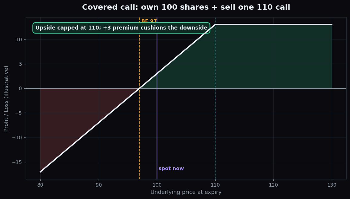
The Covered Call Explained (Illustrative Example)
A beginner-friendly, illustrative walk-through of the covered call: own shares, sell a call, collect premium, and accept a capped upside — with the honest catch.
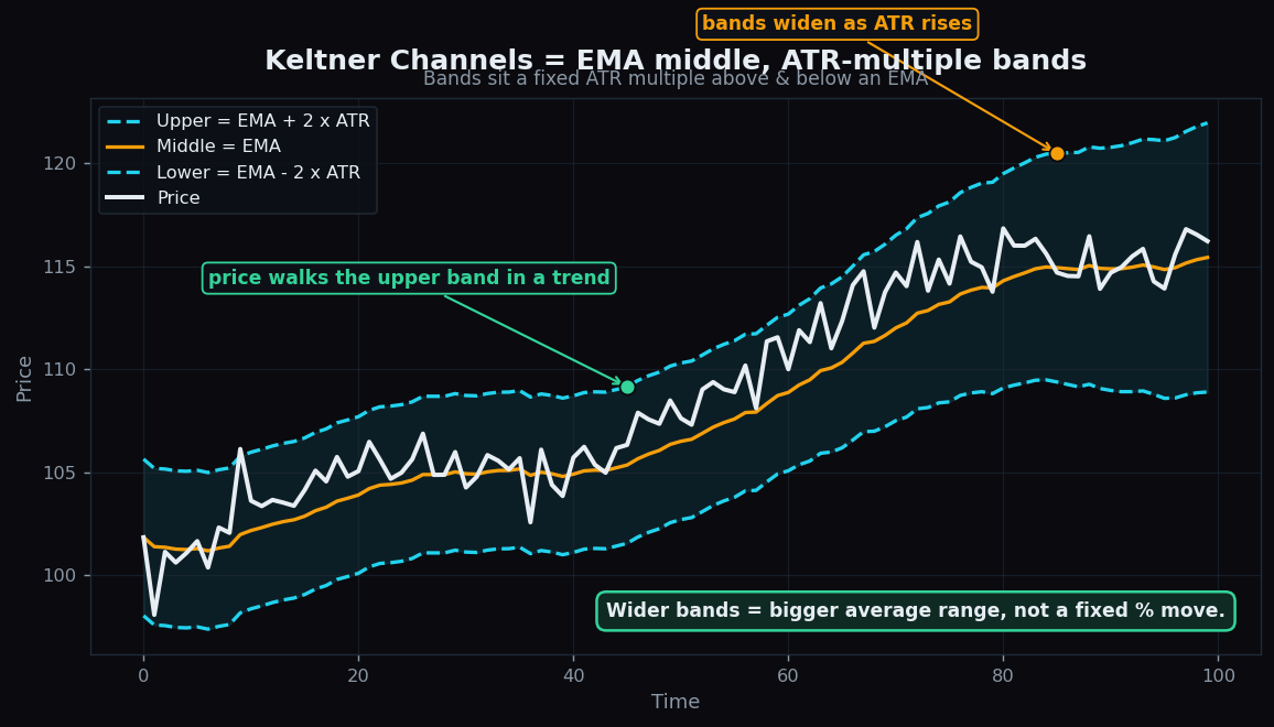
Keltner Channels Explained (vs Bollinger Bands)
Keltner Channels use an EMA middle line with ATR-multiple bands. How they work, a worked example, and how they differ from Bollinger Bands.
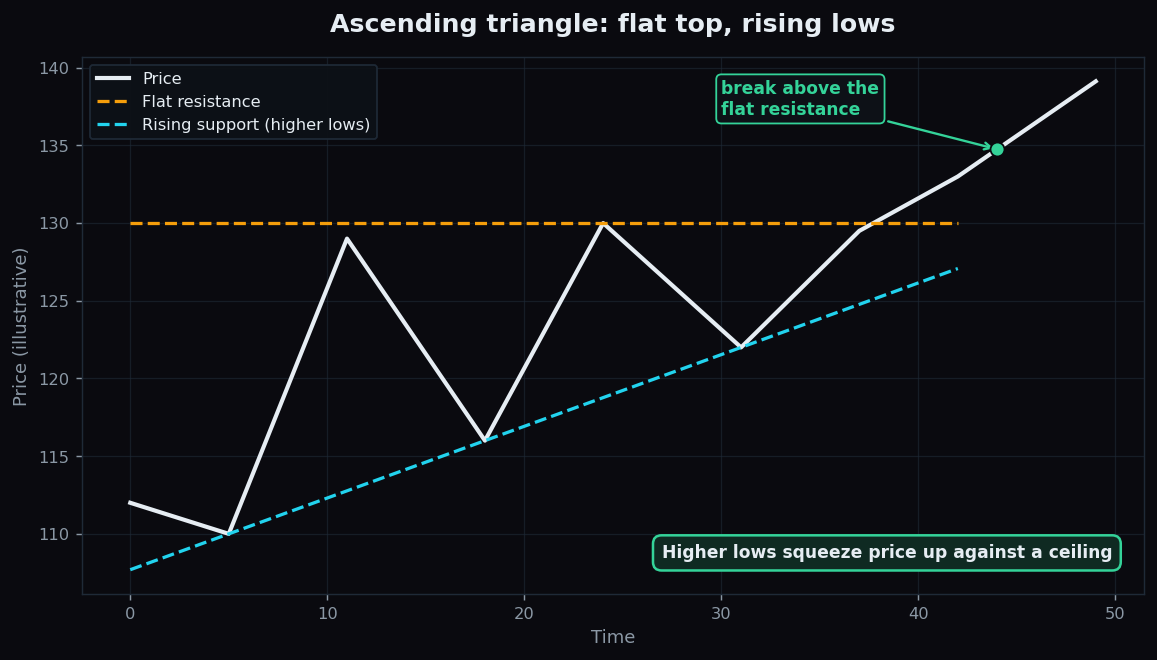
Triangle Chart Patterns: Ascending, Descending, Symmetrical
Triangles are coiling consolidation patterns. Learn ascending, descending and symmetrical types, the breakout idea, a worked example, and the fakeout catch.
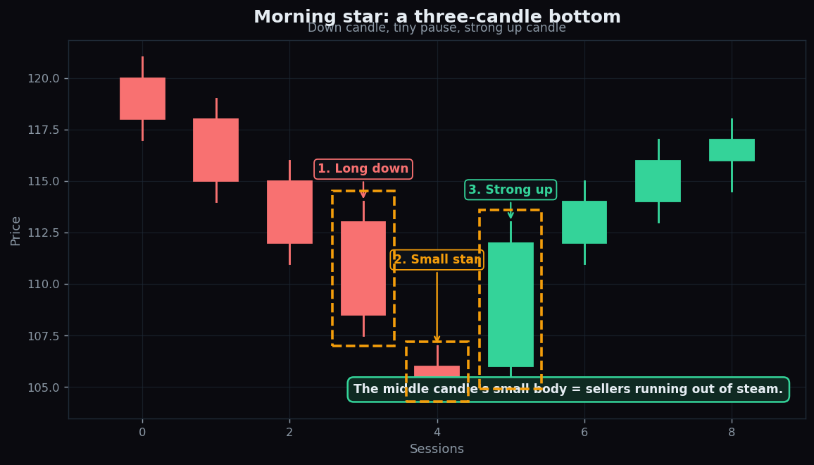
Morning Star and Evening Star Candlestick Patterns
The morning star and evening star are three-candle reversal patterns at bottoms and tops. How to read the small middle candle, with a worked example.
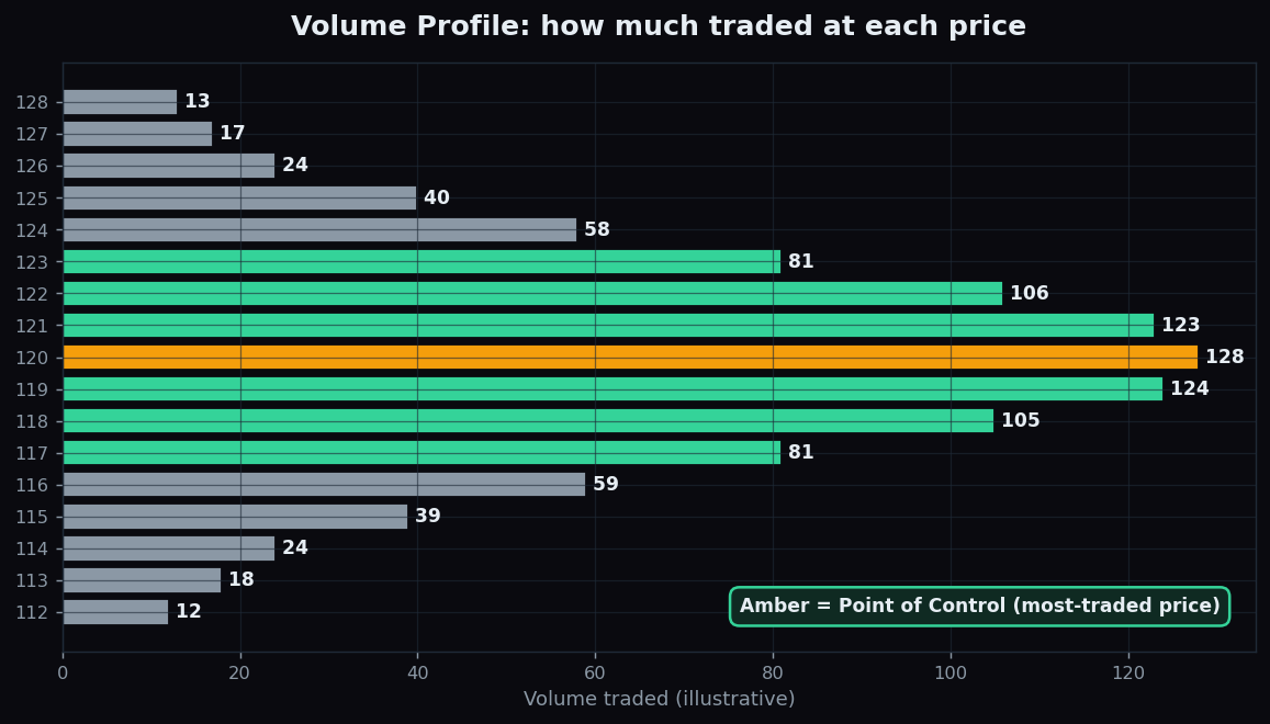
Volume Profile Explained: Volume by Price
Volume Profile shows how much traded at each price, not over time. Learn the Point of Control, value area, a worked example, and its honest limits.
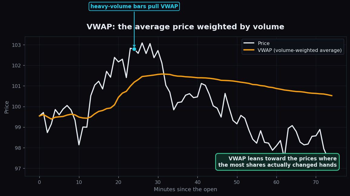
VWAP Explained: Volume Weighted Average Price
A beginner guide to VWAP: what volume weighted average price is, how it is calculated, why institutions benchmark against it, and where it falls short.
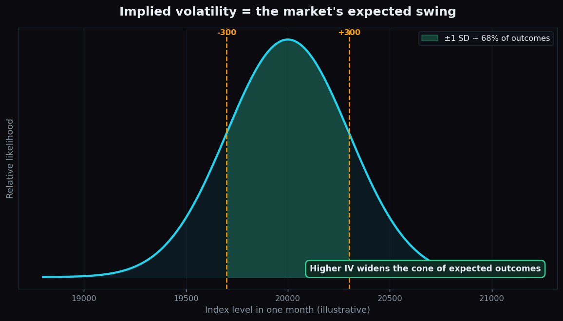
Implied Volatility Explained for Beginners: IV vs Realised
Implied volatility is the market's expected swing baked into option prices. Learn IV vs realised volatility and how IV becomes an expected move, in plain English.
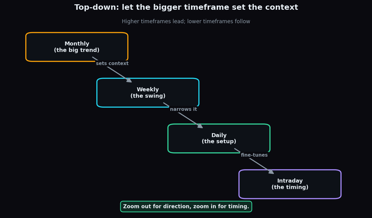
Multi-Timeframe Analysis Explained for Beginners
Reading the same market across monthly, weekly, daily and intraday lenses. How top-down timeframe alignment works, with a simple worked example.
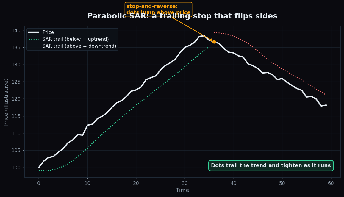
Parabolic SAR Explained: The Trailing Dots
Parabolic SAR plots trailing dots that stop and reverse when a trend ends. Learn how its acceleration works, a worked example, and why ranges break it.
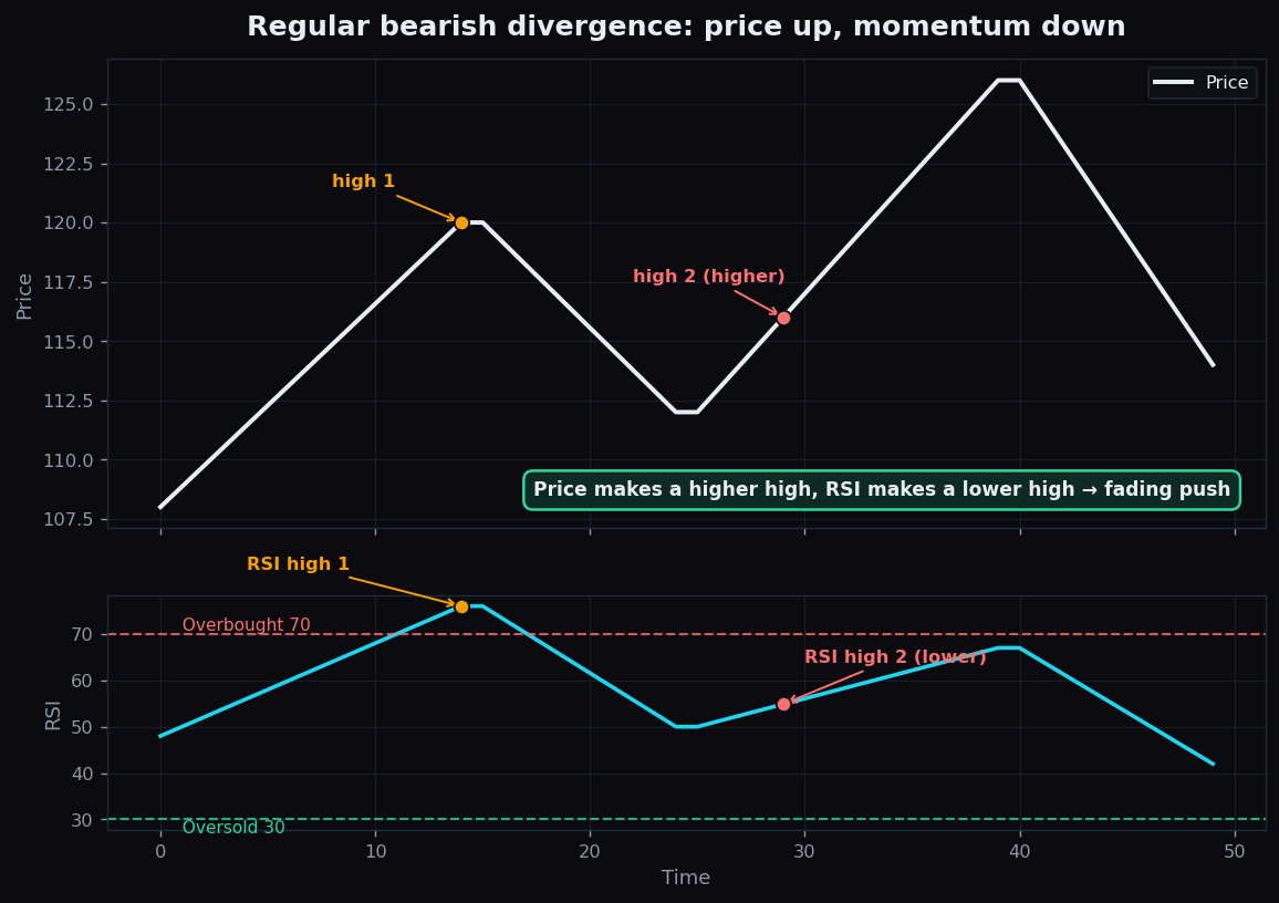
Divergence: When Price and Momentum Disagree
Divergence is when price and a momentum oscillator like RSI disagree. Learn regular vs hidden divergence and why it hints a trend may be tiring.
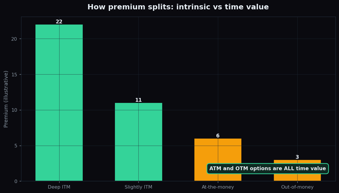
Intrinsic Value and Time Value of Options Explained
Every option premium splits into intrinsic value and time value. Learn to calculate each, why out-of-money options are all time value, and how time decay works.
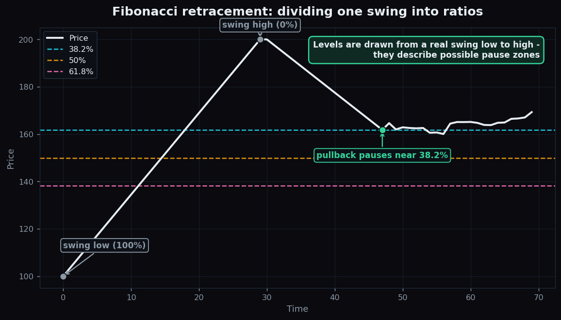
Fibonacci Retracement Explained Simply
A plain-English guide to Fibonacci retracement: where the 38.2, 50 and 61.8 percent levels come from, how to draw them, and the self-fulfilling caveat.
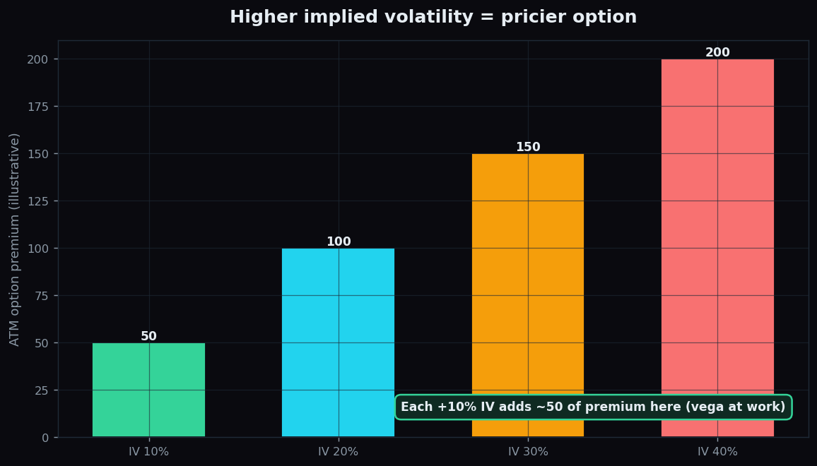
Option Vega: Sensitivity to Volatility, Explained Simply
Vega is an option's sensitivity to the volatility weather: how a change in implied volatility moves the premium. A plain-English beginner guide with a worked example.
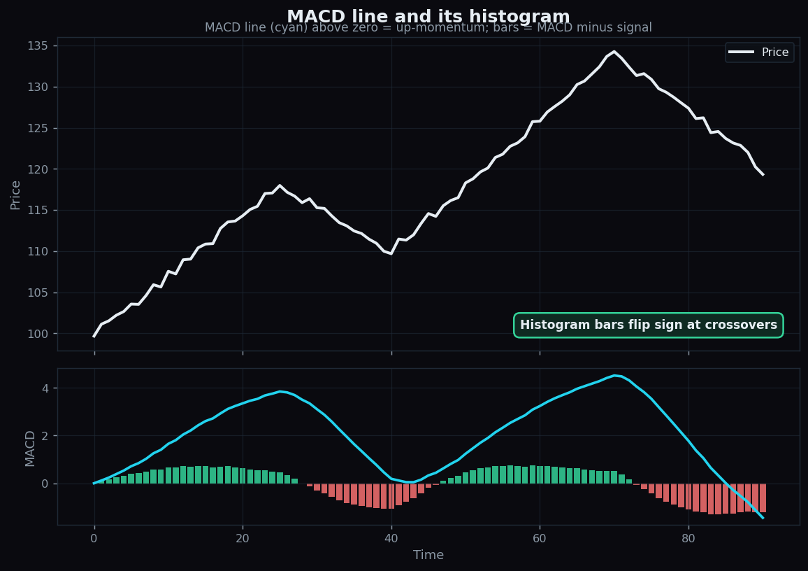
MACD Explained: The Convergence-Divergence Indicator
MACD made simple: the MACD line, signal line, histogram, the crossovers traders watch, a worked example, and the double lag and whipsaw that limit it.
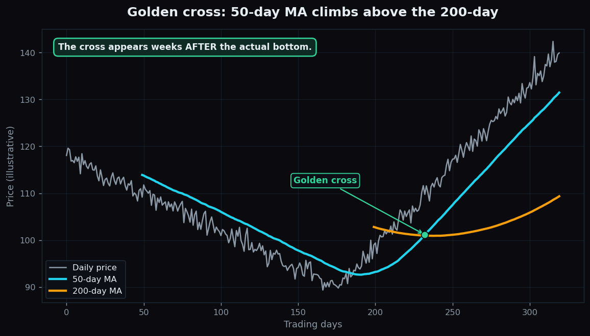
Golden Cross and Death Cross Explained for Beginners
A golden cross is the 50-day moving average crossing above the 200-day; a death cross is the reverse. Here is what they mean, with charts and the catch.
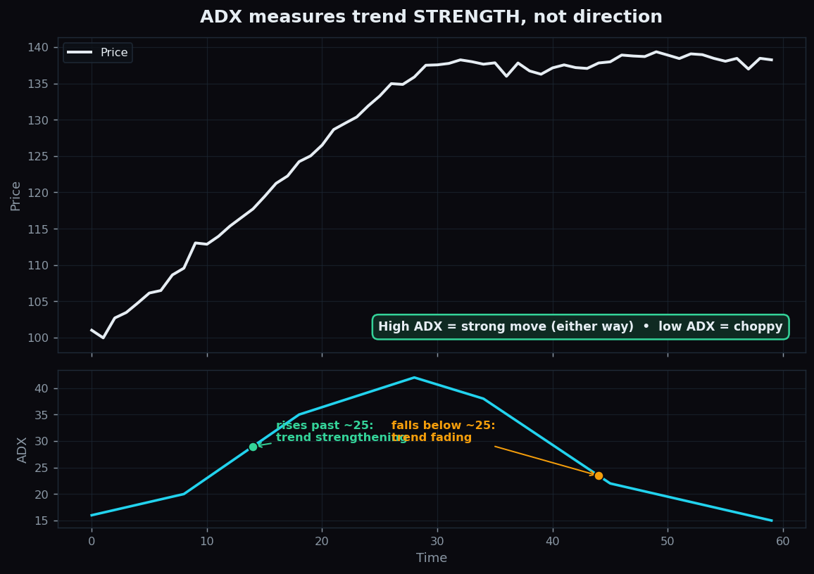
ADX Explained: How to Measure Trend Strength
The ADX measures how strong a trend is on a 0 to 100 scale, not its direction. Learn how +DI and minus DI add direction, with a simple worked example.
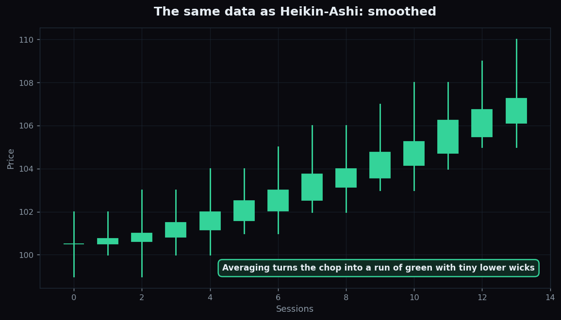
Heikin-Ashi Candles Explained for Beginners
Heikin-Ashi candles smooth normal candlesticks with averages to make trends easier to see. Learn how they differ and the lag tradeoff they carry.
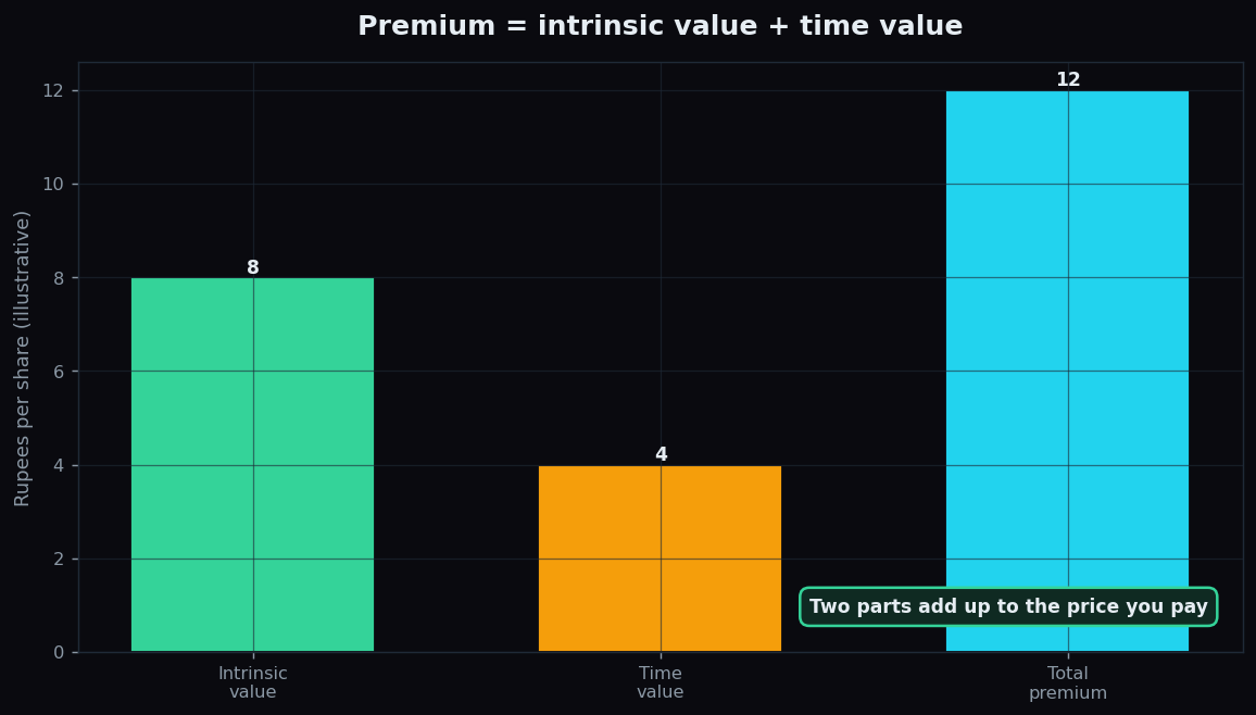
Option Premium: What You Pay and Why It Moves
An option premium splits into intrinsic value plus time value. Learn what each part means, what drives premiums, and why time value decays.
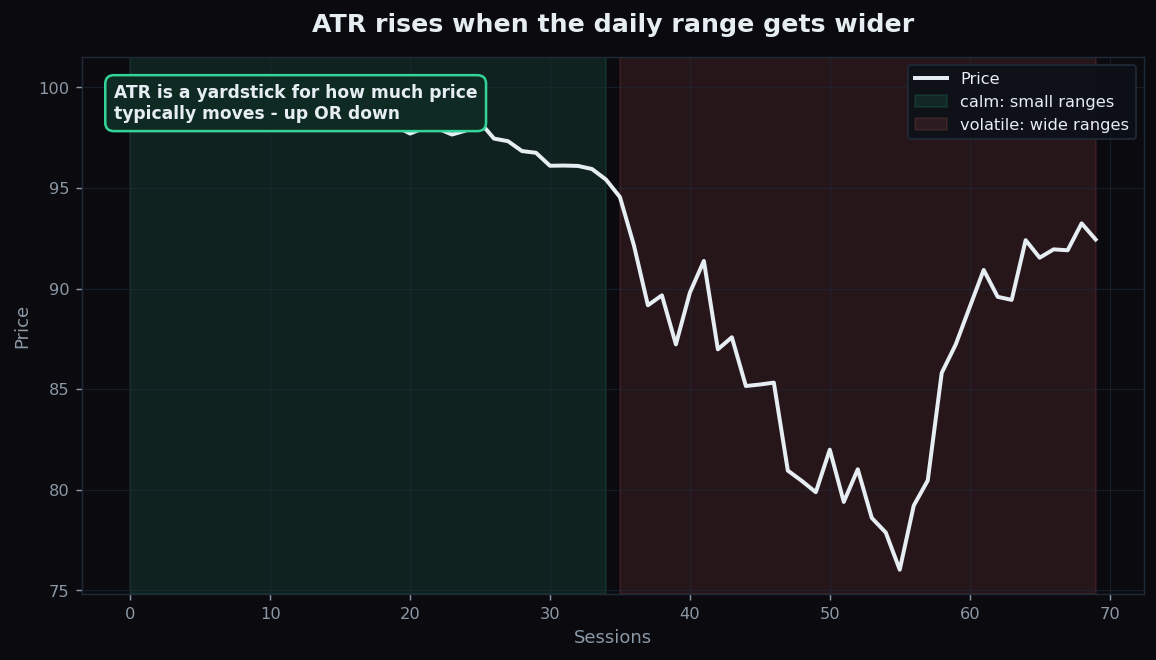
ATR Explained: Measuring Market Volatility
A beginner guide to ATR: what True Range is, how ATR measures typical movement, an illustrative stop-distance example, and its honest limits.
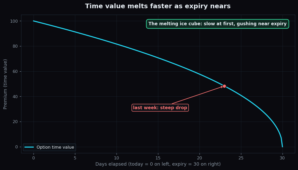
Option Theta: Time Decay Explained for Beginners
Theta is the melting ice cube of options: how much premium bleeds away each day. Learn why time decay accelerates near expiry, with a clear worked example.