Head and Shoulders Pattern Explained
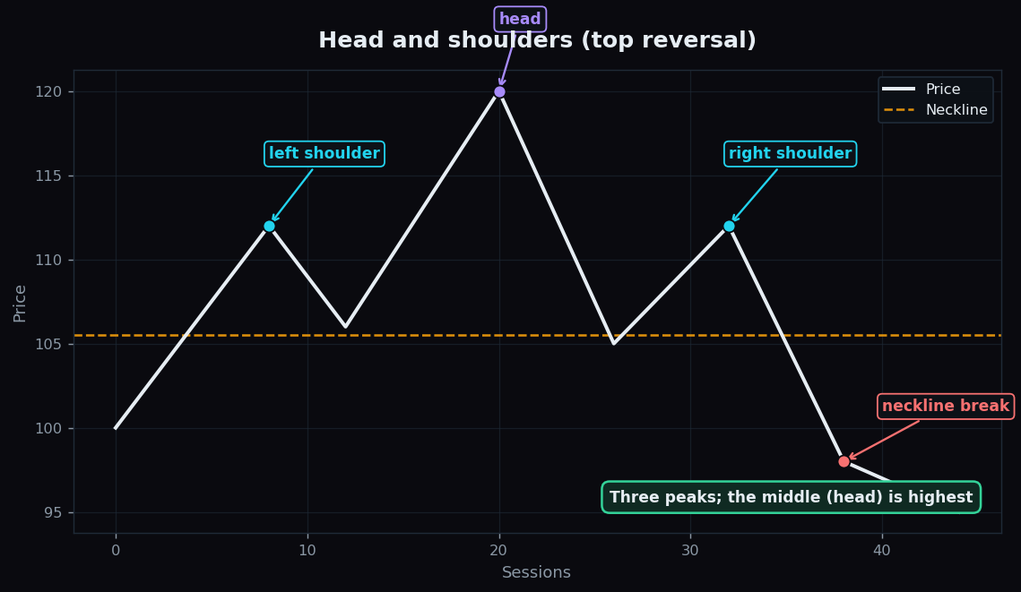
Of all the chart patterns, none has a more memorable name than the head and shoulders. It is three bumps in a row — a tall one in the middle flanked by two shorter ones — and for over a century chart-readers have treated it as a classic warning that an uptrend may be running out of steam. This post breaks down what it is, the all-important neckline, and why its famous reputation deserves a healthy dose of scepticism.
Everything here is educational. We are describing what the shape is and what it can and cannot tell you — not suggesting any action.
What the pattern looks like
Picture a price that has been climbing, then carves out three peaks:
- A left shoulder — price rises to a peak, then pulls back.
- A head — price rises again to a higher peak, then pulls back to roughly where it did before.
- A right shoulder — price rises a third time but stalls lower than the head, near the height of the left shoulder, then falls.
The everyday analogy: imagine someone trying to jump higher each attempt. The first jump clears a decent height (left shoulder). The second jump is their personal best (head). The third jump falls short of the second — the legs are tiring. That fading third effort is what the pattern is really capturing: buyers tried for a new high and could not get there.
The neckline is the key
Connect the two troughs — the pullback lows between the peaks — with a line. That is the neckline. It acts like a floor under the whole structure. The pattern is considered “complete” only when price closes below the neckline after the right shoulder. Until that break happens, you just have three wiggles that might turn into anything.
Why does the neckline matter so much? Because it is the level buyers had been defending. Each pullback found support there. When price finally slices through it, the floor that held three times has given way — which is why chart-readers treat the neckline break as the moment the pattern “confirms,” rather than the third peak itself.
A worked example with round numbers
Suppose a stock climbs and forms:
- Left shoulder peak at 112, pulling back to a trough at 106.
- Head peak at 120, pulling back to a trough at 105.
- Right shoulder peak at 112 — matching the left shoulder, well below the head.
The two troughs sit near 105–106, so the neckline is roughly 105.5. As long as price stays above 105.5, the pattern is unconfirmed. If price later closes at, say, 98 — clearly below the neckline — the pattern has completed.
Chart-readers also estimate a rough measured move: the height from the head (120) down to the neckline (105.5) is about 14.5 points. Subtracting that from the neckline gives a ballpark of around 91. This is a crude guide to how far the move might extend, not a target and certainly not a promise — price frequently falls short or overshoots.
The pattern works upside down too
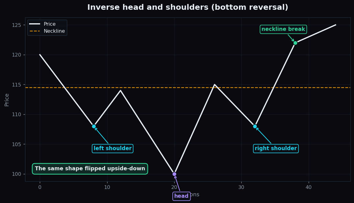
Flip everything and you get the inverse head and shoulders, which forms after a downtrend: two higher troughs around a deepest middle trough (the head), with a neckline above. It is read as a possible bottoming structure — the same logic, mirrored, where sellers tried for a fresh low and could not reach it.
How it is used in practice
Thoughtful chart-readers use the head and shoulders as a structural story, not a button:
- They wait for the neckline break before treating the pattern as complete — an unbroken neckline means nothing yet.
- They check proportion: textbook examples have roughly symmetric shoulders and a clearly higher head. Lopsided, messy shapes are far less reliable.
- They watch volume, which classically fades through the head and right shoulder and picks up on the break — a sign the move has real participation behind it.
- They combine it with the broader trend backdrop from moving averages rather than reading the pattern in isolation.
The honest catch on reliability
Here is the part most pattern tutorials skip. The head and shoulders is famous, which is exactly why you should be careful with it:
- It is identified in hindsight. The shape only becomes obvious after the right shoulder and the break. Mid-formation, countless patterns look like a developing head and shoulders and then simply do not finish.
- False breaks are routine. Price often dips below the neckline, sucks everyone in, then climbs right back — the dreaded fakeout.
- Pattern-spotting is subjective. Show ten people the same chart and they will draw ten slightly different necklines. That fuzziness is real.
- Reputation invites bias. Because so many people know this pattern, it is easy to “see” one that is not really there — a textbook case of finding shapes in clouds.
None of this makes the pattern useless. It makes it a descriptive framework for spotting a possible loss of momentum — one input among many, to be confirmed and questioned, never obeyed.
The honest lesson behind every chart pattern is the same: a clean shape is not a guarantee. TrueTrend keeps that discipline visible — our public scoreboard shows how signals actually held up, hits and misses alike. Start free to learn the patterns with that reality check built in.
Key takeaways
- A head and shoulders is three peaks — a higher middle head between two lower shoulders — read as a possible top reversal.
- The neckline, drawn across the two troughs, is the key level; the pattern only “confirms” on a close below it (or above it, for the inverse version).
- The measured move (head-to-neckline height projected past the neckline) is a rough guide, never a target or a promise.
- The pattern is spotted in hindsight, suffers false breaks, and is subjective to draw — its fame makes over-spotting easy.
- Treat it as one descriptive clue confirmed with volume, proportion, and the wider trend, not a standalone signal.
See these concepts on live market data — free
Create a free TrueTrend account to watch daily support/resistance levels, market regime, and option-positioning charts on NIFTY, BankNifty and 12 more instruments. Every level we publish is scored on a public scoreboard — misses included. No card required.
Free forever tier · daily levels with published hit-rates across every instrument. Descriptive market structure, not investment advice.
Not ready for an account? Get the daily levels by email.
One short email each market day — the indices' call wall, put wall, gamma flip and max pain, and how the last session's levels scored. Free, no account, unsubscribe anytime.
Descriptive market structure, not investment advice. We never share your email.