Bollinger Bands Explained in Full Detail
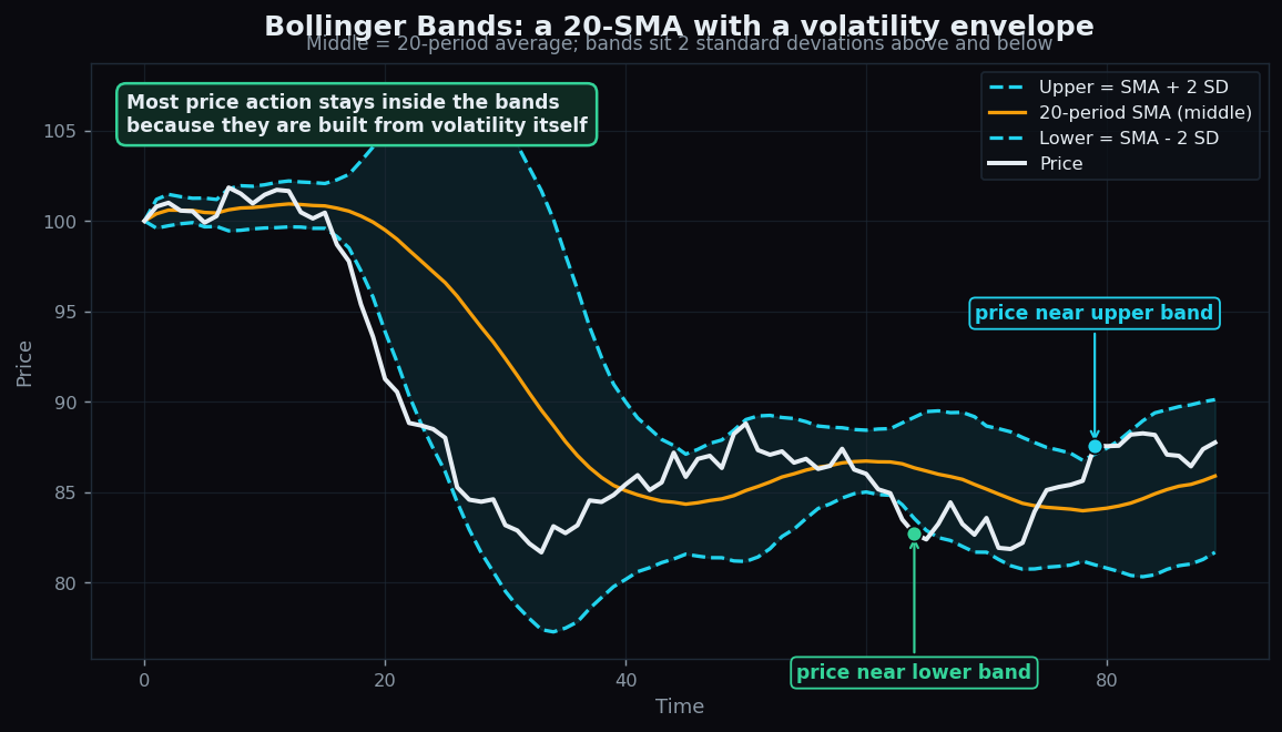
Squeeze a chart between two wavy lines and suddenly the noise has a frame. That frame is the Bollinger Band — one of the most recognised tools in technical analysis, built by John Bollinger in the 1980s. It wraps price in an envelope that automatically widens when markets get wild and pinches in when they go quiet. This guide explains exactly how the bands are built, what the famous “squeeze” and “walking the band” really mean, and where the tool quietly misleads people.
We will use only round, made-up numbers so the mechanics are crystal clear. Nothing here is a recommendation — it is an explanation of market structure so you can read a chart with more confidence.
What Bollinger Bands actually are
A Bollinger Band has three lines. The middle one is a plain moving average — the average closing price over the last N periods, usually 20. If you are new to that idea, our guide to moving averages covers it from scratch. The two outer lines sit a fixed number of standard deviations above and below that average — by default two.
What is a standard deviation? It is a measure of how spread out a set of numbers is. If recent prices barely move, the standard deviation is small; if they swing about, it is large. So the outer bands are not drawn at a fixed distance — they breathe with the market. The full recipe is:
- Middle band = 20-period simple moving average (SMA).
- Upper band = middle band + (2 × standard deviation of the last 20 closes).
- Lower band = middle band − (2 × standard deviation of the last 20 closes).
Think of the bands as a dog on an elastic leash. The owner walking down the street is the moving average — the steady centre. The dog is price, darting left and right. The leash is the band: when the dog is calm it stays short, but when the dog lunges the leash stretches to allow it. The leash rarely snaps, which is why price spends most of its time inside the bands.
Why the ±2 standard deviation choice matters
For data that follows a typical bell-shaped spread, roughly 95% of observations fall within two standard deviations of the average. Bollinger borrowed that statistic. So by design, the great majority of price action is expected to stay between the bands, and only the rare, stretched moves poke outside. Real markets are not perfectly bell-shaped — they have fatter tails, meaning extreme moves happen more often than the textbook says — but the intuition holds: touching a band means price is statistically far from its recent average, not that it must turn around.
This is the single biggest reason the tool is useful: it turns the vague idea of “price looks stretched” into something measured. A touch of the upper band literally means price is about two standard deviations above its 20-period average right now.
A worked example with round numbers
Suppose a stock’s last 20 closes average exactly ₹500, and the standard deviation of those closes works out to ₹10. Then:
- Middle band = ₹500.
- Upper band = 500 + (2 × 10) = ₹520.
- Lower band = 500 − (2 × 10) = ₹480.
The bands are ₹40 wide. Now imagine the market calms down and the standard deviation falls to ₹4. The average might still be ₹500, but the bands tighten to ₹508 and ₹492 — only ₹16 wide. Price did not have to move for the bands to change shape; volatility changed, and the envelope responded. That breathing motion is the whole point.
The squeeze: when the bands pinch together
A squeeze is simply a stretch where the bands narrow sharply because the standard deviation has collapsed — the market has gone quiet. Quiet markets tend not to stay quiet forever. Energy builds up; eventually a catalyst arrives and price expands again, flinging the bands apart. Traders watch the squeeze because it flags a shift from low volatility, which often comes before a larger directional move.
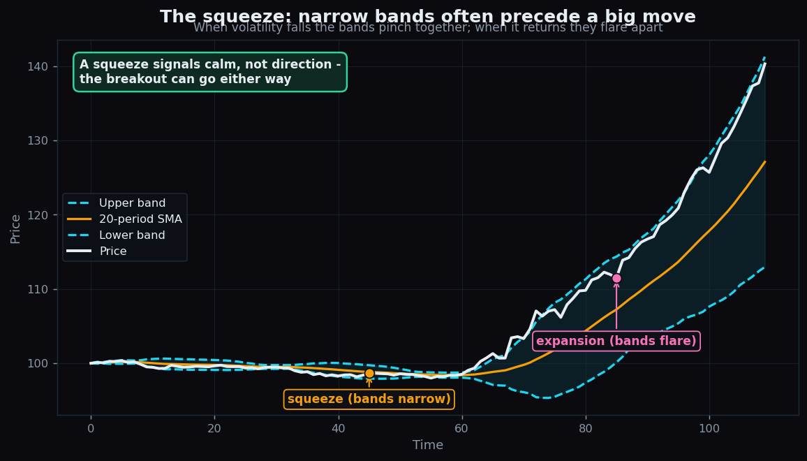
Here is the honest catch, and it is important: a squeeze tells you a move may be coming, not which way it will go. The bands are symmetrical — they say nothing about direction. A coiled spring can release up or down. People who treat a squeeze as a directional arrow are reading something into it that is not there.
Walking the band: strength, not a ceiling
The most common beginner mistake is to assume that price touching the upper band is “too high” and must fall, or that a touch of the lower band is “too cheap” and must bounce. In a strong trend, exactly the opposite often happens: price walks the band, hugging the upper line for many bars in a row as it climbs (or riding the lower line as it falls).
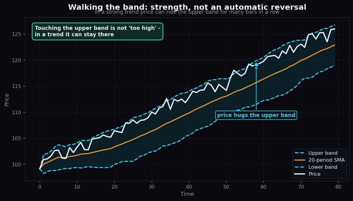
Why does this happen? Because a powerful trend keeps pushing price two standard deviations above its own average, again and again. The band is not a wall; it is a moving measurement. So a band touch by itself is ambiguous — it can mark exhaustion or confirm strength. That is why most chartists never read a band touch in isolation; they combine it with the trend, volume, and other context.
Two helper readings: %B and Bandwidth
Bollinger added two companion numbers that put the same information on a clean scale.
- %B tells you where price sits relative to the bands. It reads 1.0 at the upper band, 0.0 at the lower band, and 0.5 at the middle. Above 1.0 means price has poked above the upper band; below 0.0 means it has dropped under the lower band. It converts “how stretched is price?” into one tidy figure.
- Bandwidth measures how wide the bands are, as a fraction of the middle band. A very low Bandwidth is the numerical fingerprint of a squeeze; a rising Bandwidth shows volatility expanding. It lets you spot a squeeze without eyeballing the chart.
Quick example: if the upper band is ₹520, the lower band is ₹480, and price is ₹512, then %B = (512 − 480) ÷ (520 − 480) = 32 ÷ 40 = 0.8 — price is 80% of the way up the channel. Bandwidth here is (520 − 480) ÷ 500 = 0.08, or 8% of the middle band.
The honest catch: limits and traps
Bollinger Bands describe volatility and position. They do not predict direction, and they fail in recognisable ways:
- They lag. Both the middle average and the standard deviation are built from past prices. The bands always describe where price has been, not where it is going.
- Band touches are not signals on their own. In a range they may coincide with turns; in a trend they coincide with continuation. The same event means opposite things in different regimes.
- The settings are conventions, not laws. 20 periods and 2 standard deviations are popular defaults, but they are arbitrary. Change them and every “signal” changes too — which is a reminder that the bands are a lens, not an oracle.
- Fat tails. Markets produce more extreme moves than the bell-curve maths assumes, so “rare” band-piercing happens more than 5% of the time, especially around news.
Used well, the bands are a context tool: they frame whether price is calm or volatile and whether it is stretched or central. That framing is genuinely valuable. Treated as a buy-and-sell machine, they disappoint — because that was never what they measure.
Want to see how a volatility frame like this behaves day after day, on real instruments, with the outcomes tracked honestly? TrueTrend publishes a transparent, openly-scored view of how its market readings hold up over time — explore the TrueTrend scoreboard or create a free account to follow along.
Key takeaways
- Bollinger Bands = a 20-period SMA (middle) with bands set two standard deviations above and below. They widen with volatility and narrow when markets calm.
- By design, most price action stays inside the bands; a band touch means price is statistically far from its recent average — not that it must reverse.
- A squeeze (very narrow bands) flags a shift out of low volatility and often precedes a bigger move, but says nothing about direction.
- Walking the band shows trend strength: in a strong move price can ride a band for many bars without turning.
- %B places price on a 0-to-1 scale within the bands; Bandwidth measures how wide they are and pinpoints squeezes.
- The bands lag, rely on arbitrary settings, and assume tidier maths than markets obey — they are a context tool, not a prediction engine.
See these concepts on live market data — free
Create a free TrueTrend account to watch daily support/resistance levels, market regime, and option-positioning charts on NIFTY, BankNifty and 12 more instruments. Every level we publish is scored on a public scoreboard — misses included. No card required.
Free forever tier · daily levels with published hit-rates across every instrument. Descriptive market structure, not investment advice.
Not ready for an account? Get the daily levels by email.
One short email each market day — the indices' call wall, put wall, gamma flip and max pain, and how the last session's levels scored. Free, no account, unsubscribe anytime.
Descriptive market structure, not investment advice. We never share your email.