The Engulfing Candlestick Pattern Explained
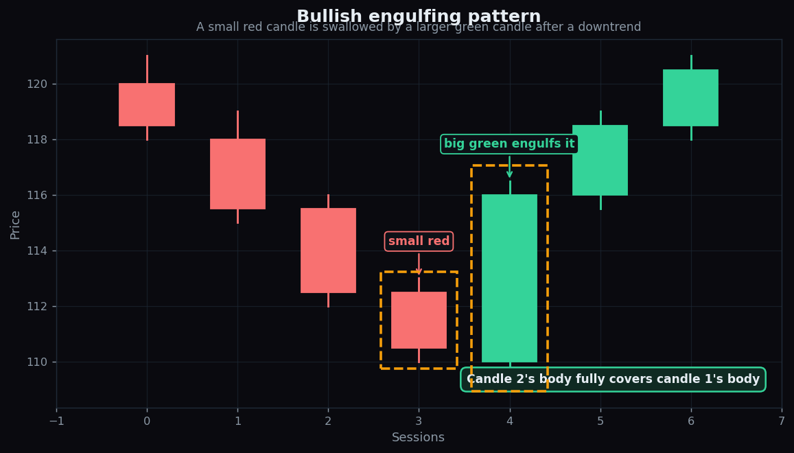
Open a candlestick chart and most candles blur together. Then occasionally two candles stand out: a small one, followed by a big one that completely swallows it. That pair is an engulfing pattern — one of the first reversal signals new chart-readers learn, because the picture is so blunt that you can spot it from across the room.
This post explains what bullish and bearish engulfing patterns actually are, why the size of the second candle is the entire point, how traders read them for context, and where they quietly fail. As always, this is education, not a recommendation to act.
First, a quick candle refresher
A candlestick sums up one time period — a day, an hour, five minutes — into four prices: the open (where it started), the close (where it ended), the high, and the low. The fat part between open and close is the body. The thin lines poking out are the wicks (or shadows), marking the extremes.
- A green (bullish) candle closes higher than it opened — buyers won the period.
- A red (bearish) candle closes lower than it opened — sellers won.
The body length tells you how decisively one side won. A long body is a landslide; a stubby body is a near tie.
What an engulfing pattern is
An engulfing pattern is just two candles where the second body completely covers the first body. Picture a tug-of-war: for several rounds one team inches the rope their way, then suddenly the other team yanks it all the way back past the centre line in a single heave. The big second candle is that yank.
Bullish engulfing
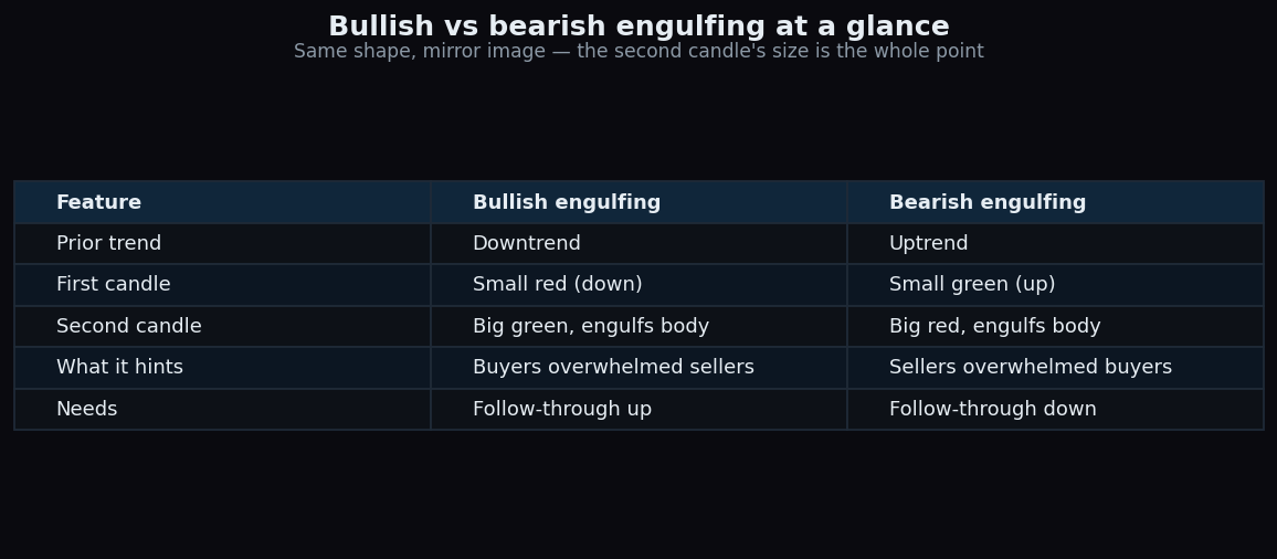
This appears after a downtrend. You get a small red candle (sellers still nudging price down), then a large green candle whose body opens at or below the previous close and closes at or above the previous open — fully wrapping the little red body. The story: sellers had control, then buyers showed up in force and erased a whole session of selling in one go.
Bearish engulfing
The mirror image, after an uptrend. A small green candle is followed by a large red candle that swallows it. Buyers were drifting price up, then sellers slammed it back down decisively.
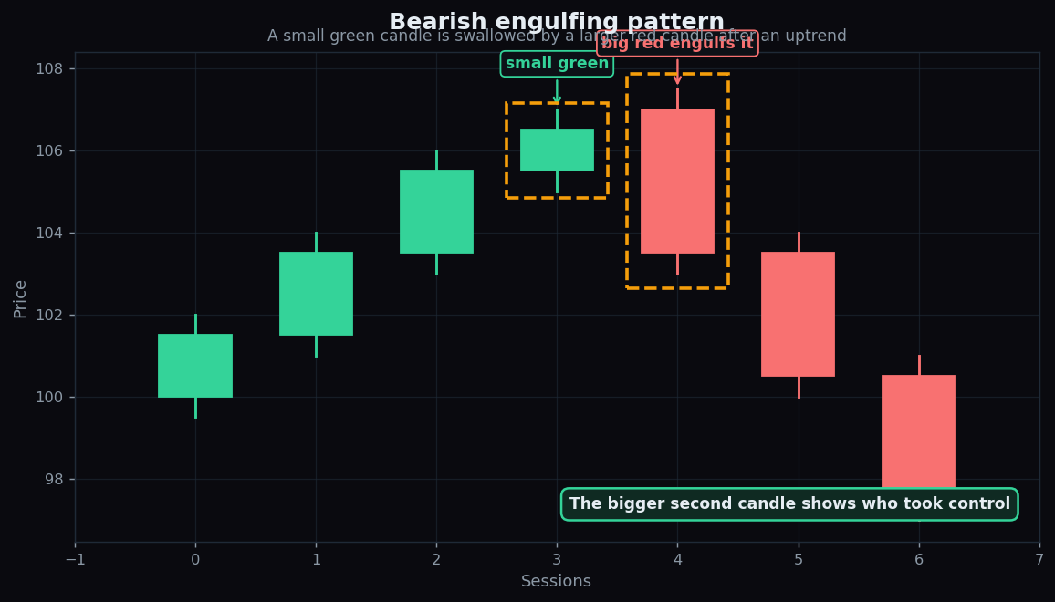
The two are structurally identical — same shape, flipped. The table below lines them up side by side.
Why the second candle's size matters so much
Engulfing is not about colour alone — it is about who reversed how hard. A green candle after a red one is ordinary. A green candle that single-handedly undoes the previous candle and then some is a bigger statement, because more buying pressure was needed to cover that range. The larger the engulfing body relative to what it swallows, the louder the message.
Volume often gets read alongside it. A big engulfing candle on heavy volume suggests genuine participation; the same shape on thin, sleepy volume is easier to dismiss. The pattern is a measure of conviction, and conviction is what the body size is trying to capture.
A worked example with round numbers
Imagine a stock drifting down for a week. Yesterday it opened at 112.50 and closed at 110.50 — a small red body spanning 2 points. Today it opens at 110.00 (below yesterday's close) and closes at 116.00. Today's green body runs from 110 to 116, a 6-point range that completely covers yesterday's 110.50–112.50 body.
That is a textbook bullish engulfing. The takeaway a chart-reader draws is not “price will rise” — it is “the short-term balance of pressure just flipped from sellers to buyers, and the flip was forceful.” Whether that flip holds is a separate question the next few candles answer.
How it is actually used
Experienced chart-readers rarely treat one engulfing candle as a verdict. They use it as a context clue layered with other information:
- Location. An engulfing at a well-tested support or resistance zone, or near a key moving average, carries more weight than one in the middle of nowhere.
- Trend. A bullish engulfing only “reverses” something if there was a downtrend to reverse. In a sideways chop, engulfing candles appear constantly and mean little.
- Confirmation. Many wait for the next candle to follow through in the same direction before they trust the signal, rather than reacting to the engulfing candle itself.
Notice the framing throughout: the pattern describes a shift in pressure. It does not issue instructions.
The honest catch
Engulfing patterns look authoritative and fail constantly. Three reasons to stay sceptical:
- False signals are common. Markets are full of big candles that engulf and then go nowhere, or reverse straight back. The pattern has no memory of what happens next.
- It is lagging. By definition you only see the engulfing candle after the move that formed it. The forceful part already happened.
- Context decides everything. The same shape that “works” at a major support level is noise inside a choppy range. Stripped of location and trend, the candle is almost meaningless.
- Timeframe matters. A dramatic engulfing on a 5-minute chart can be invisible on the daily. The pattern is only as meaningful as the timeframe you trust.
This is why one pattern is a clue, not a conclusion. Real readers combine it with trend, levels, volume, and a clear-eyed acceptance that plenty of textbook patterns simply do not pan out.
Patterns feel convincing until you see how often they miss. TrueTrend was built to keep that honesty front-and-centre — we publish how our signals actually performed on our public scoreboard, so context beats hype. Create a free account to explore the charts and learn at your own pace.
Key takeaways
- An engulfing pattern is two candles where the second body fully covers the first body.
- Bullish engulfing (small red, then big green) appears after a downtrend; bearish engulfing (small green, then big red) appears after an uptrend.
- The size of the second candle is the signal — it measures how forcefully the balance of pressure flipped.
- Read it with location, trend, and volume; an engulfing candle in a directionless market means little.
- It is lagging and produces frequent false signals — treat it as one context clue, never a standalone trigger.
See these concepts on live market data — free
Create a free TrueTrend account to watch daily support/resistance levels, market regime, and option-positioning charts on NIFTY, BankNifty and 12 more instruments. Every level we publish is scored on a public scoreboard — misses included. No card required.
Free forever tier · daily levels with published hit-rates across every instrument. Descriptive market structure, not investment advice.
Not ready for an account? Get the daily levels by email.
One short email each market day — the indices' call wall, put wall, gamma flip and max pain, and how the last session's levels scored. Free, no account, unsubscribe anytime.
Descriptive market structure, not investment advice. We never share your email.