What Are Candlestick Charts? A Beginner's Guide
Open any trading screen in India and you will see a wall of little green and red bars, each with thin lines poking out of the top and bottom. Those bars are candlesticks, and they are the most common way traders read price. Once you learn to see them, a chart stops looking like noise and starts telling a story: who was in control, how hard they fought, and where the buyers and sellers finally agreed.
What a candlestick actually is
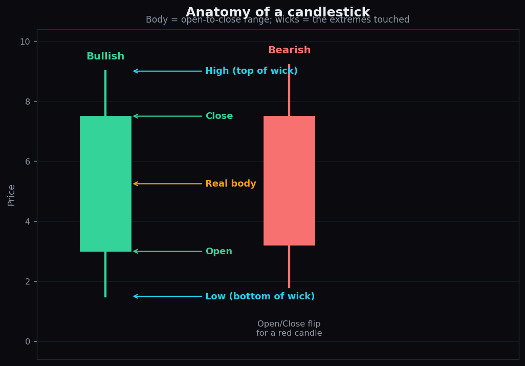
A candlestick is a single picture that packs in four prices for one slice of time. That slice can be five minutes, one hour, or a whole day — you choose. Whatever the period, the candle records four numbers, together called the OHLC:
- Open — the price at the start of the period.
- High — the highest price touched during the period.
- Low — the lowest price touched.
- Close — the price at the end of the period.
Think of one trading day like a tug-of-war match. The open is where the rope starts, the close is where it ends, and the high and low are the furthest each team managed to drag it before time ran out. The candle is just a neat way to draw the whole match in one symbol.
Body and wick: the two parts
Every candle has two parts. The thick rectangle in the middle is the real body. It stretches between the open and the close, and it shows the net result of the period. The thin lines above and below are the wicks (also called shadows or tails). They reach up to the high and down to the low — the extremes that were touched but did not stick.
A long body means the price moved a lot from open to close: one side clearly won. A tiny body means open and close finished close together: the fight was a draw. Long wicks tell you the price travelled far in a direction and then got pushed back before the period ended.
Green versus red
Colour tells you direction at a glance. The exact shades vary by platform, but the rule is the same everywhere:
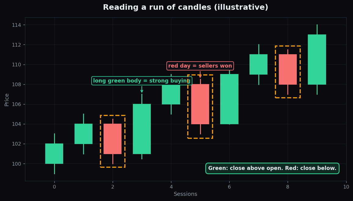
- A green (or white) candle means the close was above the open — price finished higher than it started. Buyers were in control for that period.
- A red (or black) candle means the close was below the open — price finished lower. Sellers were in control.
For a green candle, the open sits at the bottom of the body and the close at the top. For a red candle they flip: open on top, close at the bottom. That single flip is why a screen full of candles is so quick to scan.
A quick worked example
Suppose a stock opens the day at 100. During the day it climbs as high as 107, dips as low as 99, and finally closes at 106. The candle for that day is green, because 106 (close) is above 100 (open). Its body runs from 100 to 106. A short wick pokes down to 99, and a slightly longer wick reaches up to 107. In one glance you know: buyers won the day, but there was a brief attempt to push higher that did not hold.
Now imagine the next day opens at 106, runs up to 108, falls to 103, and closes at 104. That candle is red — the close (104) is below the open (106). The body sits between 104 and 106, with a wick up to 108 showing that buyers tried and failed.
Why traders prefer candles over a line chart
The simplest chart is a line chart: it joins up only the closing prices, one dot per period, into a single line. It is clean and great for seeing the broad direction. But it throws away three of the four numbers. It cannot tell you where the price opened, how high it spiked, or how deep it dipped.
Candlesticks keep all four. That extra information is the whole point. With candles you can see how a move happened, not just that it happened. Did the price drift up calmly, or did it crash and recover within the same hour? A line chart shows the same closing dot either way. Candles show the difference instantly through body size and wick length.
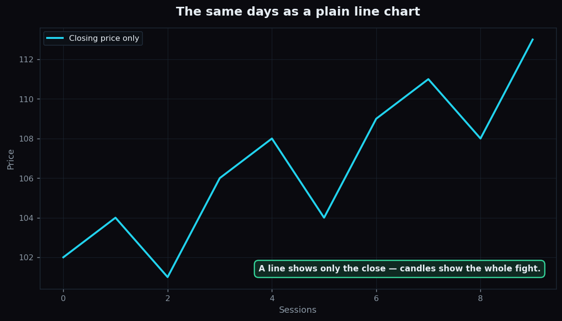
This is why patterns — recognisable candle shapes that traders study — only exist on candlestick charts. A long lower wick, a tiny body, two candles that overlap a certain way: these shapes are clues about the balance between buyers and sellers, and they simply are not visible on a line.
The honest catch
Candlesticks are a brilliant way to read what already happened. They are not a crystal ball. A green candle does not promise a green candle tomorrow. Every pattern that looks meaningful in hindsight also fails plenty of times going forward, and a single candle in isolation rarely means much.
A few honest limits to keep in mind:
- Timeframe changes everything. The same moment looks bullish on a 5-minute candle and bearish on a daily candle. Always know which period you are viewing.
- One candle is a sentence, not the story. Traders read candles in context — the trend around them, the volume, and the bigger picture — not one bar alone.
- Colour conventions differ. Check your platform's settings so you are not reading green as red.
- Patterns are probabilities, not certainties. They describe what often happened before; they do not guarantee what comes next.
If you want to go a step further, candles are also the canvas on which indicators are drawn. Our explainer on how moving averages smooth out price shows one common overlay that sits right on top of these same candles.
Once candles click, the next step is seeing whether the patterns actually hold up over hundreds of real sessions. TrueTrend publishes a transparent, data-checked level-and-signal scoreboard so you can study how often market structure behaves as expected — learning from measured evidence instead of gut feel. Create a free account to explore it.
Key takeaways
- A candlestick packs four prices — open, high, low, close — for one slice of time.
- The body shows open-to-close; the wicks show the high and low extremes.
- Green = close above open (buyers won); red = close below open (sellers won).
- Candles beat a line chart because they show how price moved, not just the closing dot.
- They describe the past clearly but predict nothing on their own — timeframe and context matter, and patterns are probabilities.
See these concepts on live market data — free
Create a free TrueTrend account to watch daily support/resistance levels, market regime, and option-positioning charts on NIFTY, BankNifty and 12 more instruments. Every level we publish is scored on a public scoreboard — misses included. No card required.
Free forever tier · daily levels with published hit-rates across every instrument. Descriptive market structure, not investment advice.
Not ready for an account? Get the daily levels by email.
One short email each market day — the indices' call wall, put wall, gamma flip and max pain, and how the last session's levels scored. Free, no account, unsubscribe anytime.
Descriptive market structure, not investment advice. We never share your email.