Flag and Pennant Patterns Explained for Beginners
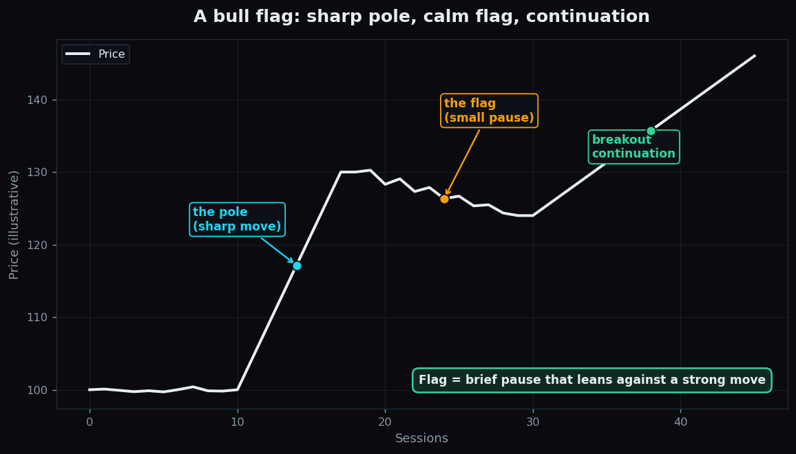
Some of the cleanest-looking moves on a price chart are not one long line up or down. They come in two parts: a fast, almost vertical surge, and then a short, quiet pause — before price often pushes on in the same direction. That pause has a shape. When it looks like a small rectangle it is called a flag; when it looks like a tiny triangle it is called a pennant. Both belong to a family chartists call continuation patterns.
What a flag and a pennant actually are
A continuation pattern is a brief consolidation that interrupts a strong move and then tends to resolve in the same direction the move was already going. Think of a sprinter who takes one quick breath mid-race and then keeps running — the breath is the pattern, the race is the trend.
Every flag and pennant has the same three ingredients:
- The pole — a sharp, steep move on heavy participation. This is the "flagpole" the pattern hangs from.
- The pause — a small, calmer drift that usually leans slightly against the pole. In a flag this drift forms a narrow channel (two roughly parallel lines). In a pennant the range squeezes inward into a small triangle (two lines that converge).
- The resolution — price eventually leaves the pause. When it leaves in the direction of the pole, the pattern is said to have continued.
The picture above is a bull flag: the pole drives higher, the flag drifts gently lower for a few sessions, and then price exits upward. A bear flag is the mirror image — a sharp drop, a small drift higher, then a continuation lower.
Flag vs pennant — the only real difference
The two patterns describe the same idea and differ only in the geometry of the pause:
- A flag consolidates inside a small parallel channel. Its highs and lows fall by a similar amount, so the shape looks like a tilted rectangle.
- A pennant consolidates inside converging lines. The highs come down and the lows come up, so the range narrows to a point.
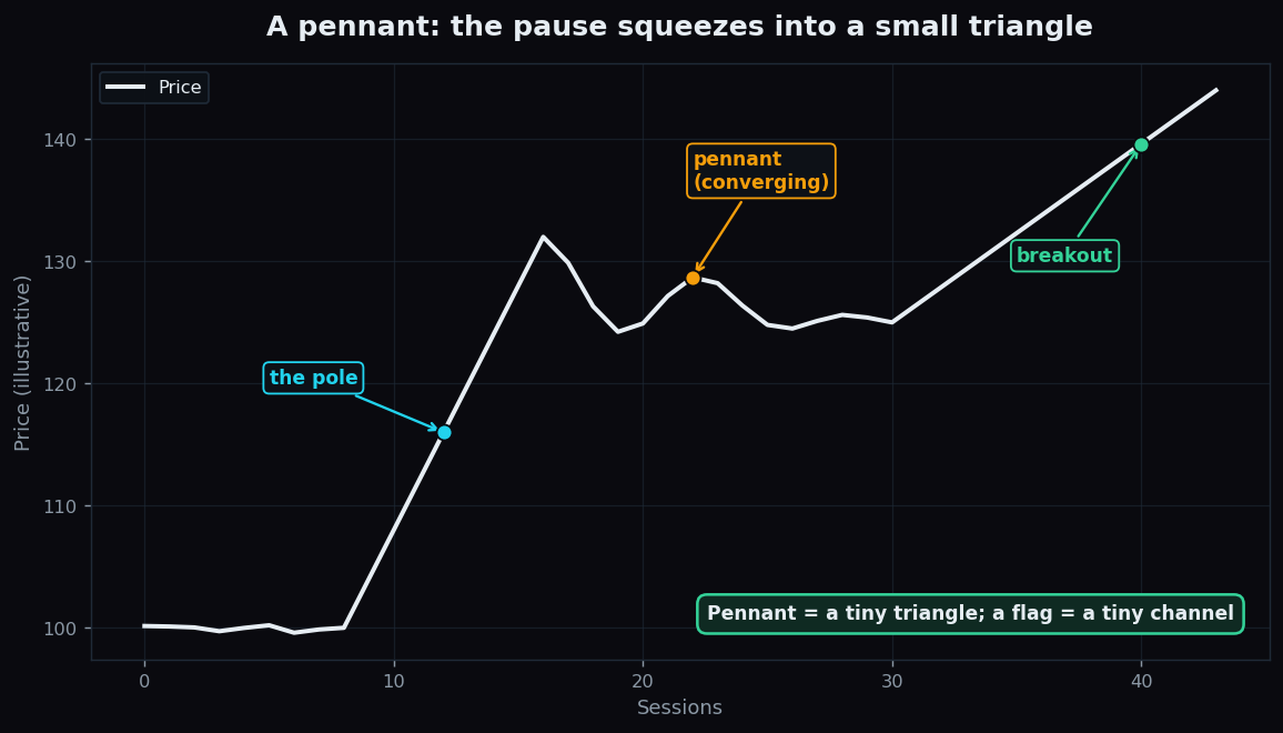
In the pennant above, notice how the swings get smaller and smaller until the chart almost goes flat. That squeeze — energy coiling into a tighter and tighter space — is the signature of a pennant.
Why these patterns get so much attention
The appeal is the story they tell about who is in control. A steep pole says one side (buyers in a bull flag, sellers in a bear flag) just overwhelmed the other. The shallow pause says the winning side is resting rather than retreating — profit-takers trim, a few bargain-hunters nibble, but no real counter-trend forms. If the pause stays shallow and orderly, many chartists read it as the original move simply catching its breath.
Patterns like these also give traders three things that are hard to get from a chart otherwise: a clear reference point (the edge of the pause), a way to frame risk (a move back through the pole often means the idea failed), and a rough sense of scale. A classic rule of thumb is the "measured move": the distance of the pole, projected from the breakout, gives an illustrative idea of how far a continuation might travel. It is a guess, not a guarantee.
A worked example with round numbers
Imagine a stock drifting sideways near 100. Over a few fast sessions it jumps to 130 — that 30-point surge is the pole. Then it spends a week drifting gently down to about 124 on quieter activity. The highs and lows during that week stay inside a tidy little channel: this is a bull flag.
Now apply the measured-move idea. The pole was 30 points (100 to 130). If price exits the top of the flag near 124, projecting the pole from there gives a rough illustrative objective of 124 + 30 = 154. Equally important is the other side of the story: if price instead slides back below the bottom of the pole (toward 100), the "continuation" thesis has simply been wrong, and the orderly pause has turned into a real reversal. The numbers here are invented to show the arithmetic — they are an example, not advice or a forecast.
The honest catch
Flags and pennants look tidy in textbooks because textbooks show the ones that worked. In live markets they come with real limits:
- Failed breakouts are common. Price can leave the pause, then snap right back through it. A clean-looking flag is no promise of anything.
- They are drawn by hand. Where exactly the pole ends and the pause begins is a judgement call, and two people will draw slightly different lines on the same chart.
- The measured move is a rule of thumb, not physics. It is one rough estimate among many and is wrong all the time.
- Context decides. The same shape behaves very differently in a calm market than in a violent, news-driven one. A pattern is a clue, never the whole picture.
This is why disciplined chartists treat a flag or pennant as one piece of evidence to be weighed against volume, the broader trend, and the market backdrop — not as a button that prints money.
Patterns are easier to trust when you can see how often they actually followed through. TrueTrend publishes a transparent, sessions-based scoreboard so you can study how setups behave over time instead of relying on a single tidy textbook chart.
Key takeaways
- Flags and pennants are continuation patterns: a sharp move (the pole), a short pause, and often a push onward in the same direction.
- The pause is the only real difference — a flag is a small parallel channel, a pennant is a small converging triangle.
- They give traders a reference point, a way to frame risk, and a rough "measured move" sense of scale.
- Both can fail; breakouts reverse, lines are subjective, and the measured move is only a rule of thumb.
- Treat them as one clue among many — this article is education, not a recommendation.
See these concepts on live market data — free
Create a free TrueTrend account to watch daily support/resistance levels, market regime, and option-positioning charts on NIFTY, BankNifty and 12 more instruments. Every level we publish is scored on a public scoreboard — misses included. No card required.
Free forever tier · daily levels with published hit-rates across every instrument. Descriptive market structure, not investment advice.
Not ready for an account? Get the daily levels by email.
One short email each market day — the indices' call wall, put wall, gamma flip and max pain, and how the last session's levels scored. Free, no account, unsubscribe anytime.
Descriptive market structure, not investment advice. We never share your email.