Reading the Option Chain: A Beginner's 5-Minute Guide
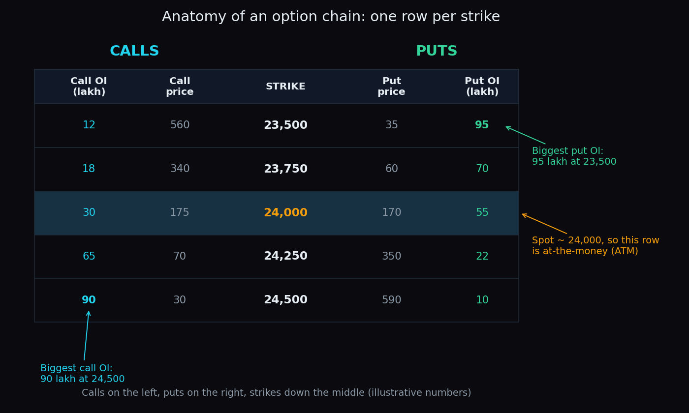
Open any trading app, pull up the Nifty option chain, and you meet a wall of blinking numbers — dozens of rows, a dozen columns, everything updating at once. It looks like the cockpit of a plane. Here is the good news: for a first read, you only need five things on that screen. This post turns them into a simple five-minute routine, with pictures.
First, what is an option chain?
An option is a contract whose value is tied to where the market goes next. A call gains value when the index climbs above a chosen level; a put gains value when the index falls below it. That chosen level is called the strike price. (Completely new to options? Start with our primer on calls and puts, then come back — this post builds on it.)
The option chain is simply a table that lists every available strike for one expiry date: calls on the left, puts on the right, strikes running down the middle like the spine of a book. Think of it as the seating map of a stadium. Every strike is a row of seats, and the numbers tell you how full each row is. You cannot see any single person’s ticket — but where the crowd chooses to sit tells you a lot about what the crowd expects.
For a quick read, the columns that matter most are the two open interest (OI) columns. OI counts how many contracts are currently open at that strike — positions taken and not yet closed. It is the “seats taken” number for each row. In index options it is usually quoted in lakhs (1 lakh = 100,000 contracts). Note that OI and volume are different things — here is OI vs volume in plain words.
The 5-minute routine
Minute 1: find the spot and the ATM strike
The spot is the current index level — say Nifty at 24,000. The strike closest to spot is called at-the-money (ATM); most apps highlight this row. Everything on the chain is measured from here: strikes above spot are out-of-the-money for calls, strikes below are out-of-the-money for puts. If those labels are new, our short explainer on option moneyness covers them.
Minute 2: find the biggest OI on each side
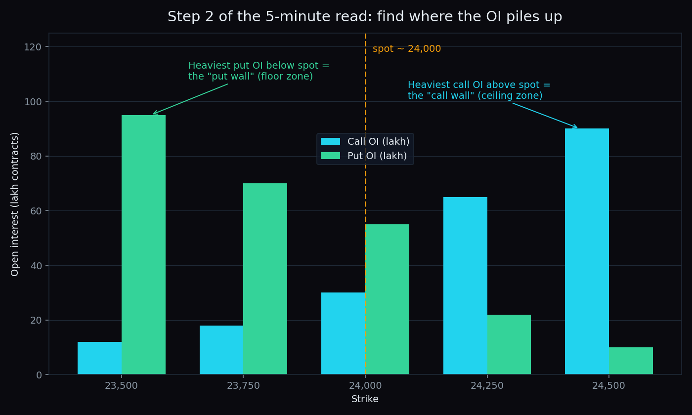
Now scan just two columns. In the call OI column, look above spot for the single largest number — traders call that strike the call wall. In the put OI column, look below spot for the largest number — the put wall. These are the strikes where option writers — the traders who created and stand behind those contracts — have the most money at stake. Heavy OI marks the levels the crowd is watching hardest.
Minute 3: read the implied playing field
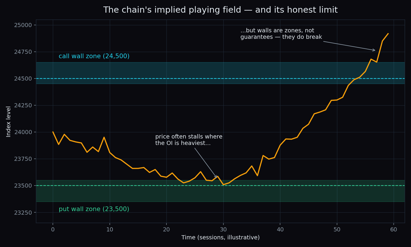
Put the two walls together and you get the range that positioning currently implies: the put wall acts like a floor zone below the market, the call wall like a ceiling zone above it. Price often slows down, stalls, or reverses near these zones, because the writers defending them have a strong incentive to keep the index on their side of the line. It is a map of where the crowd has dug in — not a promise of where price will stop.
Minute 4: check the change in OI
Most chains show a change in OI column next to the OI itself. Rising OI at a strike means fresh positions are being added — that wall is being reinforced. Falling OI means positions are being closed — that wall is being dismantled. A big wall that is shrinking deserves less respect than a modest wall that is growing.
Minute 5: glance at implied volatility
Finally, check the IV column near the ATM strike. Implied volatility is the size of the move the crowd expects — higher IV means wider expected swings, which means the walls are more likely to be tested soon. Some readers also glance at the put-call ratio as a one-number mood summary, but on a five-minute read it is optional.
A worked example with round numbers
Say Nifty is at 24,000. The chain shows the biggest call OI above spot is 90 lakh at 24,500, and the biggest put OI below spot is 95 lakh at 23,500. The five-minute read: positioning implies a playing field of roughly 23,500 to 24,500 — a floor zone 500 points below, a ceiling zone 500 points above, with the floor slightly better-attended than the ceiling. That is context for the day, not a prediction of it.
Do the walls actually work? The measured answer
This is the question most explainers skip. TrueTrend tracks it in public: every session, its scoreboard records whether the day’s call wall and put wall held or broke when price actually touched them. As of early July 2026, the measured record reads: the Nifty call wall held on 73% of touches (n=15) and the Nifty put wall on 72% of touches (n=18). Bank Nifty is messier: its put wall held 75% of touches (n=12), but its call wall held only 29% (n=7). Two honest notes: these samples are still small, so the percentages will move as more sessions are scored — and even a 73% wall breaks roughly one time in four.
The honest catch
- OI is anonymous. The chain shows how many contracts are open, not who opened them or why. A giant put position could be a bearish bet or a cautious hedge — the number looks identical.
- The map redraws itself. Walls shift as positions change, sometimes within a single session — and fastest on expiry days. A morning reading can be stale by afternoon.
- Zones, not lines. Price routinely pokes through a wall by a few points before reacting. Treat walls as areas of interest, never as exact levels.
The key takeaway: the option chain is a map of positioning, not a forecast. It shows you where the crowd has committed money and where the pressure points sit — the market still decides which way to drive. Read it for context, and let the walls earn your respect one measured touch at a time.
That is the whole routine: spot, walls, range, change in OI, IV. Five numbers, five minutes. Do it daily and the wall of numbers stops being a cockpit and starts being a weather report.
Scanning strike-by-strike takes practice — and the walls move every day. TrueTrend turns this market structure across Nifty, Bank Nifty and F&O into one clear, at-a-glance read, and scores its own hit-rate in public. See the record on the live scoreboard or create a free account.
See these concepts on live market data — free
Create a free TrueTrend account to watch daily support/resistance levels, market regime, and option-positioning charts on NIFTY, BankNifty and 12 more instruments. Every level we publish is scored on a public scoreboard — misses included. No card required.
Free forever tier · daily levels with published hit-rates across every instrument. Descriptive market structure, not investment advice.
Not ready for an account? Get the daily levels by email.
One short email each market day — the indices' call wall, put wall, gamma flip and max pain, and how the last session's levels scored. Free, no account, unsubscribe anytime.
Descriptive market structure, not investment advice. We never share your email.