Does Price Really Gravitate to Max Pain? The Scored Data
If you follow options traders near expiry, you have heard the prophecy: “price will drift to max pain.” It sounds almost magical — as if an invisible hand tugs the market to one exact strike. So we put the claim on trial against our own scored sessions. The verdict up front: across 56 scored Nifty sessions the close landed near the max pain strike just 41% of the time, and across 55 Bank Nifty sessions only 13% of the time. The pull is real in theory, but far weaker than its reputation.
First, what “max pain” actually means
Every index option trades at a strike — a fixed price level like 24,500 or 25,000. The option chain is simply the full list of these strikes with the number of open contracts at each one. That count of live, not-yet-closed contracts is called open interest (OI).
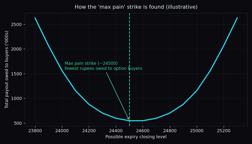
Max pain is the strike where, if the market closed exactly there on expiry day, option buyers as a whole would collect the least money — equivalently, where the most options expire worthless and the writers who sold them keep the most premium. The theory claims price tends to gravitate toward this strike as expiry nears, because the large writers who created those options have an incentive to see them expire cheap.
A worked example with round numbers
Imagine an expiry where the only large positions are 1,000 call contracts at the 25,000 strike and 1,000 put contracts at the 24,000 strike. Ask what happens at different closing levels:
- Close at 25,200: the 25,000 calls are worth 200 points each — the writers owe the holders a lot. High pain for the writers.
- Close at 23,800: now the 24,000 puts are worth 200 points each — again the writers pay out.
- Close near 24,500: both the calls and the puts expire worthless. Holders collect almost nothing; the writers keep everything.
That middle level — around 24,500 — is the max pain point. Add up the payout owed to option holders at every possible close and you get a valley shape; the bottom of the valley is max pain.
The theory: a marble rolling to the bottom of a bowl
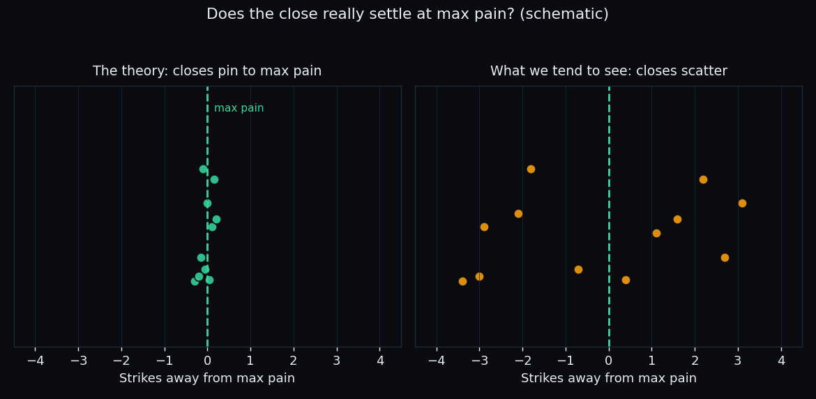
Picture the pain curve as a bowl and the market as a marble. The max pain idea says the marble naturally rolls to the lowest point — the strike that hurts holders most — and settles there by the closing bell. It is an elegant story, and on some expiries it looks exactly right.
Key idea: max pain describes where the option writers would be happiest — not a promise about where price will go. Whether the marble actually reaches the bottom is a question you can measure, not assume.
How we tested it — and kept the misses
Every session we read the max pain strike from a fixed morning snapshot of the option chain, then checked where the index actually closed. We scored a “hit” generously: the close only had to land within one strike of max pain to count. That is a wide net — roughly a full strike step on either side.
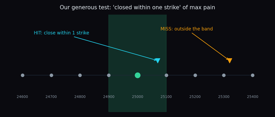
Two rules kept us honest. The level is fixed in advance from the snapshot, so there is no hindsight. And every miss stays in the record — no quietly dropping the days it failed. You can watch the same levels get scored, session after session, on our free public Scoreboard.
What our scored data shows
Here is the measured result, with the sample size (n) next to each figure:
- Nifty 50: closed within one strike of max pain in 41% of sessions (n=56).
- Bank Nifty: closed within one strike of max pain in 13% of sessions (n=55).
Sit with that for a second. Even with a generous one-strike band, Nifty landed near max pain fewer than half the time, and Bank Nifty barely one session in eight. If max pain were a strong magnet, these numbers would be high. They are not. For Bank Nifty especially, assuming a max pain pin would have been wrong roughly seven times out of eight.
Why the pull is weaker than the legend
A few plain reasons the marble often misses the bottom of the bowl:
- The bowl keeps moving. Open interest shifts through the day, so the max pain strike itself drifts. You are aiming at a level that keeps walking away.
- Real news overpowers positioning. A surprise inflation print, a sharp global slump, or heavy institutional flow moves price far more than option writers ever could.
- Bank Nifty is simply wilder. Its bigger daily swings blow past any one strike, which is exactly why its pin rate (13%) is so much lower than Nifty's (41%).
So how should you read max pain?
Not as a prediction, and not as a magnet you can lean on. Read it as context — one clue about where large option positions sit, best used alongside other structure like support, resistance and the option walls. Treat any claim that price must reach max pain with the skepticism our numbers earned it. If you want the full background on the concept, our explainer on max pain theory walks through the mechanics.
TrueTrend scores levels like max pain, call walls and put walls in public — hits and misses — and turns the daily option chain into a clear, at-a-glance read across Nifty, Bank Nifty and F&O. See the live track record on the Scoreboard, or create a free account to follow the levels each session.
See these concepts on live market data — free
Create a free TrueTrend account to watch daily support/resistance levels, market regime, and option-positioning charts on NIFTY, BankNifty and 12 more instruments. Every level we publish is scored on a public scoreboard — misses included. No card required.
Free forever tier · daily levels with published hit-rates across every instrument. Descriptive market structure, not investment advice.
Not ready for an account? Get the daily levels by email.
One short email each market day — the indices' call wall, put wall, gamma flip and max pain, and how the last session's levels scored. Free, no account, unsubscribe anytime.
Descriptive market structure, not investment advice. We never share your email.