Gold vs Equities: How the Safe-Haven Link Really Works
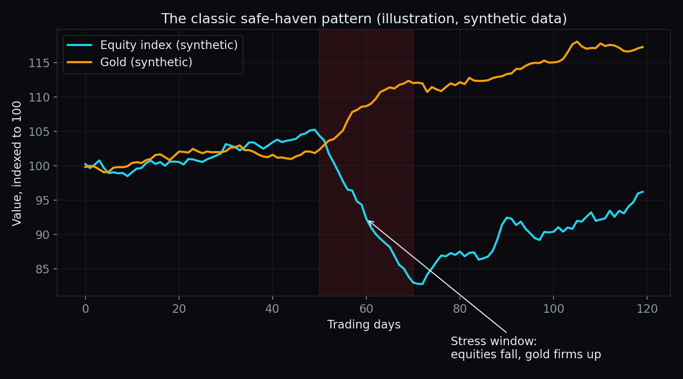
When the stock market falls hard, money looks for somewhere to hide. For centuries, that somewhere has been gold. The pattern is real — but it is not a law of physics. Gold usually cushions an equity crash, sometimes ignores it, and occasionally falls right alongside it. Here is how the relationship actually behaves, when it breaks, and a worked example with simple numbers.
What a safe haven actually is
A safe haven is an asset that tends to hold or gain value exactly when riskier assets — like stocks — are losing it. Think of it as a financial umbrella: nobody cares about it on a sunny day, but when it starts raining, everyone wants one at once.
Gold earns this label for a simple reason: it is nobody's promise. A stock can go to zero if the company fails. A bond can default. Gold has no balance sheet, no earnings, and no counterparty — so when trust in promises falls, its relative appeal rises.
The catch, and it matters: an umbrella keeps you dry in normal rain. In a flood, it does nothing. Gold behaves the same way, and we will get to that.
Why gold often zigs when equities zag
In a typical risk-off episode — bad growth news, a geopolitical shock, a credit scare — three forces push gold up while equities fall:
- Fear demand. Investors rotate money out of risky assets and into things perceived as safe: government bonds, the US dollar, and gold.
- Falling real interest rates. A real interest rate is the interest you earn minus inflation. Gold pays no interest, so when real rates fall, the cost of holding gold instead of a bond shrinks — and gold tends to rise. Stress episodes usually bring rate cuts, which helps gold.
- The rupee effect (the Indian bonus). Gold in rupees is roughly the global dollar price of gold times the USD/INR exchange rate. In a global scare, foreign investors often pull money out of Indian equities, which tends to weaken the rupee. A weaker rupee pushes the rupee price of gold up even if the dollar price of gold goes nowhere. Indian investors effectively get a second cushion.
That is the classic picture: equities fall through a stress window, gold firms up through the same window. It shows up often enough that the reputation is deserved.
A worked example with simple numbers
Say a portfolio starts at ₹1,00,000. Compare two versions through a bad quarter where equities fall 20% and gold rises 10%:
- All-equity: ₹1,00,000 falls 20% to ₹80,000. Loss: ₹20,000.
- 80% equity + 20% gold: the ₹80,000 equity slice falls 20% to ₹64,000. The ₹20,000 gold slice rises 10% to ₹22,000. Total: ₹86,000. Loss: ₹14,000, or 14%.
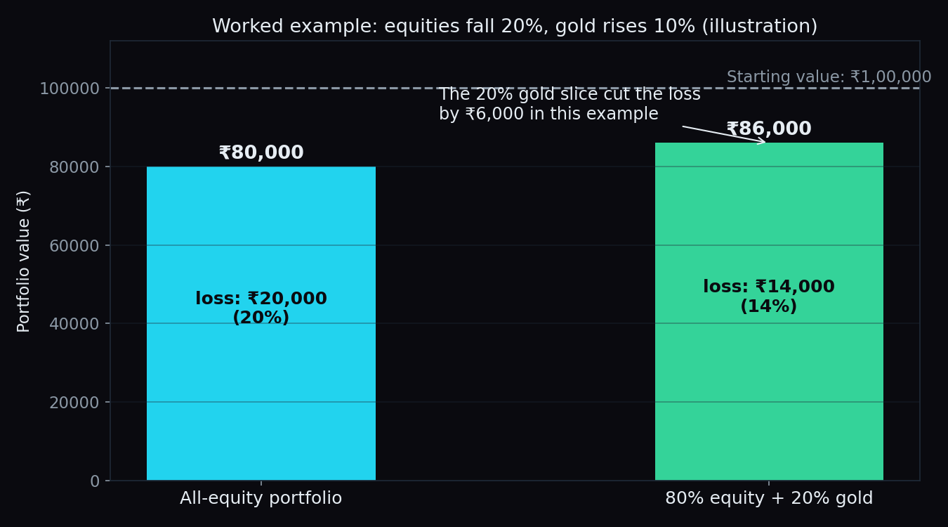
Notice what the gold slice did: it turned a 20% portfolio loss into a 14% loss. It did not need a heroic rally — a modest 10% rise on one-fifth of the portfolio was enough to absorb almost a third of the damage. That is what diversification means in practice. (This is arithmetic, not a portfolio recommendation — the right mix is different for every investor.)
The honest catch: the umbrella fails in a flood
Here is the part most gold marketing skips. In a genuine liquidity crisis — a moment when leveraged funds face margin calls and must raise cash immediately — they liquidate whatever is easiest to convert to cash. Gold is extremely liquid. So, for a stretch, gold can fall with equities, exactly when its owners expected it to shine.
March 2020 is the textbook case: as equities crashed worldwide, gold also dropped sharply for roughly two weeks while funds scrambled for dollars. Only after central banks flooded the system with cash did gold turn around — and it went on to make new highs later that year. The safe haven worked eventually, but not on the exact days many people needed it.
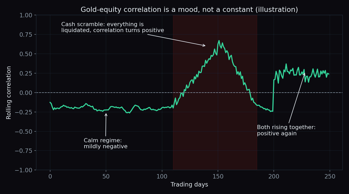
Correlation is a mood, not a constant
Correlation measures how two things move together: +1 means perfectly together, −1 means perfectly opposite, 0 means no relationship. The gold–equity correlation is famous for being mildly negative — but it drifts with the regime:
- Calm or ordinary stress: mildly negative. Gold does its umbrella job.
- Cash scramble: briefly positive. Everything liquid falls together.
- Easy-money or currency-worry phases: positive again, for a happier reason — gold and equities can both climb for months when rates fall and money is plentiful. Recent years have seen exactly this: record equity indices and record gold prices at the same time.
The practical takeaway: gold is a diversifier, not an inverse bet on the stock market. If equities fall 20%, nothing forces gold to rise — and anyone treating it as a hedge with a fixed exchange rate of “stocks down, gold up” will eventually be surprised. Volatility in both assets is normal (our explainer on what volatility means covers this in plain terms).
What our own gold data shows so far
We score option-chain levels in public across 15 instruments on our scoreboard — including MCX Gold options, which we started tracking recently. The honest status: the gold sample is still tiny. So far the gold max-pain level saw price close within one strike in just 10% of scored sessions (n=10), and the call wall has held on every touch — but with only 3 touches (n=3), that 100% means almost nothing yet. Compare Nifty, where max pain closed within one strike in 41% of sessions across n=90 — a sample you can begin to reason about.
We publish the small-n numbers anyway, because that is the point: showing the track record while it is being built, not after cherry-picking the good parts. If you are new to how these option levels work, start with calls and puts explained.
The bottom line
Gold's safe-haven reputation is earned, with an asterisk. It usually cushions equity drawdowns, the rupee effect gives Indian investors an extra layer, and a small allocation can meaningfully soften a crash — as the worked example shows. But in the sharpest moments of a liquidity crisis it can fall with everything else, and in easy-money phases it can rise with everything else. It is a shock absorber, not a mirror image of the stock market.
Regimes shift quietly — the gold–equity link that held last quarter may not hold this one. TrueTrend turns this kind of market structure into a clear, at-a-glance read across Nifty, Bank Nifty and F&O, with every level scored in public. Create a free account and see today's picture.
See these concepts on live market data — free
Create a free TrueTrend account to watch daily support/resistance levels, market regime, and option-positioning charts on NIFTY, BankNifty and 12 more instruments. Every level we publish is scored on a public scoreboard — misses included. No card required.
Free forever tier · daily levels with published hit-rates across every instrument. Descriptive market structure, not investment advice.
Not ready for an account? Get the daily levels by email.
One short email each market day — the indices' call wall, put wall, gamma flip and max pain, and how the last session's levels scored. Free, no account, unsubscribe anytime.
Descriptive market structure, not investment advice. We never share your email.