Market Breadth: What Advance-Decline Data Says About a Rally
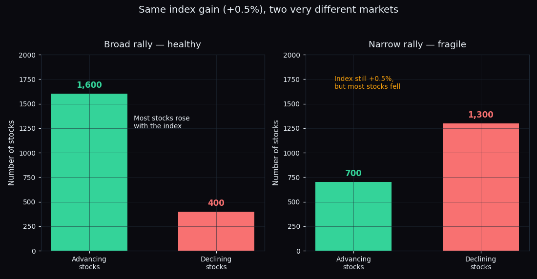
An index can close up half a percent while most of its stocks actually fell that day. Sounds impossible, but it happens often — a handful of heavyweight stocks can drag the whole index higher on their own. The tool that catches this is market breadth: instead of asking “did the index go up?”, it asks “how many stocks went up?” Here is how to read it, with simple numbers and pictures.
What is market breadth?
Market breadth measures how many stocks are taking part in a move, not just where the index landed. Think of a rally like an army on the march. The index is the general out front; the individual stocks are the soldiers behind. If the general advances and the whole army marches with him, that is strong. If the general strides ahead but most of the soldiers are standing still or falling back, the advance is a lot weaker than it looks from the front.
A quick reminder before we go on: an index like the Nifty 50 is a weighted average of its member stocks. Because it is weighted by size, the biggest companies push it around far more than the smallest ones. That is exactly why the index alone can hide what the average stock is doing — and why breadth is worth a look.
The simplest breadth number: advancers vs decliners
On any trading day, every stock ends one of three ways:
- Advancers — stocks that closed higher than the previous day.
- Decliners — stocks that closed lower.
- Unchanged — stocks that closed flat.
Count them up across the market and you have the day's breadth. A worked example with easy round numbers:
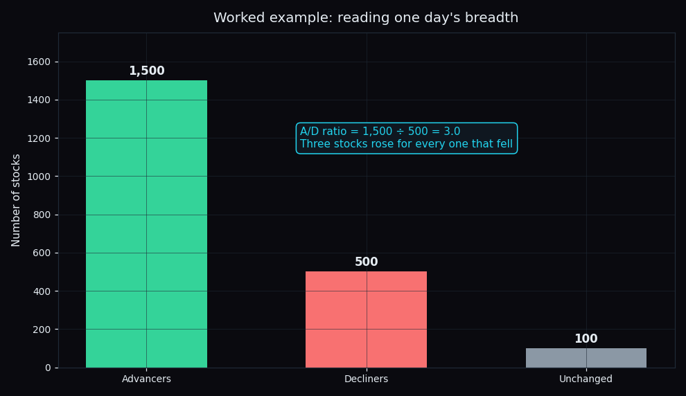
Say 1,500 stocks rose, 500 fell, and 100 were flat. The advance-decline ratio (or A/D ratio) is simply advancers divided by decliners: 1,500 ÷ 500 = 3.0. Three stocks rose for every one that fell. That is a broad, healthy day — the army marched together. A ratio near 1.0 is a coin-flip day; a ratio well below 1.0 (say 0.4) means decliners dominated, even if the index barely moved.
Two rallies that look identical on the index
This is where breadth earns its keep. Imagine the index closes +0.5% on two different days. On the index chart, those two days look the same. Under the surface they are worlds apart:
- Broad rally: 1,600 stocks up, 400 down. The gain is supported by the whole market. Most portfolios felt the green.
- Narrow rally: only 700 up, 1,300 down. The index still finished +0.5%, carried by a few giant stocks, while the typical stock actually fell. Many portfolios were red on a “green” day.
The index number is the same. The quality of the two days could not be more different. A narrow advance is not wrong or doomed — but it is resting on fewer legs, so it is more fragile if those few leaders stumble.
The advance-decline line: breadth with a memory
One day's breadth is a snapshot. To see the trend, traders keep a running total called the advance-decline line (A/D line). The recipe is one subtraction per day, added to yesterday's total:
Today's A/D line = yesterday's value + (advancers − decliners)
On our broad day above, advancers − decliners = 1,500 − 500 = +1,000, so the line steps up by 1,000. On a heavy-selling day it steps down. Plot that cumulative total over weeks and you get a line that shows whether participation is building or fading underneath the index. The absolute number does not matter; the direction does.
When breadth and price disagree: divergence
The most-watched breadth signal is a divergence — when the index and the A/D line point in opposite directions.
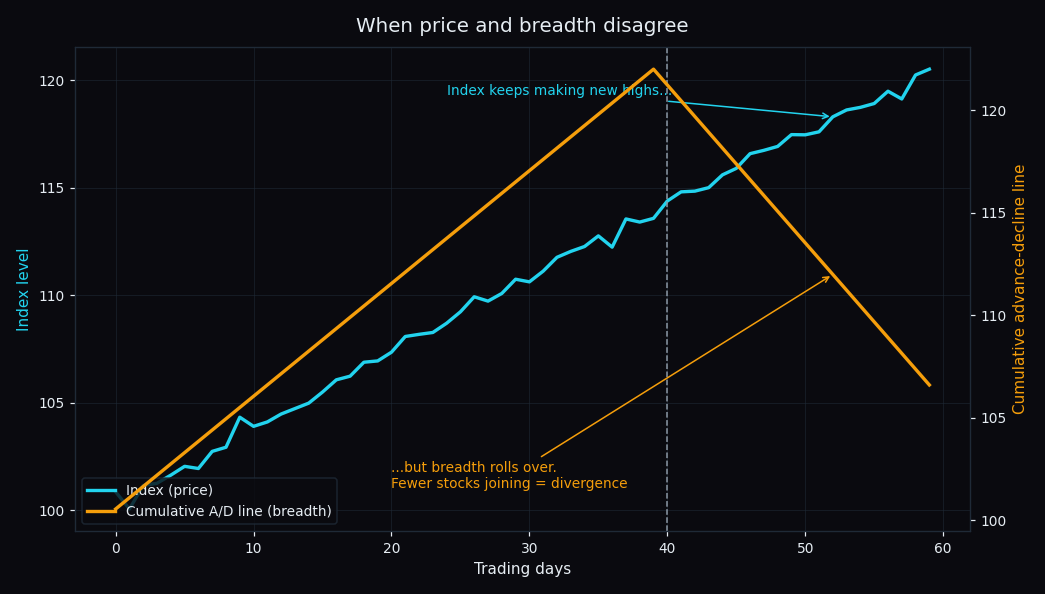
In the picture, the index keeps grinding to new highs (cyan line). But the A/D line (amber) peaks and rolls over: fewer and fewer stocks are joining each new high. The rally is narrowing — the general is still advancing, but soldiers are quietly dropping out of the march. Historically, this kind of thinning participation has often shown up before a rally runs out of steam. It is a caution flag about the rally's internal health, not a countdown timer — a narrow market can stay narrow for a long time.
The healthy case is the boring one: index up, A/D line up alongside it. Broad participation confirms the move. When both agree, the trend has the crowd behind it.
A few cousins worth knowing
The advance-decline idea shows up in several other breadth gauges, all answering the same “how many are taking part?” question:
- New highs vs new lows: the count of stocks hitting 52-week highs versus 52-week lows. Many new highs and few new lows = broad strength.
- Percent above a moving average: the share of stocks trading above, say, their 200-day average price. A rally with 70% of stocks above it is far broader than one with 35%.
- Up-volume vs down-volume: the same tug-of-war measured in traded volume instead of stock counts.
You do not need all of them. One clean advance-decline read already tells you most of the story. Breadth also pairs naturally with sector rotation — if only one or two sectors are lifting the index, breadth will be narrow, and the rotation map shows you where the strength actually sits.
The honest catch
Breadth describes participation, not timing. A divergence tells you a rally is standing on fewer legs — it does not tell you which day it will wobble, and it is sometimes simply wrong. In heavyweight-driven markets like the Nifty, a handful of large stocks can keep the index rising for weeks after breadth has already turned. Treat breadth as one honest gauge of a rally's quality, read alongside price, volume and context — never as a standalone crystal ball.
Used this way, market breadth turns a single index number into a much richer picture: is the whole market marching, or just the front row?
See the market's internals without the maths. TrueTrend reads participation across Nifty, Bank Nifty and the broader F&O universe and turns it into a clear, at-a-glance view of whether a move is broad or narrow — and scores its own track record in public. Create a free TrueTrend account to follow the market's real internal health day by day.
See these concepts on live market data — free
Create a free TrueTrend account to watch daily support/resistance levels, market regime, and option-positioning charts on NIFTY, BankNifty and 12 more instruments. Every level we publish is scored on a public scoreboard — misses included. No card required.
Free forever tier · daily levels with published hit-rates across every instrument. Descriptive market structure, not investment advice.
Not ready for an account? Get the daily levels by email.
One short email each market day — the indices' call wall, put wall, gamma flip and max pain, and how the last session's levels scored. Free, no account, unsubscribe anytime.
Descriptive market structure, not investment advice. We never share your email.