Anchored VWAP Explained: Fair Value Measured From an Event
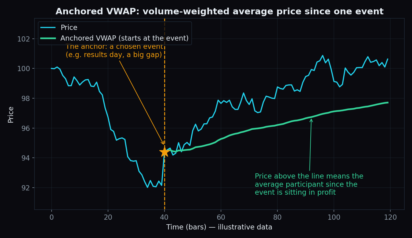
Anchored VWAP answers one simple question: since a specific event — a results announcement, a big gap, a budget speech — what is the average price the market has actually paid? That one line on a chart is a clean way to judge whether an index or a stock is trading rich or cheap relative to the crowd that showed up after the news.
First, a 30-second VWAP refresher
VWAP stands for volume-weighted average price. It is the average price of every trade, where big trades count for more than small ones. If 300 shares changed hands at ₹102 and only 100 shares at ₹100, the average leans toward ₹102, because more money actually moved there. We cover the basics in our VWAP explainer.
Regular intraday VWAP has one quirk: it resets every morning. At 9:15 the calculation starts from zero, so by design it can only tell you about today.
An anchored VWAP keeps the exact same formula but changes the starting point. Instead of restarting each day, you pin (“anchor”) the calculation to one moment you care about. The line then averages every trade from that moment onward — whether that is three hours ago or three months ago.
The cricket-average analogy
A batter’s career average says very little about current form. The average since the start of this tournament says a lot more, because it measures exactly the phase you care about. Anchored VWAP applies the same idea to price: instead of averaging all of history, it averages only what has happened since the event that changed the story.
A worked example with round numbers
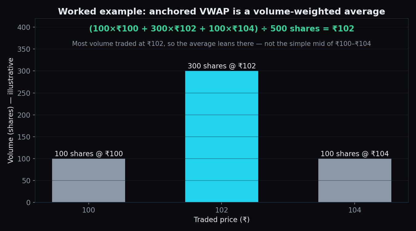
Say a company announces results, and afterwards only three batches of trades happen:
- 100 shares change hands at ₹100
- 300 shares change hands at ₹102
- 100 shares change hands at ₹104
Total money traded = (100 × 100) + (300 × 102) + (100 × 104) = ₹51,000, across 500 shares. Anchored VWAP = 51,000 ÷ 500 = ₹102.
Notice the answer is not simply the middle of ₹100 and ₹104. Volume drags the average toward where most of the money actually traded. That weighting is the whole point.
How traders read the line
- Price above the line: the average participant who traded since the event is sitting in profit. That crowd tends to defend dips toward its break-even level.
- Price below the line: the average post-event participant is underwater. Rallies back to the line often stall, because trapped positions get a chance to exit near break-even.
- Repeated reactions: price frequently slows down or reacts around the line, precisely because it marks the crowd’s average cost since the event.
Common anchors: a results day, the day of a big news gap, a major swing high or swing low, the Union Budget, a listing day, or the start of a calendar year. If this way of thinking clicks for you, volume profile is a close cousin — it maps where volume traded across prices rather than across time.
Anchored VWAP vs a moving average
A moving average looks back a fixed number of bars and treats every bar equally. Anchored VWAP looks back to a fixed moment and weighs every bar by how much actually traded. That makes it event-aware: it answers “what has the market paid since X?” rather than “what has price averaged lately?”
The honest catch
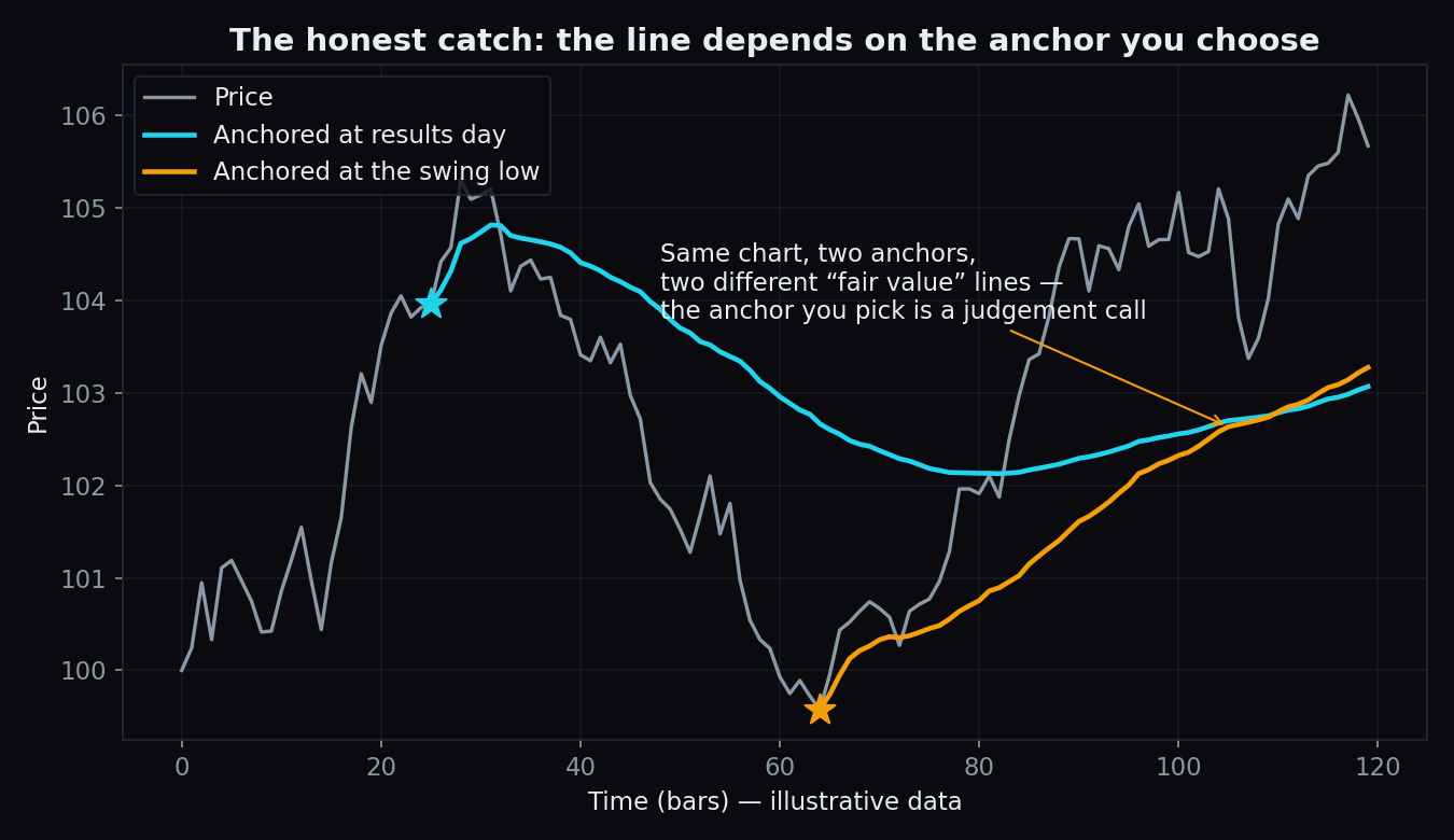
- The anchor is a judgement call. Two people can anchor to two different events and draw two different “fair value” lines on the same chart. Neither is wrong; both are choices.
- Hindsight is sneaky. Swing highs and lows look obvious only after they form. Anchoring to them after the fact can make the line fit the past beautifully while saying little about the future.
- Thin volume makes it noisy. In an illiquid stock, a handful of trades can swing the average around. The idea works best where volume is real and steady.
- It describes; it does not predict. The line shows where the average participant stands. It carries no promise about what price does next.
Key takeaway: anchored VWAP is the market’s average price paid since one chosen event. Above it, the post-event crowd is in profit; below it, that crowd is underwater. It is a clean lens on positioning — not a crystal ball.
Reference levels matter most when you can see how the whole market is positioned around them. TrueTrend turns option positioning on Nifty, Bank Nifty and F&O stocks into a clear, at-a-glance read — and scores its own track record in public. Create a free account to see today’s picture.
See these concepts on live market data — free
Create a free TrueTrend account to watch daily support/resistance levels, market regime, and option-positioning charts on NIFTY, BankNifty and 12 more instruments. Every level we publish is scored on a public scoreboard — misses included. No card required.
Free forever tier · daily levels with published hit-rates across every instrument. Descriptive market structure, not investment advice.
Not ready for an account? Get the daily levels by email.
One short email each market day — the indices' call wall, put wall, gamma flip and max pain, and how the last session's levels scored. Free, no account, unsubscribe anytime.
Descriptive market structure, not investment advice. We never share your email.