CPR (Central Pivot Range) Explained for Intraday Traders
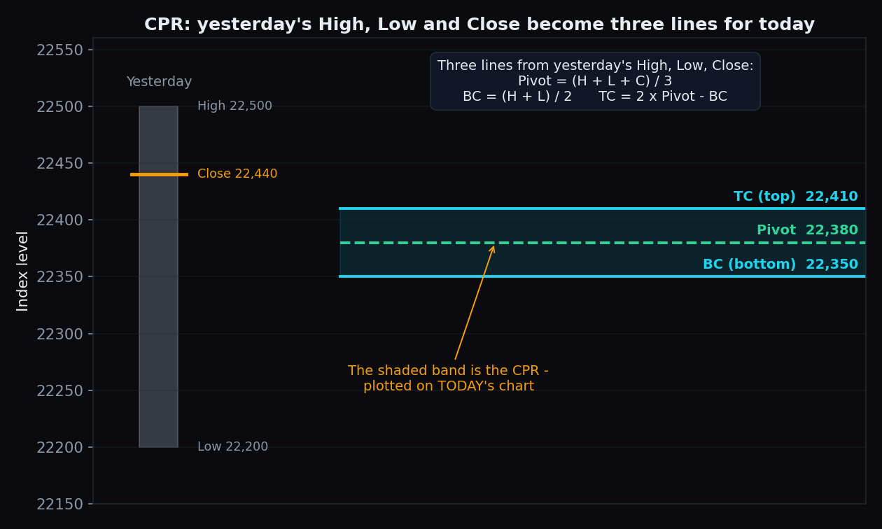
Open almost any intraday chart of Nifty or Bank Nifty on a trading app and you will see three horizontal lines huddled together, usually labelled TC, P and BC. That little band is the CPR — the Central Pivot Range. It looks technical, but it is built from just three numbers everyone already has: yesterday's high, yesterday's low and yesterday's close.
What is the CPR?
The Central Pivot Range is a set of three price levels calculated once, before the market opens, from the previous session's high, low and close. The three lines are drawn flat across today's chart:
- Pivot (P) — the middle line, a simple average of yesterday's high, low and close.
- BC (Bottom Central) — the midpoint of yesterday's range (halfway between the high and the low).
- TC (Top Central) — the pivot's mirror image on the other side of BC, so the pivot always sits between TC and BC.
Together they form a band. Think of it as a speed breaker built from yesterday's traffic: a zone where today's price often slows down, gets argued over by bulls and bears, and picks a direction. The idea grew out of the classic floor-trader pivot points and was popularised for retail traders by books like Frank Ochoa's Secrets of a Pivot Boss.
The three formulas
- Pivot = (High + Low + Close) ÷ 3
- BC = (High + Low) ÷ 2
- TC = (2 × Pivot) − BC
All three inputs come from yesterday. Nothing about today goes into the calculation — that is what makes CPR popular for planning: the levels are fixed before the 9:15 open and never move during the day.
One quirk worth knowing: if yesterday's close was in the lower half of the day's range, the raw formula puts TC below BC. Most charting platforms simply swap the labels so TC is always the top line. Don't be surprised if two apps label the same band slightly differently.
A worked example with round numbers
Say Nifty yesterday made a high of 22,500, a low of 22,200 and closed at 22,440. Then:
- Pivot = (22,500 + 22,200 + 22,440) ÷ 3 = 67,140 ÷ 3 = 22,380
- BC = (22,500 + 22,200) ÷ 2 = 22,350
- TC = (2 × 22,380) − 22,350 = 22,410
So today's chart carries a band from 22,350 (BC) to 22,410 (TC), with the pivot at 22,380. The band is 60 points tall — about 0.27% of the index. That's the whole calculation; no indicator settings, no look-back periods to tune.
Narrow CPR vs wide CPR
The most-quoted CPR idea is about the band's width (TC minus BC). Width simply reflects yesterday's session: a quiet, tightly-coiled day produces a narrow band; a big travelling day produces a wide one.
- Narrow CPR: yesterday compressed. Traders often expect such compression to resolve into a trending, directional day — the "coiled spring" read.
- Wide CPR: yesterday already moved a lot. Traders often expect a choppier, range-bound day, with price spending time inside the band.
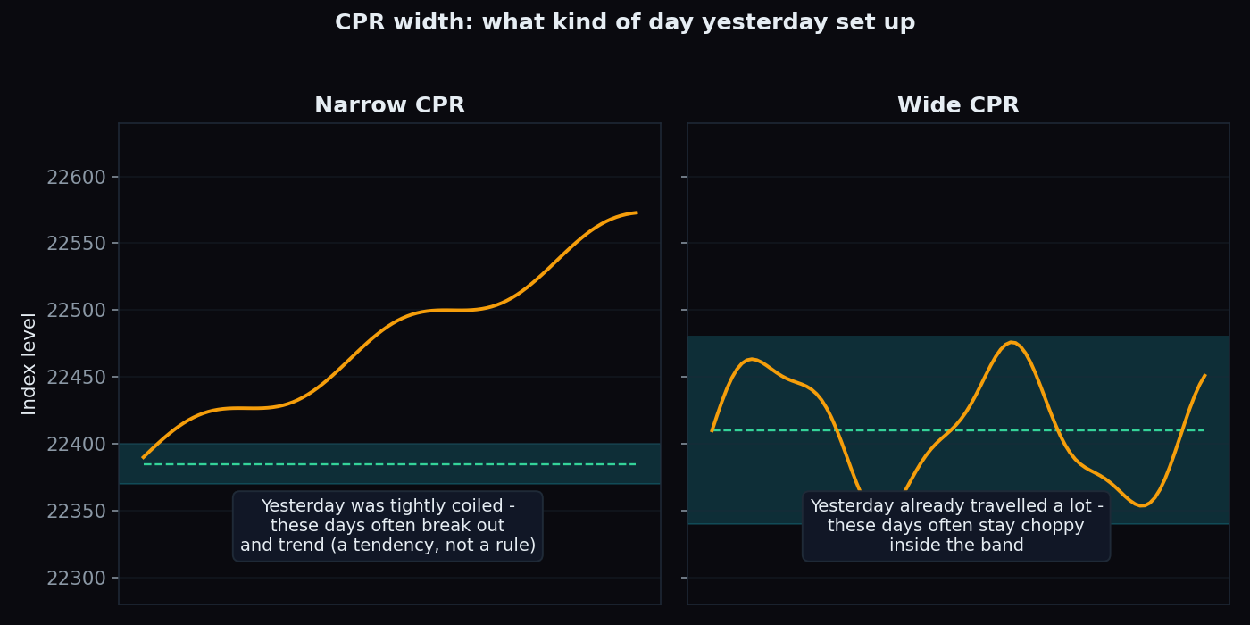
Treat "narrow = trending day, wide = sideways day" as a tendency, not a rule. It describes how days like yesterday have often resolved — it does not know about today's news, global cues or an opening gap.
How intraday traders read it
Because the levels are fixed in advance, CPR is mostly used as a reference map rather than a signal. Common ways traders read it, all descriptive:
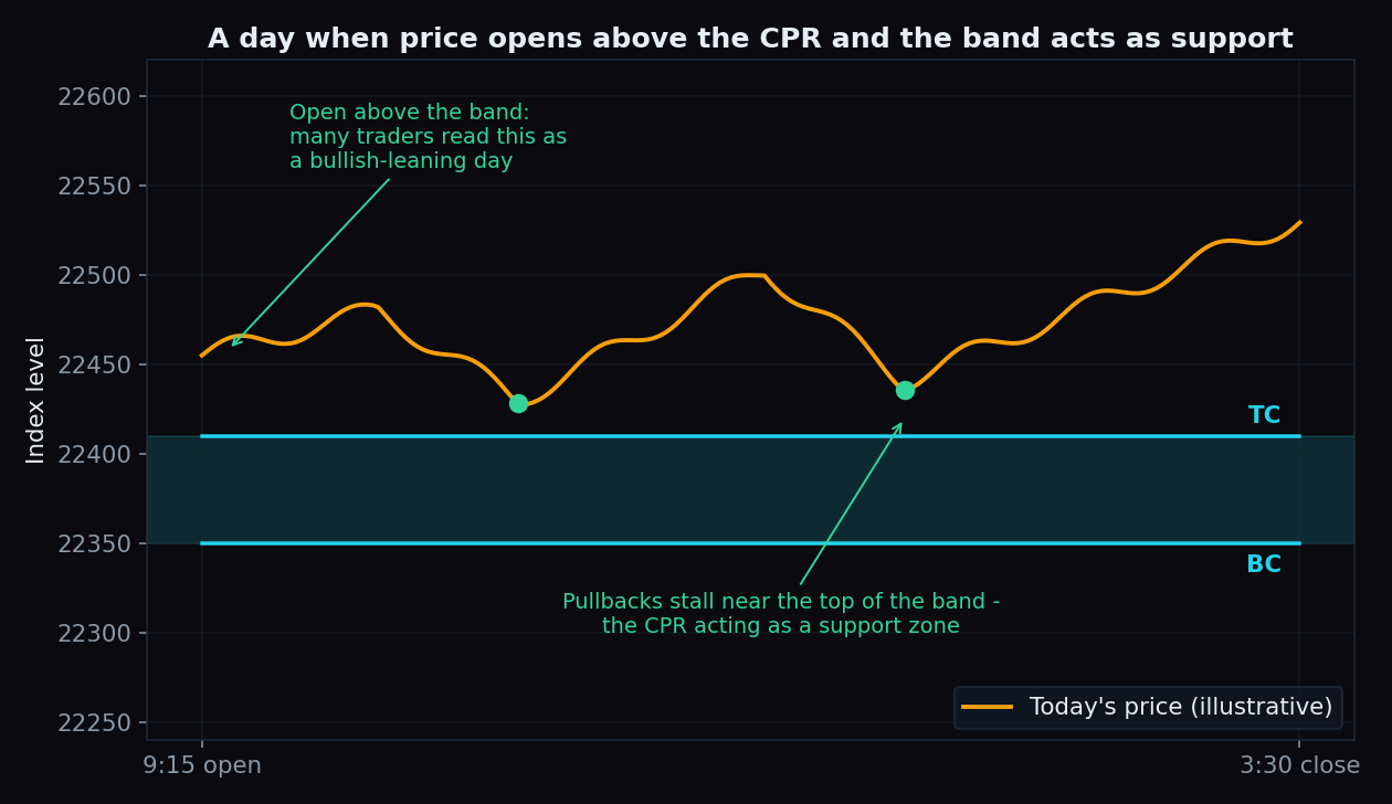
- Open location. An open above the band is often read as a bullish-leaning start; an open below it as a bearish-leaning one; an open inside the band as undecided.
- The band as a zone. When price trades above the CPR, pullbacks toward TC are watched to see if the band acts as support. Below the CPR, rallies into BC are watched the same way as resistance — the same logic as ordinary support and resistance, just with pre-computed lines.
- Alongside other tools. Many traders overlay CPR with VWAP: CPR summarises yesterday, VWAP tracks today's average price as it develops. When both sit in the same area, more eyes are on that zone.
The honest catch
CPR deserves the same scepticism as any indicator:
- It only knows three numbers. No volumes, no positioning, no news — just yesterday's high, low and close. A big overnight event makes the band stale before the open.
- Gap days sidestep it. When the index opens far above or below the band, the CPR can sit untouched all day and tells you very little.
- Part of its power is crowd behaviour. Lots of traders watch the same lines, which can make reactions at them partly self-fulfilling — and that effect is neither constant nor measurable in advance.
- Width heuristics fail often. Narrow-CPR days can chop, wide-CPR days can trend. Anyone quoting a precise success rate for these patterns should also be showing you the sample size behind it.
Used with those limits in mind, CPR is a clean, zero-lag way to frame the day: where yesterday's business was done, and how today's price is behaving around it.
TrueTrend turns readings like these into one clear, at-a-glance picture — live market structure across Nifty, Bank Nifty and F&O, with its own track record scored in public. Create a free account to see today's read.
See these concepts on live market data — free
Create a free TrueTrend account to watch daily support/resistance levels, market regime, and option-positioning charts on NIFTY, BankNifty and 12 more instruments. Every level we publish is scored on a public scoreboard — misses included. No card required.
Free forever tier · daily levels with published hit-rates across every instrument. Descriptive market structure, not investment advice.
Not ready for an account? Get the daily levels by email.
One short email each market day — the indices' call wall, put wall, gamma flip and max pain, and how the last session's levels scored. Free, no account, unsubscribe anytime.
Descriptive market structure, not investment advice. We never share your email.