Donchian Channels Explained: Trading the N-Day High and Low
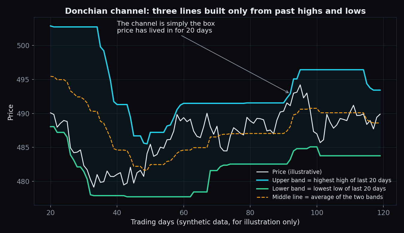
Take the last 20 trading days of any stock or index. Note the highest price it touched and the lowest price it touched. Draw a line at each level. That is a Donchian channel — one of the oldest and simplest tools in technical analysis, and the engine behind some of the most famous trend-following systems ever run.
What exactly is a Donchian channel?
A Donchian channel is three lines, recalculated every day:
- Upper band — the highest high of the last N days.
- Lower band — the lowest low of the last N days.
- Middle line — the halfway point between the two bands.
N is the lookback — the number of days you glance back over. The classic setting is 20 days, roughly one month of trading. The tool is named after Richard Donchian, a fund manager widely called the father of trend following, who built rules around weekly highs and lows as far back as the mid-20th century.
Notice what is not in the recipe: no averages, no smoothing constants, no weights. The channel is simply the box price has lived in for the last N days. That bare-bones honesty is the whole appeal — nothing to tune, nothing hidden.
An everyday analogy: the high-water mark
Think of a riverbank after the rains. The water leaves a visible mark at the highest level it reached. Everyone in the village knows that mark; the river has not gone past it in living memory of the season. The Donchian upper band is the market's high-water mark for the last N days, and the lower band is its low-water mark. When the river rises past the old mark, something real has changed — more water is coming in than at any point recently. A Donchian breakout is exactly that moment for price.
A worked example with round numbers
Say a stock's highest traded price over the last 20 days is ₹520 and its lowest is ₹480. Then today:
- Upper band = ₹520 (the 20-day high)
- Lower band = ₹480 (the 20-day low)
- Middle line = (520 + 480) ÷ 2 = ₹500
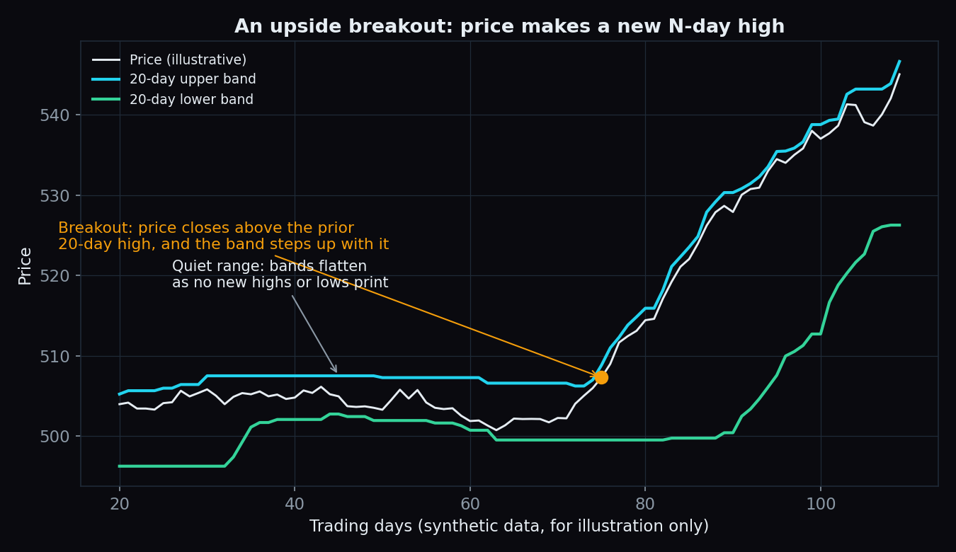
Now suppose the stock closes at ₹523. That is above ₹520, so it just printed a new 20-day high — an upside breakout. Tomorrow the upper band itself steps up to ₹523. If instead the stock drifts near ₹500 for weeks, no new highs or lows print, and both bands flatten into a narrow shelf — a visual cue that volatility has dried up.
Why breakout traders watch it
The reasoning is simple. A market chopping inside its recent range is telling you nothing new. But when price does something it has not done in N days — a fresh high or a fresh low — a trend may be starting, and a Donchian channel flags that moment mechanically, with zero judgement calls.
The historical trend-following playbook (described here for education, not as a recommendation) looked like this: go long when price closes above the prior N-day high; go short, or step aside, when it closes below the prior N-day low; and often use the middle line or the opposite band as the trailing stop that closes the position.
In the 1980s, the famous "Turtle" experiment run by traders Richard Dennis and William Eckhardt handed beginners a rulebook built on Donchian-style breakouts — entries on 20-day and 55-day extremes, exits on shorter opposite extremes. The lesson was never that those exact numbers are magic. It was that a rule this simple could fit on an index card and be followed without emotion.
Choosing N: the only knob there is
A short lookback (10 days) hugs price, fires often, and catches small swings — along with plenty of noise. A long lookback (55 days) fires rarely, reacts late, and only speaks up for big moves. There is no perfect N; there is only a trade-off between speed and reliability. Many charting platforms default to 20.
The channel width is useful on its own, too: a wide channel means the last N days were volatile, and a tight channel means they were calm. In that sense it is a crude cousin of the average true range (ATR).
Donchian vs other channels
Bollinger bands and Keltner channels wrap a moving average in bands sized by volatility, so they breathe continuously with every tick. Donchian bands only move when a new extreme prints. That is why they form those flat shelves you can spot from across the room — and why a touch of a Donchian band means something concrete: price is at its N-day extreme, full stop.
The honest catch: whipsaws
Markets trend only some of the time. In a sideways phase, price pokes above the old high, draws in breakout traders, and slides straight back into the range. Then it does the same at the lows. Each failed poke is a small loss, and small losses stack up. Trend-following systems historically earned their keep from a handful of big moves and gave a chunk back in choppy stretches — a pattern that demands more patience than most newcomers expect. A Donchian breakout also says nothing about why price moved; a one-off news spike prints the same fresh high as a genuine trend.
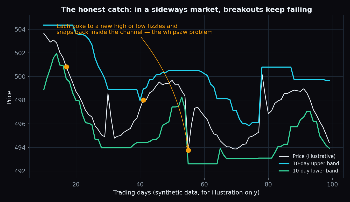
A Donchian breakout does not predict — it observes. "Price just did something it has not done in 20 days" is a fact. Whether that fact grows into a trend is never certain in advance, and no lookback setting changes that.
What to take away
Donchian channels are the plainest possible answer to "is this market doing something new?" Three lines, one knob, no smoothing. They shine at making trends and quiet phases visible at a glance, and they humble everyone in sideways chop. If you learn one channel tool first, this is the easiest one to reason about — because you can rebuild it yourself with a pencil and 20 rows of prices.
Channels tell you where price has been. Positioning tells you where the crowd is leaning right now. TrueTrend turns that market structure — Nifty and Bank Nifty levels, F&O positioning, regime shifts — into one clear, at-a-glance read, and scores its own track record in public. Create a free account to see today's picture.
See these concepts on live market data — free
Create a free TrueTrend account to watch daily support/resistance levels, market regime, and option-positioning charts on NIFTY, BankNifty and 12 more instruments. Every level we publish is scored on a public scoreboard — misses included. No card required.
Free forever tier · daily levels with published hit-rates across every instrument. Descriptive market structure, not investment advice.
Not ready for an account? Get the daily levels by email.
One short email each market day — the indices' call wall, put wall, gamma flip and max pain, and how the last session's levels scored. Free, no account, unsubscribe anytime.
Descriptive market structure, not investment advice. We never share your email.