Money Flow Index (MFI) Explained: The Volume-Weighted RSI
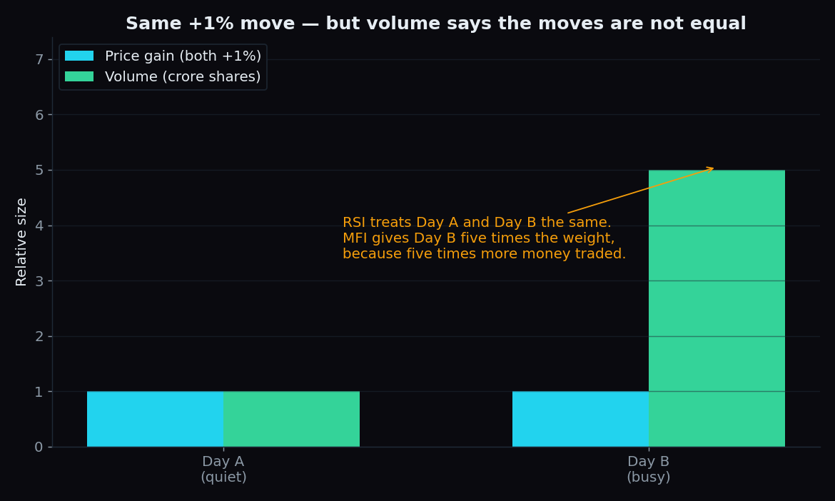
Two trading days can look identical on a price chart. A stock rises 1% on Monday and 1% again on Tuesday. But on Monday only one crore shares changed hands, while on Tuesday five crore did. The Money Flow Index (MFI) is built on one simple idea: those two days are not equal, because five times more money moved on Tuesday.
What is the Money Flow Index?
The Money Flow Index is a momentum indicator — a tool that measures how fast and how forcefully price has been moving. It reads on a scale of 0 to 100 and is usually calculated over the last 14 candles (14 days on a daily chart). Analysts Gene Quong and Avrum Soklow designed it as a close cousin of the Relative Strength Index (RSI), which J. Welles Wilder published in 1978.
The difference is one ingredient. RSI looks only at closing prices: it compares how much price gained on up days versus how much it lost on down days. MFI multiplies each day's price by its trading volume — the number of shares or contracts that changed hands — before making the same comparison. Volume is the weight. That is why MFI is often called the volume-weighted RSI.
An analogy: hands raised vs money on the table
Think of each trading day as a small vote on the market's direction. RSI counts hands: how many recent days closed higher, how many closed lower, and by how much. MFI runs the same vote but weighs every hand by the money behind it. A +1% day on five crore shares carries five times the weight of a +1% day on one crore shares. A move backed by heavy volume is like a vote backed by real commitment — harder to dismiss as noise.
How MFI is calculated, step by step
- Typical price. For each candle, average the high, the low and the close: (high + low + close) / 3. Example: high 102, low 98, close 100 gives a typical price of exactly 100.
- Raw money flow. Multiply the typical price by that candle's volume. If 5,000 shares traded, raw money flow = 100 × 5,000 = 5,00,000. This is roughly the rupee value that changed hands.
- Positive or negative. If today's typical price is higher than yesterday's, today's money flow counts as positive (money pressing up). If it is lower, it counts as negative.
- The ratio. Add up all positive flows and all negative flows over the last 14 candles. Money flow ratio = positive total / negative total. Then: MFI = 100 − (100 / (1 + ratio)).
A worked example with simple round numbers. Suppose over the last 14 days, positive money flow adds up to ₹300 crore and negative money flow to ₹100 crore. The ratio is 300 / 100 = 3. So MFI = 100 − 100 / (1 + 3) = 100 − 25 = 75. Three times more money flowed in on up days than flowed out on down days, and the reading of 75 reflects exactly that.
If inflows and outflows are equal, the ratio is 1 and MFI sits at 50 — the neutral midpoint. All money in pushes it toward 100; all money out pushes it toward 0.
How the MFI is read
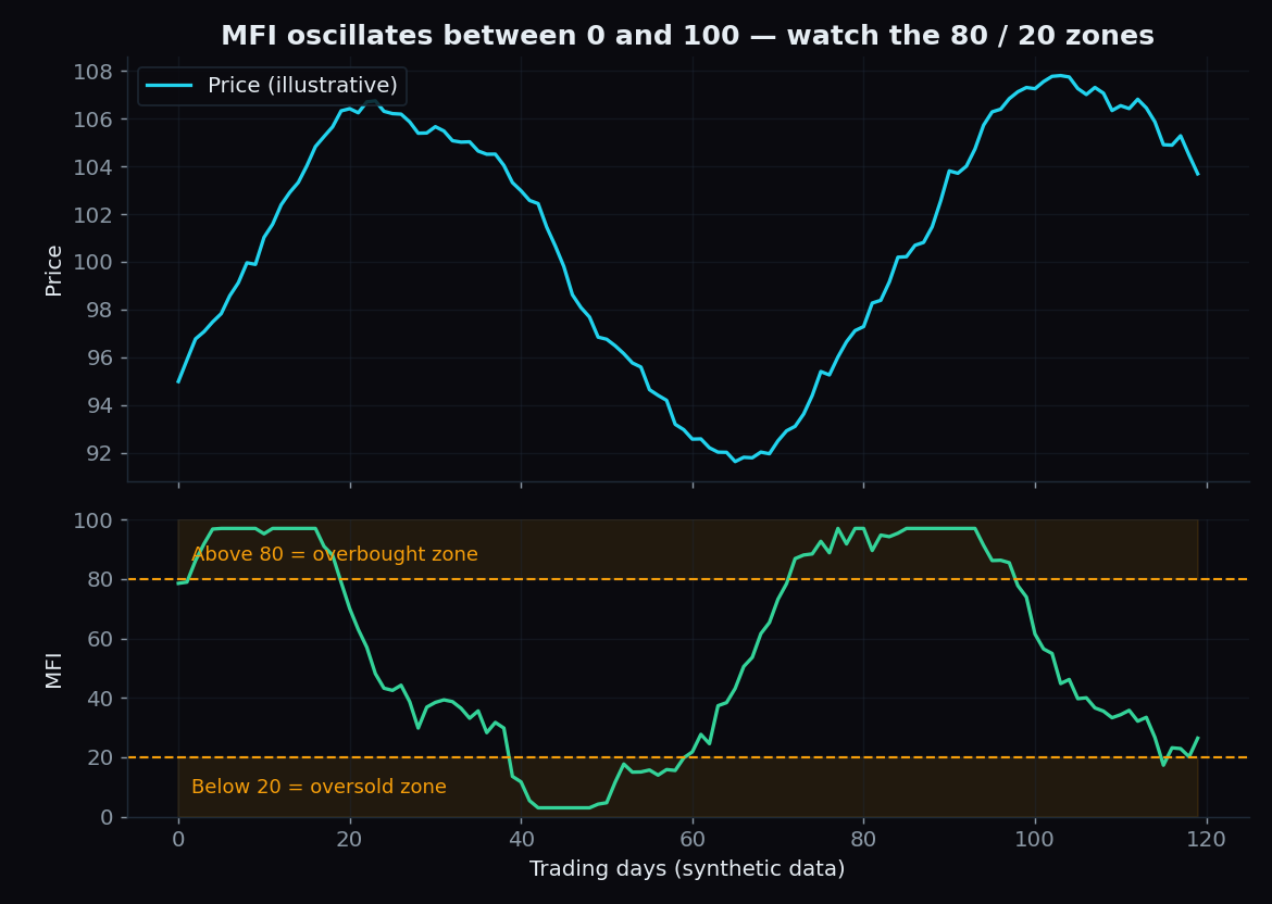
Because MFI is bounded between 0 and 100, chart readers watch two zones. Above 80 the market is called overbought: the recent stretch was dominated by unusually heavy inflows. Below 20 it is called oversold: outflows dominated. (RSI uses 70/30; MFI's extra volume weighting makes it swingier, so its traditional bands sit wider at 80/20.)
It is important to read these zones as descriptions of what already happened, not as forecasts. "Overbought" means a lot of money just moved in quickly. Sometimes that exhausts the move; in a strong trend, it simply continues.
Divergence: when price and money disagree
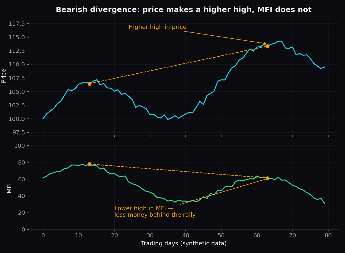
The second reading is divergence. If price makes a higher high but MFI makes a lower high, the second leg of the rally attracted less money than the first — the crowd is still voting, but with thinner wallets. That is called bearish divergence. The mirror image (price makes a lower low, MFI makes a higher low) is bullish divergence: the decline is running on less money.
MFI vs RSI: what actually changes
- Input. RSI uses closing prices only. MFI uses typical price × volume, so it responds to conviction, not just direction.
- Traditional zones. RSI: 70/30. MFI: 80/20, because the volume weighting produces sharper spikes.
- What a spike means. An RSI spike says price moved a lot. An MFI spike says price moved a lot and heavy money participated.
- Where each struggles. Both get pinned at extremes in strong trends. MFI has an extra dependency: it is only as good as the volume data feeding it.
The honest catch
- Indices have no volume of their own. Nifty 50 is a calculated number, not a traded share, so charting platforms substitute something — futures volume, or the combined volume of the constituent stocks. Two platforms can show different MFI values for the "same" index chart. On a single stock this problem disappears.
- Overbought is not a ceiling. In a strong uptrend MFI can stay above 80 for weeks while price keeps climbing. The same holds below 20 in a decline.
- Divergences can fail. A lower high in MFI flags thinner participation; it does not schedule a reversal. Divergences can stretch on far longer than expected.
- 14 is a convention, not a law. Shorter settings react faster but whipsaw more; longer settings are smoother but slower. There is no magic number.
Key takeaway: MFI tells you how much money supported a move — useful context that pure price indicators miss. It does not tell you what happens next. Treat every reading as a description of the recent past, never as an instruction.
In practice, chart readers rarely use MFI alone. It works best as a second opinion alongside market structure — trend, support and resistance, and what the broader positioning data says.
Reading one indicator is the easy part; reading the whole market's positioning is harder. TrueTrend turns Nifty, Bank Nifty and F&O positioning into a clear, at-a-glance read — and scores its own track record in public, so you can judge it before you rely on it. Create a free account to see it live.
See these concepts on live market data — free
Create a free TrueTrend account to watch daily support/resistance levels, market regime, and option-positioning charts on NIFTY, BankNifty and 12 more instruments. Every level we publish is scored on a public scoreboard — misses included. No card required.
Free forever tier · daily levels with published hit-rates across every instrument. Descriptive market structure, not investment advice.
Not ready for an account? Get the daily levels by email.
One short email each market day — the indices' call wall, put wall, gamma flip and max pain, and how the last session's levels scored. Free, no account, unsubscribe anytime.
Descriptive market structure, not investment advice. We never share your email.