Yield Curve Inversion: What It Signals and Why Equity Markets Watch It
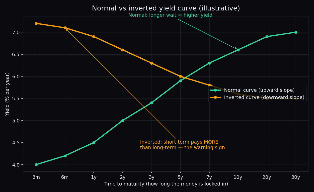
On most days, lending money for ten years pays you more than lending it for two. Once in a while, that flips — short-term loans start paying more than long-term ones. That flip is called a yield curve inversion, and it is one of the most-watched warning lights in global finance. Here is what it actually means, what it has (and has not) predicted, and why stock traders far away from the bond market still track it.
First, what is a yield curve?
Start with three words:
- A bond is a loan you give to a government or a company. They pay you interest and return your money on a fixed date.
- The yield is the yearly return you earn on that bond at its current price. (New to this? Read our explainer on how bond yields work first.)
- The maturity is how long the loan runs — 3 months, 2 years, 10 years, and so on.
Now plot the yields of the same borrower — say, the government — across all maturities, from shortest to longest. The line you get is the yield curve. Normally it slopes upward: the longer you lock your money away, the higher the yield you demand.
Think of a bank fixed deposit. A 5-year FD almost always pays a higher rate than a 6-month FD. That feels fair: you are giving up your money for longer, and more can go wrong in five years than in six months. An upward slope is the bond market behaving normally.
What “inversion” means — a worked example
An inversion is simply that logic running backwards. Use easy round numbers:
- The 2-year government bond yields 7% per year.
- The 10-year government bond yields 6% per year.
Traders compress this into one number, the spread: the 10-year yield minus the 2-year yield. Here that is 6% − 7% = −1 percentage point. A negative spread means the curve is inverted — the market is paying you more to lend for two years than for ten. In FD language: the bank is offering a better rate on the 1-year deposit than on the 10-year one. Strange world.
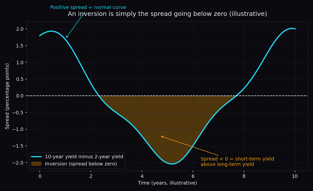
The two spreads people quote most are the 10-year minus 2-year (nicknamed “2s10s”) and the 10-year minus 3-month. When headlines say “the yield curve has inverted”, they almost always mean one of these two has gone below zero — usually on US Treasury bonds, since that is the market the whole world watches.
Why would the curve ever invert?
Two forces pull the two ends of the curve in opposite directions:
- The short end follows the central bank. When a central bank (like the US Federal Reserve) raises rates aggressively to fight inflation, short-term yields jump almost one-for-one.
- The long end follows expectations. A 10-year yield is roughly the market’s average guess of where short-term rates will sit over the next decade. If investors believe today’s high rates will cool the economy and force rate cuts later, long-term yields stay low even while short-term yields climb.
Push the short end up while the long end stays anchored, and the curve flips.
An inverted curve is the bond market saying: “Rates are high today, but we do not expect them to stay high — because we expect the economy to slow down.” It is a forecast about growth, written in prices.
The signal: why equity markets care
The reason everyone watches this specific indicator is its track record. Research from the US Federal Reserve system has documented that the US yield curve inverted ahead of every US recession over the past half-century — typically 6 to 24 months in advance, with at least one false alarm along the way (the mid-1960s inversion that was not followed by an official recession). Few indicators of any kind have a record like that, which is exactly why the phrase “yield curve inverted” makes front pages.
For stock markets, the transmission works through three channels:
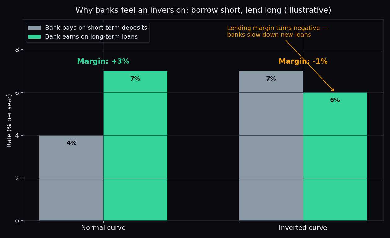
- Banks squeeze first. A bank’s core business is borrowing short (your deposits) and lending long (home loans, corporate loans). A normal curve makes that profitable; an inverted one crushes the margin, so banks slow new lending — and less credit means less fuel for the economy.
- Earnings expectations cool. If the bond market is pricing a slowdown, equity analysts start trimming future profit estimates, and stock prices lean on future profits.
- Risk appetite shifts. Global funds read the same signal. When US yields invert deeply, money often moves defensively — and that shows up in foreign flows into markets like India. (See how interest rates feed into stock markets and how US markets affect India.)
The India angle
Indian traders mostly experience this signal second-hand. It is usually the US yield curve that inverts and dominates headlines; India’s own government bond curve has inverted far less often. But the US curve still matters here, because it shapes the global mood that Indian indices open into — through FII (foreign institutional investor) flows, the US dollar, and risk appetite across emerging markets. A deep US inversion is one of those overnight cues, like the US close or crude oil, that quietly sets the tone for Nifty and Bank Nifty.
The honest catch
The inversion’s reputation as a predictor hides two big problems:
- It is a terrible timing tool. The gap between inversion and any downturn has ranged from several months to about two years. Historically, equities have often kept rising for months after an inversion began. Reacting to the headline on day one has usually meant being very early — which, in markets, feels identical to being wrong.
- The latest test was humbling. The US 2s10s curve inverted in mid-2022 and stayed inverted for roughly two years — the longest stretch in the modern data — while the widely predicted US recession did not arrive on schedule. Some researchers argue central-bank bond buying distorted long-term yields, making the old signal noisier than it used to be.
So treat an inverted curve for what it is: a description of what bond investors expect, with a strong but imperfect record. It says the probability of a slowdown has risen. It does not say when, how deep, or what any index will do next week. No single indicator does.
An inverted yield curve tells you the mood of the bond market in one number. TrueTrend does a similar job for Indian index traders — it turns Nifty and Bank Nifty options positioning into a clear, at-a-glance daily read, and scores its own track record in public. Create a free account to see it.
See these concepts on live market data — free
Create a free TrueTrend account to watch daily support/resistance levels, market regime, and option-positioning charts on NIFTY, BankNifty and 12 more instruments. Every level we publish is scored on a public scoreboard — misses included. No card required.
Free forever tier · daily levels with published hit-rates across every instrument. Descriptive market structure, not investment advice.
Not ready for an account? Get the daily levels by email.
One short email each market day — the indices' call wall, put wall, gamma flip and max pain, and how the last session's levels scored. Free, no account, unsubscribe anytime.
Descriptive market structure, not investment advice. We never share your email.