Cup and Handle Pattern Explained for Beginners
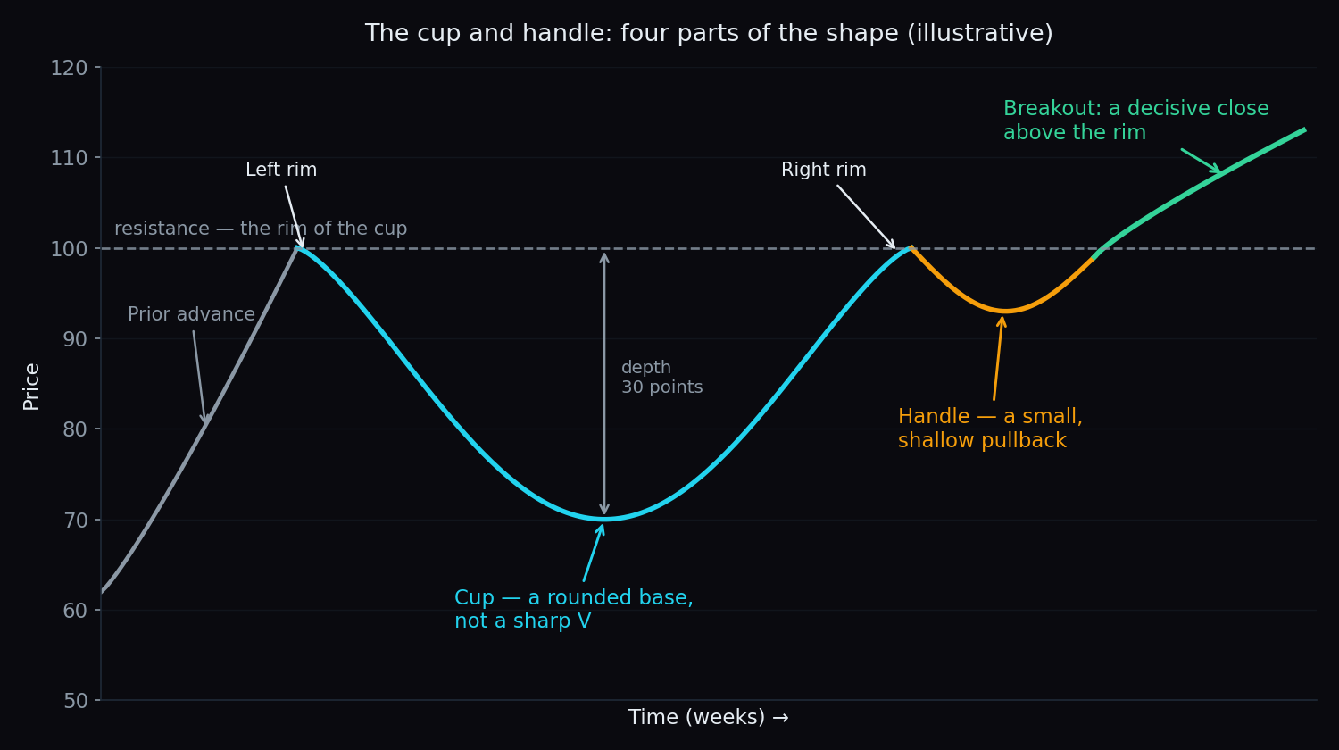
A stock climbs to 100 and stalls. Over the next few months it slides to 70, drifts along the lows, then grinds all the way back to 100. It dips gently to 94, pauses — and then closes at 103. Chart readers have a name for that shape: the cup and handle. It looks exactly like a teacup seen from the side, and it is one of the first patterns most beginners learn to spot. This post explains what the shape is, the four parts it is built from, what volume is supposed to do along the way, a worked example with simple round numbers, and — the part most tutorials skip — how often these things simply do not work.
What a cup and handle is
A chart pattern is just a recognisable shape that price traces out over time. The cup and handle is a continuation pattern: it usually shows up after a rise, and chartists read it as a pause before the rise possibly resumes. “Possibly” is doing real work in that sentence — we will come back to it.
The pattern was popularised by the American investor William J. O’Neil, who described it as the “cup with handle” in his 1988 book How to Make Money in Stocks. He was looking for a specific visual signature in stocks that had gone on to run hard, and this shape kept appearing.
Two terms you need first:
- Resistance — a price level where advances have repeatedly stopped. It is not a physical barrier; it is simply a price where enough supply has shown up before to halt the rise. (More on this in support and resistance explained.)
- Breakout — the moment price pushes decisively through that level instead of turning back at it.
The four parts of the shape
- The left rim. The old high, where the earlier advance ran out of steam. This price becomes the resistance level for everything that follows.
- The cup. A decline and a recovery that together trace a rounded bottom — a U, not a sharp V. This is the slow part; it often takes months.
- The right rim. Price arrives back at roughly the old high. The cup is now complete.
- The handle. A small, shallow pullback just below the rim — a final pause rather than a fresh collapse. In our diagram, price eases from 100 to about 94.
The event chartists then watch for is the breakout: a decisive close above the rim, ideally on heavy volume.
An everyday analogy: the marble in the bowl
Picture rolling a marble down into a wide bowl. It races down one side, slows as the bowl flattens out at the bottom, rolls across, then climbs the far side — losing speed the whole way up. Near the top edge it stalls, slips back a little (that is the handle), gathers itself, and either tips over the rim and out onto the table, or rolls back down into the bowl.
That is the whole pattern in one picture. The rounded bottom matters because it means the marble spent real time down there rather than bouncing straight off. And the little slip near the rim is not a failure — it is what you would expect from something that has almost run out of momentum.
Why the shape is supposed to mean something
The story behind the shape is about trapped supply. Think about who is holding the stock at each stage:
- People who bought near the old high of 100 are now sitting on a loss as price falls to 70. Many of them decide that if they ever get back to breakeven, they are out.
- Down at the bottom of the cup, the impatient holders have already given up and left. Trading goes quiet. There is nobody left in a hurry to sell.
- As price grinds back toward 100, that queue of “get me out at breakeven” holders finally gets its chance. Their selling is the supply that creates the rim.
- The handle is that supply being absorbed. The dip is shallow and the selling fizzles — which is read as a sign that the queue has emptied out.
A breakout above the rim is therefore read as: the overhead sellers are gone, and it took only modest demand to clear them. That is the theory. Whether it holds in practice is a separate question, and it is the one we return to at the end.
Volume: the quiet part of the story
Volume is the number of shares or contracts traded in a period — a measure of how much activity is behind a move (see what is trading volume). In a textbook cup and handle it follows a distinctive rhythm.
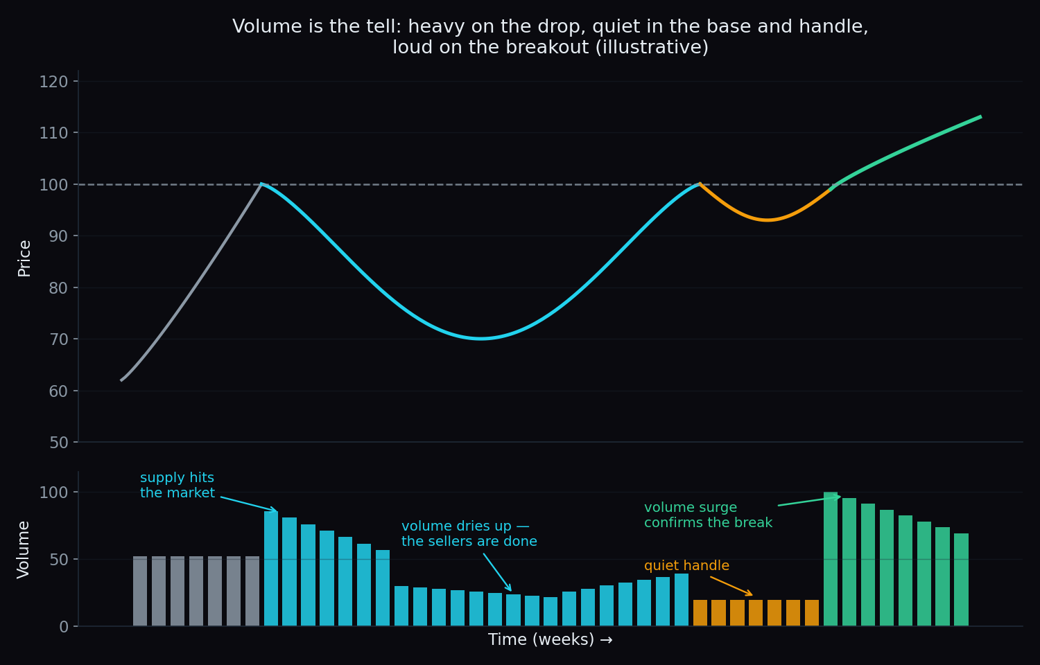
- Heavy on the way down — supply hitting the market as the earlier holders bail out.
- Drying up at the base — the quiet middle. Falling volume near the lows is read as sellers being exhausted rather than eager.
- Quietest in the handle — a shallow pullback on thin volume suggests light, unenthusiastic selling.
- A surge on the breakout — the confirmation chartists look for. A break through the rim on limp volume is treated with suspicion.
This is why volume is often called the pattern’s lie detector: the shape shows you what happened, and volume hints at how much conviction was behind it.
A worked example with round numbers
Take a stock and follow it step by step:
- It peaks at 100 after a good run, then falls back. That 100 is the left rim.
- Over about four months it declines to 70, spends several weeks drifting sideways near the lows, then recovers to 100 again. That round trip is the cup, and its depth is 30 points — 30% below the rim.
- At the rim it eases back to 94 over a fortnight on thin volume. That 6-point dip is the handle — shallow, and comfortably in the upper half of the cup.
- Price then closes at 103, clearly above the 100 rim, on volume well above its recent average. That is the breakout.
Chartists often gauge the rough scale of what follows using the cup’s own depth: the cup was 30 points deep, so a textbook measured move would project something in the region of 30 points beyond the breakout. Treat that as a description of how the pattern is conventionally read — illustrative arithmetic, not a forecast and not a recommendation. Real moves routinely fall well short of it or sail far past it.
What separates a clean cup from a sloppy one
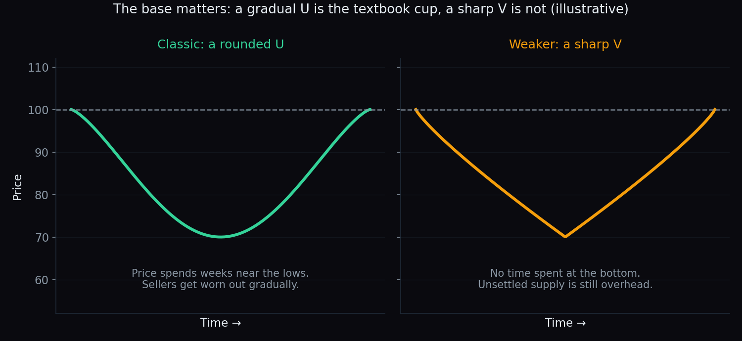
The single biggest tell is the shape of the base. A gradual U means price spent weeks near the lows and the sellers were worn down slowly. A sharp V means it simply snapped back — nobody was worn down, and the same unsettled supply is still sitting overhead. O’Neil treated the V-shaped rebound as a distinctly weaker version of the pattern.
The other conventions from his original description, in plain terms:
- Duration: cups typically take anywhere from about seven weeks to well over a year. A shape that forms in three days is noise, not a base.
- Depth: commonly around 12% to 33% below the left rim. Much deeper, and the damage starts to look structural rather than like a pause.
- Handle placement: in the classic form, the handle sits in the upper half of the cup. A “handle” that gives back most of the recovery is not a handle — it is a fresh decline.
- Handle depth: shallow, usually a fraction of the cup’s own depth, and on light volume.
Different chart readers use different thresholds for all of these. They are rules of thumb for describing a shape, not laws of physics, and reasonable people draw the same chart differently.
The honest catch
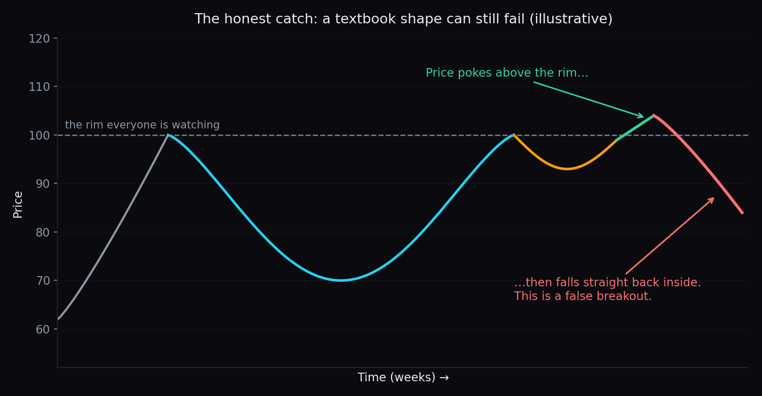
Here is the part that tutorials tend to bury. A textbook cup and handle can be perfectly formed and still fail outright.
- False breakouts are common. Price pokes above the rim, everyone watching the obvious level reacts, and then it drops straight back inside. Because the rim is so visible, it is exactly where sharp reversals get set off.
- The shape is subjective. Where does the cup begin? Is that dip a handle or the start of a new leg down? Two analysts can label the same chart differently and reach opposite conclusions.
- Hindsight flatters the pattern. Every example in every textbook is one that worked. The cups that dissolved into noise were never labelled cups, so they never make it into the picture book.
- The measured move is a rough guide at best. It is arithmetic about a past range, not information about the future.
We can put a number on the broader point. On TrueTrend’s public scoreboard we track a different kind of level — an overhead level drawn from the option chain rather than from a chart shape — and we score, in public, whether it held or broke when price actually reached it. Across the 14 index and single-stock instruments we cover, that overhead level has held on just 53% of the 119 touches recorded so far. Broken out, it swings hard: Nifty 75% (n=20) against Bank Nifty 33% (n=9).
Those samples are small, the instruments differ, and an option-chain level is not the rim of a cup. But the lesson carries: a level that everybody can see is not a wall. It is closer to a coin toss with a good story attached. That is why disciplined chart readers wait for confirmation rather than anticipating the break, size their risk on the assumption that a meaningful share of breakouts will fail, and treat any single pattern as one input among many — alongside the broader trend, other consolidation shapes, and reversal structures like the head and shoulders.
Want to see how real levels actually behave across recent sessions, instead of tidy diagrams? TrueTrend turns raw market structure into a clear, at-a-glance read across Nifty, Bank Nifty and F&O names — and scores its own track record in public. Browse the TrueTrend scoreboard or create a free account to explore.
Key takeaways
- The cup and handle is a rounded base (the cup) followed by a small, shallow pullback (the handle) just below the old high.
- The four parts are the left rim, the cup, the right rim, and the handle; the event watched for is a decisive breakout above the rim.
- The story behind it is trapped supply being absorbed — which is why volume drying up in the base and surging on the breakout is treated as confirmation.
- A gradual U is the classic form; a sharp V is a weaker one. Handle in the upper half, and shallow.
- The cup’s depth gives a rough measured move — emphasis firmly on rough.
- Obvious levels are not walls: on TrueTrend’s public scoreboard, a widely watched overhead level held on 53% of 119 touches across 14 instruments. Plan for failures.
- This is educational content using illustrative numbers only — not trading advice.
See these concepts on live market data — free
Create a free TrueTrend account to watch daily support/resistance levels, market regime, and option-positioning charts on NIFTY, BankNifty and 12 more instruments. Every level we publish is scored on a public scoreboard — misses included. No card required.
Free forever tier · daily levels with published hit-rates across every instrument. Descriptive market structure, not investment advice.
Not ready for an account? Get the daily levels by email.
One short email each market day — the indices' call wall, put wall, gamma flip and max pain, and how the last session's levels scored. Free, no account, unsubscribe anytime.
Descriptive market structure, not investment advice. We never share your email.