Rising and Falling Wedge Patterns Explained
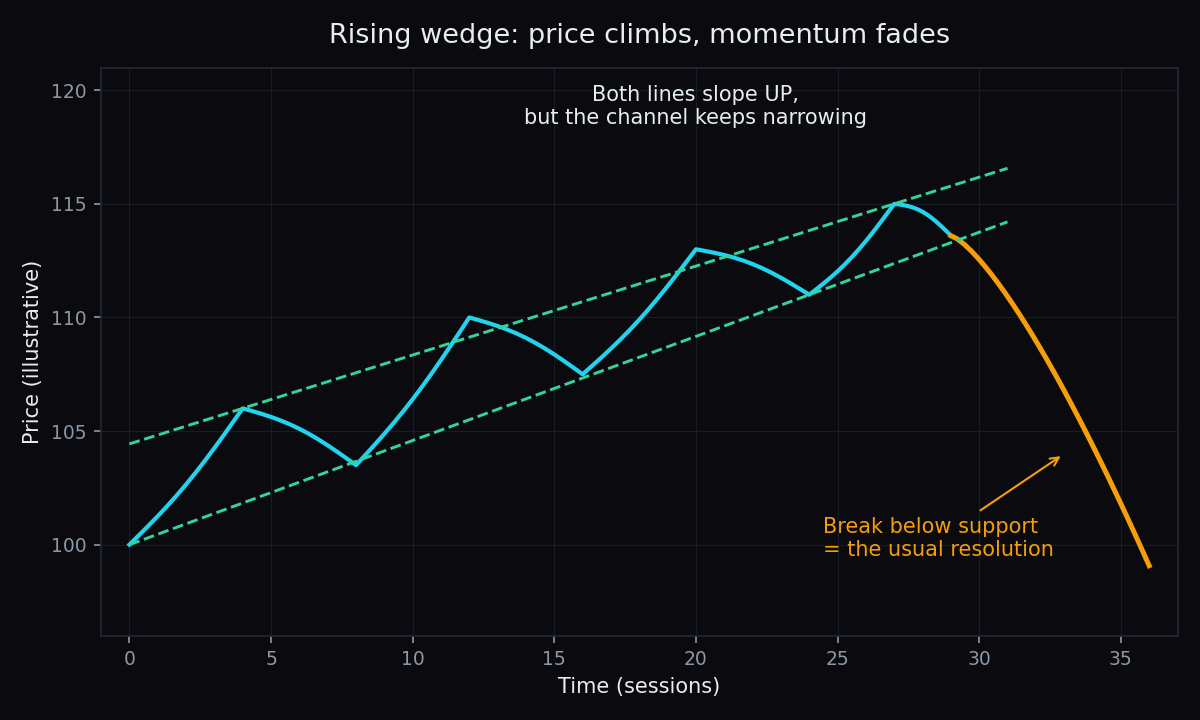
A wedge is a chart pattern in which price gets squeezed between two converging trendlines that both slope in the same direction. A rising wedge tilts upward and usually resolves downward. A falling wedge tilts downward and usually resolves upward. That flip — the pattern leaning one way and breaking the other — is exactly what makes wedges worth understanding.
What is a wedge pattern?
Start with the building block. A trend line is a straight line drawn across a chart's swing highs or swing lows. Draw one line across the highs and one across the lows. If both lines slope the same way — both up, or both down — and they are converging (getting closer together), the shape between them is a wedge.
That "same direction" detail is what separates a wedge from its cousins. In triangle patterns, the two lines slope towards each other from opposite directions, or one of them is flat. In flags and pennants, the pattern is a brief pause after a near-vertical move. A wedge is its own animal: price is still making progress in one direction, but the progress is shrinking with every swing.
Here is an everyday picture. Imagine a ball bouncing along a corridor whose walls slowly close in. Early on, the ball has room for big bounces. As the walls narrow, each bounce gets smaller, until there is no room left and the ball has to exit through one of the walls. A wedge is that corridor drawn on a price chart: the two trendlines are the walls, and the breakout is the exit.
The rising wedge: climbing on tired legs
In a rising wedge, price keeps printing higher highs and higher lows — which sounds healthy — but each new high sits only slightly above the last one. The lower line rises faster than the upper line, so the channel narrows. Read plainly: buyers are still winning, but they are winning by less and less each swing. Demand is fading even while the price drifts up.
Chartists watch the lower line, because it is acting as rising support. The textbook reading is that when that support line finally gives way, the move tends to be down — the fading momentum that the narrowing shape was hinting at becomes visible. Rising wedges are most often described in two spots: late in an extended uptrend, or as a slow upward bounce inside a larger downtrend.
Note the word tends. "Usually breaks down" is a tendency chartists have observed, not a law. Some rising wedges simply break upward and keep going.
The falling wedge: sellers running out of steam
The falling wedge is the mirror image. Price keeps printing lower lows and lower highs, but each new low is only slightly below the previous one. The upper line falls faster than the lower line, so again the channel narrows. Selling pressure is drying up even while the price drifts down.
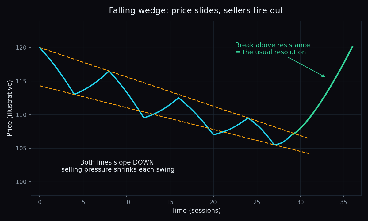
Here the upper line is the one to watch, because it is acting as falling resistance. The textbook reading is that when price pushes up through it, the move tends to be up. Falling wedges are most often described late in an extended downtrend, or as a slow downward pullback inside a larger uptrend.
A worked example with simple numbers
Say a stock climbs from 100 and starts carving a rising wedge:
- The first swing runs from a low of 100 to a high of 110. That first swing is the wedge's widest part: 110 − 100 = 10 points.
- The next swings shrink: down to 105, up to 113, down to 109, up to 115. Higher highs, higher lows, smaller gains.
- Price then slips below the rising support line at around 112. That is the break.
- The classic "measured move" rule projects the widest part downward from the break: 112 − 10 = 102 becomes the zone chartists watch for the pattern to play out.
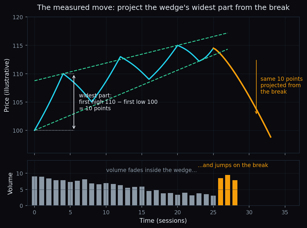
The measured move is a rule of thumb for sizing expectations, nothing more. Price can stop far short of the projected zone, or sail through it. Nothing on a chart is certain.
Volume: the quiet tell
Volume — the number of shares or contracts changing hands — is the wedge's supporting witness. In a textbook wedge, volume fades while the pattern forms, which fits the story: fewer and fewer participants are pushing price along. Look at the lower panel of the chart above — the bars shrink inside the wedge and jump on the break.
Chartists lean on volume at the exit. A break that happens on a clear jump in volume is taken more seriously, because it shows real participation behind the move. A break on thin volume is treated with suspicion — these are the ones that often snap back inside the pattern, which traders call a false break.
The honest catch
Wedges come with real limitations, and it is worth naming them plainly:
- Drawing is subjective. Two people can look at the same chart and connect different highs and lows. One sees a wedge; the other sees a channel or nothing at all. There is no referee.
- Hindsight flatters the pattern. The clean wedges in textbooks were chosen because they worked. In live markets, half-formed wedges morph, overshoot, or quietly fizzle out.
- The tendency is modest, not magic. Even well-formed patterns fail regularly, and no public, audited hit-rate exists for wedges on Indian indices.
That last point deserves a number for perspective. We publish measured hit-rates for the option levels we track: on the public scoreboard right now, the Nifty 50 call wall has held on 76% of touches (n=21) and the put wall on 68% of touches (n=28). Those are real, measured tendencies — and even they give way a quarter to a third of the time. It is sensible to assume a hand-drawn wedge is no stronger than that: a lean, not a law.
Key takeaway: a wedge tells you momentum is fading. It does not tell you the exact day of the exit, and it offers no certainty about direction. Chartists wait for the break, check the volume behind it, and still treat the outcome as a probability.
Where wedges fit in your learning
Wedges sit in the same toolbox as triangles, flags and other consolidation shapes: they describe how a market pauses and how momentum shifts inside the pause. The skill is less about spotting the shape and more about the discipline around it — waiting for the break, reading the volume, and accepting the miss rate.
Reading momentum, levels and positioning off raw charts takes practice. TrueTrend turns that market structure into a clear, at-a-glance read across Nifty, Bank Nifty and F&O — and it scores its own levels in public, so you can see the hit-rates before you rely on them. Create a free account to explore it.
See these concepts on live market data — free
Create a free TrueTrend account to watch daily support/resistance levels, market regime, and option-positioning charts on NIFTY, BankNifty and 12 more instruments. Every level we publish is scored on a public scoreboard — misses included. No card required.
Free forever tier · daily levels with published hit-rates across every instrument. Descriptive market structure, not investment advice.
Not ready for an account? Get the daily levels by email.
One short email each market day — the indices' call wall, put wall, gamma flip and max pain, and how the last session's levels scored. Free, no account, unsubscribe anytime.
Descriptive market structure, not investment advice. We never share your email.