Rate of Change (ROC): The Simplest Momentum Indicator
An index closes at 25,200 today. Ten trading sessions ago it closed at 24,000. Its 10-day Rate of Change is +5%. That is the entire indicator — one subtraction, one division, nothing to tune.
Rate of Change (ROC) is the plainest momentum indicator on any charting platform, and the one most people scroll past on the way to something that looks more sophisticated. It is worth a few minutes, because most of the fancier momentum tools are dressed-up versions of it.
What ROC actually measures
Momentum, in chart language, means speed: not where price is, but how fast it got there. ROC measures that speed as a percentage over a fixed window.
ROC = (Price today − Price N sessions ago) ÷ Price N sessions ago × 100
The lookback (N) is the only choice you make. ROC(10) compares today with ten sessions ago. ROC(63) compares today with roughly a quarter ago, since the Indian market trades about 250 sessions a year.
Think of a car. The price chart is the odometer — how far you have travelled. ROC is the speedometer — how fast you are moving right now. A car can be a long way from home and crawling. A stock can sit near its highs and be losing speed. Those are two different readings, and ROC gives you the second one.
One practical note before you read a level: platforms plot ROC in two ways. Most centre it on zero, using the formula above. Some plot Price today ÷ Price N sessions ago × 100 instead, which centres on 100. Same information, shifted by 100. Check which convention your chart uses.
A worked example with round numbers
- Ten sessions ago the index closed at 24,000. Today it closed at 25,200.
- The gain is 1,200 points. 1,200 ÷ 24,000 = 0.05.
- So ROC(10) = +5.0%.
Now the mirror image. Say the index instead fell from 25,200 to 24,000 over ten sessions. Same 1,200 points, but 1,200 ÷ 25,200 = 0.0476, so ROC(10) = −4.76%. The percentage is smaller because the starting price was larger. Percentages always measure from where the window began — a small detail that matters whenever you compare a rally with a decline.
The zero line is the whole story
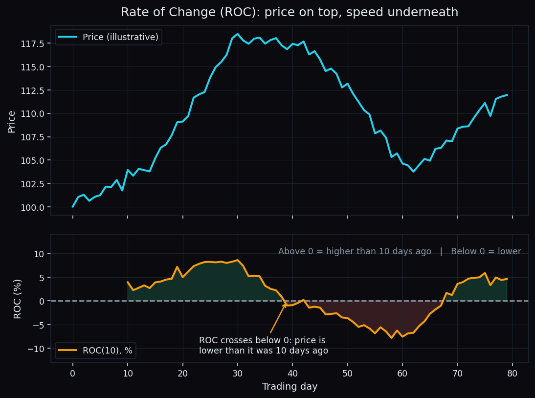
Above zero, today's price is higher than it was N sessions ago. Below zero, it is lower. At zero, the round trip went nowhere.
Two things are worth separating on that lower panel:
- Which side of zero ROC sits on — the direction of the move across the window.
- How far from zero it sits — the size of that move.
ROC can be positive and falling at the same time. Price is still higher than ten sessions ago, but it is adding ground more slowly than it was. That combination is what people usually mean when they say a move is losing steam. It is also why the indicator often turns before price does — and why it just as often turns when price is merely pausing.
Fast and jumpy, or smooth and late
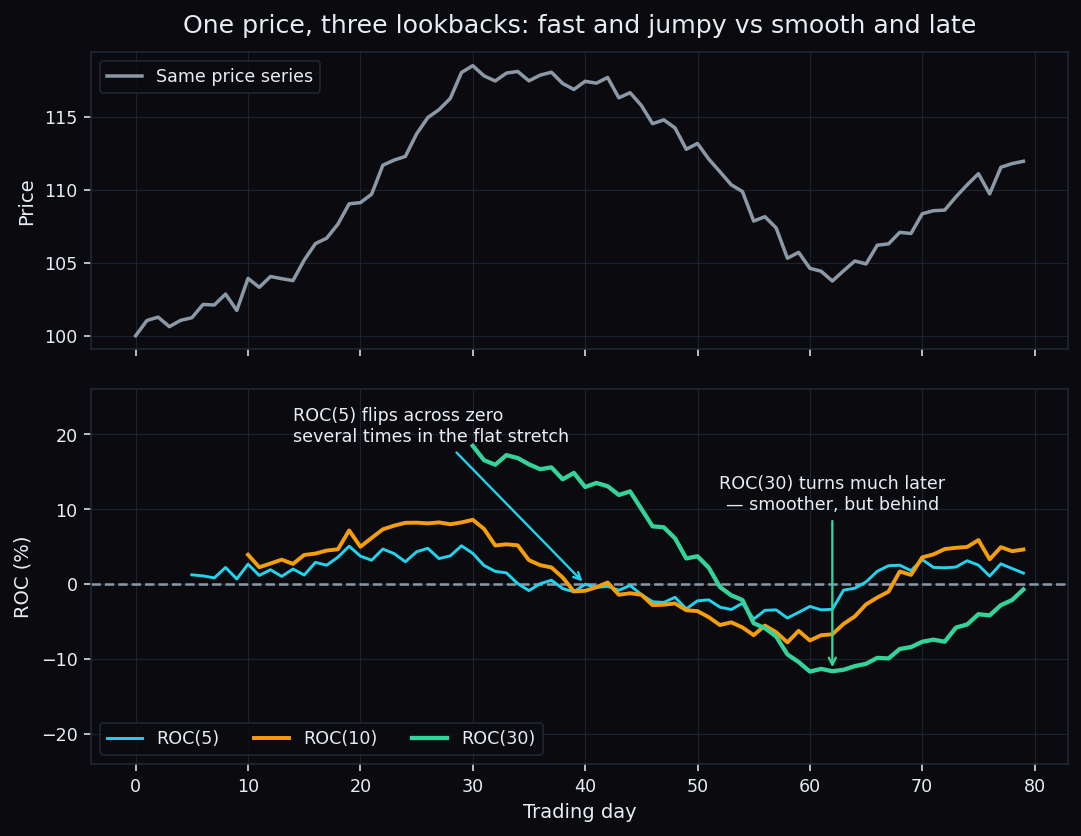
The lookback decides the personality of the line. A short window reacts quickly and crosses zero constantly. A long window is calmer and arrives late. There is no correct number, only a trade-off you choose deliberately.
Common windows, roughly:
- 9 to 14 sessions — short-term swings, noisy.
- 25 sessions — about a month, a middle ground.
- 63 sessions — about a quarter; the window used in a lot of relative-momentum work.
- 125 or 250 sessions — half a year and a year, for slow positional context.
Pick by asking which mistake costs you more: reacting to noise, or reacting late. You cannot avoid both.
Why percent and not points
This is the quiet reason ROC beats a raw points-moved figure. A Rs 200 stock that adds Rs 20 and a Rs 2,000 stock that adds Rs 60 look very different in points. In percent, the small one moved more than three times as fast.
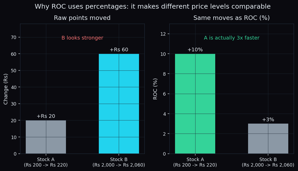
Because ROC is a percentage, the same number means the same thing on a Rs 90 small-cap, on Reliance, and on the Nifty. That is what makes it usable for ranking: run the same lookback across a list of names, sort the list, and you have a crude measure of relative strength against the index or across sectors.
How chart readers use it
- Side of zero as a filter. Some people only look for long setups while ROC is above zero, and the reverse below. It is a context switch, not a signal.
- Stretched readings. ROC has no fixed bands, unlike the RSI, which is pinned between 0 and 100. A +8% reading may be extreme for the Nifty and ordinary for a mid-cap. The only sane reference is that instrument's own history of ROC values.
- Divergence. Price posts a higher high while ROC posts a lower one — the new high was made at a slower speed. That is the classic divergence read, and it fails often enough that it is context, not proof.
- As the ancestor of other tools. The MACD is the gap between two moving averages — the same "is price accelerating?" question, smoothed. If you understand ROC, MACD stops being mysterious.
The honest catch
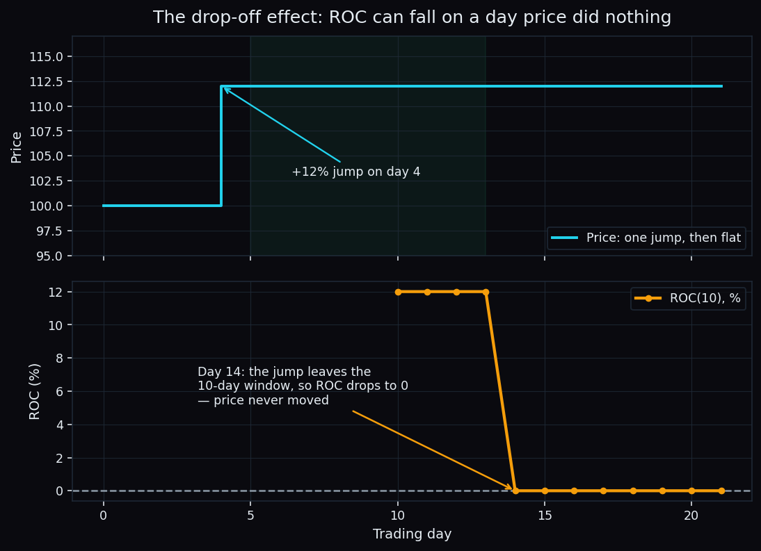
ROC looks at exactly two prices: today's and one from N sessions ago. Everything in between is invisible to it. That single fact causes most of its failures.
The clearest one is the drop-off effect. Suppose a stock jumps 12% in one session and then goes completely flat for a month. Ten sessions after the jump, the jump is still inside the window and ROC(10) reads +12%. On the very next session the jump falls out of the window, and ROC collapses to 0 — on a day when price did not move at all.
The rest of the list:
- No ceiling and no floor. There is no level that is objectively "too high". Thresholds are always instrument-specific and always fitted to the past.
- It whips in a range. In a sideways market a short-window ROC crosses zero again and again, and each crossing looks meaningful in isolation.
- Corporate actions wreck it. A stock split that turns one share into two halves the quoted price overnight. On unadjusted data, ROC prints roughly −50% for a company where nothing actually happened. Confirm your data feed uses split-adjusted prices.
- It is a description of the past. ROC states how fast price moved. It says nothing about what happens next, and a fast move is not a durable one.
ROC is a measuring stick, not a verdict. It answers one narrow question honestly — how fast has price moved over exactly this many sessions — and anyone who reads more into a single crossing is reading things that are not there.
The 30-second version
- ROC = percent change over a fixed lookback. Two prices, one division.
- Above zero, higher than N sessions ago; below zero, lower. Distance from zero is the size of the move.
- Short lookback: early and noisy. Long lookback: steady and late.
- Percent makes different price levels comparable, which is what makes ranking possible.
- Watch the drop-off effect, corporate actions, and the absence of fixed thresholds.
TrueTrend takes this kind of market structure — momentum, levels, and option positioning across Nifty, Bank Nifty and the F&O names — and turns it into one clear, at-a-glance read, then scores its own levels in public on the TrueTrend scoreboard: 15 instruments, with the sample size next to every hit-rate. Create a free account to see the current read.
See these concepts on live market data — free
Create a free TrueTrend account to watch daily support/resistance levels, market regime, and option-positioning charts on NIFTY, BankNifty and 12 more instruments. Every level we publish is scored on a public scoreboard — misses included. No card required.
Free forever tier · daily levels with published hit-rates across every instrument. Descriptive market structure, not investment advice.
Not ready for an account? Get the daily levels by email.
One short email each market day — the indices' call wall, put wall, gamma flip and max pain, and how the last session's levels scored. Free, no account, unsubscribe anytime.
Descriptive market structure, not investment advice. We never share your email.